Rule-breaking palettes are celebrated in a new book about daring graphic design colour schemes
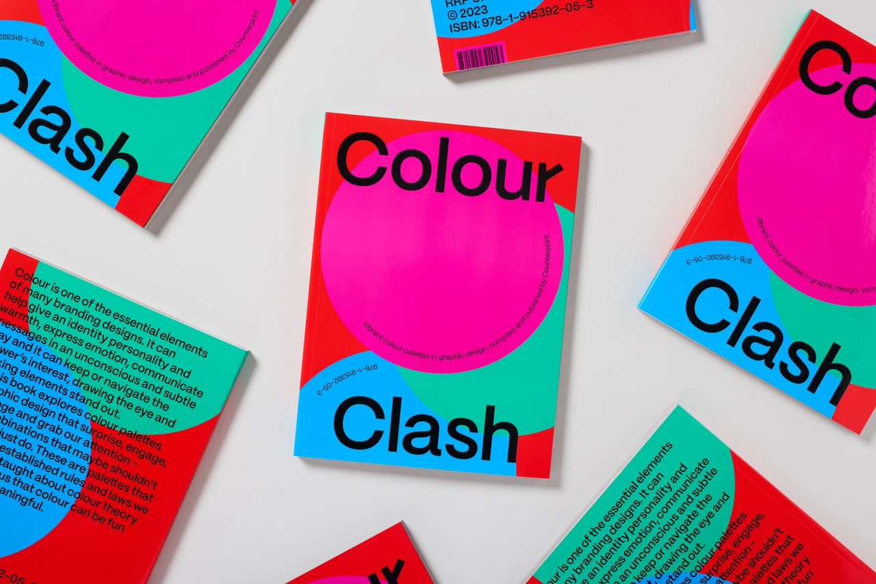
Colours are a fundamental part of graphic design, but even using them in a seemingly 'incorrect' way can produce striking, eye-catching results. And it's these colour schemes that rip up the rule book, which is the focus of a new book recently released by Counterprint.
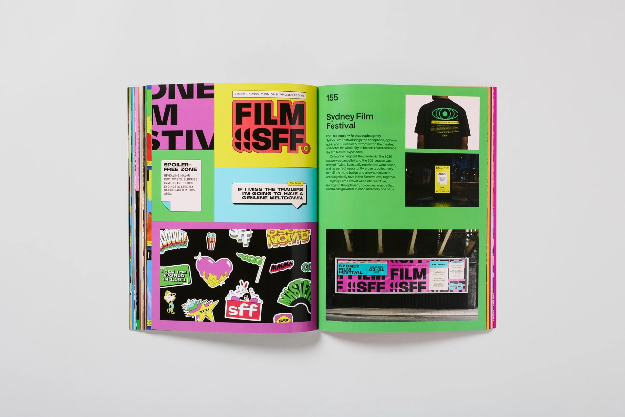
The book is titled Colour Clash and is the latest offering from editor Jon Dowling, who also provides a foreword to this graphic design deep dive. Joining a list of impressive titles delivered by his online bookshop over the last 15 years, including a look at mascots, industry logos and even a Kama Sutra A-Z, Colour Clash promises to be a worthy addition to Counterprint's catalogue.
In Colour Clash, Jon looks at colour palettes in graphic design that "surprise, engage, challenge and grab our attention". These include colour combinations that shouldn't work in theory, but when you see them on the page, there's no denying that they deliver. Ripping up the established rules and laws surrounding colour theory, the palettes in these pages are a useful reminder that colour can be fun and meaningful.
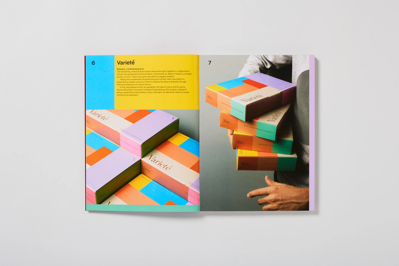
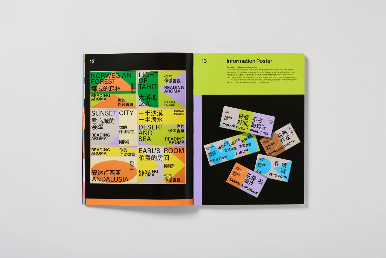
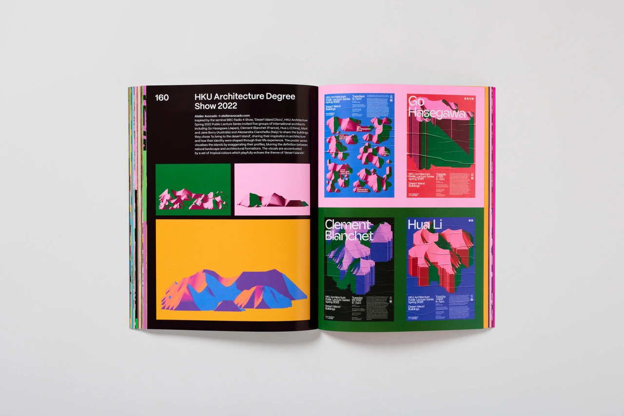
To demonstrate how clashing colours can create killer designs, Jon uses examples from dozens of creatives and studios, including Andrej and Andrej, B&W Graphic Lab, Leon Romero, Play on Play and Studio Yukiko. Accompanied by essays and interviews, these examples not only explain why these colours break the rules but also how they still manage to do the unexpected and somehow work.
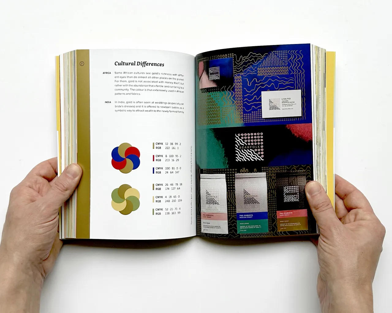
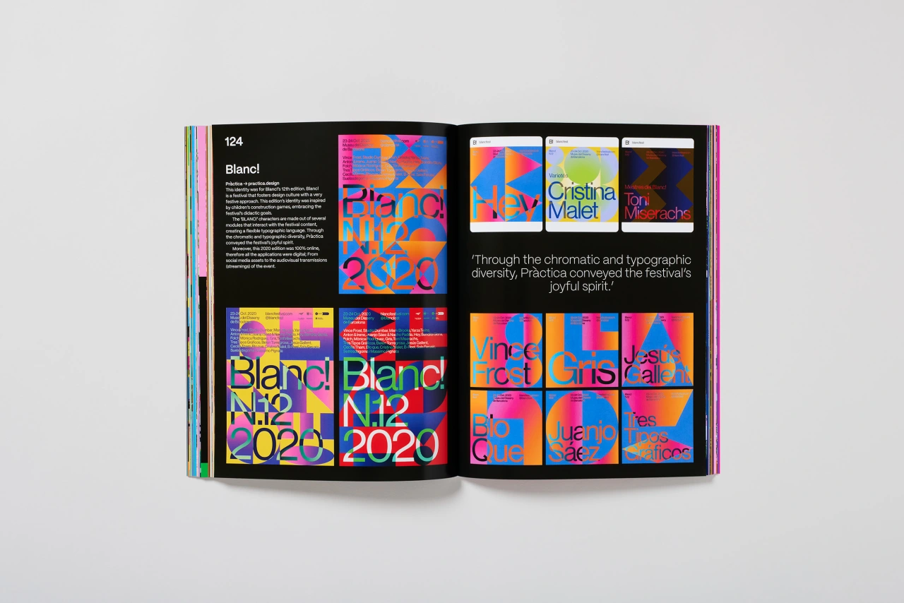
And as you'd expect, the 200-page softbound book itself is a chaotically colourful delight. Featuring photography by Thom Atkinson, Colour Clash examines everything from clothing and posters to billboards and stickers through the lens of dysfunctional colour palettes, along with page layouts that seem to be actively reacting against the work they're spotlighting. It's jarring yet perfectly fitting and is a testament to the care and attention that Counterprint puts into its releases.
Jon himself explains that when compiling examples of work for Colour Clash, he wanted to focus on "palettes that have the power to uplift the spirits, stimulate the senses and convey emotion without words." He adds: "A well-considered colour palette is capable of bringing incredible power to design, and the projects showcased in this book are living proof that colour is king."
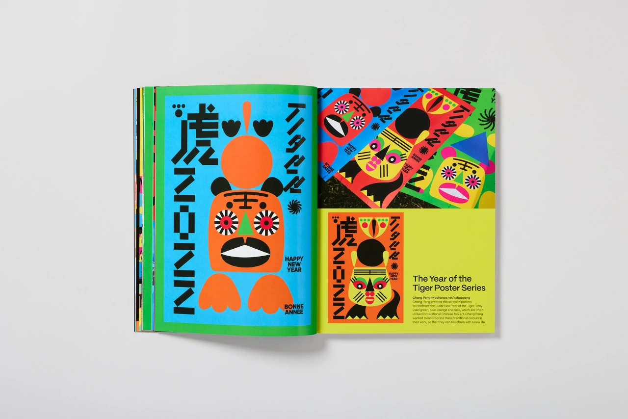
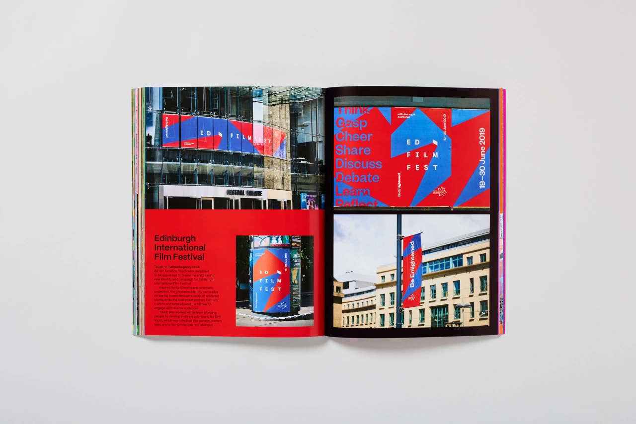
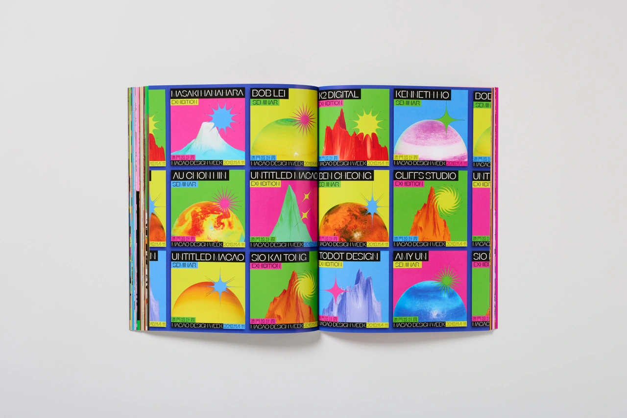
He adds, "This book showcases graphic design projects without safe, traditional colour schemes and everyday palettes. With more than 30 international design companies and interviews with acclaimed professionals, we hope it will inspire anyone wishing to create exciting, even daring, identities using colour.
"Colour Clash shows that designers today understand colour harmony but choose to break established rules by mixing unpredictable combinations, resulting in fresh and fun outcomes. If you can think of a colour combination, it's probably in here, proving that anything goes."
"We hope this book will provide designers with many inventive possibilities when creating their own palettes."
Colour Clash by Counterprint is available to purchase for £20 from the publisher's online store.
Editor's Picks





Trending





Latest Jobs
Head of Technical & Facilities at Midlands Arts Centre
Full-time·Birmingham·£40,210
Graphic & Motion Designer at The SHARP Agency
Full-time·Leeds·£26k–£33k
Growth Strategist (Ecommerce) at Tribe
Full-time·Exeter / London·£50k + Bonuses
Design Lead at Madeo
Full-time·New York City·$85k–$120k
Senior Brand Designer at Analogue
Full-time·Leeds·£38k-£45k
Head of design at Cog Design
Full-time·London·£55K