Franklyn's redesign for WeWork marks a new chapter for the co-working platform
An Apple TV series might share a little more of its rocky past than it would like, but WeWork is still around today. We look at Franklyn's new design refresh for the brand and the backstory behind it.
There are many great reasons to work in graphic design, but most of the time, feeling a rush of blood to the head and pumping adrenaline isn't one of them. Designers and agency heads often like to talk about the "challenge" of taking on a new client, but most of the time, the stakes are not, in all honesty, that high.
We're guessing, though, that the good people at Brooklyn-based creative studio Franklyn might have felt a little differently about their latest project.
If you haven't heard of WeWork, here's a quick refresher. Founded in New York in 2008, it was a startup that pioneered the idea of renting flexible co-working spaces to freelancers and other startups. The idea took off, and the company expanded rapidly to hundreds of locations around the globe. So far, so good.
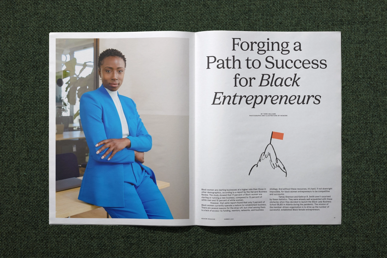
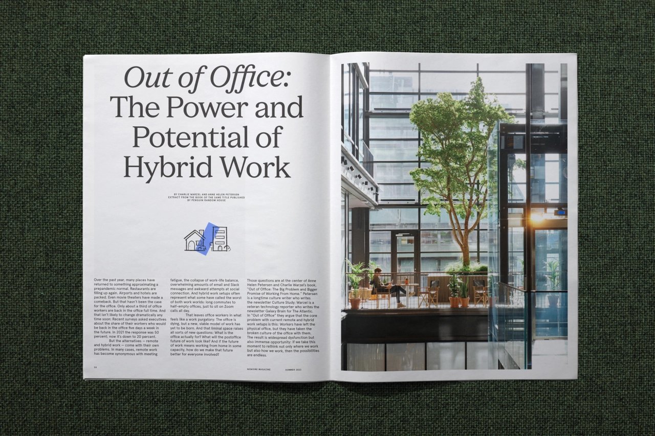
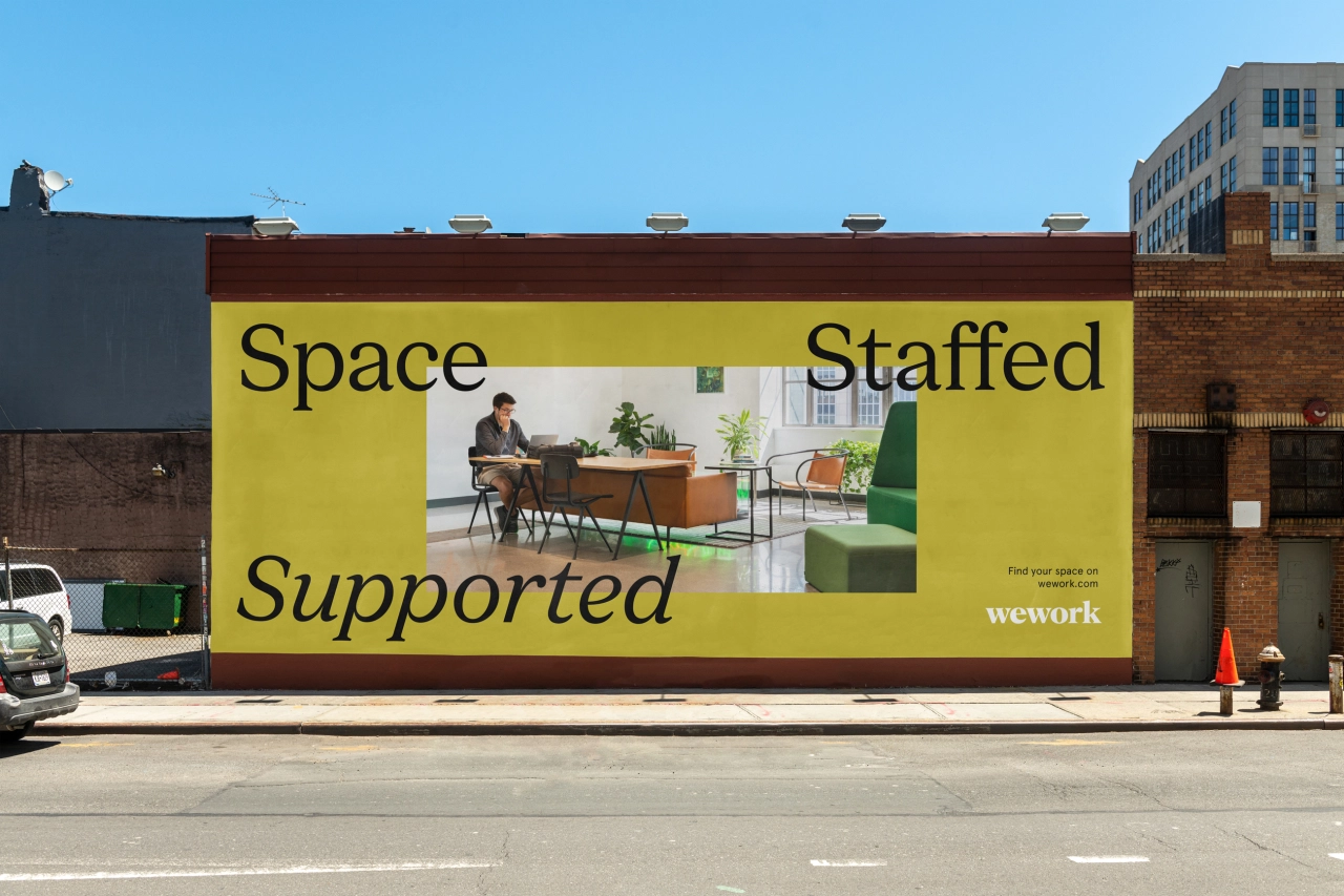
Unfortunately, as investors poured billions into WeWork, the enterprise crashed and burned in spectacular fashion. Yet, miraculously, the company survived. Admittedly, it's still somewhat in turmoil, with the CEO and CFO both departing and the stock plummeting in recent months. But the fact it's here at all surprises many. And that's testimony to the fact that, ultimately, WeWork is based on a sound business idea and has continued to deliver high-quality co-working facilities to more than half a million members worldwide.
Marketing that service in 2023, though, is certainly not for the faint-hearted. After all, both a documentary movie, WeWork: The Making and Breaking of a $47 Billion Unicorn, and an Apple TV docudrama, We Crashed, have dragged WeWork's name through the mud in recent years.
In short, Franklyn had its work cut out in reimagining WeWork's brand strategy and visual identity in an effort to rebuild its reputation and sell its services to its target audience.
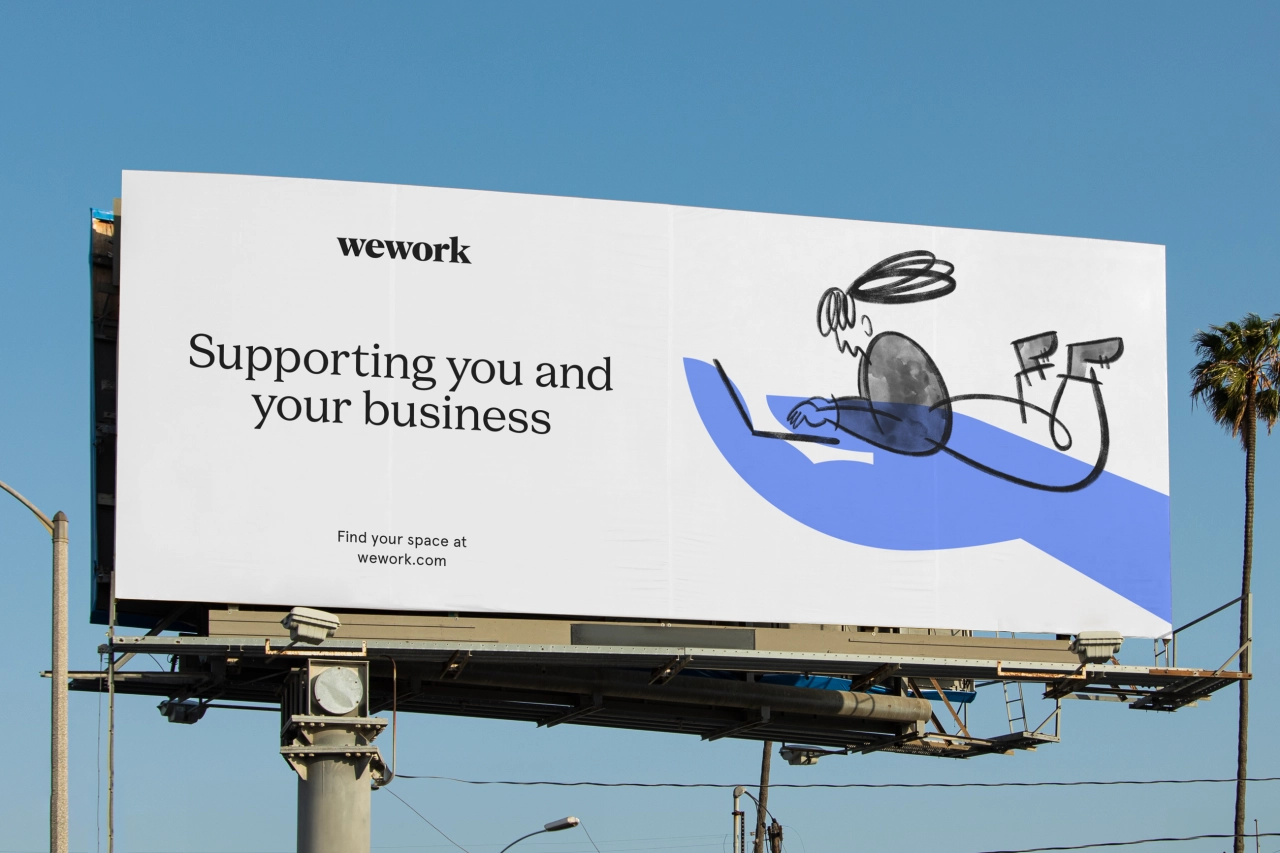
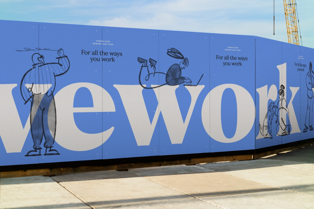
Design elements
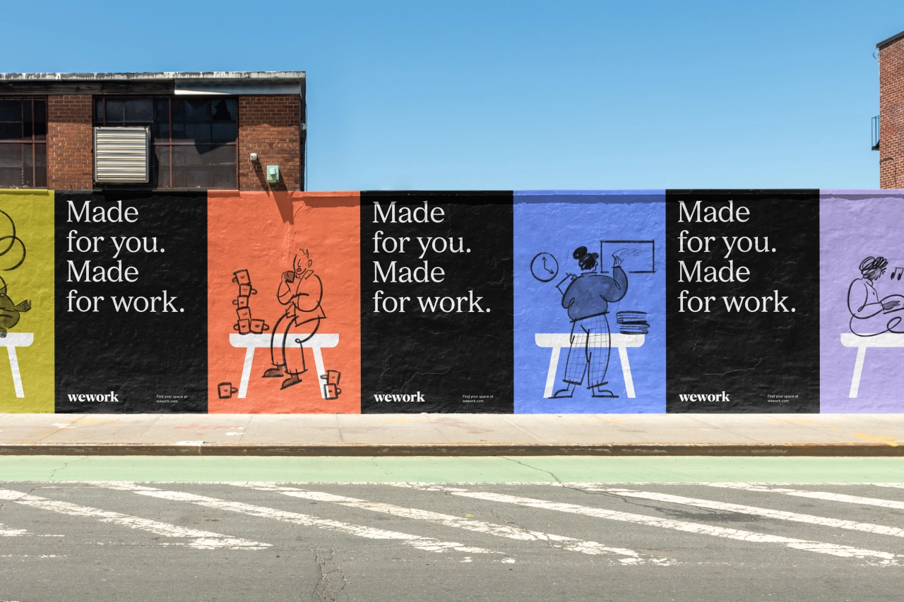
Working with WeWork's internal design team, Franklyn focused on WeWork's biggest assets: the service itself and its community of users. The new branding focuses on the high level of care and intent WeWork puts in its spaces and communities while also shifting the focus to its members. Considering there are so many of them, this is a smart move: to adopt the old saying, half a million people can't be wrong.
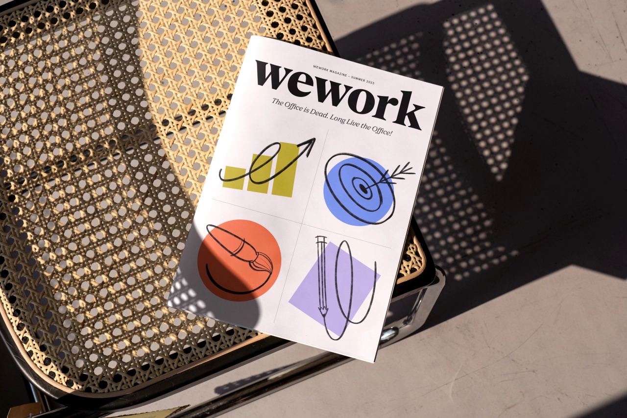
The refreshed brand is organised under the strategic banner of 'Taking care of all the ways you work' to focus on the multiplicity of ways we all work today in a post-pandemic world. A layered system of symbols and hand-drawn illustrations are designed to demonstrate the energy supplied by its members and showcase the facilities offered to WeWork members.
The existing wordmark has also been recrafted to better align with the design-driven nature of the company and its focus on attention to detail. And Franklyn has created a custom typeface titled WeWork Serif in partnership with A+ Type Foundry. This rounds out the system and echoes the charm of the wordmark, allowing people across the organisation to communicate easily with a distinct voice.
"WeWork blurs the line between art and science, emotion and intellect," says Franklyn co-founder Patrick Richardson. "And it was this duality that inspired the company’s new visual identity."
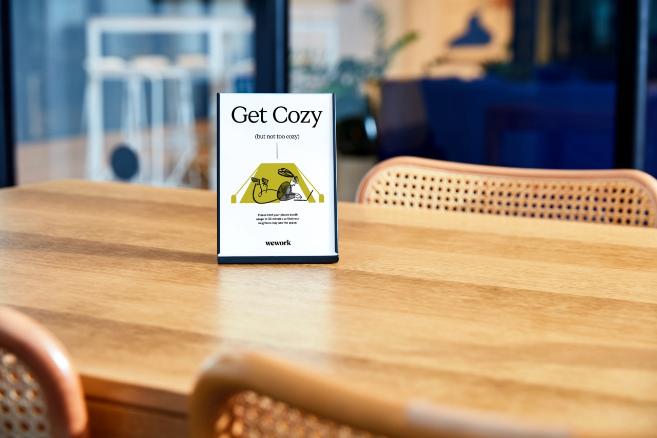
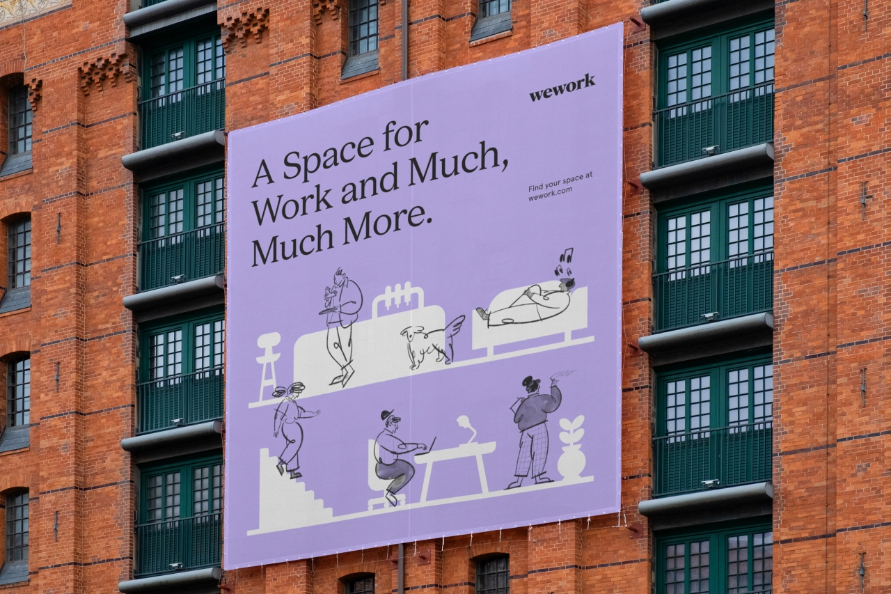
Ultimately, this is not a radical redesign but more of a refresh which offers a sense of calm and reassurance. It's all a world away from the aggressively ambitious rhetoric of WeWork founders, instead conveying a sense of calm, respectable authority, exactly what this brand needs right now.
Editor's Picks





Trending



Latest Jobs
Junior Motion Designer at Project Slingshot
Full-time·Remote·£30,000 – £35,000
Graphic Designer at The National Gallery
Full-time·London·£39,353
Senior Brand Designer at DNCO
Full-time·London·£50,000 – £60,000
Client Director at Koto
Full-time·Berlin·€70,000 – €85,000
Senior Designer, Audio at Penguin Random House UK
Full-time·London·Circa £38,000
Senior Director, Strategy at Interbrand
Full-time·New York·$210,000 – $260,000