Thisaway incorporates shapes of the sport into Padel Social Club’s identity
Padel Social Club's aim is to increase padel's popularity in the UK by championing "originality and authenticity" through its brand identity.
Bath-based branding agency Thisaway has collaborated with startup Padel Social Club on its new identity as it looks to bring the sport of Padel to the UK.
Padel was launched in the 1960s in Mexico and is a cross between tennis and squash, played by four players. It is widely considered the fastest-growing sport in the world – particularly in Spain and Italy – with over 25 million active padel players in over 110 countries, according to the International Federation of Padel.
Despite its accessible and social nature, padel has not yet taken off in the UK as it has with its European racquet-sport counterparts. In a bid to change this, Padel Social Club tasked Thisaway with creating a brand that brings padel to a UK audience.
Early on, the studio noticed that the recent surge of interest in the game brought a number of brands into the market, however, Thisaway creative director Graeme Cook thinks that most of them are "quite functional" and were designed for "mass appeal". With this in mind, the studio sought to create something "more aspirational which has a clear point of view", he reveals.
Thisaway took the view that there are enough people in the know about Padel, so the brand is not focused on educating people about the sport. Instead, it seeks to communicate how Padel Social Club offers the best game experience.
When the project began, the founders already had a name and a vision to create a more premium proposition. The brief challenged Thisaway to ensure the brand was built for an audience that resonated with this offer, which involved "agreeing and deciding on what version of 'premium' would be the right approach", says Cook.
To determine the right approach, the studio had to gain an in-depth understanding of Padel Social Club's target market. This meant developing customer archetypes and examining their associated psychographics.
Thisaway discovered that the target audience was not only "fit, active and socially outgoing" but also "status-motivated", according to Cook. He adds: "They want unique experiences, like to be ahead of the curve, set trends and avoid the mainstream".
From this, the Play Original brand idea was conceived, a notion that taps into the mindset of this specific demographic. Cook describes the idea as one that encompasses both "informed Padel lovers and open-minded fun lovers".
"These are the people who want to do things differently and take pride in originality and authenticity. We wanted to put an idea at the heart of the business that encourages everyone involved to do things a little differently", he explains.
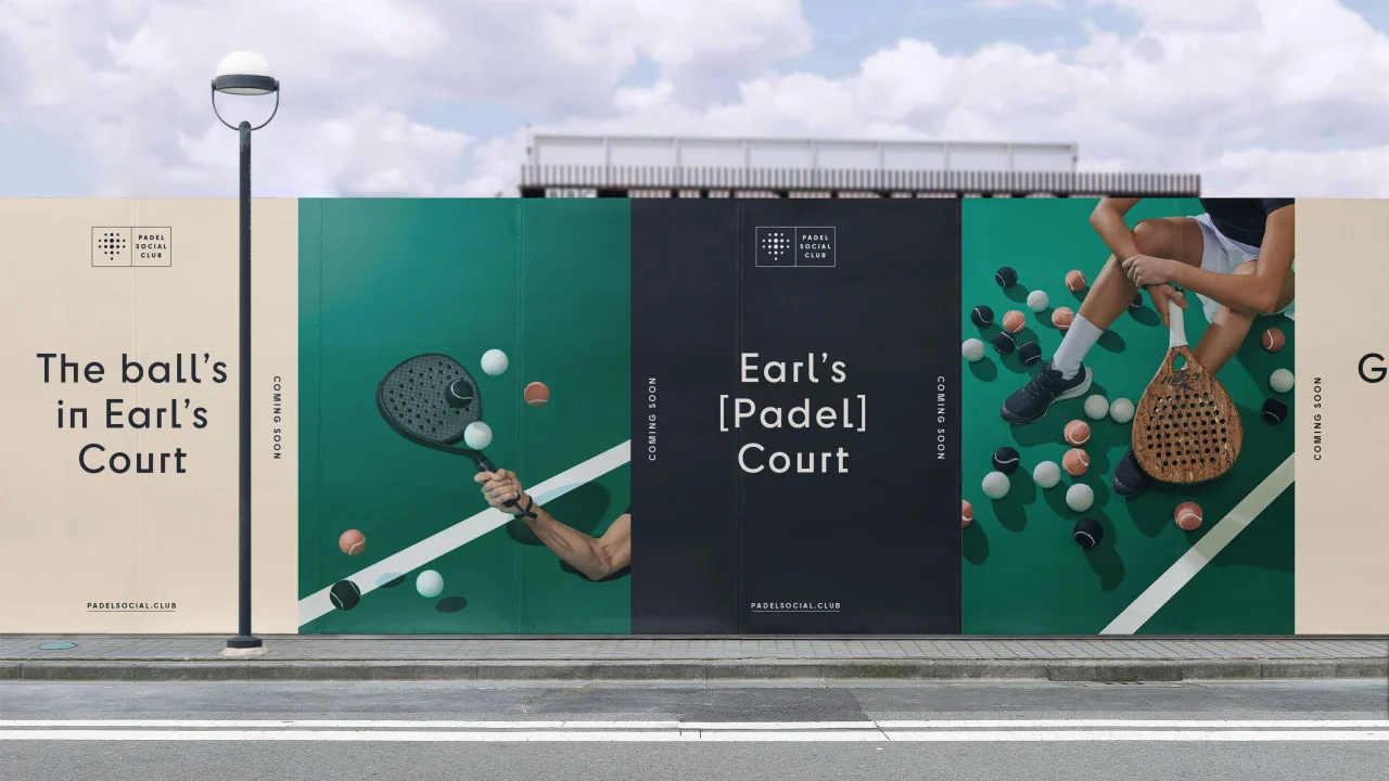
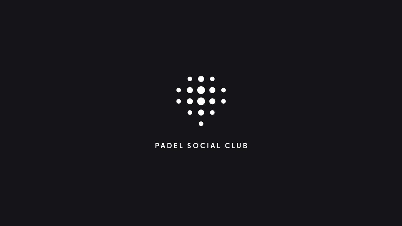
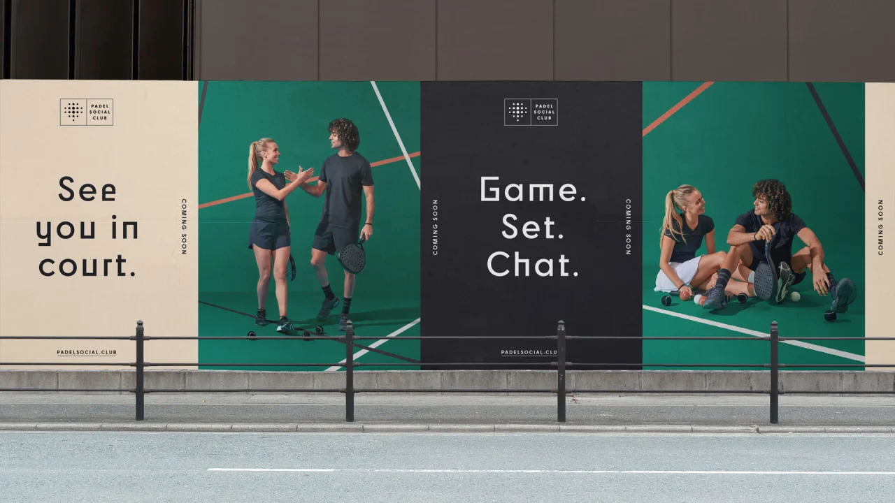
The new logo is derived from a version previously used by the founders. It has evolved and been redrawn to create a dual logo that can be interpreted as a padel racket or a location pin icon. Thisaway balanced the icon and the word mark within a holding device designed to reference the shape of a padel court.
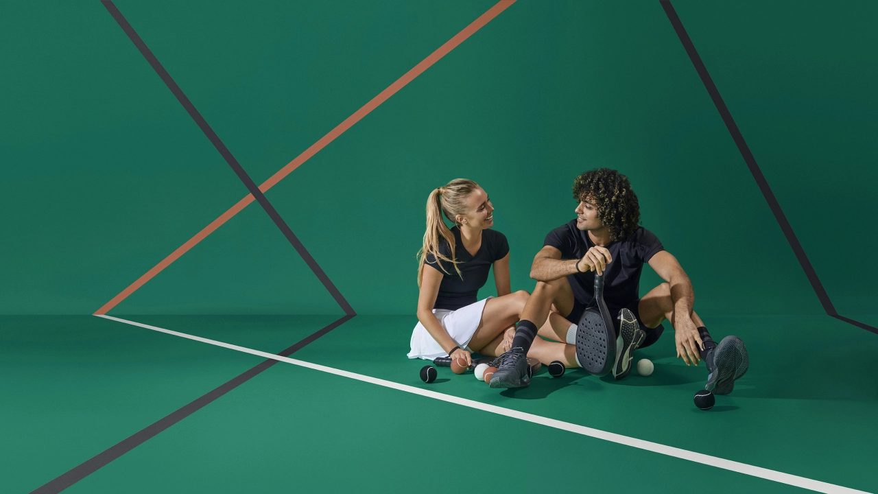
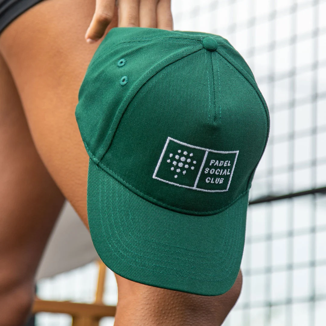
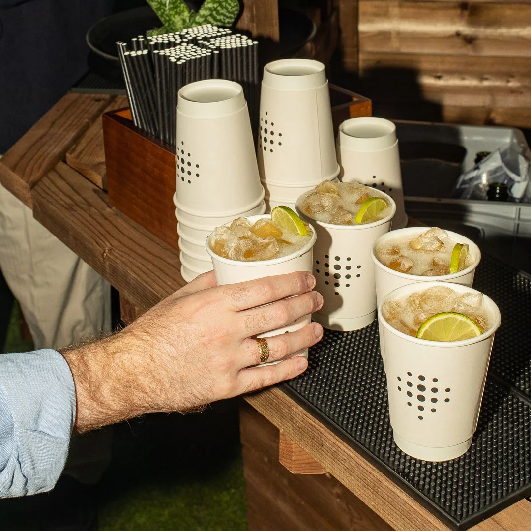
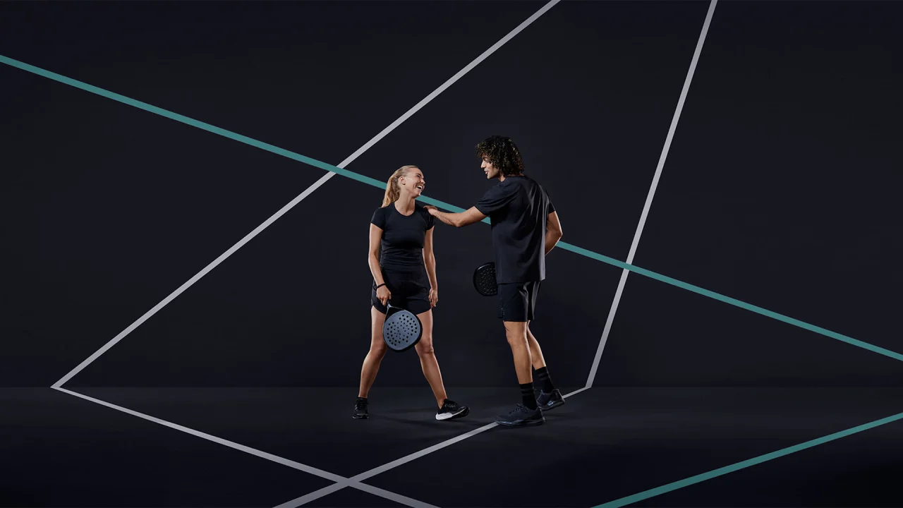
Shapes and forms from the sport come through in the identity in other ways, specifically the lines of the court. The studio incorporated lines as graphics elements across the brand and also utilised them for Padel Social Club's art direction and brand photography.
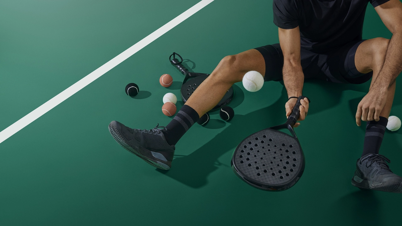
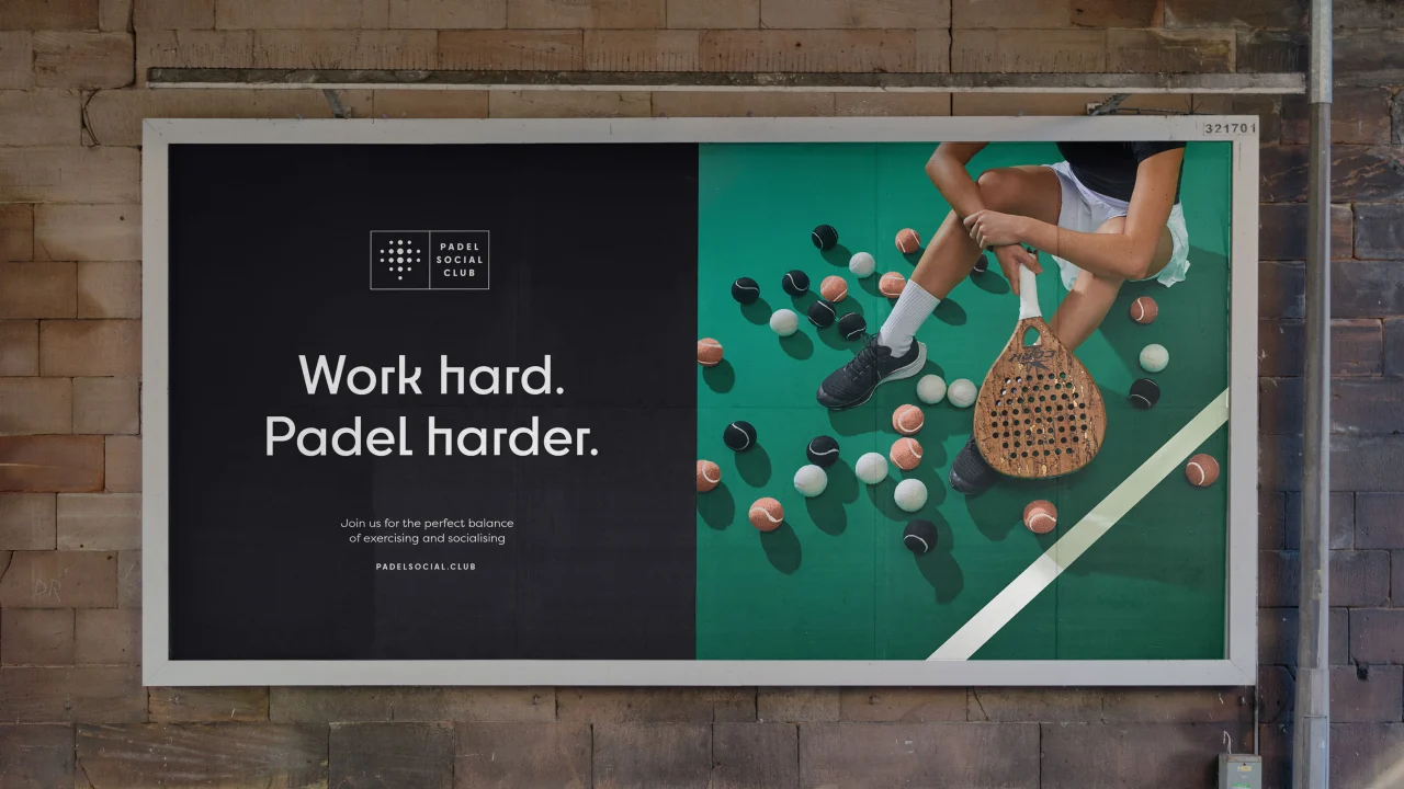
Cook adds that "the circular aspect of the identity was inspired by the holes in a Padel racquet". When looking into the brand's competitors, Thisaway saw endless action shots of people playing and enjoying the game. In an effort to make Padel Social Club stand out, the studio worked with photographer Matt Davis on a suite of unique imagery that walks the line between still life, sport and fashion photography.
"It immediately gives the brand some stand-out and has attitude as well as an aspirational feel", says Cook.
For the headline typeface, Thisaway opted for Cy from Supertype foundry. Its alternate characters, many of which have sharp angles, allude to the markings and lines on the court, again translating the shapes of the game into the visual identity.
The decision to use a combination of sharp and round letterforms feeds into the Play Original brand idea and "not taking the expected approach," Cook explains.
Editor's Picks





Trending




Latest Jobs
Designers / Copywriters / Art Directors / Creatives at Hatched
Full-time·London·£25,000 – £55,000
Design Developer, Opinion at The New York Times
Full-time·New York·$113,946 – $136,000
Project Manager at British Heart Foundation
Full-time·London·£46,000 – £48,500
Senior 2D Motion Designer at Art&Graft
Full-time·London·£50,000 – £65,000
Director, Head of Creative at Twitch
Full-time·San Francisco·$203,000 – $274,600
Lead Digital Designer at Together
Full-time·£55,000 – £75,000