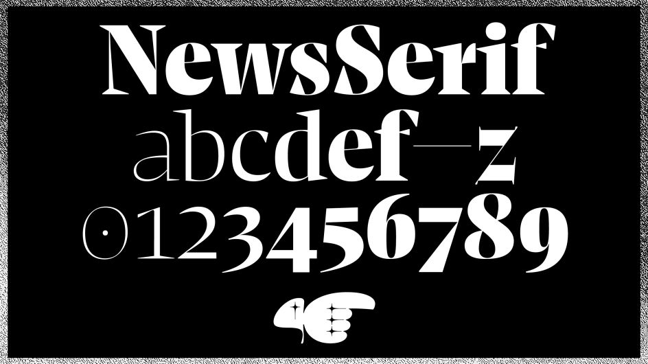
NewsSerif is a new typeface that is classically modest yet full of character
Freshly delivered and ready for all your projects next year is NewsSerif, the sister typeface of NewsSans by Henning Skibbe and his team at the foundry, Character Type. Together they make a wonderful toolbox for all editorial and typographic challenges – analogue or digital.
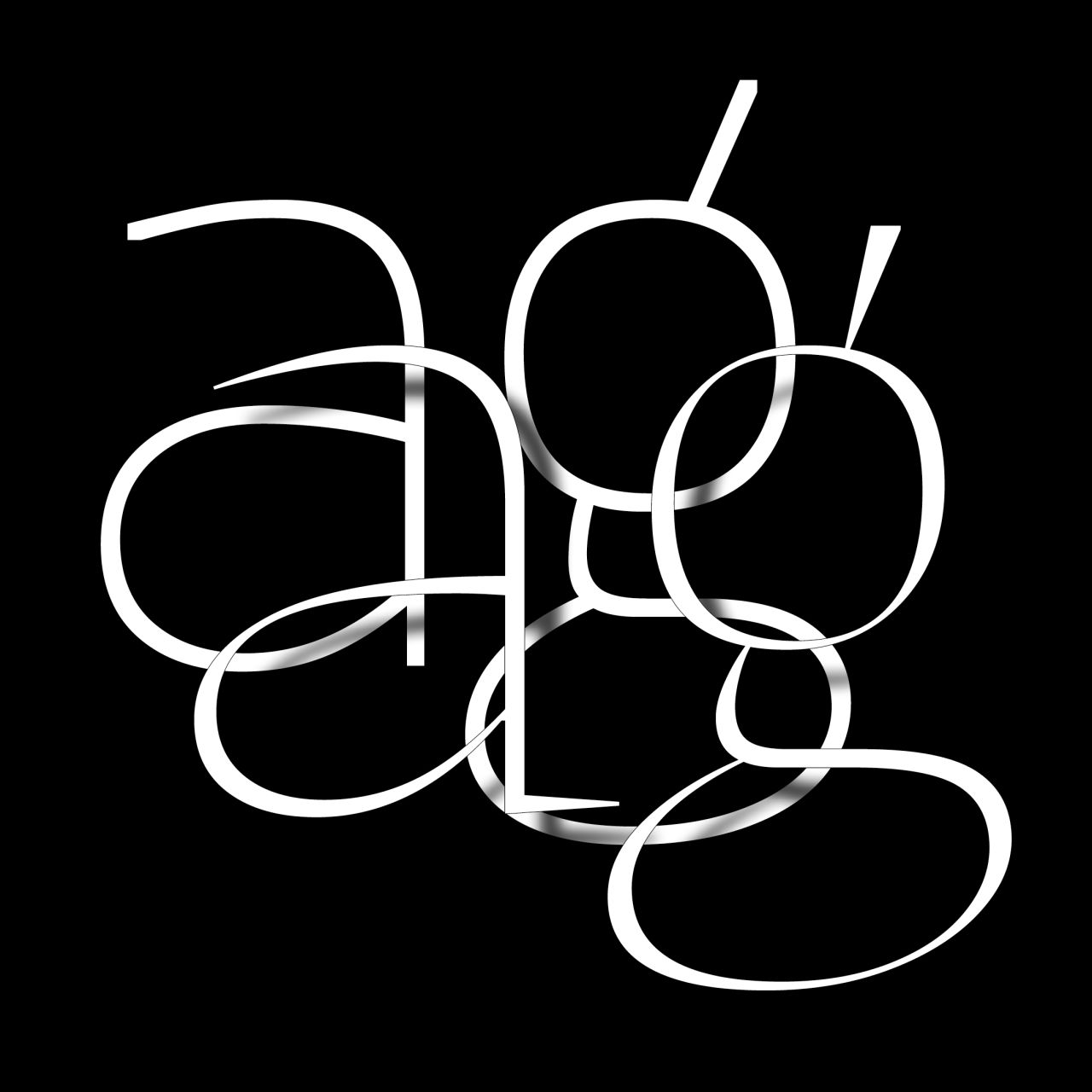
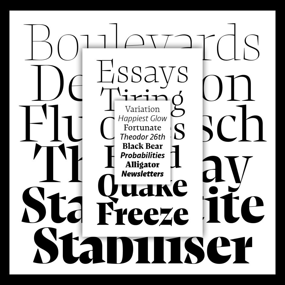
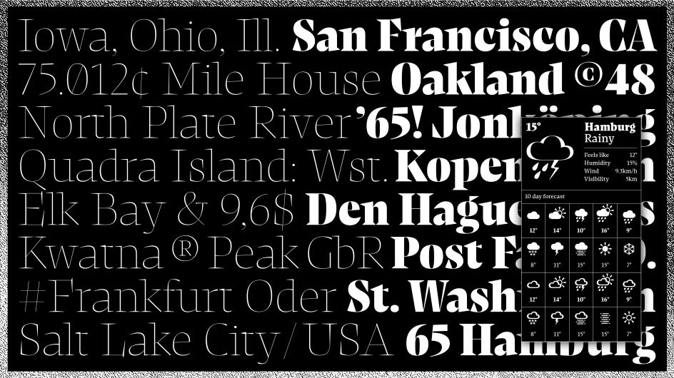
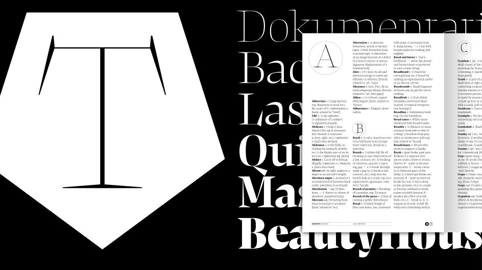
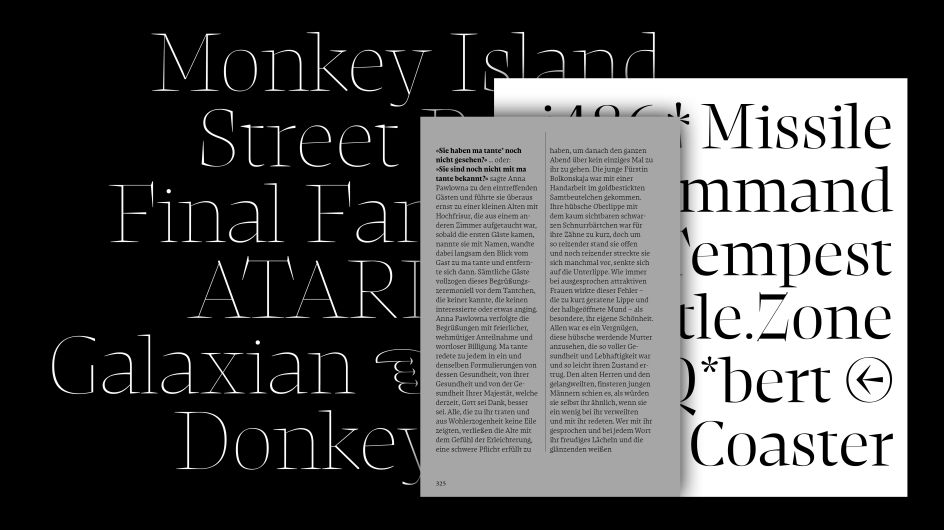
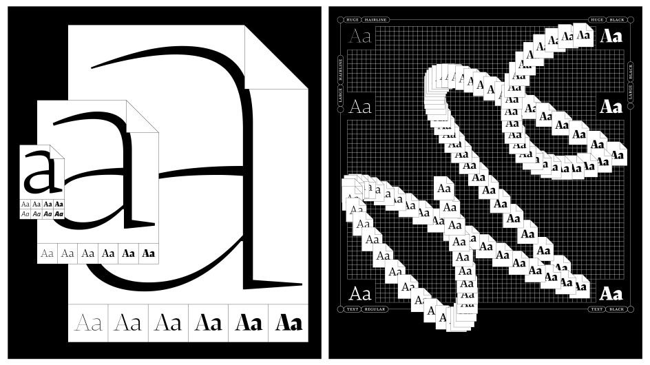
The 20 styles of NewsSerif are divided into three subfamilies named after their suggested use: Text, Large and Huge. "They all correspond in visual style but not as close as one might initially think," says Henning. In fact, the letterforms progress and evolve throughout the styles to become more expressive in the Large and Huge families. Letters such as 'k', 'c' or 'z' organically change their form so much that they become the "style-shaping stars" of the typeface.
But why? "All for the sake of character," adds Henning. Of course, NewsSerif is far from shy. While the NewsSerif Text family is classically modest, the Large and Huge options are much more extroverted. "In the latter styles, the serifs cover lots of ground and become central to the design. They vary largely in length and proportion to get as much space out of every letter as possible," says Henning. Don't know what he means? Just take a look at the 's' of NewsSerif.
This is the third type family published through Character Type and is typical of the excellent retail and custom typefaces it makes for both small and international brands. Character Type was founded in 2018 and is based in Hamburg, Germany.


](https://www.creativeboom.com/upload/articles/90/908fdb6378db1e95d12595416f54e6336d5e80b8_732.jpg)