Female-founded agency JOAN rebrands to reflect key elements of its DNA
The New York/London agency has a new identity that retains familiar visual elements but casts them in a new, forward-thinking light.
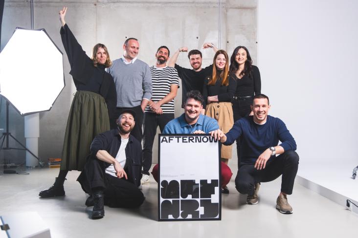
Based in New York and London, creative agency JOAN is mainly known for two things: being female-founded and delivering exceptional work, such as their campaign for body care start-up Luna Daily, which we reported on last November.
More recently, they've been applying their design talents to their own branding. And as a result, they've just released a stirring new visual identity for the studio.
Led by JOAN's internal design lead, Anjela Freyja, who previously worked at Pentagram and Base Design, the new branding is rooted in the visual codes of the studio's DNA, which she describes as "daring, soulful, expertly crafted, relevant, visionary; all of the traits needed to not just be legendary, but actually transcend agencies".
Two worlds
To appeal to big business and culture creators, JOAN endeavours to bridge the gap between these two worlds within its own visual brand. Therefore, its ethos is to be polished enough to be trusted by big business but creative and forward-thinking enough to resonate with the cultural space.
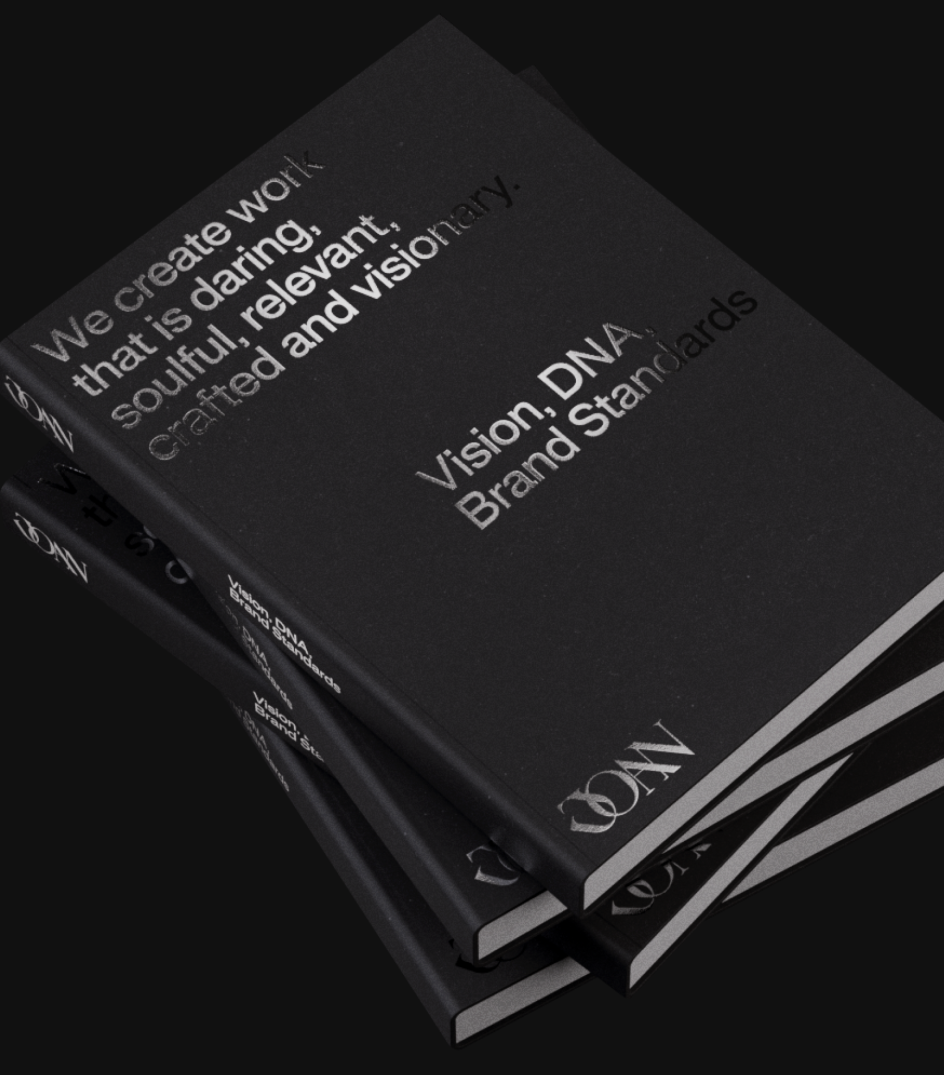
As detailed below, every design element reflective of JOAN's visual DNA codes is complemented by the sleek materiality of metal. All of these elements combined create a brand reflecting JOAN's bold personality, as outlined below:
- Soulful: Two typographies that are warm, accessible and friendly
- Daring: An edgy, bold, highly-saturated colour palette
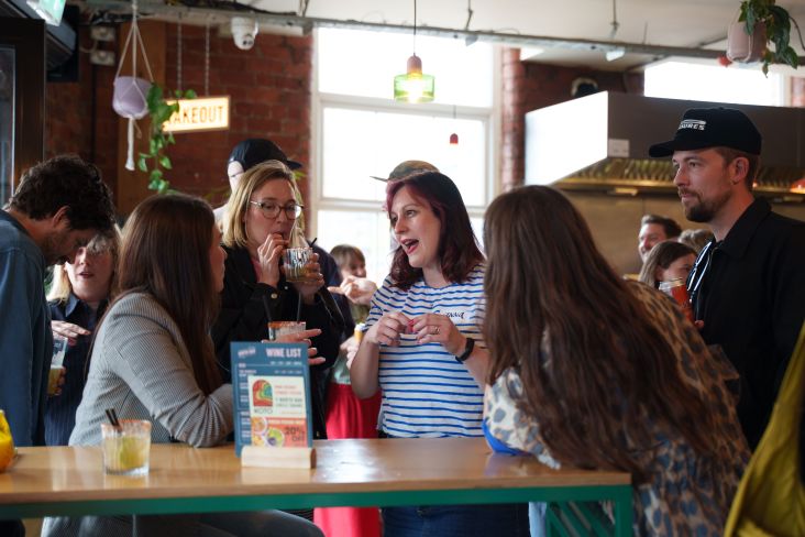
- Crafted: JOAN's ability to expertly craft is communicated through a technical gridded design system that prioritises attention to detail and technique, as well as a candid office and project photography style that captures the agency's communicating
- Relevant: Highlighting JOAN's cultural relevance via contemporary digital design, animation, and 3D techniques that flex the team's savvy and knowledge of modern tools
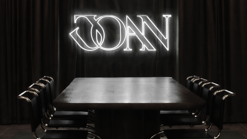
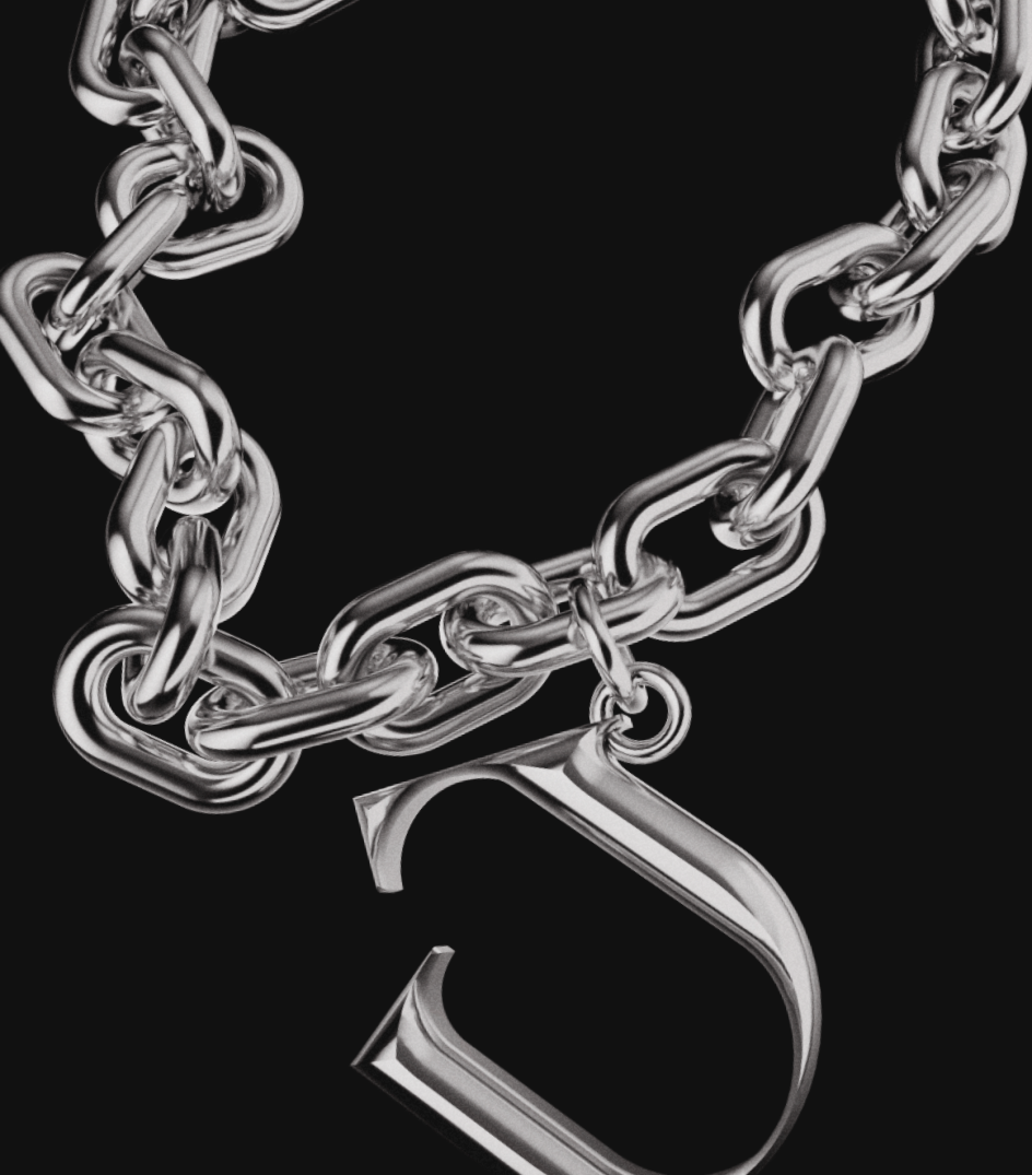
- Visionary: The sharp logo is inspired by the iconic JOAN sword, paying homage to Joan of Arc and the origin behind the agency's name
Graphic elements
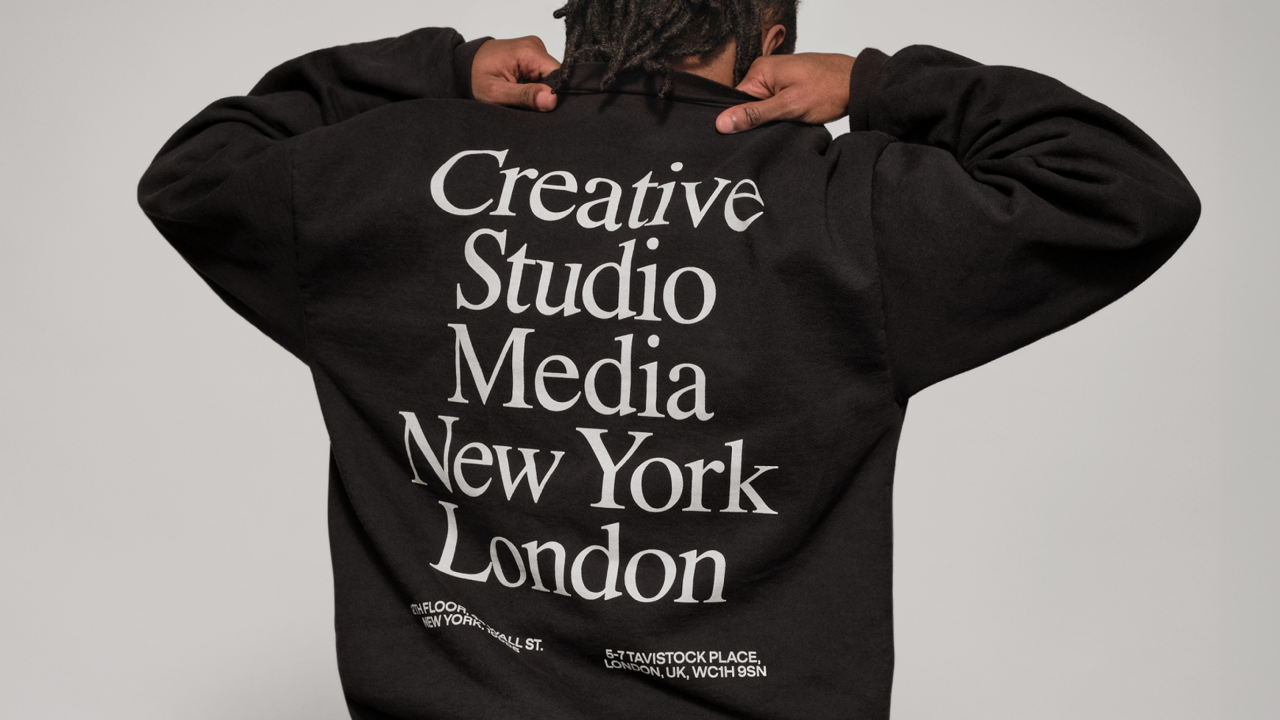
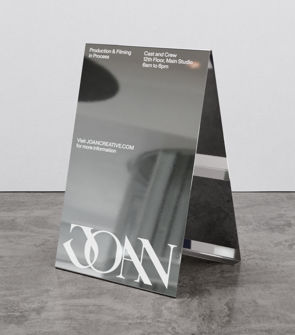
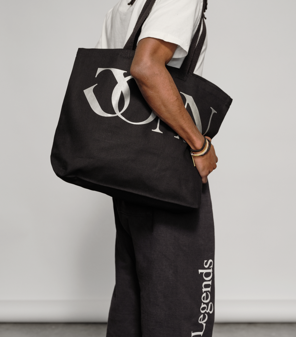
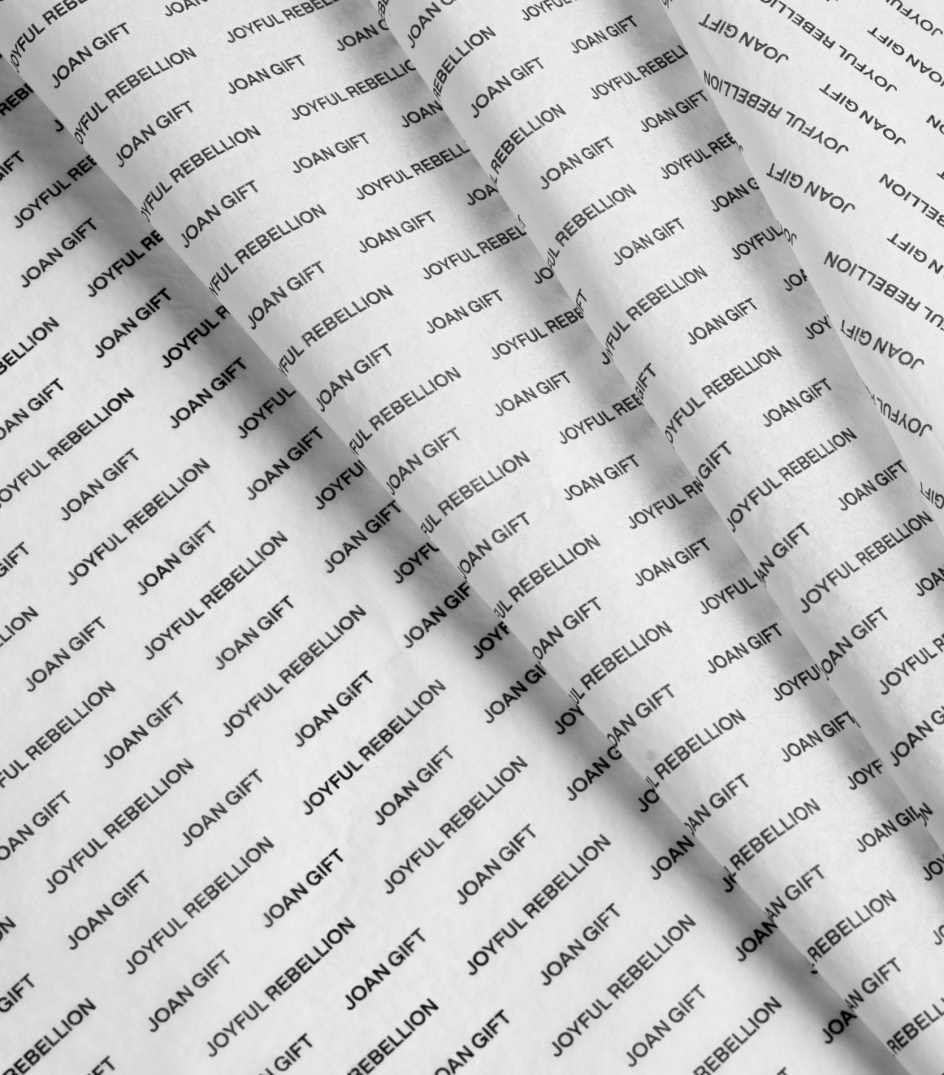
The new design system includes a new logo, a refreshed website and social channels, new signatures, new office signage, a new letterhead and one-of-a-kind merchandise for staff. Including sweaters, jogging pants, and bags, this bespoke merchandise is a brand collaboration with the hip bar brand Ray's NYC.
Important elements of the previous identity, including the sword signifying Joan of Arc, have been retained but visually brought up to date. Most notably, the new wordmark has been transformed from white and 3D to silver and 2D, with an interlocking J and O.
Framing the future
The first major project from its internal design team, the new identity will serve as an architectural frame from which JOAN, whose clients include eBay Motors, European Wax Center, and ZenBusiness, can continue its global expansion.
"It is rare to come across a creative agency founded by women," Anjela says. "Despite the progress of our generation, the men still run the show in creative circles. It's even rarer to come across an agency founded by women who have enough experience, passion, and leadership not just to survive in this market but to thrive.
"To grow a creative firm that houses advertising, design, production, and media, and to do it all with compassion and a commitment to inclusion and diversity. It's not something you see every day."
Editor's Picks


Trending


Podcasts


Editor's Picks
Further Reading