JKR creates new brand system for expanded Uber
Evolution, not revolution, as a 'go anywhere, get anything' model gears up for the next stage of growth.
When is a rebrand, not a rebrand? When it doesn't discard a brand name and over a decade of global recognition?
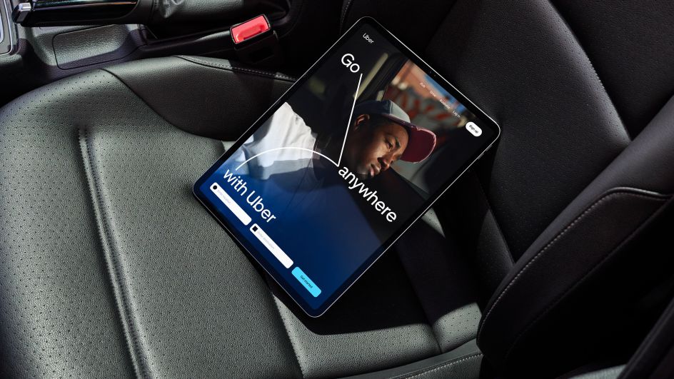
Uber didn't need a new name or logo – Wolff Olins re-designed the company's logo in 2018 – but the business continues to evolve, adding food delivery, freight transport and AI research to its core business of 'ride requests'.
Global branding agency Jones Knowle Ritchie knew that its brief wasn't to come in and start fresh, the simple black and white logo continues to stand out, but rather it was to help Uber elevate its brand to match its growth goals, bringing together its various products and services under a unified strategic approach, reflecting an expanding range, including grocery, pharmacy, and convenience delivery options.
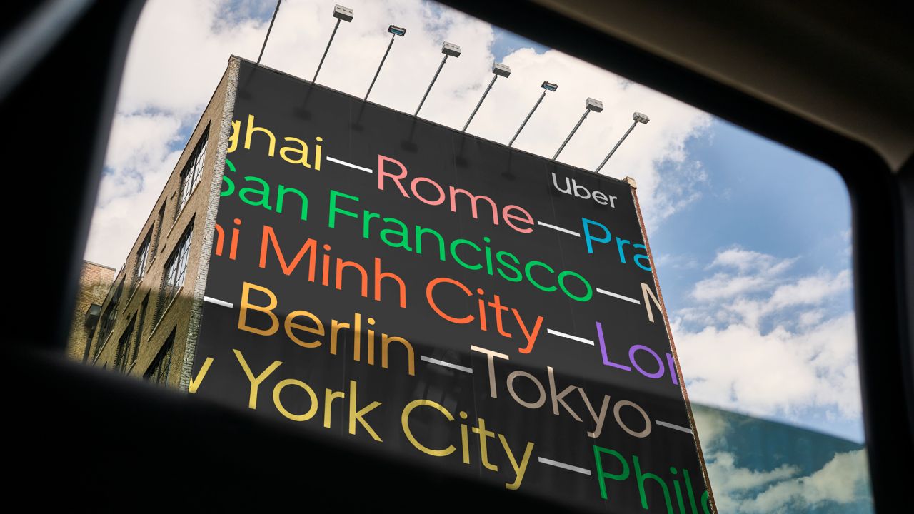
In essence, JKR needed to enhance the brand system to support Uber's transition to a full mobility brand (go anywhere, get anything) with an adaptable brand architecture system.
JKR's chief creative officer Tosh Hall explains: "Sometimes you don't have to change the logo – and that's fine. Uber was a perfect example of this. The rebrand back in 2018 was exactly what the business needed at that moment. Our job was to evolve it to reflect the business Uber is today, building a brand architecture that would echo its position as a full-scale mobility brand.
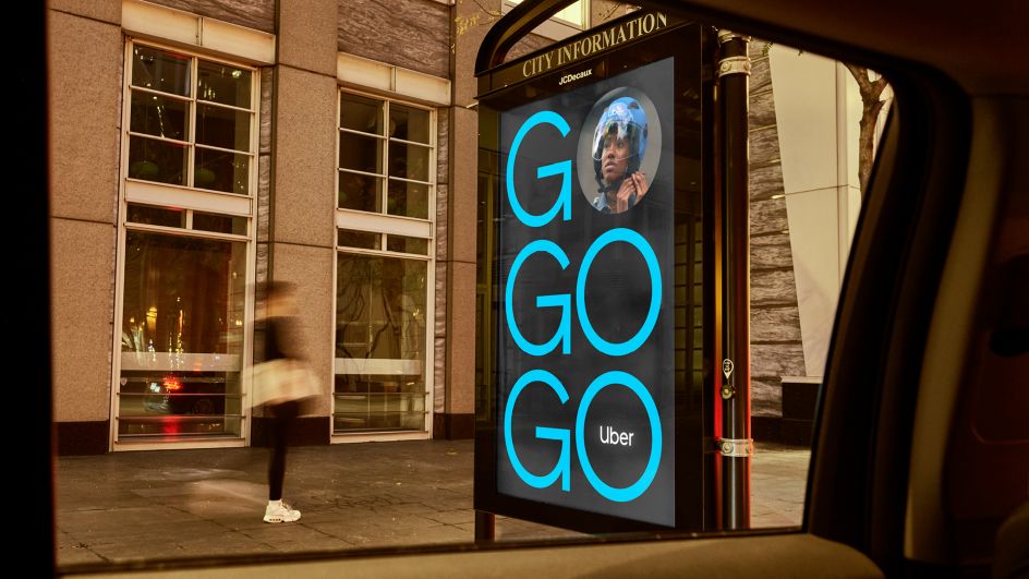
"To do that, we had to find what was distinctive to them. So, we looked at the journey map and found the original graphic language: the circle, the line and the square. Then we brought it to life, designing a flexible system that could grow and change with their own expansion."
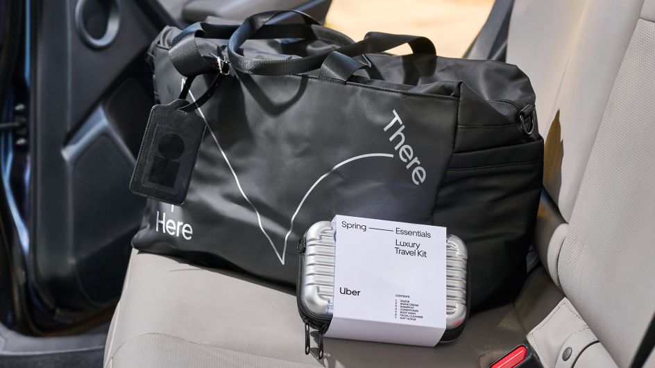
JKR set out to design a brand language that inspires people to reimagine Uber's potential to enhance their lives, doubling down on what makes Uber unique and giving the brand the tools to tell engaging stories about what happens on the journey between point A and point B.
Brands that continue to expand on their core business need design elements that can flex and adapt along with rapid growth; JKR has both expanded on the brand's existing distinctive assets and created new ones.
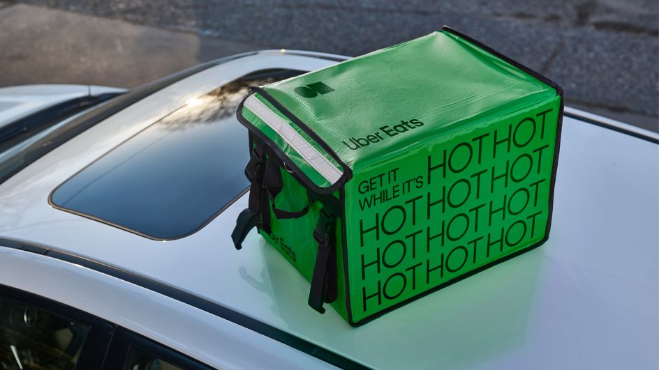
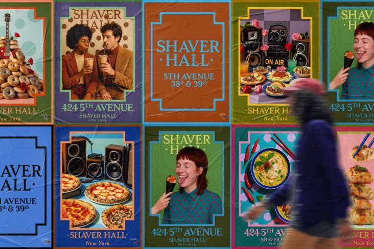
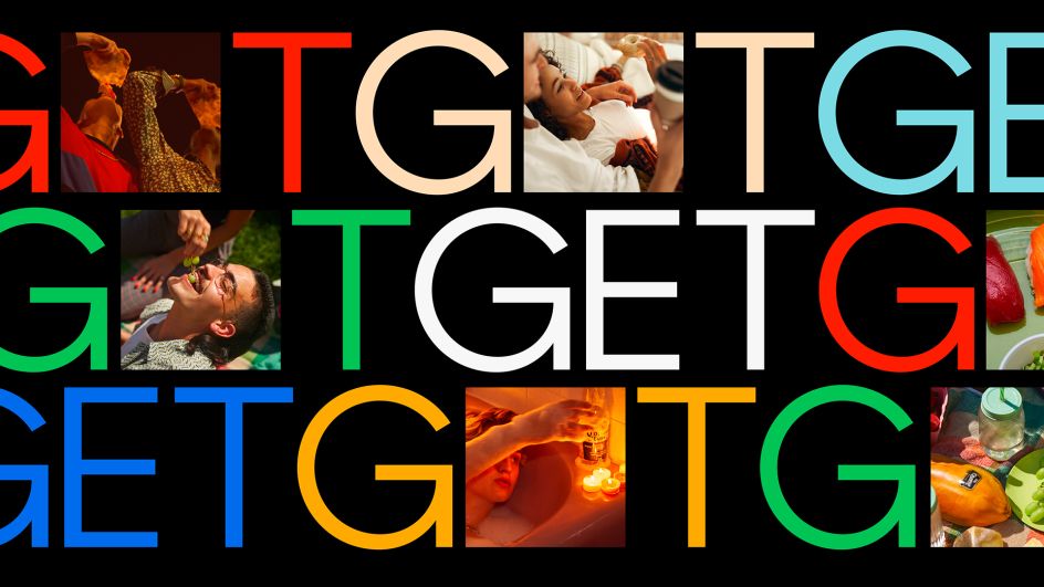
The new strategy ensures consistency and recognition, allowing audiences to easily identify and engage with Uber's various services. While Uber's mobility offerings maintained their recognisable black-and-white aesthetic, other sectors of the business – such as Uber Eats – now incorporate colour to unlock creative expression. JKR believes this approach reflects Uber's commitment to innovation and adapting to diverse market segments while maintaining a premium experience for its expanding audiences.
Tosh Hall adds: "By defining what makes the brand distinct and delivering a system and toolkit to reflect that, we're enabling any agency, whether in PR, digital, or advertising, to pick up where we left off.
"That's because we're in the business of creating brands that can be present across the entire consumer experience – allowing companies to interpret, evolve, and grow in real-time; whether it's hailing a ride, ordering food, or receiving a delivery, the refreshed brand architecture system allows users to easily identify and engage with Uber's various services and empowers them to go anywhere and get anything."