How&How Studio rebrand of Pachama helps shake up the carbon capture industry
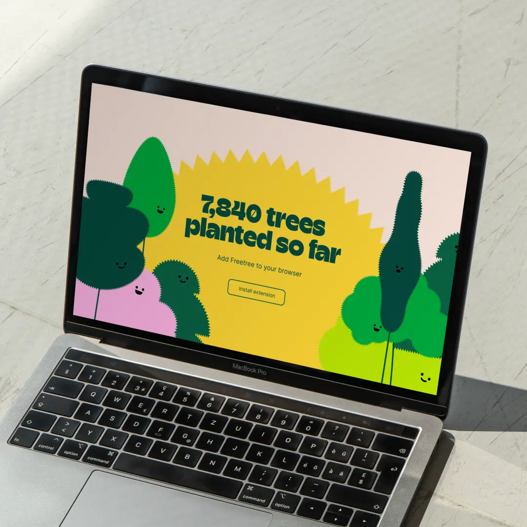
Pachama is a company at the forefront of removing carbon and restoring nature to our world. How&How Studio helped them develop eye-catching new branding, including some fabulous rainbow trees.

Carbon offsetting has had a bad rep in recent years. Many environmental groups view the practice with scepticism, arguing that it allows polluters to "greenwash" their image without addressing the root causes of their emissions.
It's not so much that the principle itself is bad. It's more that because of the lack of regulation and third-party verification, activists fear multinational companies see the practice more as good PR than a force for real-life environmental improvements.
Due to this impasse, discussions over corporate carbon solutions have started to stagnate. Pachama, however, offers a new way forward.
The brief
The Californian company uses the power of satellite images and LiDAR technology to generate accurate readings on real-time carbon removal. That way, companies, investors and consumers can rest assured that they're investing in high-quality, nature-based carbon projects.
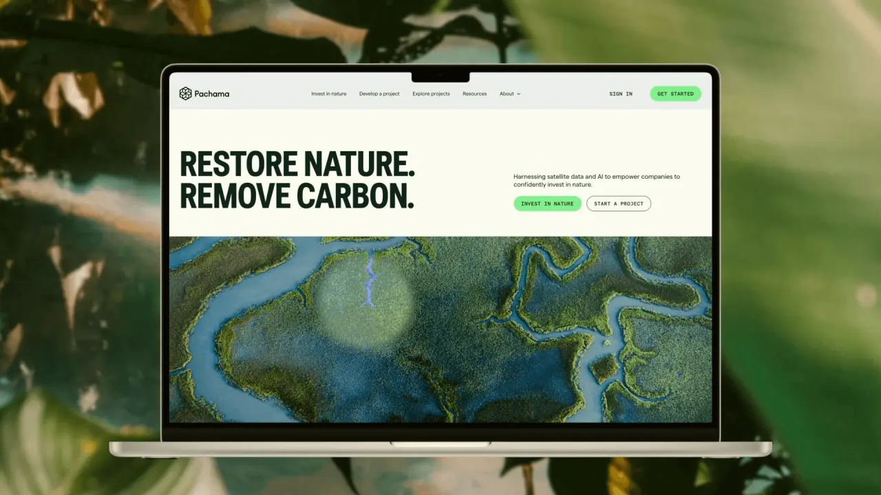

In simple terms, Pachama works with ethical and effective carbon removal projects to accurately report where carbon credits are being used and what is being done to enhance sequestration efforts. By reopening the dialogue around offsetting, Pachama wants to shake up the industry and build a new relationship between business and nature.
To do this successfully, Pachama needed a new brand, marketing collateral, launch video and website. So they turned toHow&How Studio, a brand and design agency based in London and Los Angeles.
New graphic language
The studio took on FNDR's inspiring brand strategy and ran with the idea of 'seeing carbon in action'. Through a new graphic language to be used across Pachama's website and UX, their mission was twofold: to make the invisible process of carbon sequestration visible and to amplify and celebrate the beauty of the natural world.
This involved creating a visual language that heroes colours and textures. The palette is derived from LiDAR tech scans, where colour is used to indicate the height of a tree.
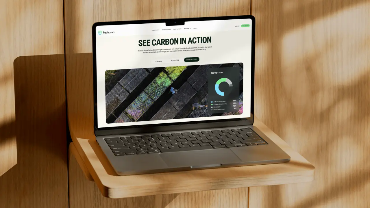
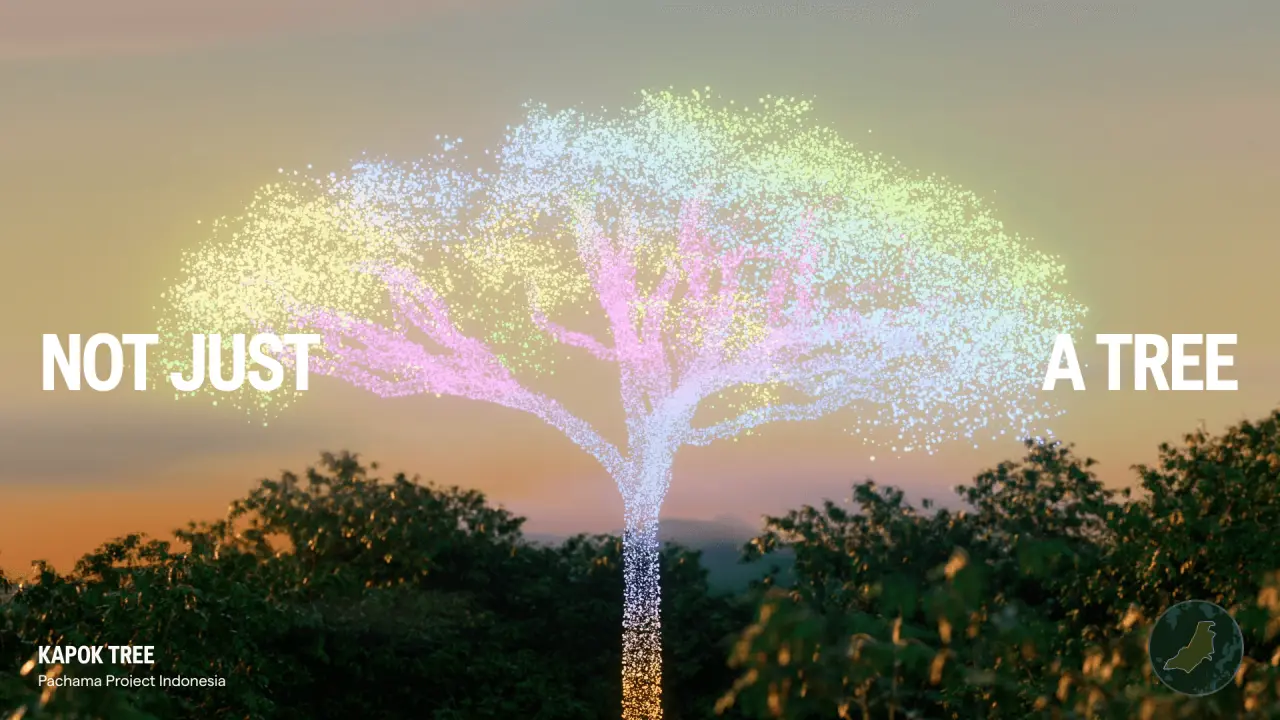
They spun these LiDAR colours into a rainbow palette, referencing the natural iridescence found in beetles, birds, shells and leaves. This showcases the symbiosis between natural wonders and Pachama's impressive technology.
Practical applications
How&How used this palette for different practical treatments such as a marquee device used to map reforested areas; pointillist tree graphics to visualise carbon sequestration; and textural landscape maps to represent Pachama's scanning technology.
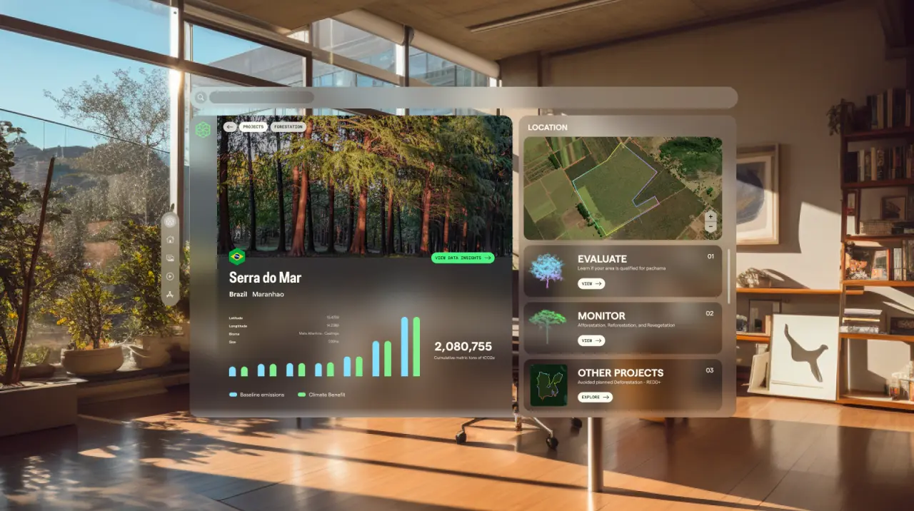
They paired these devices with punchy typography, glass layers, and circular language reiterated throughout the brand to represent transparency, layered information, and zooming in and out of landscapes and details.
These elements work hard across digital, where our emphasis on clarity creates a UI that feels light and breathable, like clean air.


"Working with H&H on our brand refresh was an absolute delight," says Diego Saez-Gil, co-founder & CEO at Pachama. "They took the time to deeply understand our vision and philosophy and then brought it to life with magical beauty."
"H&H worked really hard on every aspect of our visual identity, ensuring that every detail would be exquisite," he adds. "Their refined taste, cultural insight and work ethic make them a very special partner to work with if you aspire to build a generational brand."
Editor's Picks





Trending




Latest Jobs
Senior Account Manager at Consider
Full-time·London·£42,500
Designer, Marketing (Games) at The New York Times
Full-time·New York·$85,000 – $100,000
Marketing Officer at Manchester Metropolitan University
Full-time·Manchester·£35,608 – £39,906
Senior Designer, Children's at Penguin Random House UK
Full-time·London·£37,650 – £40,000
Associate Creative Director, Events at The New York Times
Full-time·New York·$148,000 – $170,000
Brand Strategist at DNCO
Full-time·London·£45,000 – £60,000