Rick Banks on unexpected routes to success, Football Type 2, and what must change in design
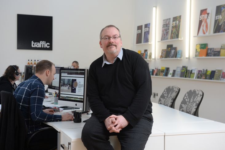
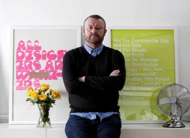
Describing himself as a graphic designer, typographer, publisher, and "proud Northerner", Rick Banks is one of the co-founders of Face37, a design studio that he runs with his wife Annabel in Manchester.
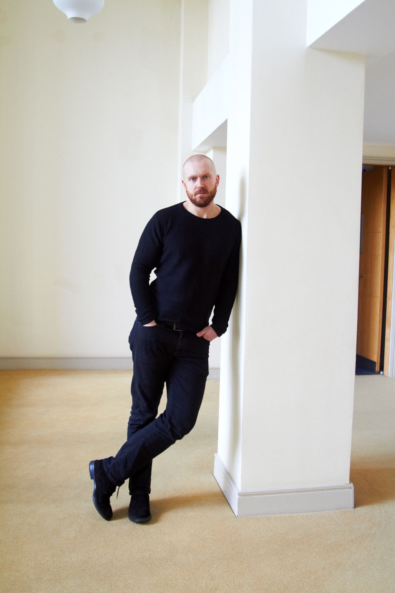
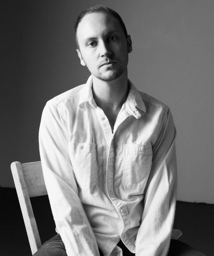
Photography by Patricia Karallis
Alongside winning a ton of awards, and having his work published internationally and exhibited in the London Design Museum and Ginza Graphic Gallery in Tokyo, Rick has helped to create some of the world's best-loved brands – EE, Triumph Motorcycles, and British Heart Foundation.
Specialising in brand, book and type design, he also runs his own foundry, F37, releasing fonts such as Bella and Ginger, which have been licensed by the likes of Selfridges, Moonpig and PepsiCo.
In 2013, he published Football Type, an acclaimed book that celebrates football and typography. Its much-anticipated sequel Football Type 2 has just been released. We caught up with Rick to find out more about his career so far.
How did you get into graphic design?
From a very early age, I was always into it. I remember collecting 'logo tags' from fashion labels at primary school, recreating football shirt lettering in my school books or studying grids on the back of music albums. Looking back, I was always more attracted to the visual and creative side of the world.
I didn't know all this was graphic design at the time, but I soaked it up anyway. I went to quite an academic school, and if you didn't want to be a doctor or a lawyer, the careers advice was dogshit. Luckily when I was 16, I went for work experience with my cousin, who was a graphic designer and that put me on the right path.
So after that work experience, what next?
I fucked up my A-levels in a big way. I just couldn't get motivated by learning about different types of soils in geography. I was supposed to go to Leeds University and study graphic design, instead – due to my laziness and poor grades – I ended up taking my unconditional in Carlisle at Cumbria Institute of the Arts.
That first year was probably the darkest time in my life, but it was also the making of me. I remember thinking I needed to work harder than everyone else to be successful. I hardly went out in my final years; I was sat at my desk for 10 hours straight.
It goes back to that Arnie quote: "While you're out there partying, horsing around, someone out there at the same time is working hard. Someone is getting smarter, and someone is winning. Just remember that".
Pure hard work goes a long way. Luckily the course at Cumbria was great, and the other students were super talented, which massively helped.
After uni, I went to D&AD New Blood and won Best New Blood and landed a job at SEA Design without the need for a work placement. I spent three years there as a junior, learning the trade, and I often look back with fond memories. Matt Judge was a senior designer at SEA at the time. He took me under his wing and spent time nurturing me – that was so important for my career path. He's now a really good friend.
Before going solo, I worked under the hugely talented Paul Belford at This is Real Art for two years. Again, that was a fantastic experience, as I could apply the skill and craft from SEA with ideas that Paul demanded.
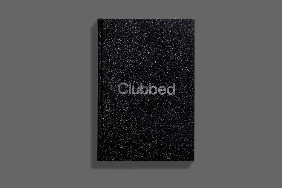
Clubbed
F37 Bella
It sounds like you learnt quickly that hard work pays off. Do you still have that in mind today?
As I said before, I was incredibly lazy at school as I didn't find anything that interested me apart from the arty subjects — and even then, I didn't like to paint. With design, I found something that I love. I'm always "working" away in my head, and I wouldn't change it for the world. At times I find it hard to switch off, but thankfully my wife, who I work with, is also a graphic designer, so she understands our "world".
On reflection, that work ethic was drilled into me by my parents. My mum brought up four kids on her own while my dad worked long hours, supporting and paying for us all. I remember my dad telling me that he liked to work one hour earlier and one hour later than everyone else: it adds up to another workday at the end of the week.
Ultimately, I think the harder you work, the more luck you create for yourself. Thankfully, I don't see design as work.
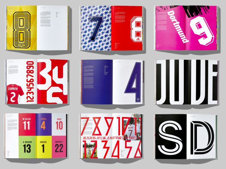
You've just released Football Type 2 – can you talk us through the decision to create a sequel?
I was initially against a sequel. I always think I should be coming up with new ideas, not re-hashing old ones. Plus there was that "dreaded sequel" mentality too. However, the more years that went on and the more emails I was getting about the original book, I thought it was a good idea to reprint the original content and update it with lots of lovely new additions.
Getting all the permissions from the brands and clubs is always a highlight. But I loved carrying out the research alongside Denis Hurley, the writer. It was a fantastic collaboration. Denis runs the blogs squadnumbers.com and museumofjerseys.com, so all his incredible knowledge flows throughout the book. He was perfect for the project.
Football Type 2
Football Type 2
Do you have any highlights?
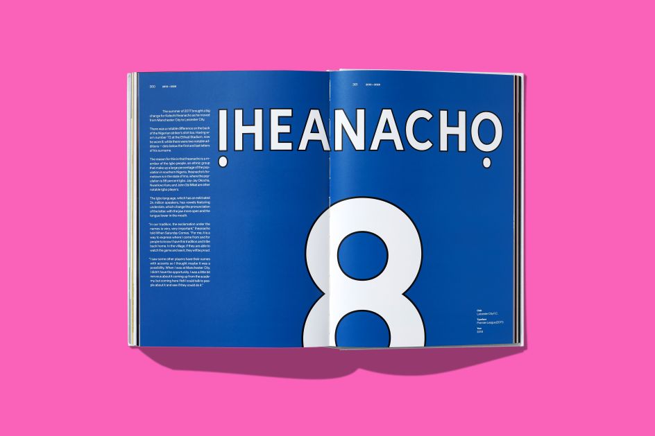
The dots under Kelechi Iheancho's surname is super interesting. Having worn number 72 at the Etihad Stadium, now he wears 8, while there were two notable additions: dots below the first and last letters of his surname. The reason for this is that Iheanacho is a member of the Igbo people, an ethnic group that make up a large percentage of the population in southern Nigeria. Iheanacho's hometown is in the state of Imo, where the population is 98 per cent Igbo. The Igbo language, which has an estimated 24 million speakers, has vowels featuring underdots, which change the pronunciation of the letter, with the jaw more open and the tongue lower in the mouth.
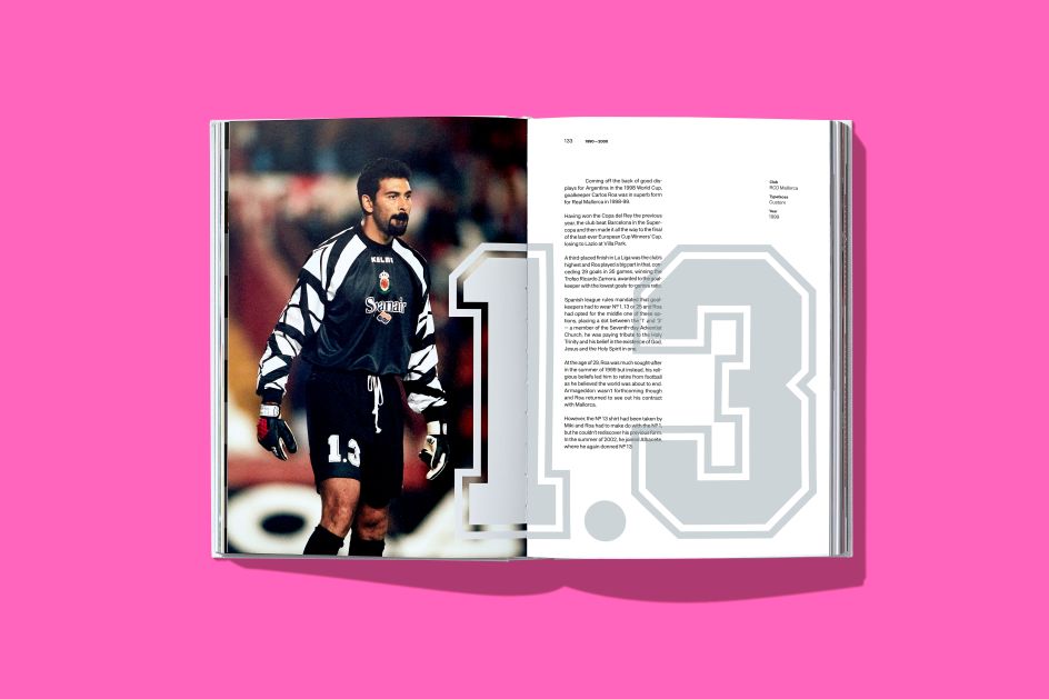
In terms of actual squad numbers stories, goalkeeper Carlos Roa's 1.3 is a great story. Spanish league rules dictate that goalkeepers had to wear № 1, 13 or 25, and Roa had opted for the middle one of these options, placing a dot between the '1' and '3'. A member of the Seventh-day Adventist Church, he was paying tribute to the Holy Trinity and his belief in the existence of God, Jesus and the Holy Spirit in one.
The bold and graphic lettering designed by Mart Anderson for the Estonian FA is superb. Based on the Estonian tradition of stone-carving, the angular shapes look simple. Still, they are based on a strict system of rake angles – each adjacent letter fits together in a mosaic-like fashion to form a complete pattern.
Elsewhere, Manchester United qualified for the 1982-83 UEFA Cup, and they were forced to modify the numbers for European competition. As well as having to remove the Adidas wordmark from under the Trefoil on the front of the shirts, United wasn't permitted to brandish the logo on their numbers. The quick fix was to cover it with masking tape!
Foot Locker
F37 Greeting Cards
That's incredible. Thanks for sharing. You mentioned you run a studio with your wife. Do you deliberately keep the business small?
Yes. I don't think I could deal with the stress of employing lots of people. We have both worked in small boutique agencies and seen the pressure it puts on the bosses. We didn't want that. I like to keep things flexible, so we work with a super talented group of freelancers, and we are always on the lookout for people who can make us better. They tend to all work for us remotely too – luckily technology makes this a breeze nowadays.
When we were junior designers, we were inspired by Universal Everything's business model and approach to remote working. Working remotely back then was unique, so this vision was really forward-thinking. We are copying Matt Pyke (Universal Everything) and building a studio at the bottom of our garden/garage next month!
After Covid-19 is over, it will be interesting to see if businesses downsize their offices and offer semi-remote working to their workers.
It would be nice to see that happen. Do you think freelancers and small studios will be busier than before after this is over?
It will be interesting to see how Covid impacts design in the short to medium term. Marketing budgets may get slashed, and savvy finance directors may look to cut costs from large centralised buildings. On the plus side, it may lead to growth at least in market share for the nimble smaller companies and individual designers and an increased cultural acceptance of remote working.
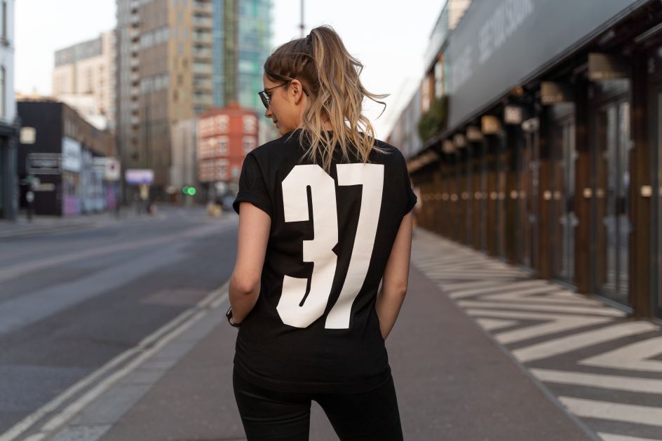
F37 T-shirt

MLS
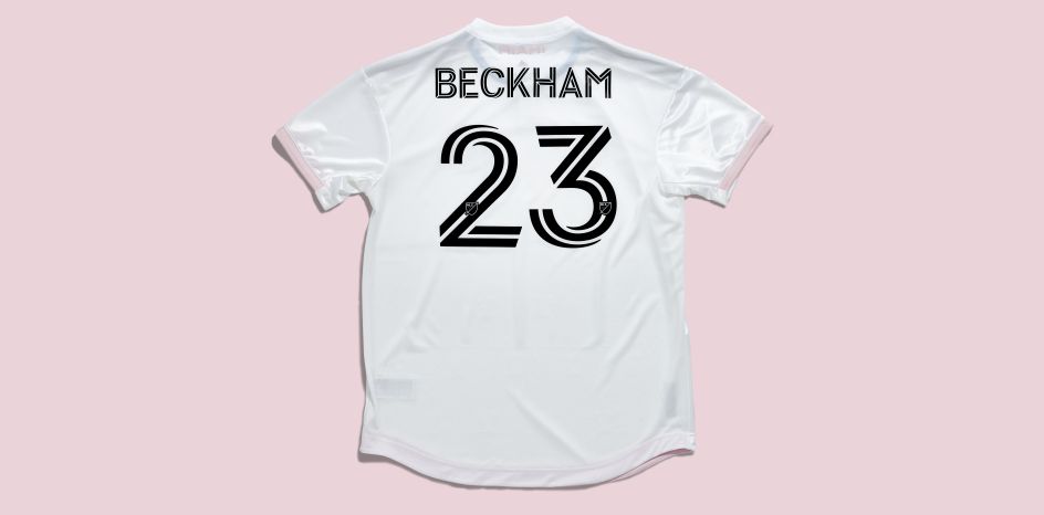
MLS
How are you finding the lockdown? Has it affected you much in that case?
It's been a massive struggle. Annabel has been on maternity leave as our son was born in January. Juggling a newborn with a toddler and trying to work at the same time has been very difficult for both of us. In terms of work, we have had a few jobs put on hold, but thankfully we have been able to work through lockdown on a major project.
What else would you like to see change in the creative industries?
I'd like to see more women, in particular working mums, in the industry. We have been banging on about this for years, but at the very top, it still seems like a white boys' club.
I'd also like our industry not to be so London centric and be a bit more like Germany where wealth and opportunities are spread throughout the country. There is a lot of great talent in Manchester, but I feel the majority of great briefs from huge brands still stem from London.
Editor's Picks


Trending


Podcasts


Editor's Picks
Further Reading
](https://www.creativeboom.com/upload/articles/e3/e378f0441c6873a921dc03121f709ba075c15c38_732.jpg)