Design Army shakes up the real estate market with arty advertising for Gallery 64
Design Army's chief creative officer and co-founder, Pum Lefebure, explains how they created an attention-grabbing advertising campaign that targets art-loving apartment hunters.
When it comes to finding somewhere to live, there's always a lot to consider. But while most real estate campaigns focus on price, location, and the number of bedrooms, Design Army has decided to focus on artistic appeal for a new DC apartment building called Gallery 64.
That's because the Washington-based complex occupies a unique position next to The Rubell Museum, an establishment famed for its progressive art exhibitions and contemporary collection.
"The property is also surrounded by 15 other brand-new developments with similar amenities, features and fees – all targeting the same demographics," Pum tells Creative Boom. "Design Army was tapped to bring their wild creativity to help Gallery 64 stand out in DC's hyper-booming real estate market."

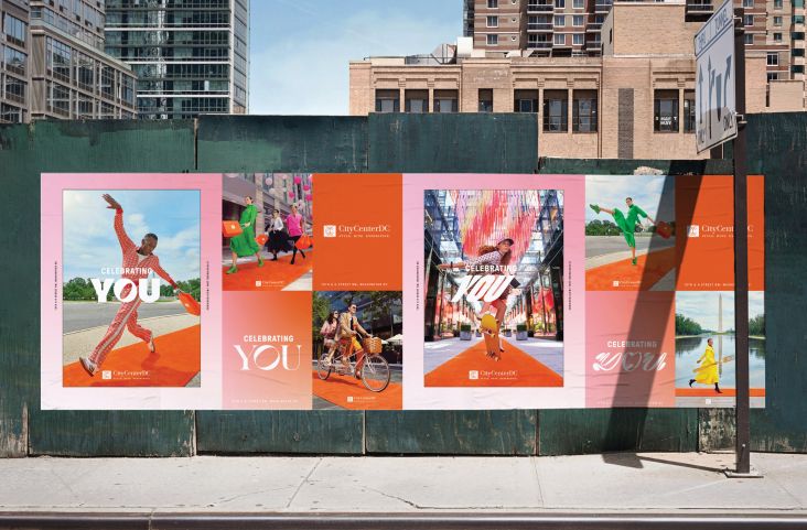
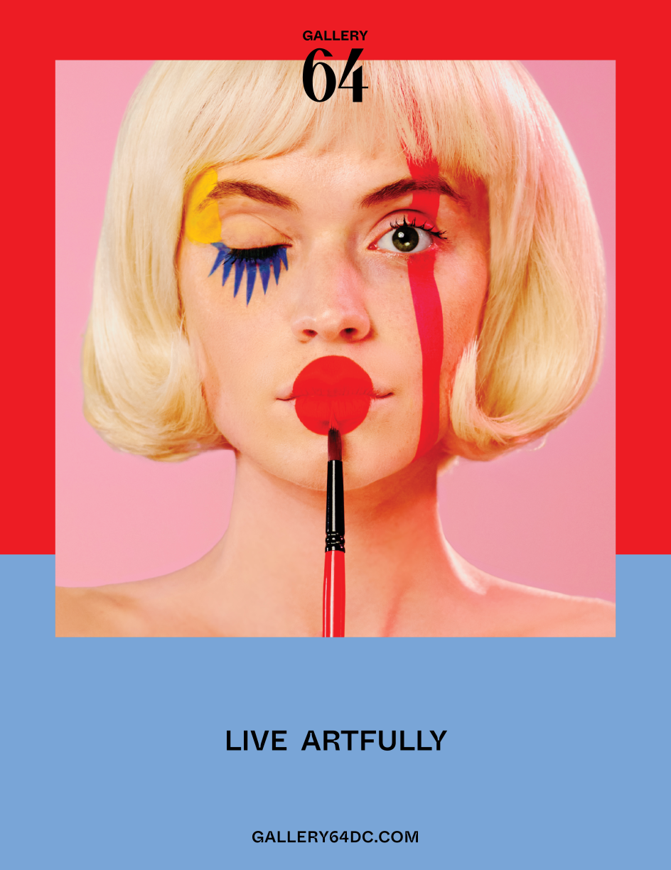
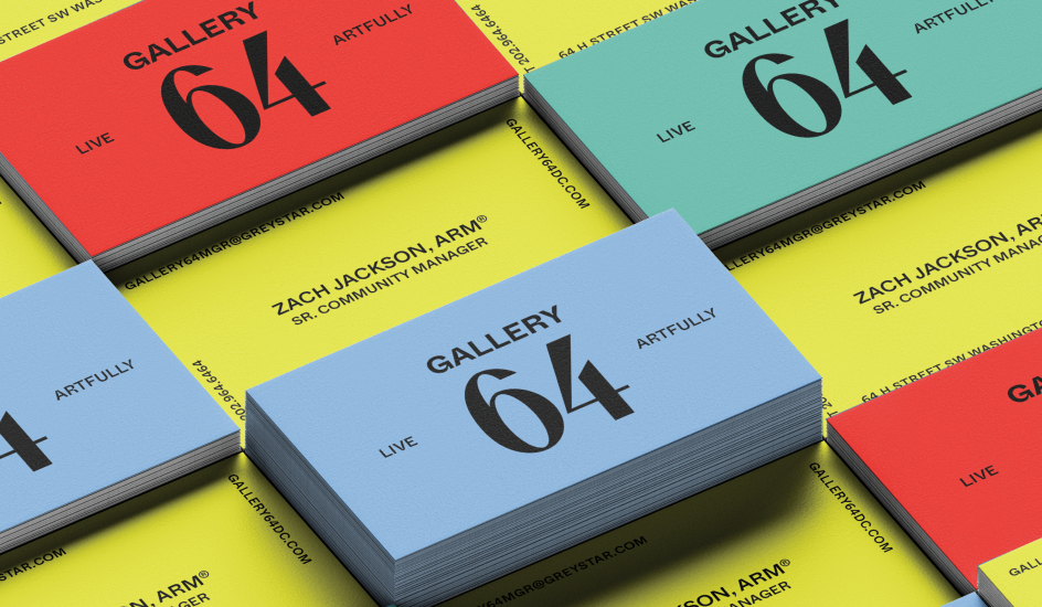
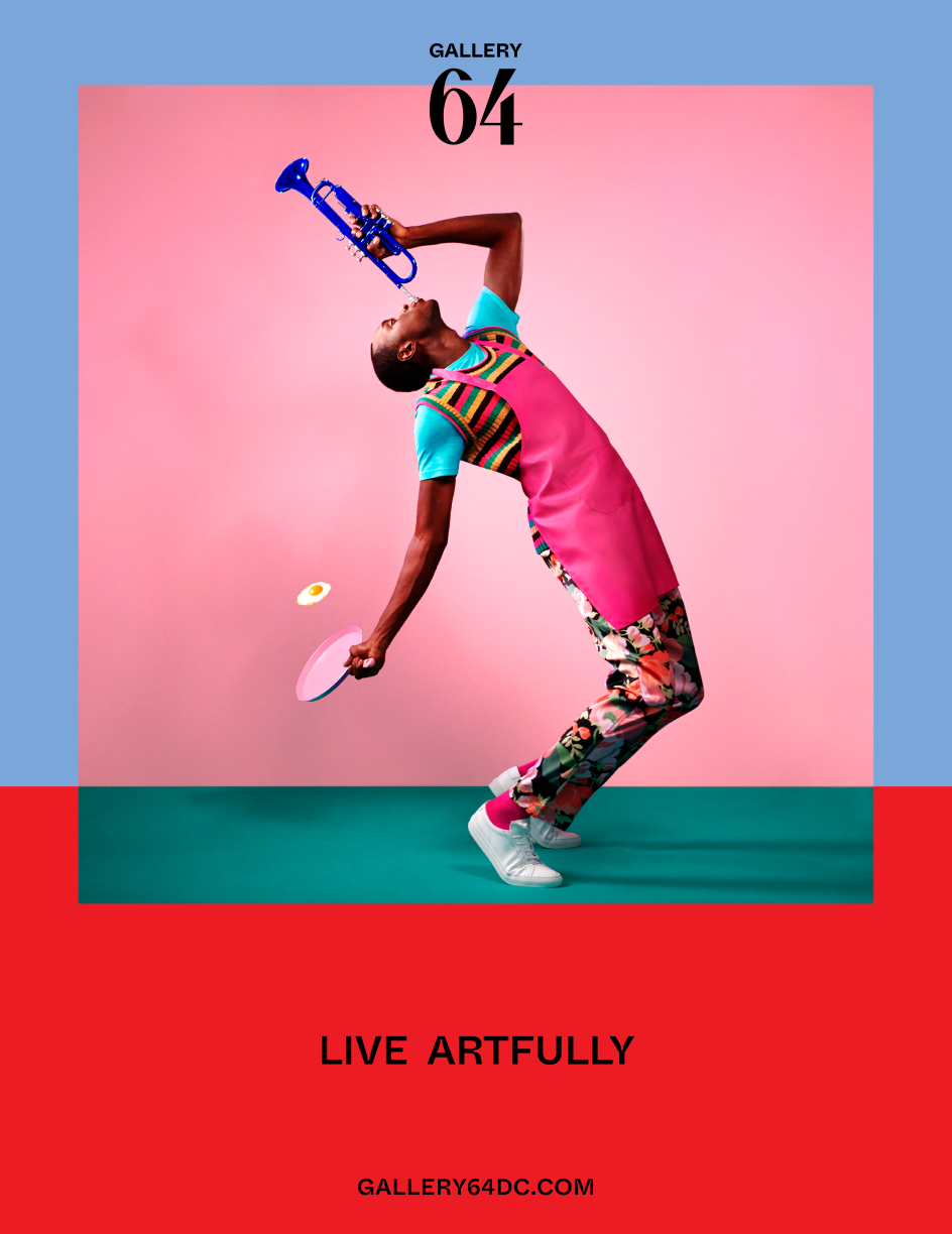
And stand out Gallery 64 has. Thanks to the use of bold colours, art-inspired photography, dynamic patterns and multiple logos, Design Army defied convention to bring attention to the fact that Gallery 64 doesn't just offer people somewhere to live and gives them a chance to immerse themselves in creativity.
At the heart of Design Army's thinking for this campaign was the concept of 'Living Artfully'. This phrase took inspiration from the property's one-of-a-kind setting, which, as well as a shared courtyard with The Rubell Museum, also includes the adjoining Culture House DC, a cool, graphic-covered church.
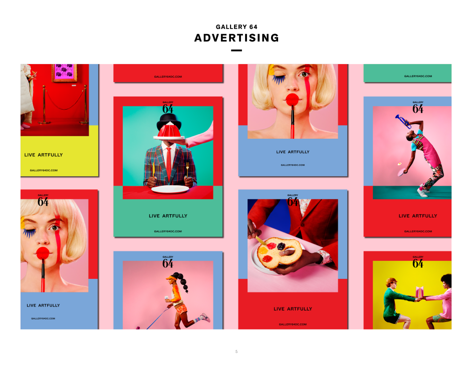
"Popping with wonderfully weird avant-garde photography and art direction, the modern art-esque graphics speak to curiosity-driven art lovers who want to live and breathe art in every form – every day," Pum adds.
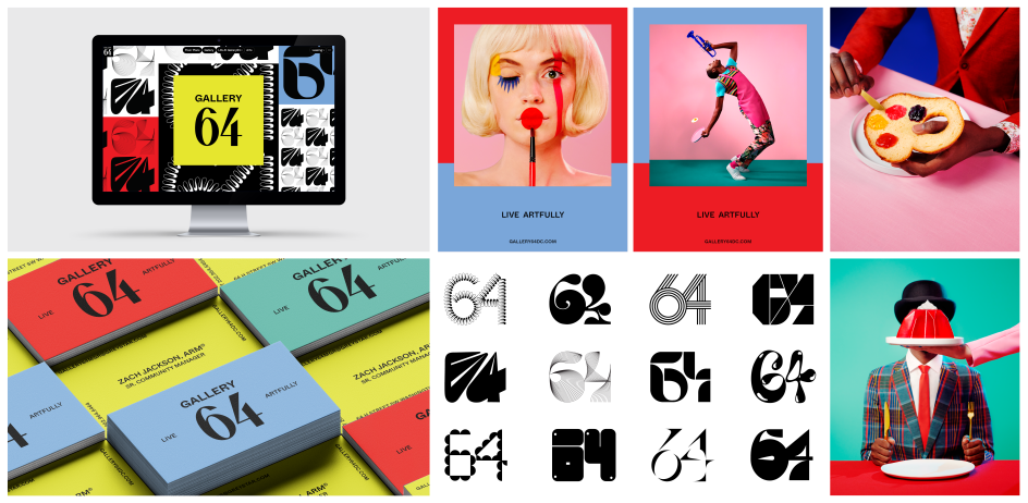
"We also conceived the name 'Gallery 64', inspired not only by the address (64 H ST SE) but a nod to 1964's pivotal moments in DC culture, from The Beatles to civil and voting rights to the arts scene exploding with new creativity.
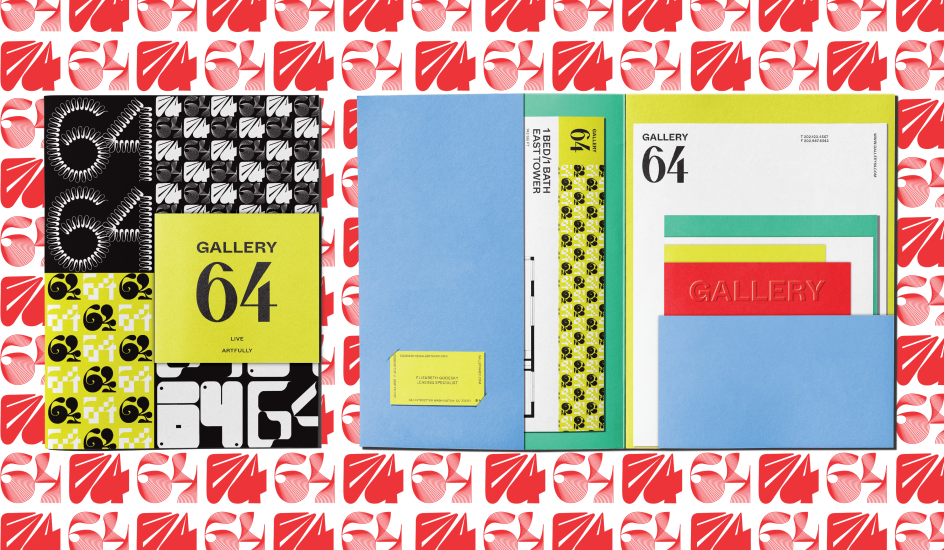
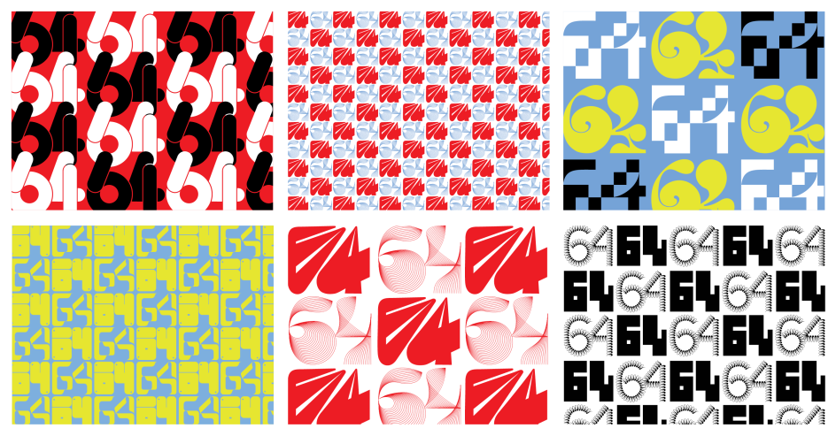
"We hand-drew a huge typographic logo library and pattern series with '64' reimagined through the arts – from gorgeous graffiti lettering to fashion, music, and beyond. Plus, a super fun 30-second animation with all the interpretations."
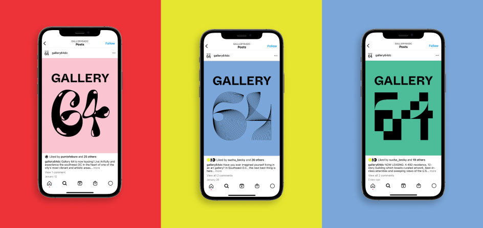
Described by Pum as "anything-but-usual" real estate branding, Gallery 64 is perfectly pitched towards people who crave the artfully unconventional and want to live that lifestyle. And it seems to have tapped in precisely to what they want. "Much like a gallery opening, this property was the hottest ticket in town, launching with a waitlist for tours, gaining over 200 organic Instagram followers per month, and signing over ten leases in the first 30 days," Pum enthuses.
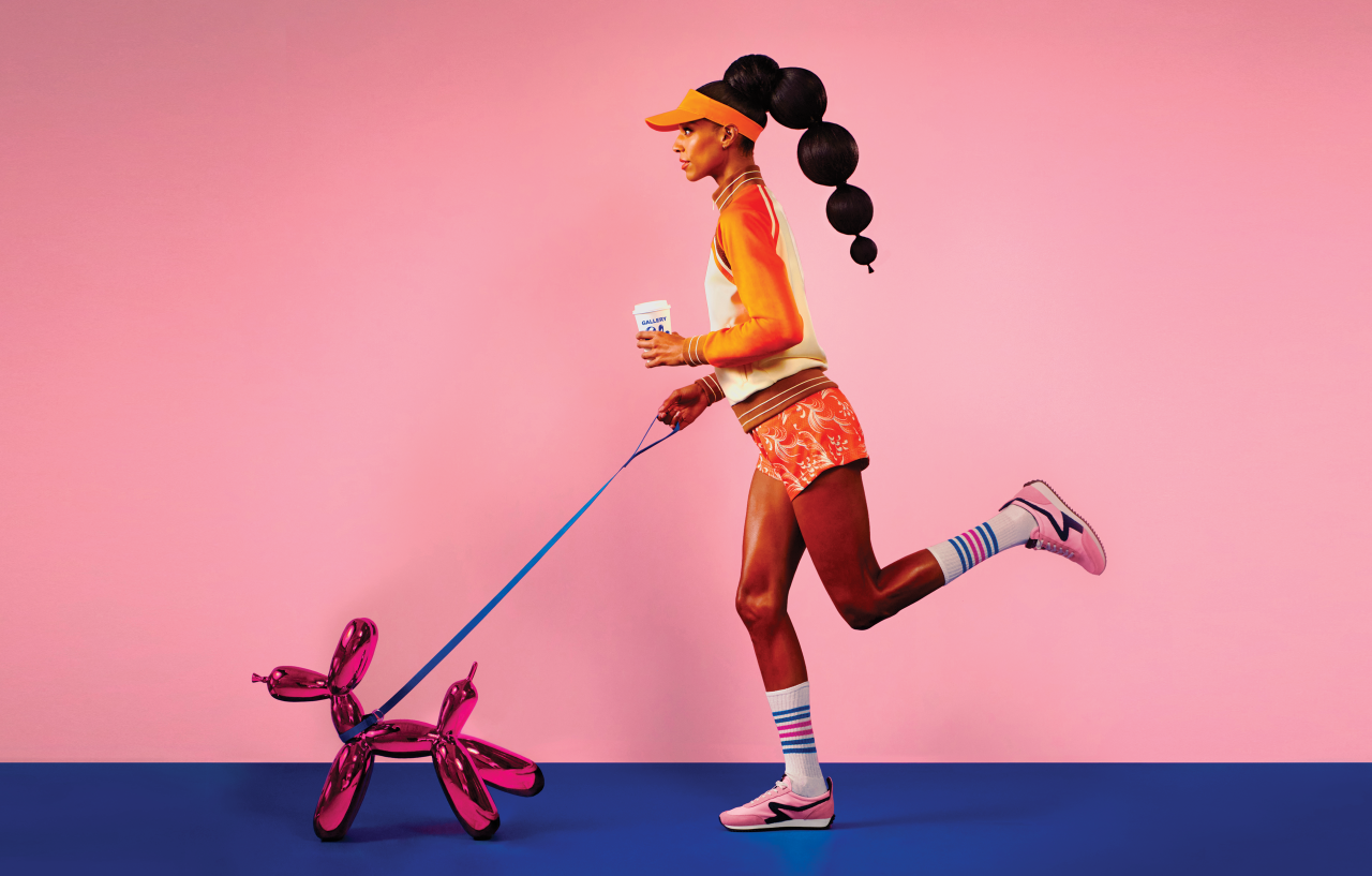
Running across websites, social media, print outlets and collateral, the artfully whimsical advertising works so well because it plays on familiar iconography from the art world. There are knowing winks to Magritte's surreal paintings with a man whose face is obscured by jelly, and Alex Katz's colour-blocked portraits are also referenced in the photography. Even Andy Warhol's slightly skewed colour palette becomes the basis of the campaign.
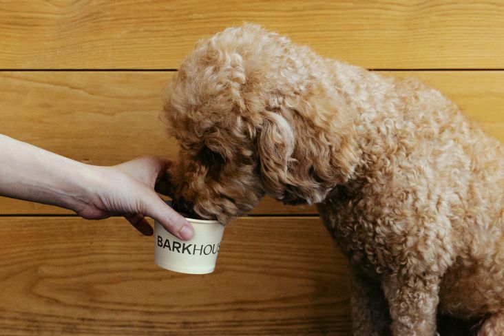
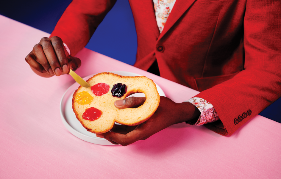
"Be it creatively walking your pooch, prepping breakfast with a bread and jam painter's palette, or dining with a jello-faced gentleman - it's all about living artfully," adds Pum.
As well as tapping into the creativity that's quite literally on Gallery 64's doorstep, Pum attributes the campaign's success to Design Army's decision to look different. With the vast majority of apartment advertising relying on similar-looking stock photos and super conservative design, the creative team had a blank canvas on which they could make their own distinctive mark.
"This feels anything but traditional," she concludes. "The visuals are over-the-top weird, artful and pique your curiosity, yet totally makes sense with the progressive museum's proximity. We also worked super hard on the '64' typographic library and pattern series.
"And just like art exhibitions, I love that the branding can constantly evolve and feel fresh – like '64' with ribbon lettering for the holidays, etc. – yet all together, it remains timeless."
Editor's Picks


Trending


Podcasts


Editor's Picks
Further Reading