Buff Motion's motion identity for Starling is built around confidence, not cash
Following the bank's 2025 refresh, the Brighton studio turned a job making 16 social films into the rulebook for how Starling moves on screen.
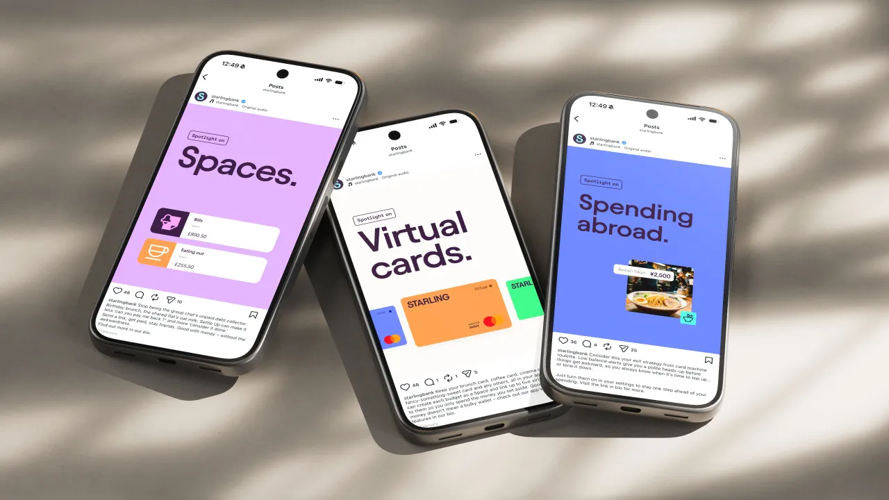
Be honest. When did a bank's social feed stop you mid-scroll? Personally, I'd rather bury my head in the sand than look at my account balance, not to mention all the beige and boring financial content out there. So it's refreshing to come across a project that treats the way a bank moves on-screen as worthy of our attention.
Brighton-based motion studio Buff Motion has been doing just that for Starling. Following the bank's brand refresh last year, Buff was brought in to help shape Starling's motion identity. The result is a full-on framework for how the entire brand behaves in movement.
The project started much smaller. Buff was commissioned to make a series of short films showing off features across Starling's app and website. But the studio spotted a bigger opportunity: to set down the principles, behaviours and animation language that would define how Starling moves from here on in. The scale of the campaign, as they saw it, made it the ideal moment to formalise how a freshly refreshed brand should behave in motion.


"The brief quickly became about much more than creating social content," says Tom Allen, creative director at Buff. "Starling's brand isn't built around wealth. It's built around confidence. What I particularly loved about this project was being trusted to define how that confidence should translate into motion. We pulled out the brand's core tonal attributes and developed a motion language built around direct, purposeful movement with a playful human confidence. That shaped these films while giving Starling a framework for future work."
Across 16 vertical films, Buff helped to add storytelling to Starling's many banking features. For example, open on a relatable problem, introduce the feature that fixes it, connect it to a benefit that matters, and end on a clear brand sign-off. The films weren't launching anything new, by the way... they were built to help us find tools already sitting in the app, like budgeting (something I definitely use) and saving (something I avoid) or maybe debt management (mercifully no longer an issue).
And hey, as you can probably tell by now, I'm a happy Starling customer. I use the app to try and stick to a monthly budget. (Not always easy when Outsiders in Manchester currently has an epic sale on. Sigh.)
But the bit that's really clever is the restraint. There's no expressive or over-the-top animation, which we've seen elsewhere. It feels confident and warm. And the emojis earn their place, getting an idea across without piling on anything too heavy. The result, as Buff puts it, felt "unmistakably Starling": clear, modern and human.
Buff also wrote it all down. It began mostly as an internal guide for themselves, as they documented the creative principles, the technical approach, and the animation behaviours. It ended up being handed over to Starling's in-house team to keep the brand moving in the same voice long after Buff's work was done.
For Starling, the benefits went well beyond the first campaign. "The overall success and design language of this project has moved the Starling brand on in a really positive way," says Neil Cooper, executive creative director at Starling. "It is held up as the benchmark across the business and has been some of our best-performing content."
It's been such a success that Starling has since brought Buff back for a further 12 films promoting its business banking products. The reminder at the heart of all this: motion is part of the brand system itself, as valuable as a colour palette or a logo.
You can see more of the studio's work on Buff Motion's website, or on Instagram and LinkedIn.

Editor's Picks





Trending



Latest Jobs
Copywriter & Content Strategist at Chapel
Full-time·London·£30,000 – £40,000
Graphic Designer & Marketing Coordinator at Sign Pro
Full-time·Newcastle·£13 – £16 per hour
GTA VI Social Lead at Future
Full-time·Bath·£29,000 – £40,000
Senior Director, Production, Marcom at Code and Theory
Full-time·New York·$190,000 – $230,000
Staff Producer, Studio Central at DoorDash
Full-time·San Francisco·$176,800 – $260,000
Verbal Identity Fellow at Interbrand
Full-time·New York·$30 per hour