A versatile typeface inspired by Orson Welles' Citizen Kane
Combining a love of classic cinema and contemporary art, Kane Display is a lovely little typeface created by design studio Think Work Observe.
](https://www.creativeboom.com/upload/articles/b3/b3e8aa93551248abf7815c7bf1b18772ea917f2c_1280.jpg)
All images courtesy of Think Work Observe
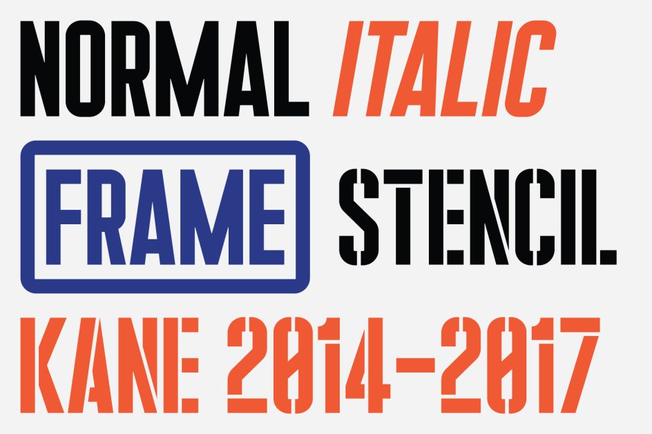
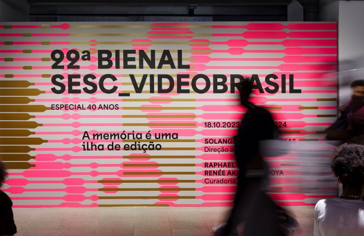
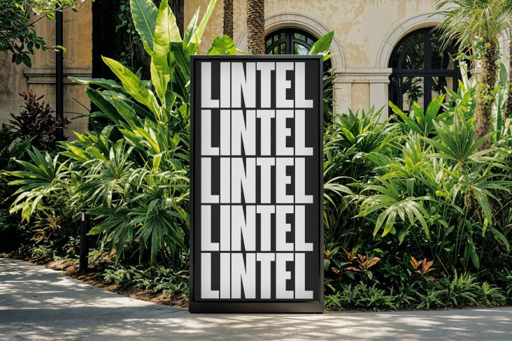
Based in Udine, Italy, Think Work Observe initially created the typeface in 2014 as a lettering system inspired by the woodblock type posters for Citizen Kane, Orson Welles’ 1941 film often hailed as one of the greatest works of cinema of all time.
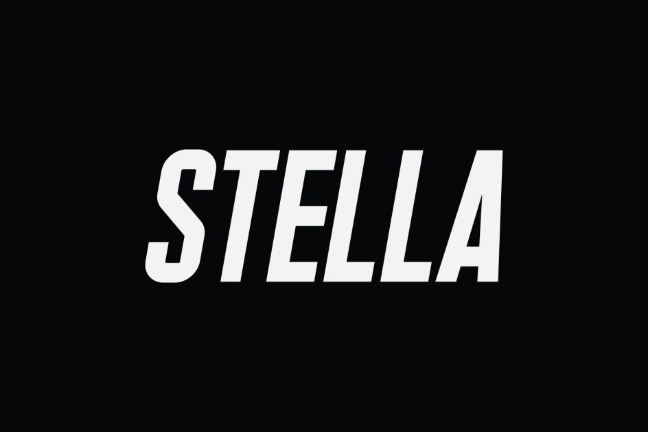
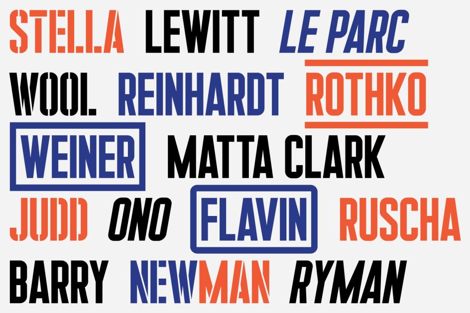
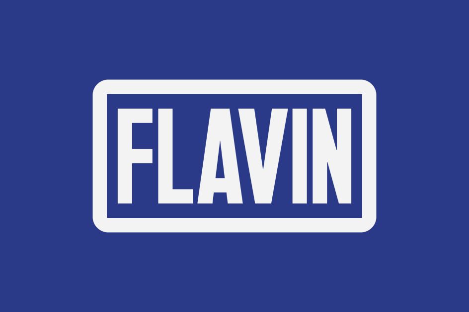
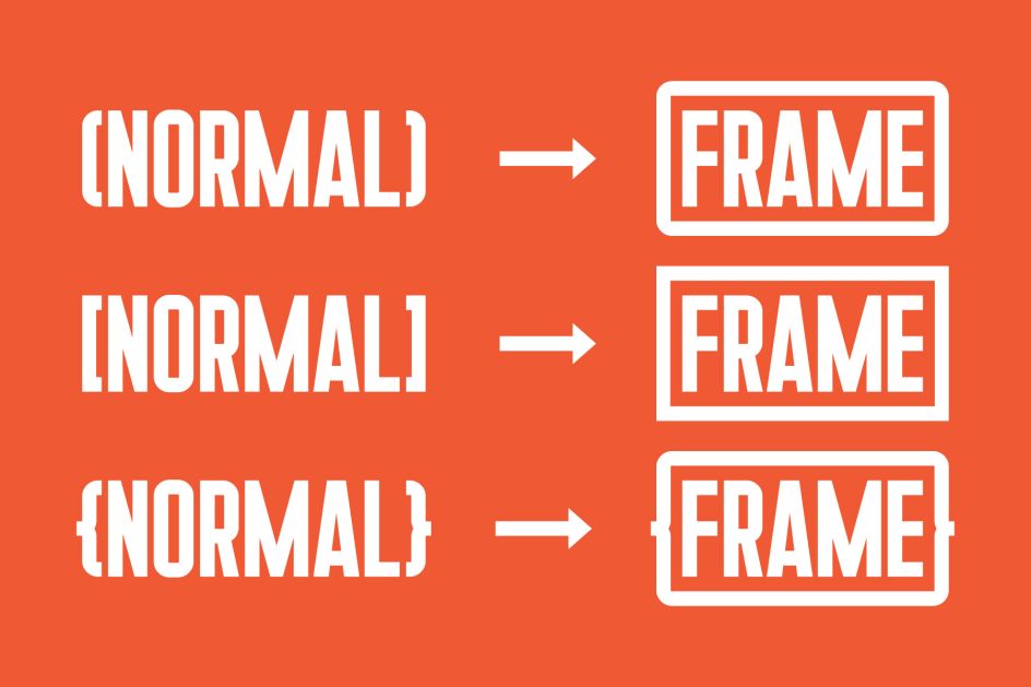
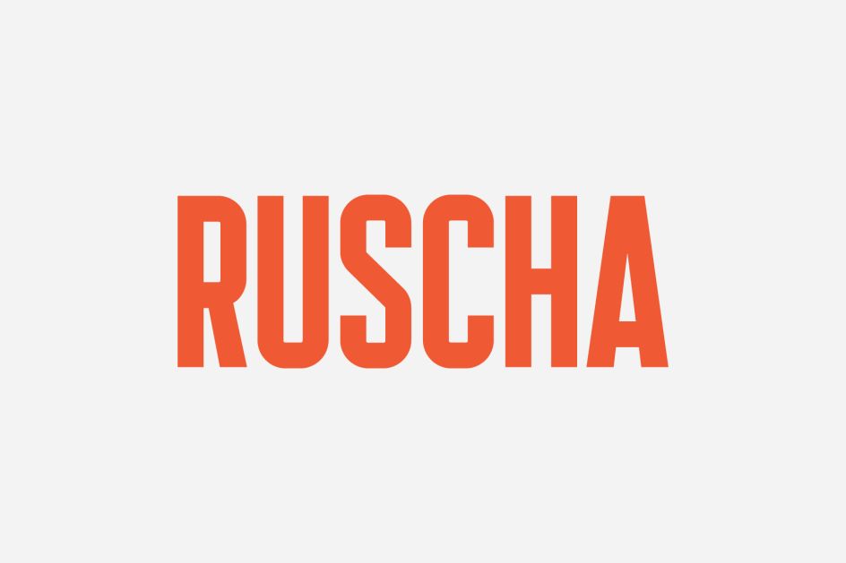
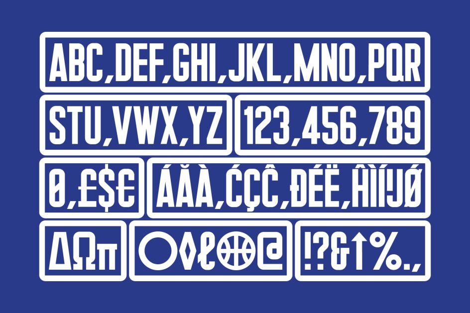
This year, the studio added some new styles to the typeface family inspired by the work of conceptual artists like Christopher Wool and Lawrence Weiner. Kane Display is now available in four styles – Normal, Italic, Frame, and Stencil – and it supports Standard Western and Latin Extended characters. It’s a modern and bold set of letters, and would certainly look great in film titles or in cultural client logos.
Think Work Observe was founded in December 2011 by Piero di Biase and Alberto Moreu, and works across commissioned projects in the commercial, cultural and editorial sector, with a strong focus on original typography.


](https://www.creativeboom.com/upload/articles/90/908fdb6378db1e95d12595416f54e6336d5e80b8_732.jpg)


 using <a href="https://www.ohnotype.co/fonts/obviously" target="_blank">Obviously</a> by Oh No Type Co., Art Director, Brand & Creative—Spotify](https://www.creativeboom.com/upload/articles/6e/6ed31eddc26fa563f213fc76d6993dab9231ffe4_732.jpg)
