White Bear Studio crafts a cuttingly sharp bold identity for Swordfish Works
Swordfish Works, a Shoreditch-based workshop that specialises in laser cutting, recently called upon the talents of White Bear Studio to create a sharp brand identity for its new name.
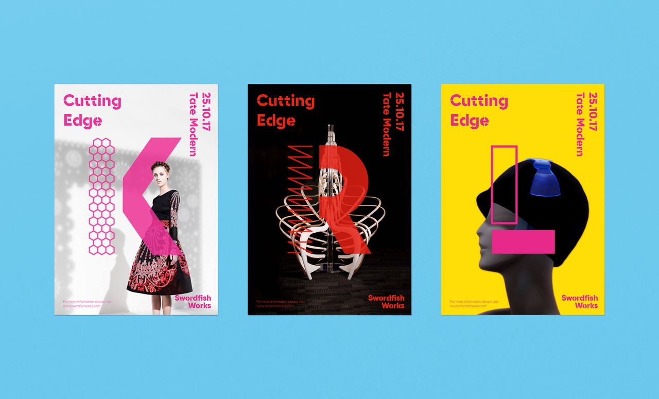
Previously called 'Capital Models Laser Cutting Department', its new name encapsulates the company's precision and accuracy, as well as a new direction for its business. "The team uses state-of-the-art machinery to cut into an exciting array of materials on a large scale, anything from plastic to lychee fruit," explains Esme Rees. "They needed a fresh and contemporary identity that matched their creative capabilities and showcased the variety of their services. That's where we came in.
"Our brief was to create a brand that would stand out against the rest of the laser cutting market and that represented the high level of craftsmanship of the business and their problem-solving capabilities. They don't have a cookie-cutter approach (no pun intended) – every job is unique and has its own challenges."
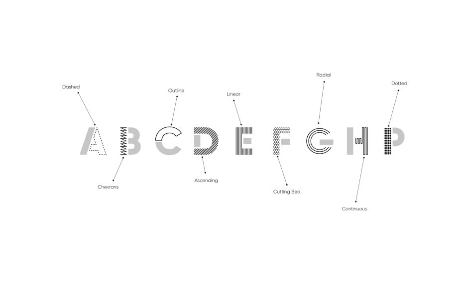
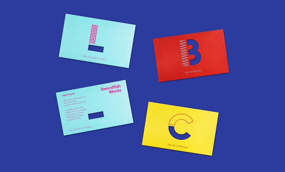
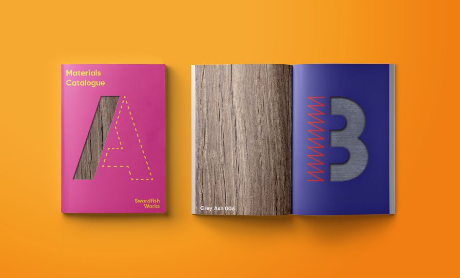
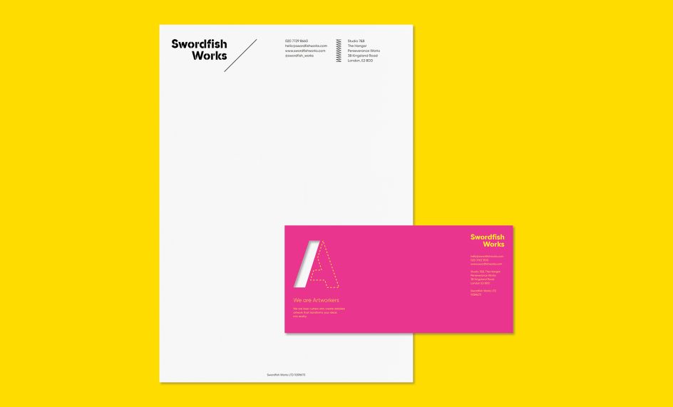
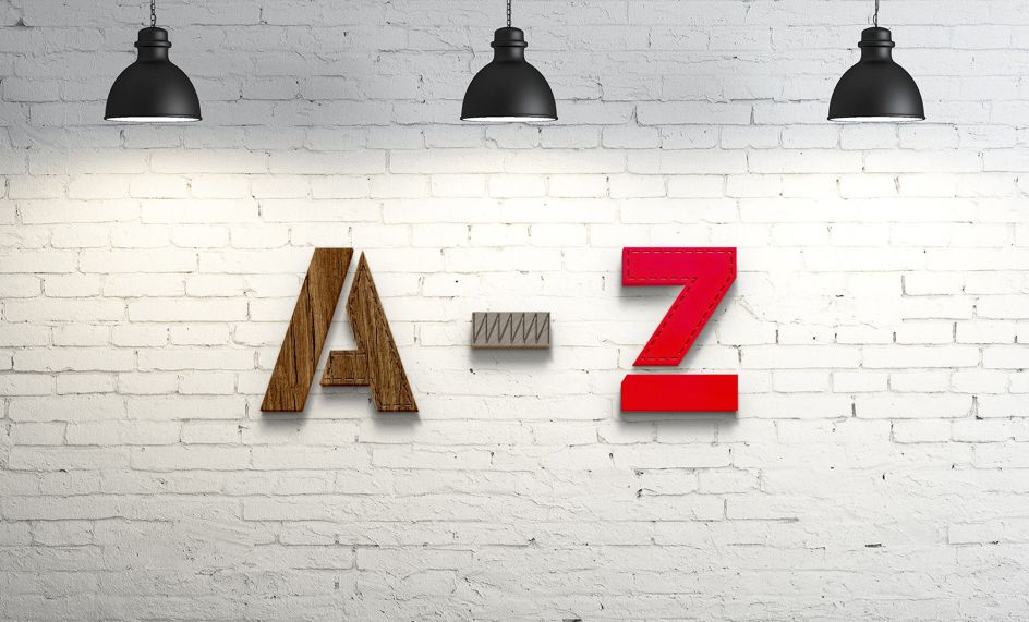
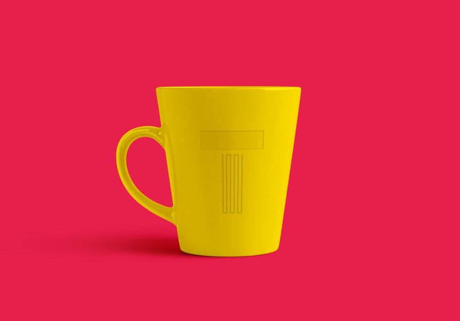
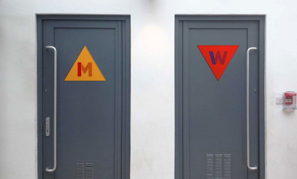
White Bear positioned Swordfish as the A to Z of laser cutting, developing an identity that showcased both their skills as a company and the boundless creativity that they help their clients realise. Esme added: "We designed a bespoke patterned alphabet in which each letter's treatment was inspired by a laser cutting technique and each letter from A-Z represents a different aspect of working with Swordfish, from art-working to customer care to team players, thereby conveying the breadth of their proposition and identity."
The bespoke letters feature across the identity, coupled with bold bright colours that were inspired by the acrylic colours from which Swordfish can cut. These assets combined with their body of work gives them a disruptive and impactful brand language that is instantly arresting.
Editor's Picks


Trending


Podcasts


Editor's Picks
Further Reading