Utopick Chocolates: Sweet branding that looks good enough to eat
Anyone with a sweet tooth will love this creative branding project for Paco Llopis; a master chocolatier. Described as an "ingenious craftsman constantly searching for new discoveries in flavours, textures and filling techniques", when it came to creating a packaging design that matched the luxurious qualities of the product inside, Llopis knew just who to ask.
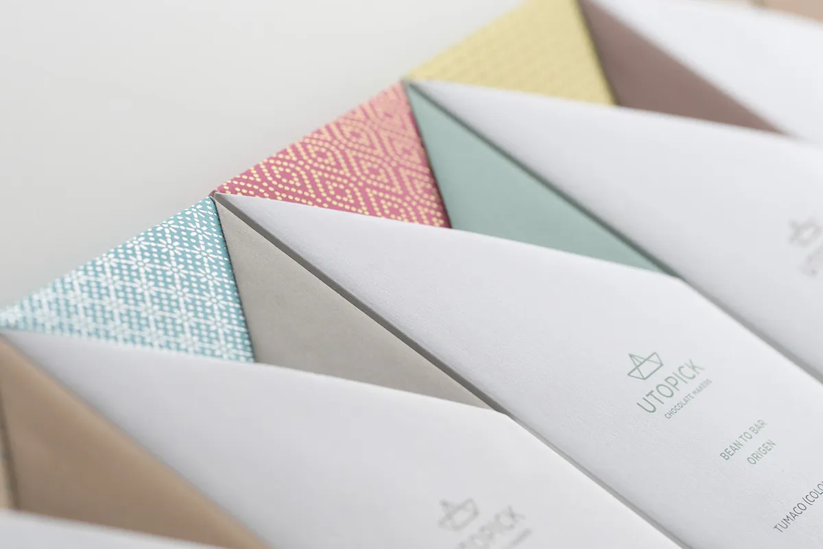
Lavernia & Cienfuegos is a design agency based in Valencia, Spain. The team explains: "Paco came to us with the challenge of creating a new design and unique packaging that effectively communicates who he is and what he does, in other words, a design that represents invention and creativity.
"He already had a name for his product, Utopick: (a reference perhaps to the creator's desire for unattainable perfection and, at the same time, a play on words 'you to pick').
"He also had a symbol, a ship embodying the spirit of adventure and representing the long voyage the cocoa pods make to reach the chocolatier – this being the same route taken by Spanish explorers when they set sail and first brought them back in the Sixteenth Century.
"Engaged in the task of how to package the chocolate, we transformed the symbol into an origami boat, a moment that marked the birth of our solution."
Utopick packages its batches by hand, so in response, a unique way of folding the paper to wrap the bars was created. "This is a hands-on process which is pure and authentic, embracing the traditions of a skilled craft that is free from the restraints of automation.
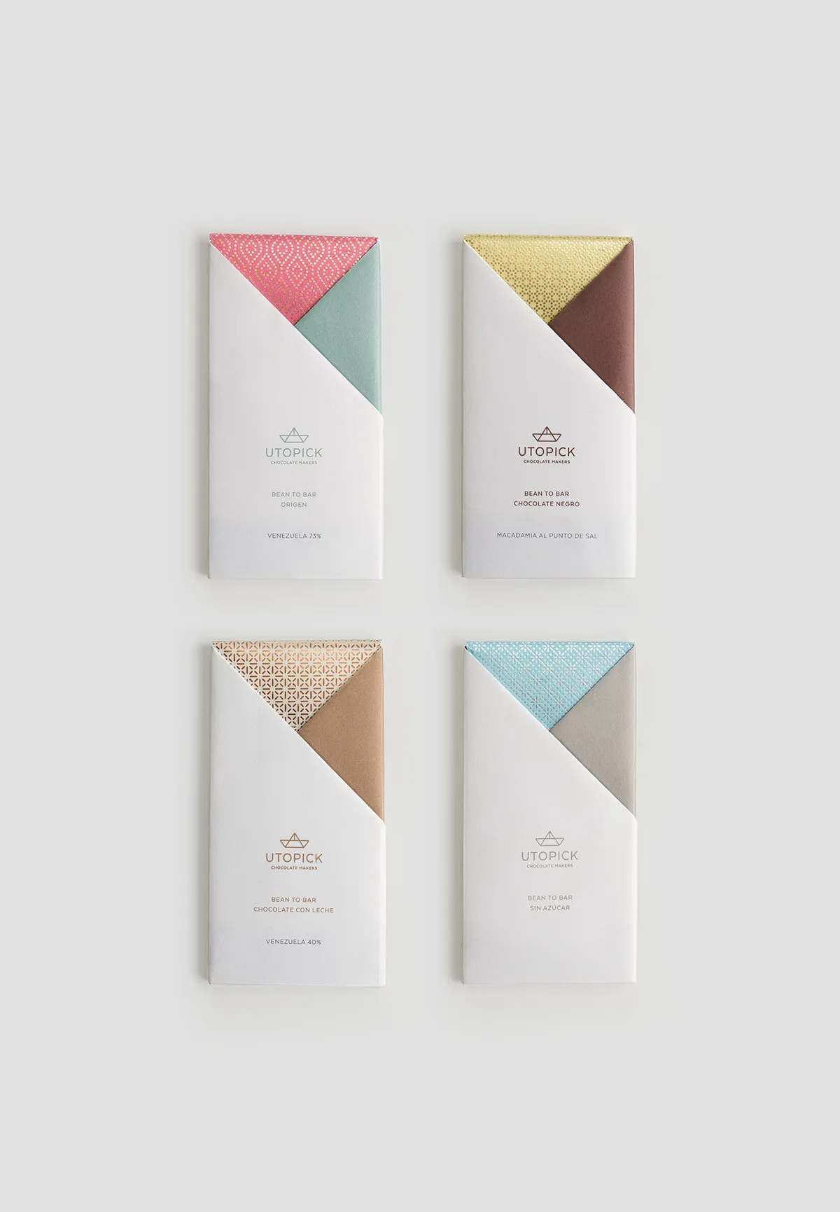
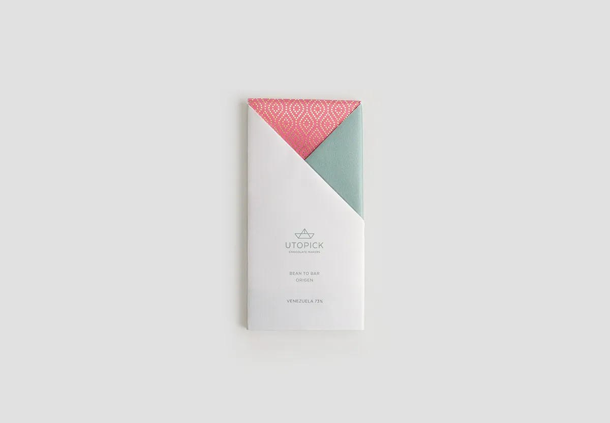
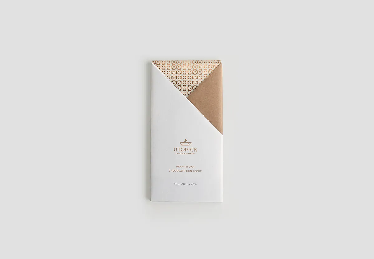
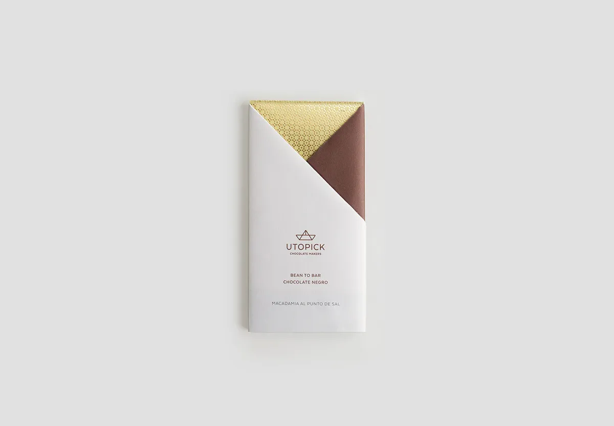
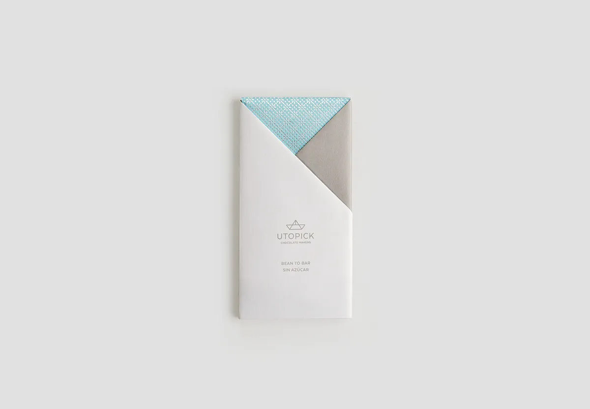
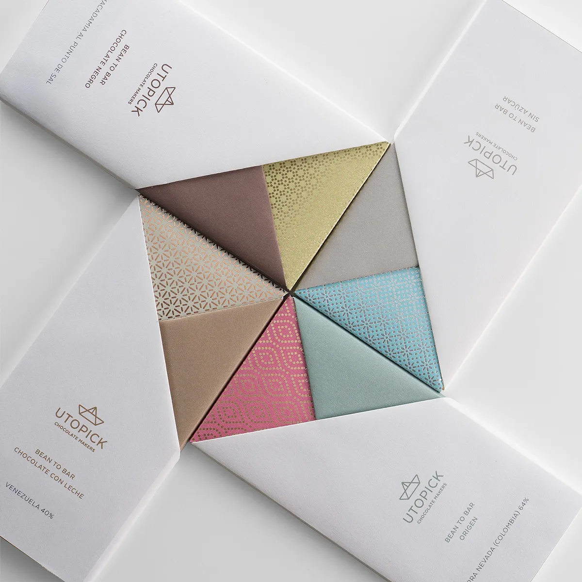
"The paper folds to create two triangles on the front of the design, each with their own colour and texture, personalising every bar. The packaging opens and closes in a way that makes it easy to rewrap the chocolate making it appear untouched (it’s well known that some people like to keep their chocolate addiction secret).
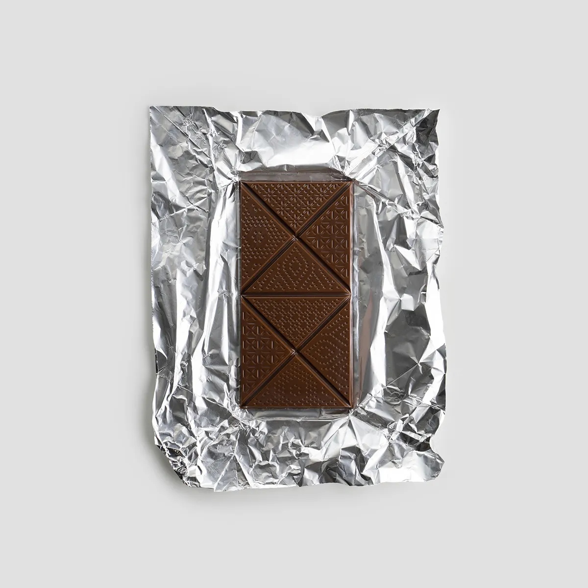
"We reproduced the same shapes on the bar, which is pre-cut into big triangles, once again taking advantage of the ships own geometry – the symbol of Utopick: a paper ship that’s travelled from afar."
See more at lavernia-cienfuegos.com.
Editor's Picks





Trending






Latest Jobs
Talent Agent & Producer at The Jacky Winter Group
Full-time·Los Angeles·$70k-$85k
Design Lead at Madeo
Full-time·New York City·$85k–$120k
Graphic & Motion Designer at The SHARP Agency
Full-time·Leeds·£26k–£33k
Head of design at Cog Design
Full-time·London·£55K
Brand Copywriter at Origin
Full-time·Porthleven, Cornwall·£35k–£40k
Digital Marketing Executive at Arise
Full-time·Sheffield·From £23,750