Universal Favourite reframes the art world with normality-free rebrand for The Other Art Fair
Design studio Universal Favourite has made the world of art more accessible with a new identity for The Other Art Fair which is themed around the idea of never being normal.
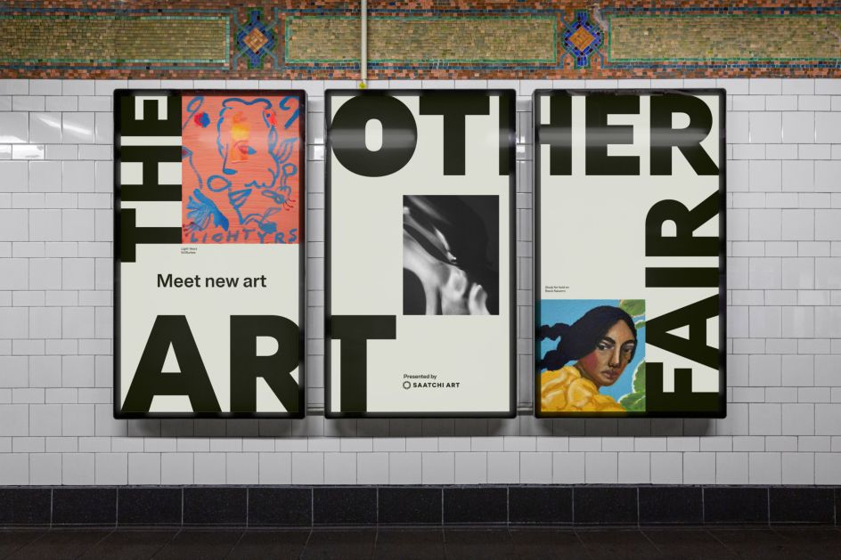
A simple colour scheme lets the work speak for itself
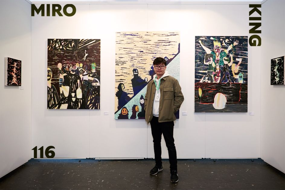
The world of art can be an inaccessible place. Besides the work itself, it can be difficult to 'get' the industry and for emerging talent to find a place and forge a career. That's where The Other Art Fair comes in. Aiming to smash down the elitist barriers surrounding the creative world, The Other Art Fair seeks to make it more welcoming and exciting to everybody.
A pioneering fair needs a pioneering brand, though. To help achieve this, The Other Art Fair collaborated with Universal Favourite to create a new identity which encapsulates their ethics and repositions them as an approachable movement. Because while The Other Art Fair had done a good job so far in terms of getting through to visitors and creatives, it felt its previous brand identity did not reflect its rebellious, boundary-pushing mission statement.
Universal Favourite worked with Untangld and TONE agency on this project

Brand writer Cat Wall honed the tone of voice
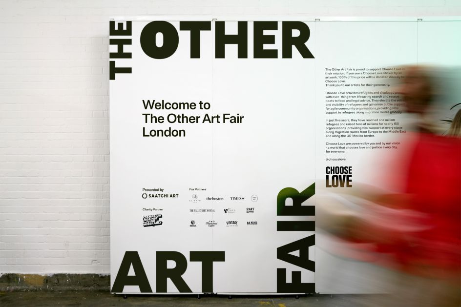
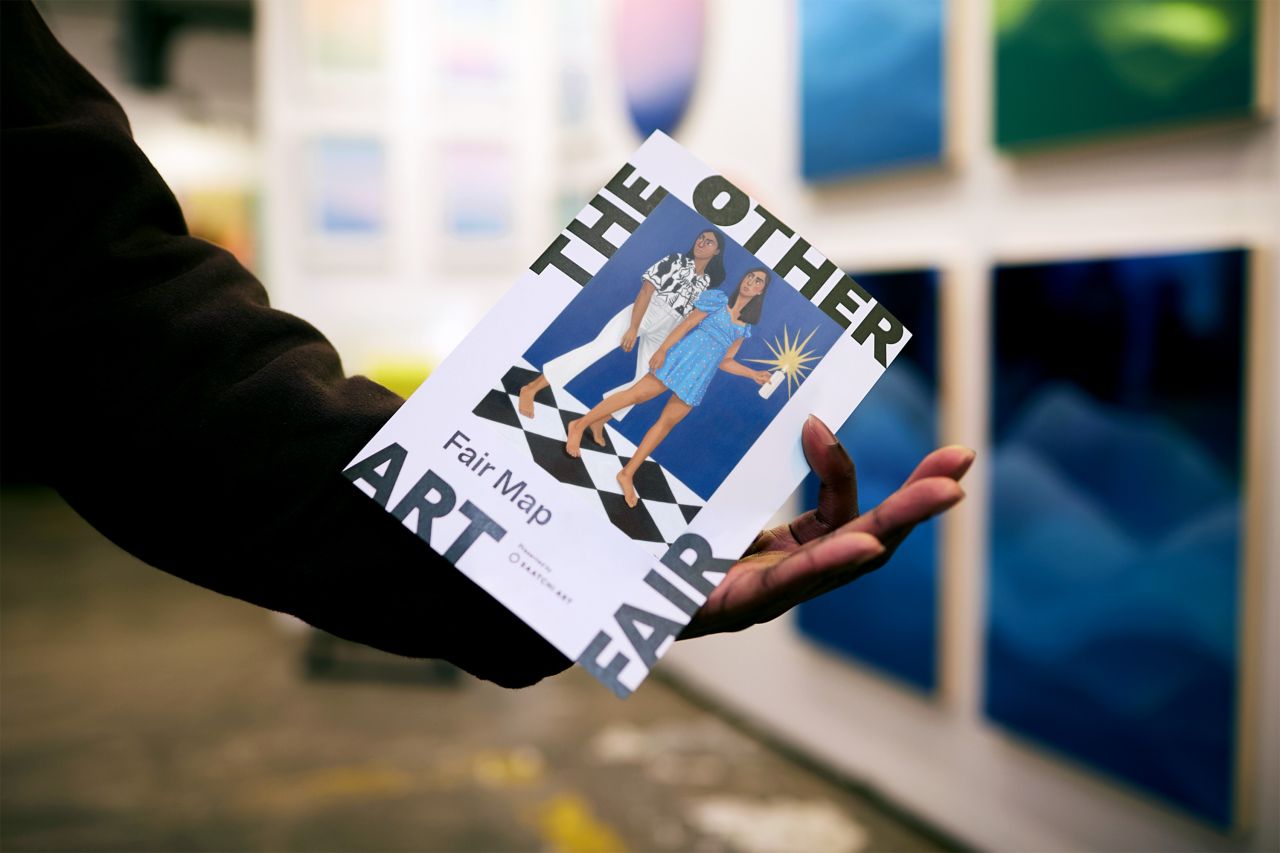
A new dynamic logo flexes to fit its contents
Working alongside brand and customer consultancy Untangld, Universal Favourite settled on the idea of 'Never Normal'. This theme would be used in every graphic and touch point, as well as the brand's tone of voice, to help push The Other Art Fair away from the ordinary and expected messaging of the art world.
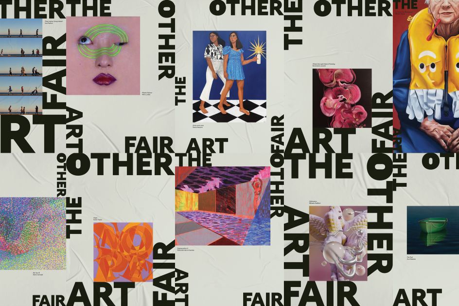
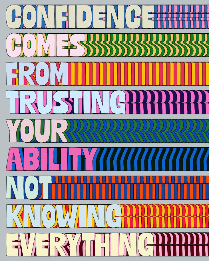
"To get the visual side of things underway, we asked ourselves, what if the brand itself was art?" says Universal Favourite. "This would allow us to hero the artists and work to which the fair gave a voice and make each iteration of the visual identity a unique and creative expression. Taking visual cues from anti-trend behaviour, we explored how we could reframe TOAF the way they were reframing the art world."
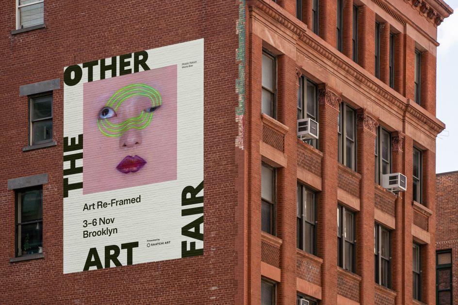
Another way the brand pushes boundaries is with its logo. Instead of conventional logos, which are usually well-designed but relegated to the corner of a website or other messaging, Universal Favourite transformed it into a dynamic framing device which flexes to suit the context.
"In line with TOAF's rejection of the ordinary, the design system is also led by the logo. The way it's applied means each brand touchpoint celebrates the in-frame image, rather than the brand, bringing the focus back to what really matters."
The Other Art Fair demystifies the industry for emerging talent
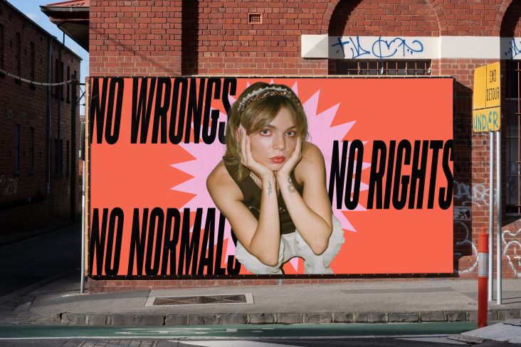
The Online Art Fair aims to knock down elitist barriers in the art world
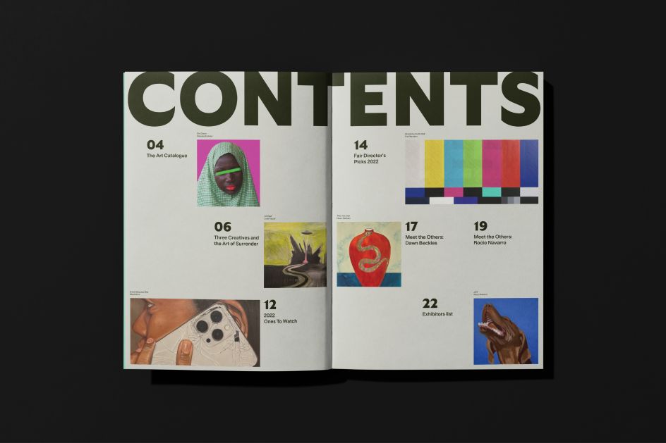
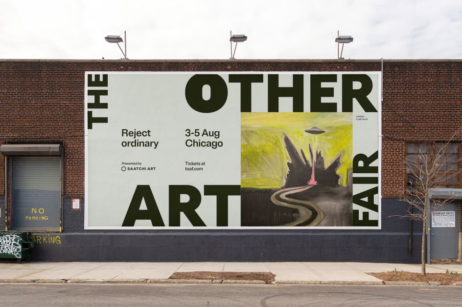
Simple, unassuming typography was used for headline copy
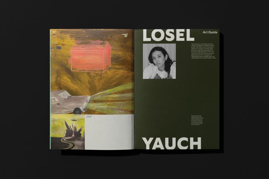
Just because it's rejecting the received wisdom of the art industry, though, doesn't mean Universal Favourite did away with taste. In fact, it's followed the 'less is more' maxim pretty closely by settling on a colour palette which does not go over the top. "When it came to colour, we kept it simple," the studio explains. "Tweaking the hero green from the previous identity to be more ownable, the palette is straightforward but striking.
"Within the brand system, each colour is used as a solid block background and assigned to a specific category of assets. The green-grey provides a neutral base that allows the colours and vibrancy of artwork to shine, green-black is used for artist information and headshots, and other-green highlights event-specific content and promotional materials. Overall, the updated palette is digitally-optimised, confident and signals a distinct brand transformation for TOAF."
Where would an effective identity be without good typography, though? Universal Favourite settled on two for this project: Gt Ultra and Brut Grotesque. The former is the basis of the wordmark and is mainly used as an accent typeface thanks to its "humanist flare", which fuses calligraphy and construction. Meanwhile, the latter is the hard-working counterpart used for headings and body copy due to being "unassuming and indistinct."
Universal Favourite rejected normality with its rebrand
The anti-trend movement inspired the style of the rebrand
Appearing online and OOH across various print and advertising material, Universal Favourite's rebrand captures the essence of The Other Art Fair and gives it room to scale and reach a larger audience thanks to an easy-to-use design system that is easily replicable. In other words, it can shapeshift and adapt just like the ever-changing art industry itself.
Speaking about the rebrand, Universal Favourite added: "TOAF was built on a rejection of the ordinary. When the art world as we knew it went one way, they went the other, daring to deviate from the premise that art isn't confined to convention or rule, so how we enjoy it shouldn't be either.
"Their mission is to keep reframing art and how we perceive, experience and purchase it, in new and ever-changing ways, and now they have a bold and adaptable brand identity behind them that does exactly that."
Neutral grey-green colours give vibrancy to the artwork
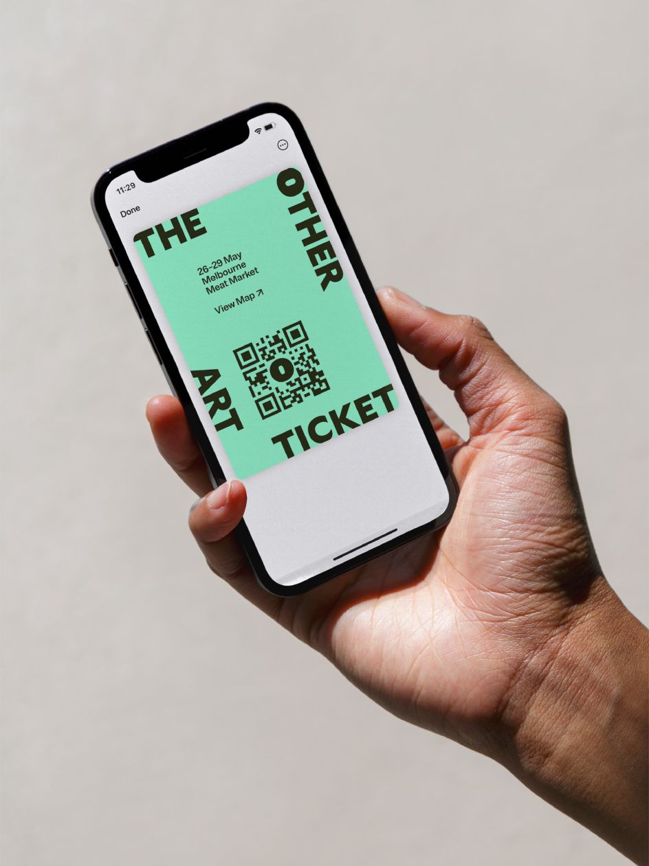
The new brand identity appears on print and digital assets
Editor's Picks


Trending


Podcasts


Editor's Picks
Further Reading