Suculent by Comité is a brand identity inspired by Barcelona inns
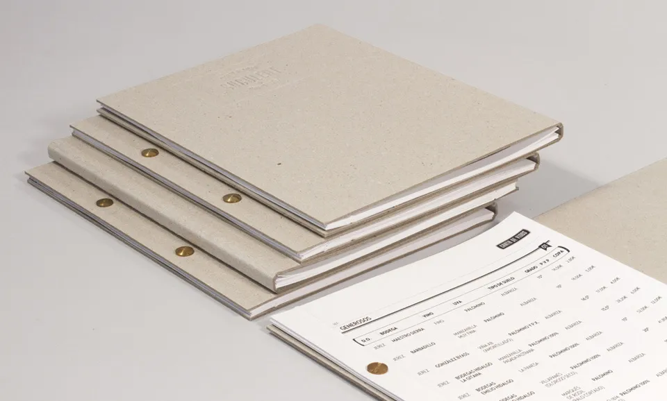
Barcelona-based studio Comité has created a brand identity for Suculent, a new bar and restaurant located in the premises of the city's old Bodega del Raval.
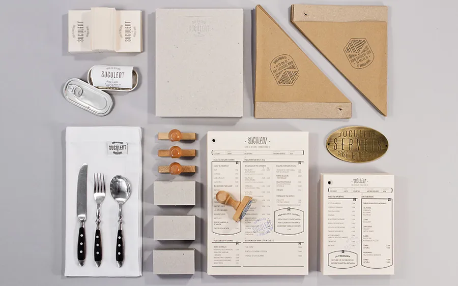
It's a rather odd place, which has been frequented by all kinds of personalities and riff-raff over the last century. It's inspired by the Barcelona inns of the Sisos where in the old days, the working classes could enjoy reasonably-priced menus.
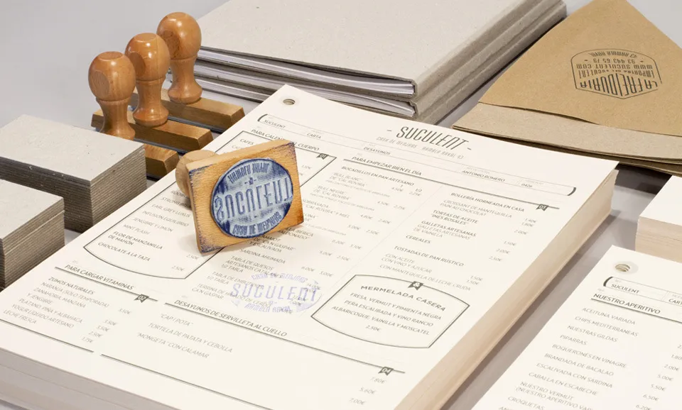
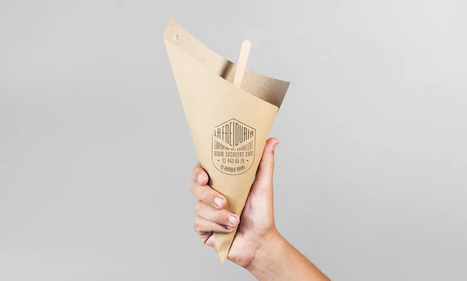
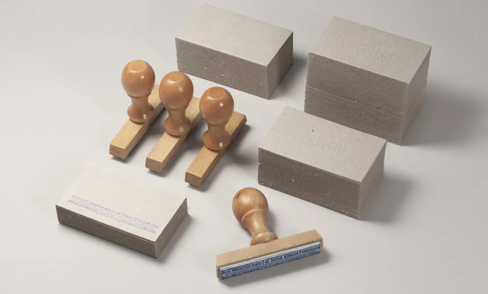
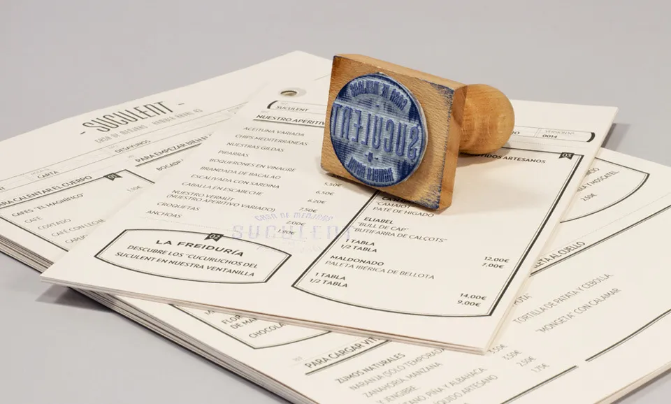
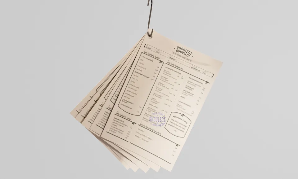
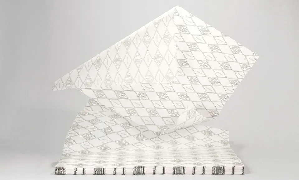
Market packets, vintage conserves, warehouse dockets, all served to Comité as a source of inspiration in creating its branding. An essentially typographical image which is enriched with the broad range of supports, materials and techniques, was used throughout.
Editor's Picks





Trending






Latest Jobs
Midweight Designer at Catalyst Creative
Full-time·London·£32k-£36k
Marketing Copywriter at ustwo
Full-time·London·£40k-£50k
Creative Social Content Producer at Bompas & Parr
Contract·London·£32k–£40k
Project Manager at A Practice for Everyday Life
Full-time·London·£37k-£46k
Creative Content Executive at Cognition
Full-time·Birmingham·£28k–£35k
Art Director at The New York Times
Full-time·New York·$120k–$130k