A new visual identity to 'defeat hatred and apathy in a digital age'
Billed as working to "defeat hatred and apathy in a digital age," The Alfred Landecker Foundation is a public foundation that exists to defend liberal societies and protect democratic structures in the face of rising populist and nationalist movements that are fuelling antisemitism and hatred directed at minorities.
The foundation has recently launched a new visual identity and digital editorial platform created by the London-based design agency Studio Output.
"It's no surprise that engagement with traditional institutions, established media and politicians is waning. Broadcasting at young audiences shuts them out instead of inviting them in," says Studio Output. "You shouldn't have to be an academic to engage and take action. So we created an experience that felt more like a conversation. This gives the Alfred Landecker Foundation a voice among its audience and a more powerful way to provoke action."
The new brand aims to be challenging and provocative, but also authoritative in order to be taken seriously. "At its heart is the idea of frail structures that are under threat," says Studio Output. "This is reflected in the monogram logo itself, with its contrast of fine hairlines resisting the dominant, heavy strokes applying pressure."
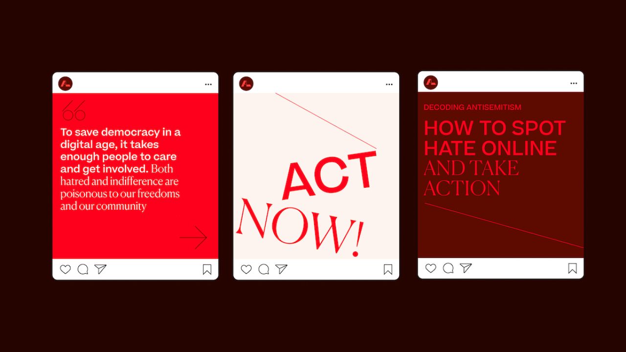
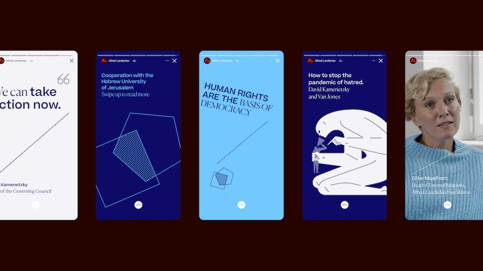
Bold, single colour illustrations were commissioned out to Cleon Peterson and Ben Hickey; while typography is deliberately set at unusual angles "to add to the sense of discontent, with hover states shifting the content off-balance," the studio explains.
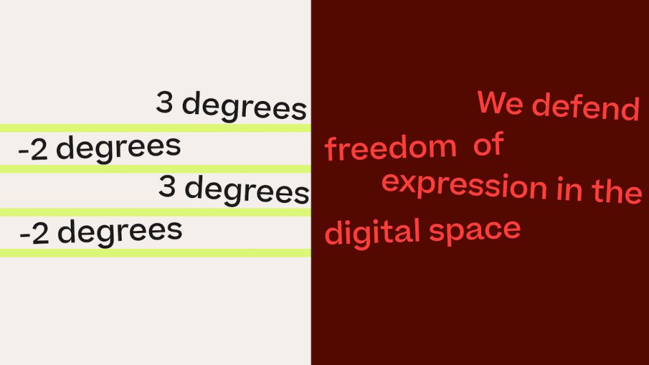
Throughout the editorial platform, readers' preconceptions are challenged by a number of provocative questions, while the colour palette uses "deliberately uncomfortable" colour combinations to heighten and lead peoples' eyes to draw attention to more inflammatory topics and more harmonious ones for thought-provoking content.
The main challenge for the team was to create designs that inspired active participation around key issues, particularly among younger people, and shake audiences out of apathy. It was addressing this issue that led to the "deliberately unconventional" approach.

"The site is designed and built around the tension between two principles: The frailty of democracy against the chaos in the world, and a call-to-arms to build a civil response and do better," Studio Output explains.
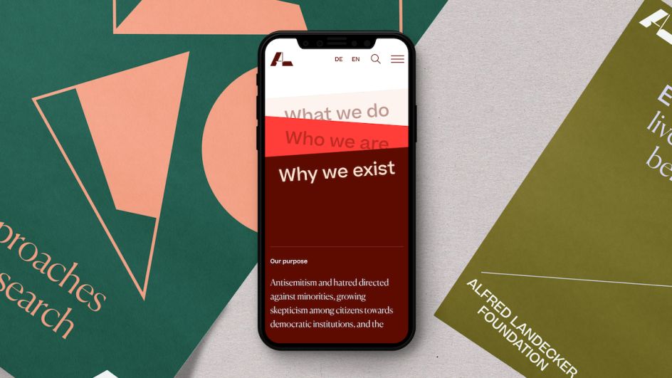
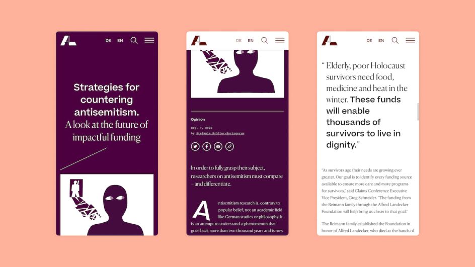
To accommodate the foundation's wide range of audiences - including experts, government officials and NGO leaders, educational institutions and other interested individuals of all ages and demographics – the website needed to both appeal to casual browsers who might be open to discovery and looking to fulfil a specific task. The site content is also used to demonstrate the links between current issues and events and those from the past, "using the lessons of history as a wake-up call to action," says Studio Output. As such, instead of organising the site around named sections like 'About Us' or 'Projects', the core navigation is built to answer three simple questions for The Alfred Landecker Foundation: 'What we do', 'Why we exist' and 'Who we are'. These pages re-stack as they're viewed, aiming to reflect how they feed into and affect each other.
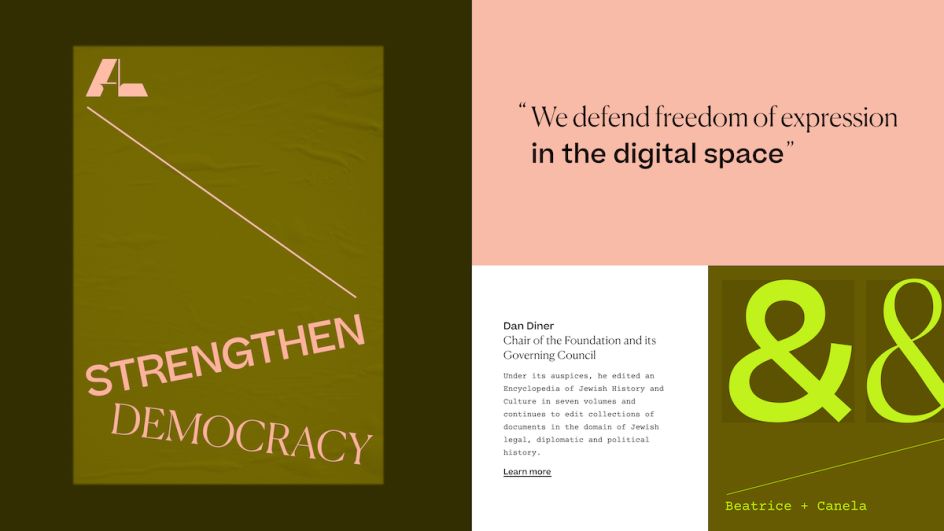
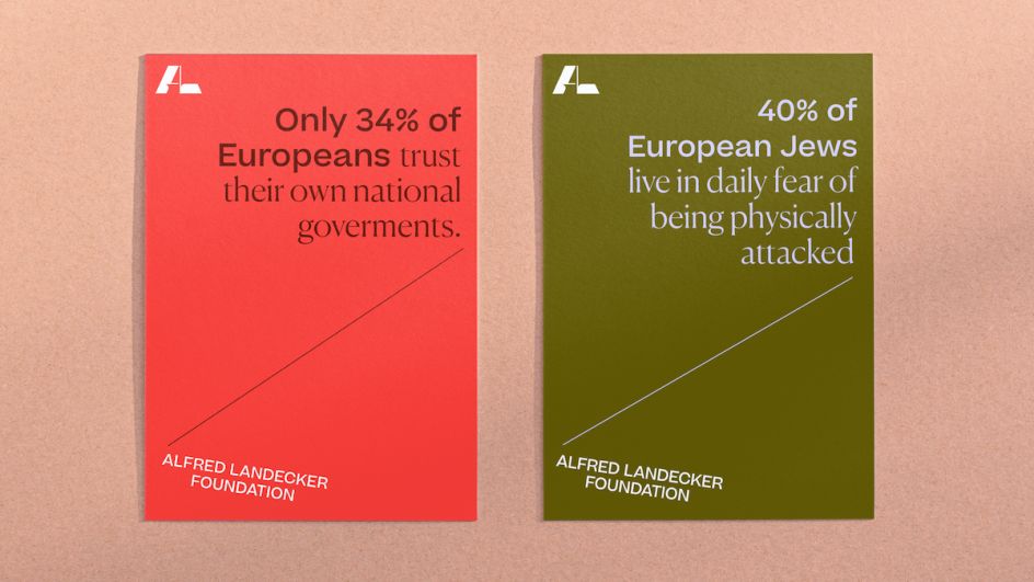
"Manifesto-like" topics that inherently demand action are used to focus the site's navigation and draw in readers, like 'Strengthen democracy' or 'Depolarise debates'. Topic types are colour coded to enable site users to connect them across the platform and easily follow particular themes.
"The new website and identity had to feel truly different to stand a chance at driving change," says Rob Coke, Studio Output founding partner.
"The project really typifies the kind of work we want to be doing: something meaningful and positive but presented in a relevant way which grabs attention."
Editor's Picks


Trending


](https://www.creativeboom.com/upload/articles/90/908fdb6378db1e95d12595416f54e6336d5e80b8_732.jpg)
Podcasts


Editor's Picks
Further Reading