Studio Bright Green reframes jewellery as 'eclectic works of art' in Spicer Warin rebrand
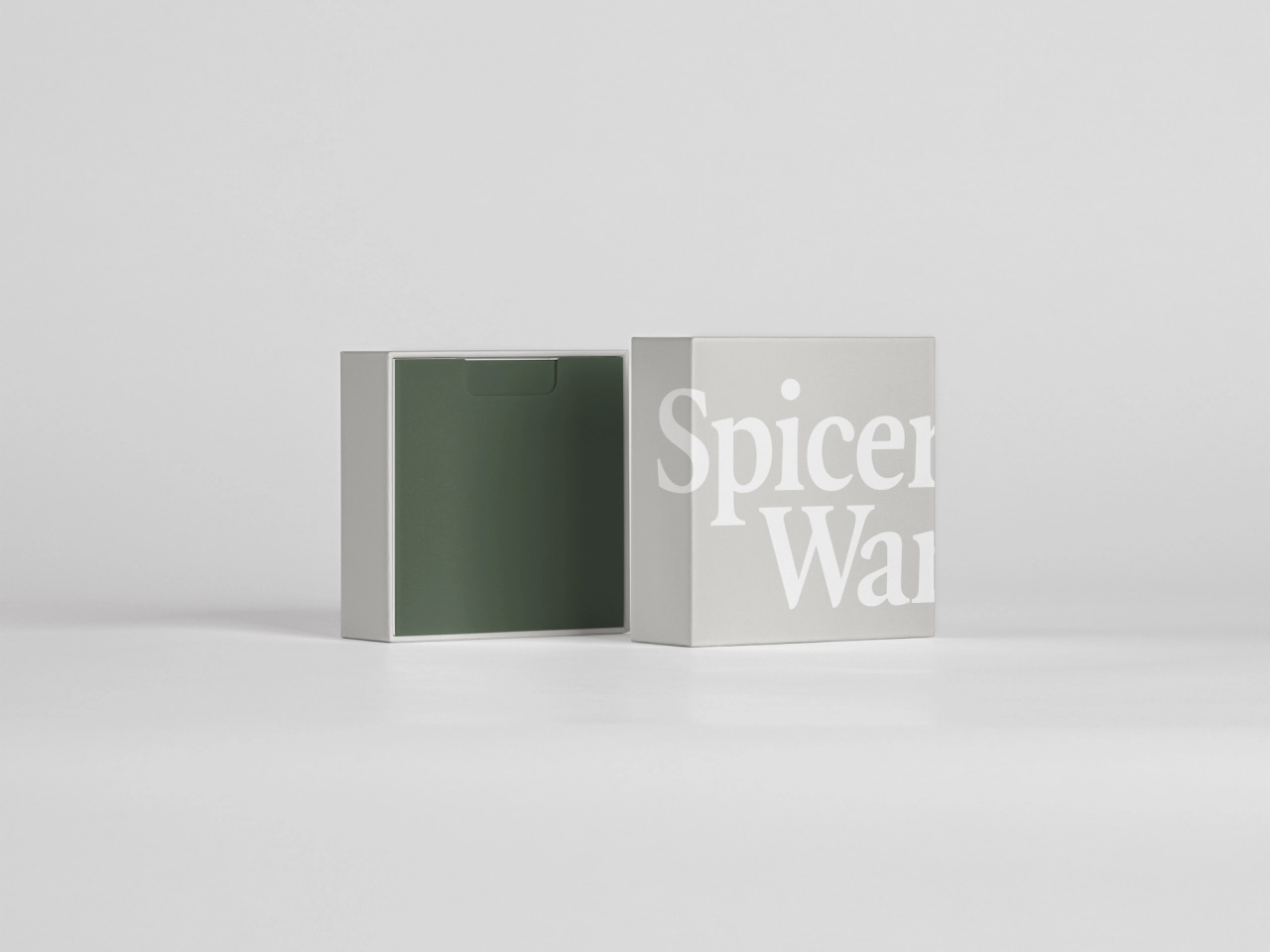
London-based Studio Bright Green has created a new brand identity for Spicer Warin, a British jewellery retailer specialising in fine jewellery, diamonds, gemstones and pearls from the 18th century to the present.

Spicer Warin's founder and director, Richard Spicer, has garnered decades of experience and global connections in his field. He has gained a reputation for his "restless determination to acquire fine jewellery and stones exclusively of the most superior quality and provenance," according to Studio Bright Green founder Deborah Green.
The problem was that while Spicer Warin had a loyal customer base, its ambition to expand the business into new territories and appeal to a younger generation meant that its branding needed a bit of a shakeup. "The new designs were developed to build a stronger and more contemporary identity with a focus on finding a balance of timeless and modern, a brand in which the magnificent diverse historical collection is as relevant today as when it was first conceived," says Green.
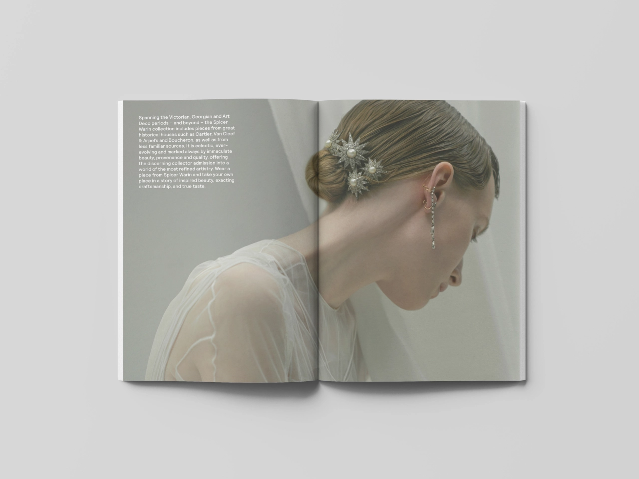
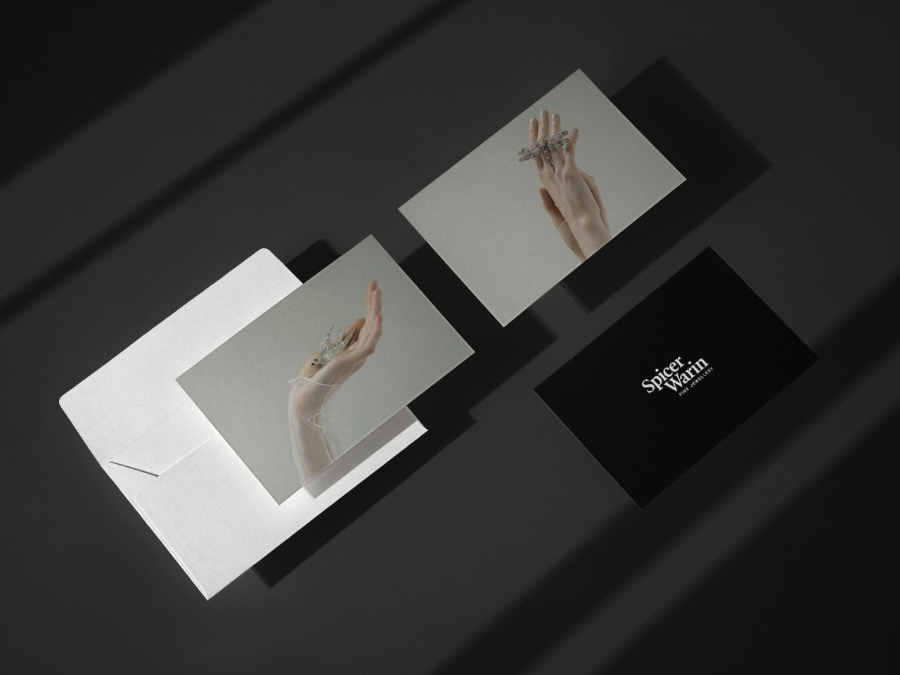
The identity looked to "capture the spirit in which the pieces were conceived – more than mere decorative jewellery, each piece is designed as an eclectic work of art," she continues.
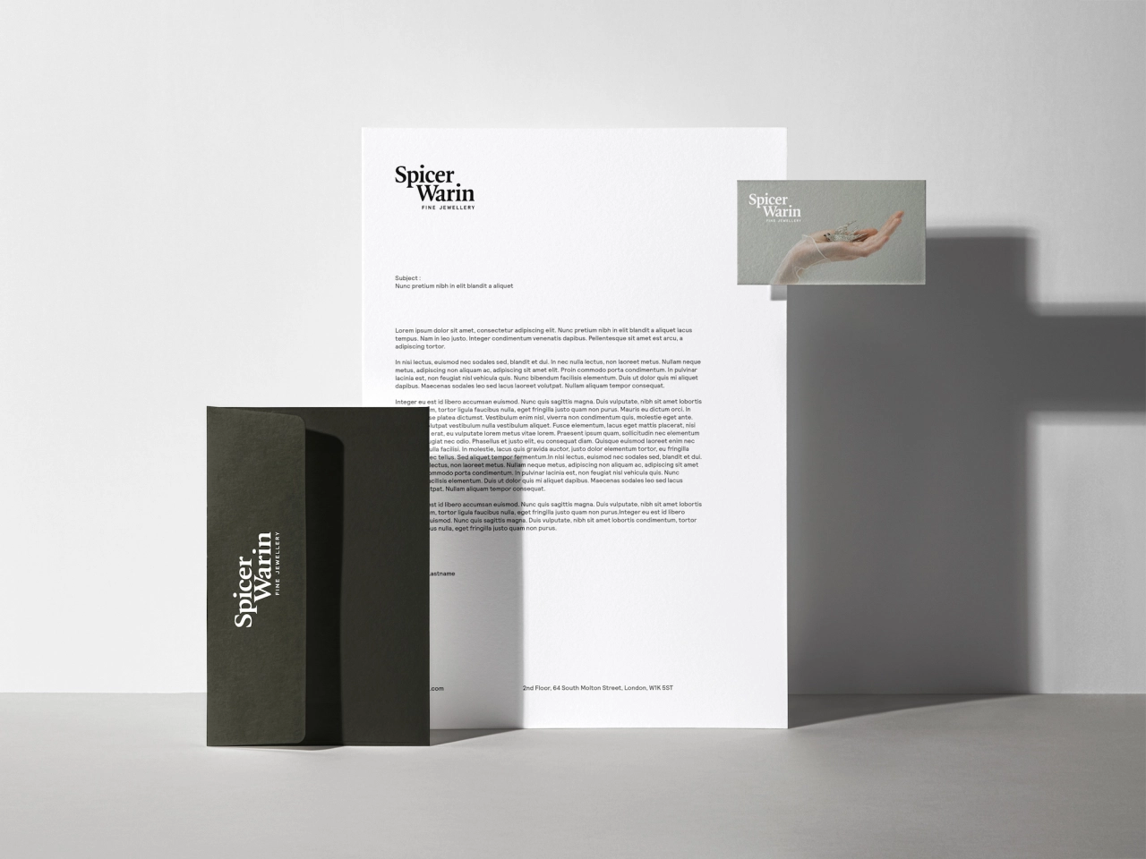
The new logotype and brand typeface use Quadraat, a high-contrast serif typeface designed by Fred Smeijers, who describes it as combining Renaissance elegance with contemporary ideas around form and construction.
It was chosen as the Spicer Warin brand font thanks to its classic, delicate feel; and is paired with UK foundry Colophon's geometric sans-serif Relative.
The identity is heavily centred on a suite of "ethereal" imagery that looks to "enhance the beauty" of Spicer Warin's jewellery and "transports us out of the everyday and into a place of mystery, contemplation and even enchantment," according to Green.
Independent, multi-disciplinary design studio Studio Bright Green has more than 20 years of experience specialising in brand identity, digital experiences, packaging, print and visual communications. Its clients include Innocent, Endemol, Tesco and not-for-profit organisation The Good Company People.
Editor's Picks





Trending






Latest Jobs
Frontend Developer at Northern Artillery
Full-time·Leeds·£35k–£45k
Senior Creative Lead at Random Studio
Full-time·Amsterdam / Paris·€90k-€110k
Agent & Producer at The Jacky Winter Group
Full-time·London·£35k–£40k
Art Director at SPOKE
Full-time·London·£55k-65k
Principal Software Engineer at BBC Media Tech
Full-time·Glasgow·Up to £83,790
Brand Copywriter at Origin
Full-time·Porthleven, Cornwall·£35k–£40k