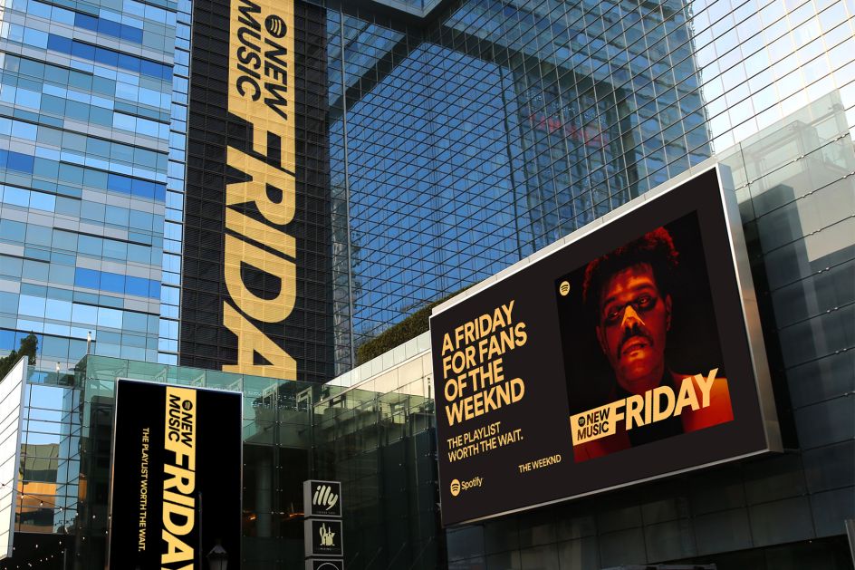
Spotify's new identity, branding and launch campaign for its New Music Friday
If you're a fan of Spotify, then you'll know Fridays hold a special place in your weekly routine. Now the start of the weekend is looking even fresher as the platform's New Music Friday debuts its global rebrand today.
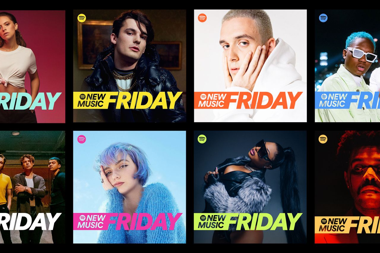
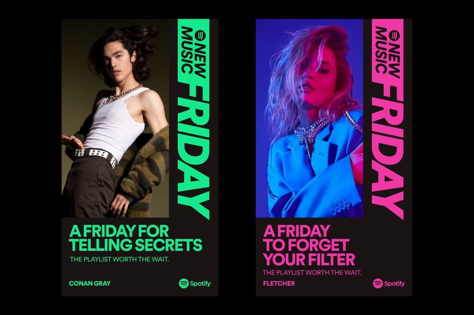
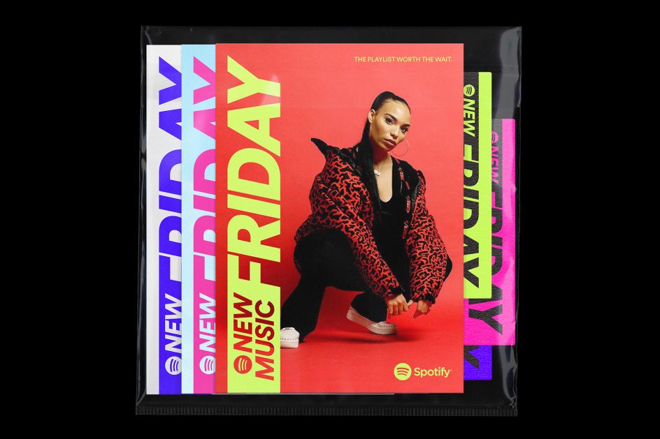
The celebrated playlist, which has 43 versions worldwide, has become a household name and is a one-stop-shop to discover new music – there are 8 million listeners globally. Its new identity builds on the same concept that "something new has just arrived", so says Spotify.
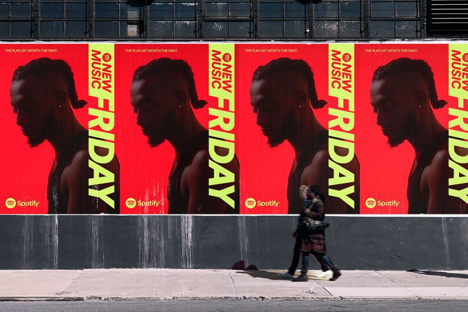
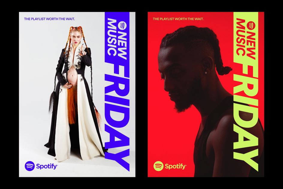
"We needed to be bold, fresh and vibrant. For these reasons, we went with the italicised version of Spotify Circular, but made our thickest font-weight, Black, even thicker – and added a tail to visually communicate speed," it says.
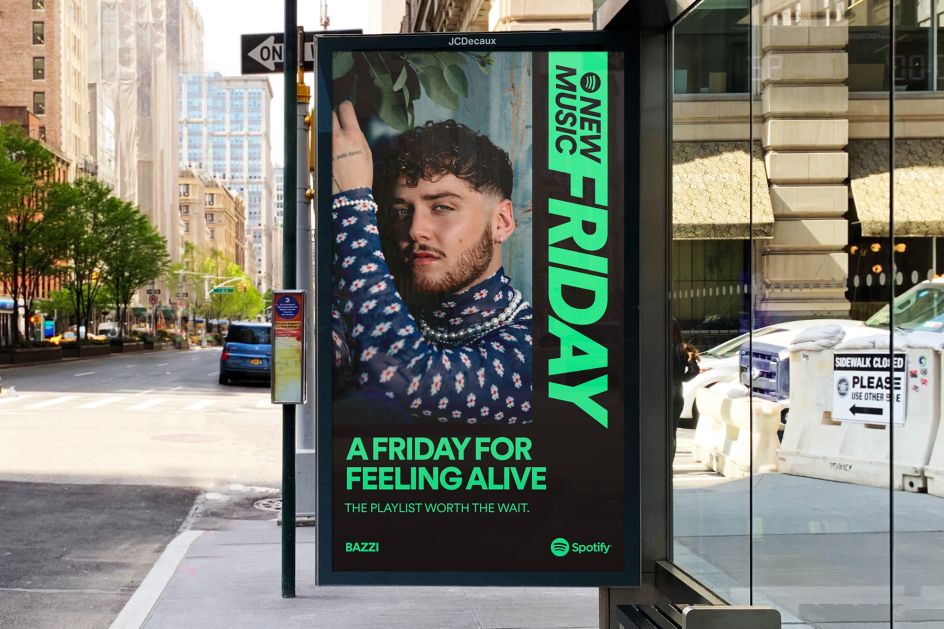
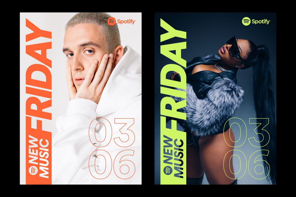
Spotify also wanted to create an identity that "allows for the artists' own styles and emotions to shine through with no treatment to their photos". And, in a similar fashion to how many culturally impactful editorial magazines create their covers: "We simply decided to work with our own brand palette to choose the best-suited accent for each cover," it adds. To accommodate for a wide variety of artist-provided images, Spotify made simplified colour palettes offering playlist editors 15 options to pick from.
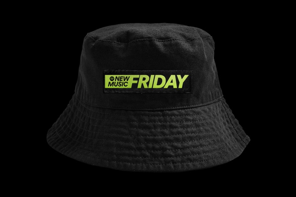
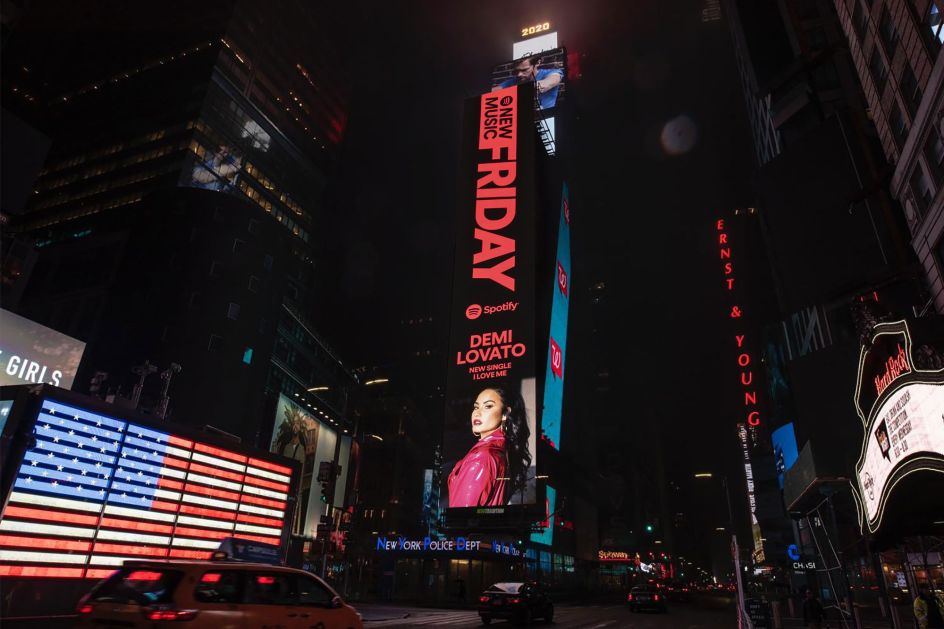
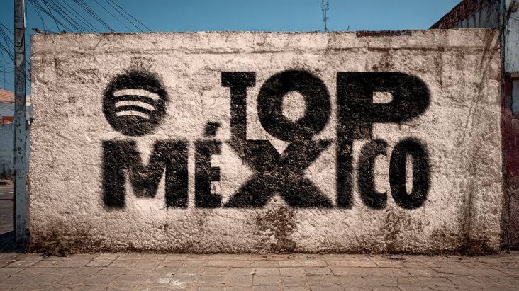
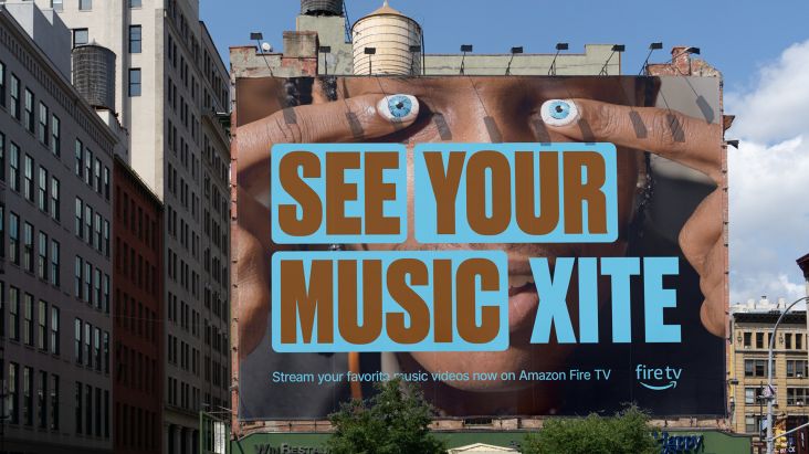
The marketing for New Music Friday, meanwhile, "truly happens in all channels", so Spotify has created layouts that function well in OOH, social, artist-generated social, and on its own platform. The launch campaign included placements around New York City, Los Angeles and Toronto.
"We developed a motion language that works both as an intro animation and transitions between content. It's supposed to give a quick glimpse of what you're about to see, but most of all, set up the stage for what has just arrived," Spotify adds.