SMAKK crafts quirky branding for Vikre, an organic Minnesota distillery
If your eccentric grandma was a hip spirits brand, she might look a little like this. We profile SMAKK's new identity for Minnesota distillery Vikre.
The spirits industry is ever-keen to experiment with new tactics for standing out on the shelf. And here's a fun example from US craft distillery brand Vikre. They've teamed up with New York creative agency SMAKK to deliver a touch of absurdity and a piece of their hometown of Duluth, Minnesota – a place known for its natural beauty and quirky people – to every customer.
Vikre was founded by Emily and Joel Vikre, a husband and wife team whose approach to spirits champions a triple bottom line: people, planet, and prosperity. The company is known for developing a certified organic, zero-waste process, building bottle reuse and giveback programs, and sourcing ingredients locally, including wild botanicals, grains and water from the Lake Superior watershed.
SMAKK, meanwhile, is one of the biggest names in wellness marketing, design and branding, having worked with and helped launch many buzzworthy brands, including dog wellness brand FLOOF, traditional Chinese Medicine supplement brand NOOCI, sexual wellness standout Wild Flower and sustainable wipes innovator Busy Co.
To build Vikre's brand, website and packaging, SMAKK used hints of surrealism to build a world that reflects its vibrant Duluth community and Nordic heritage. Its eclectic, values-based approach is designed to appeal to younger consumers interested in sustainability, health and well-being.
Brief and storytelling
Vikre wanted to rethink its brand to embrace its natural quirks. As they looked to expand from hometown hero to industry standout, they knew they needed to communicate their singular qualities more clearly.
"Vikre needed deeper brand storytelling that would act as a springboard for more national distribution, brand name awareness and a cult following," explains SMAKK founder Katie Klencheski. "We really wanted their brand to reflect their story, personality and, most importantly, a sense of place.
"These are people dedicated to doing things the right way," she continues. "Not just the easy way, across all aspects of the brand — from sourcing to sustainability to their dedication to their employees and the experience they give their customers, both in their tasting room and out in the wild. All of that needed to take centre stage."
SMAKK also saw a growing trend in the spirits industry. "People, especially younger generations, are really focused on moderation and making intentional choices towards greater health and well-being," explains Klencheski.
It meant it was essential to showcase the unique botanical ingredients and flavour profiles that make Vikre's spirits different, interesting, and something customers want to share with others.
SMAKK proceeded to create strategy, brand development (including new identity and messaging), as well as packaging and website redesign for Vikre. In the process, they incorporated hints of surrealism to build a world of Vikre that reflects the vibrant Duluth community and its Nordic heritage.
Graphics and packaging
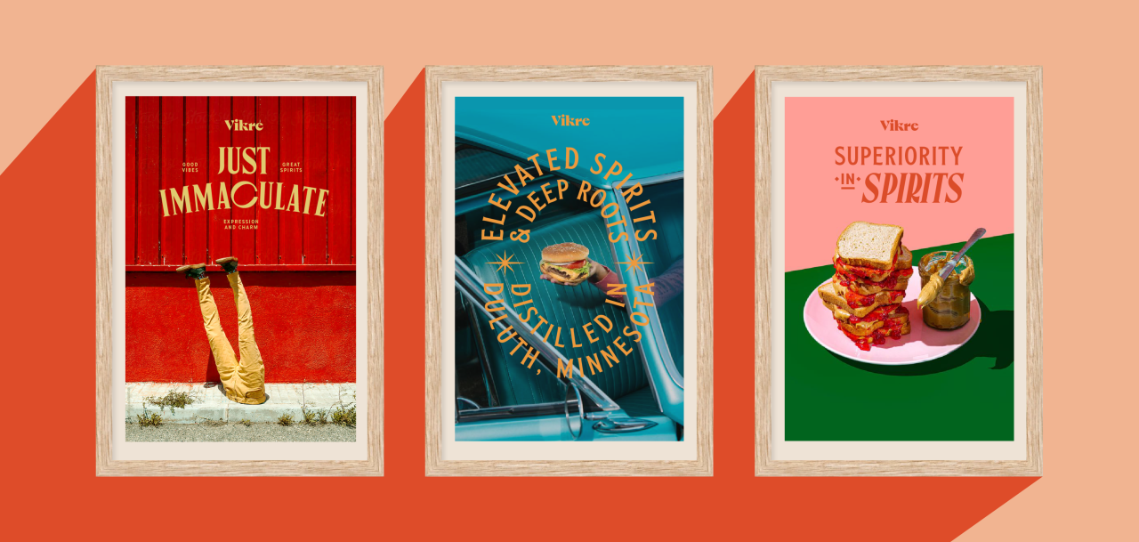
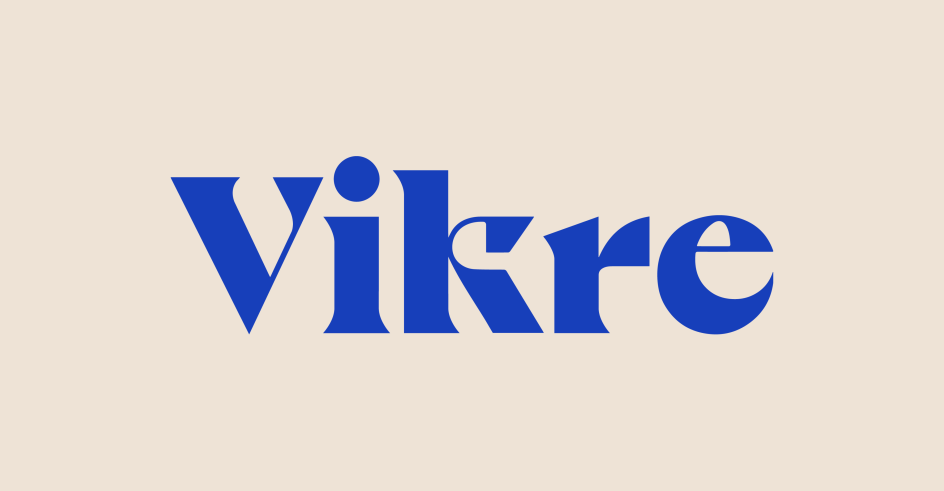
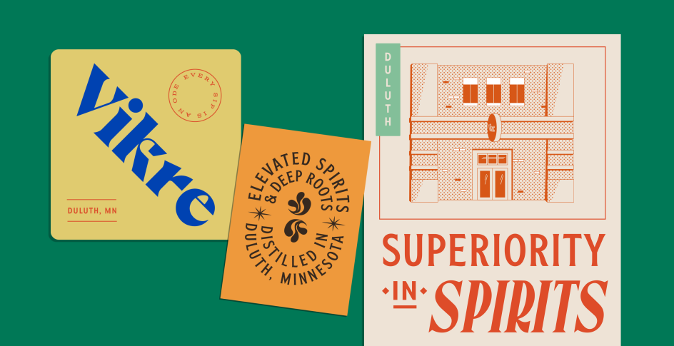
From the logo to iconography to the retro-inspired suite of graphics, the identity is rich with charm and eccentricity.
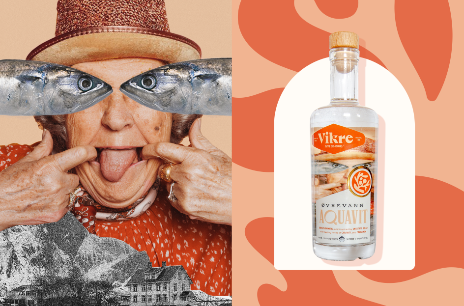
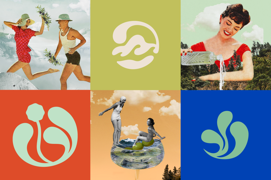
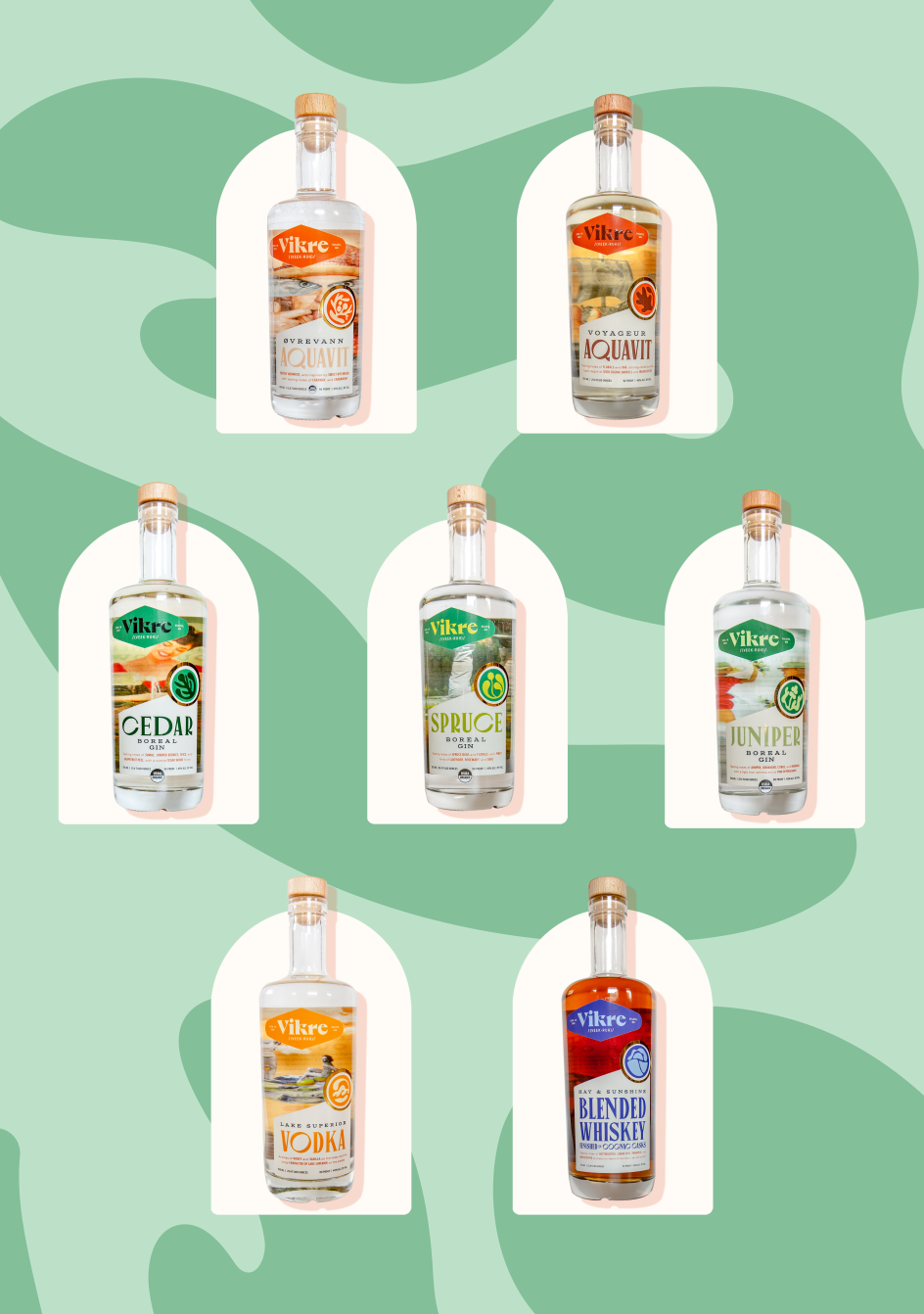
Collaged imagery referencing local places (such as Minnesota's Temperance River), characters (including a wild Norwegian grandmother) and ingredients (such as pine and juniper berry), the identity represents Duluth and Vikre's distilling practices while also building a strong narrative.
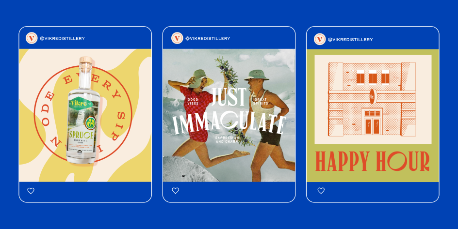
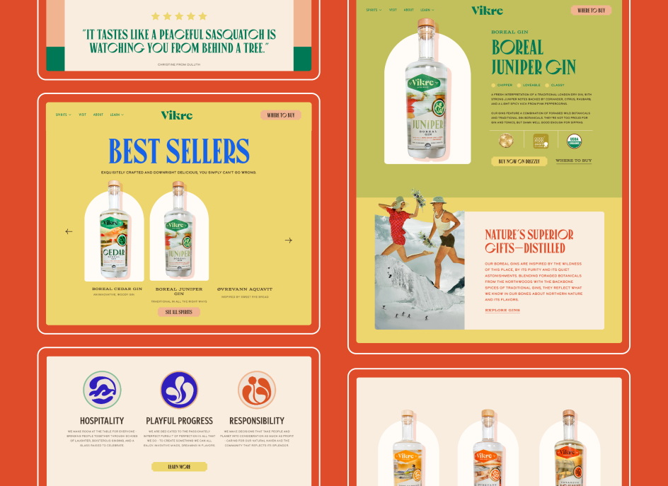
This approach extends to the bottle packaging. Each flavour takes on its own unique persona, perfect for standing out on the shelf with a clarity of message and a clear hierarchy of information.
Like a modern take on Norwegian "hygge" – a cosy, warm nature of a space that feels intimate – Vikre's new brand embodies the idea of cheerful gatherings, hosting parties and providing drinks as an act of kindness shared between family and friends. It also demonstrates how a celebration of place can be a means to better tasting, higher quality and clean products.
"From the beginning, we fell in love with the vivid picture that Emily and Joel created of Duluth as a uniquely quirky and eclectic natural haven," says Katie. "Now, with its new branding, Vikre can embrace the vibrant community, eccentricities and values that are key to the foundation of its brand ethos.
"People are looking for meaning, purpose and connection now more than ever, and we're proud to partner with a spirits brand delivering that more."
Editor's Picks


Trending


Podcasts


Editor's Picks
Further Reading