Singpore studio Do Not Design's clean, striking graphic identity for a university architecture department
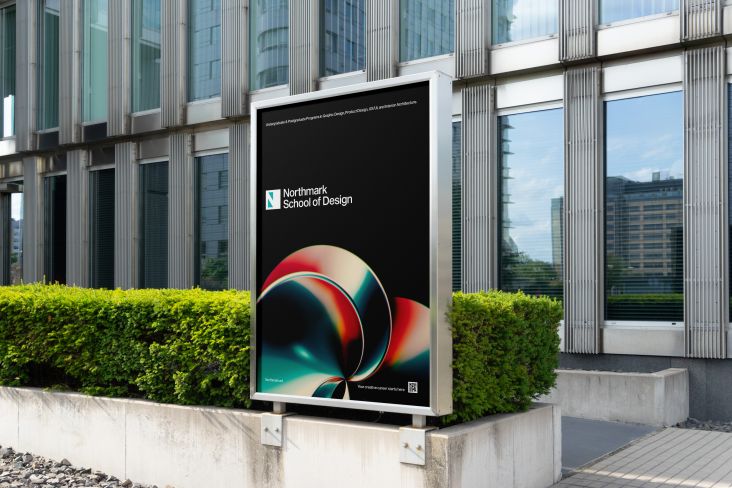
Some lovely new work here from Singaporean studio Do Not Design, which has created a striking yet understated new graphic identity for the National University of Singapore’s Department of Architecture.
According to the agency, the new look aims to “reflect the research-intensive school’s creativity and modular organisation, enthusiasm as well as its mission of ‘Nurturing creative global designers and critical thinkers for the built environment to shape Asia’s future and the world.’”
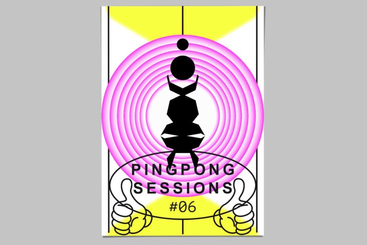
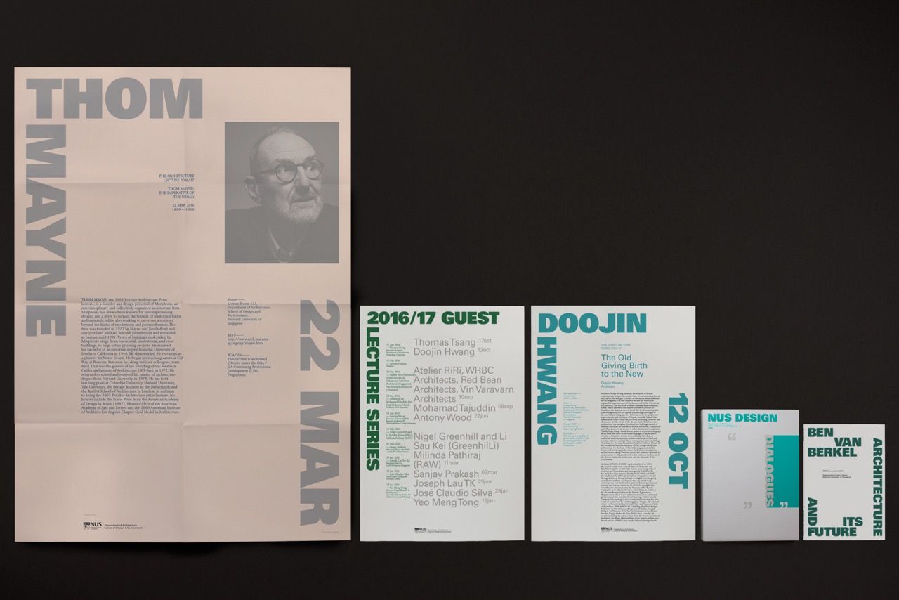
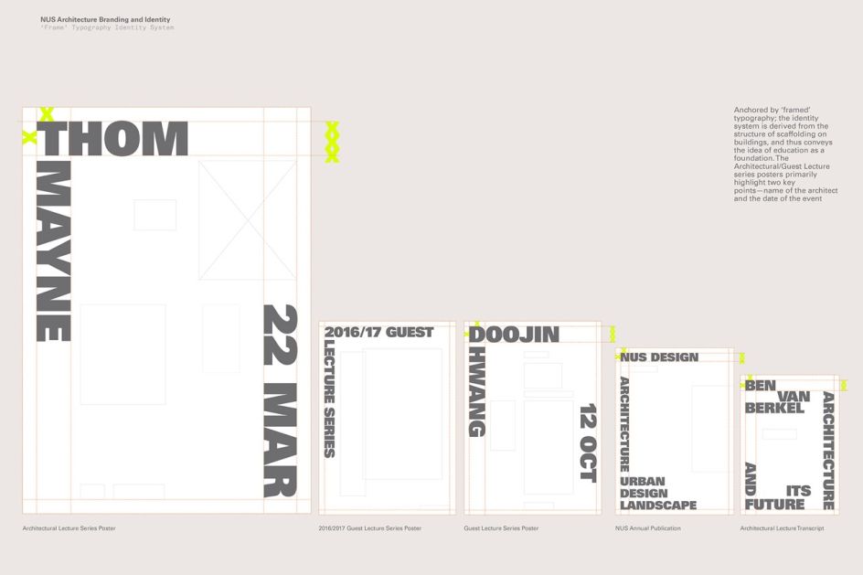
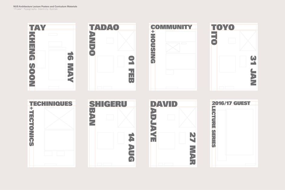
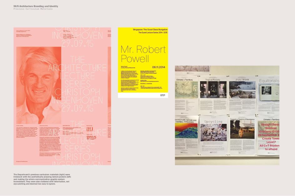
Do Not Design worked to make the curriculum materials’ designs less cluttered, and pare them back to a simpler, more eye-catching design. Alongside redesigning these materials, the agency also worked across curriculum posters, studio thesis posters, event materials, yearbooks and other touchpoints.
At the heart of the identity system is “framed” typography, inform by the structure of scaffolding on buildings to “convey the idea of education as a foundation.” Adrian Frutiger’s neo-Grotesque face Univers is used as the main typeface, while the colour palette was chosen as a point of differentiation from the school’s main red and blue palette and the buildings’ yellow and grey facades.
Editor's Picks


Trending


](https://www.creativeboom.com/upload/articles/90/908fdb6378db1e95d12595416f54e6336d5e80b8_732.jpg)
Podcasts


Editor's Picks
Further Reading