Secret societies inspire Ragged Edge's identity for a 'sharing is caring' startup
We're potentially entering into an age of collaboration where businesses help each other to flourish, rather than keep their practices secretive out of fear of losing work. That's a growing appetite spotted by Paris-based startup, Reveal, that believes those who work together, do better individually. It's why for its rebrand, Ragged Edge looked to secret societies for its inspiration.
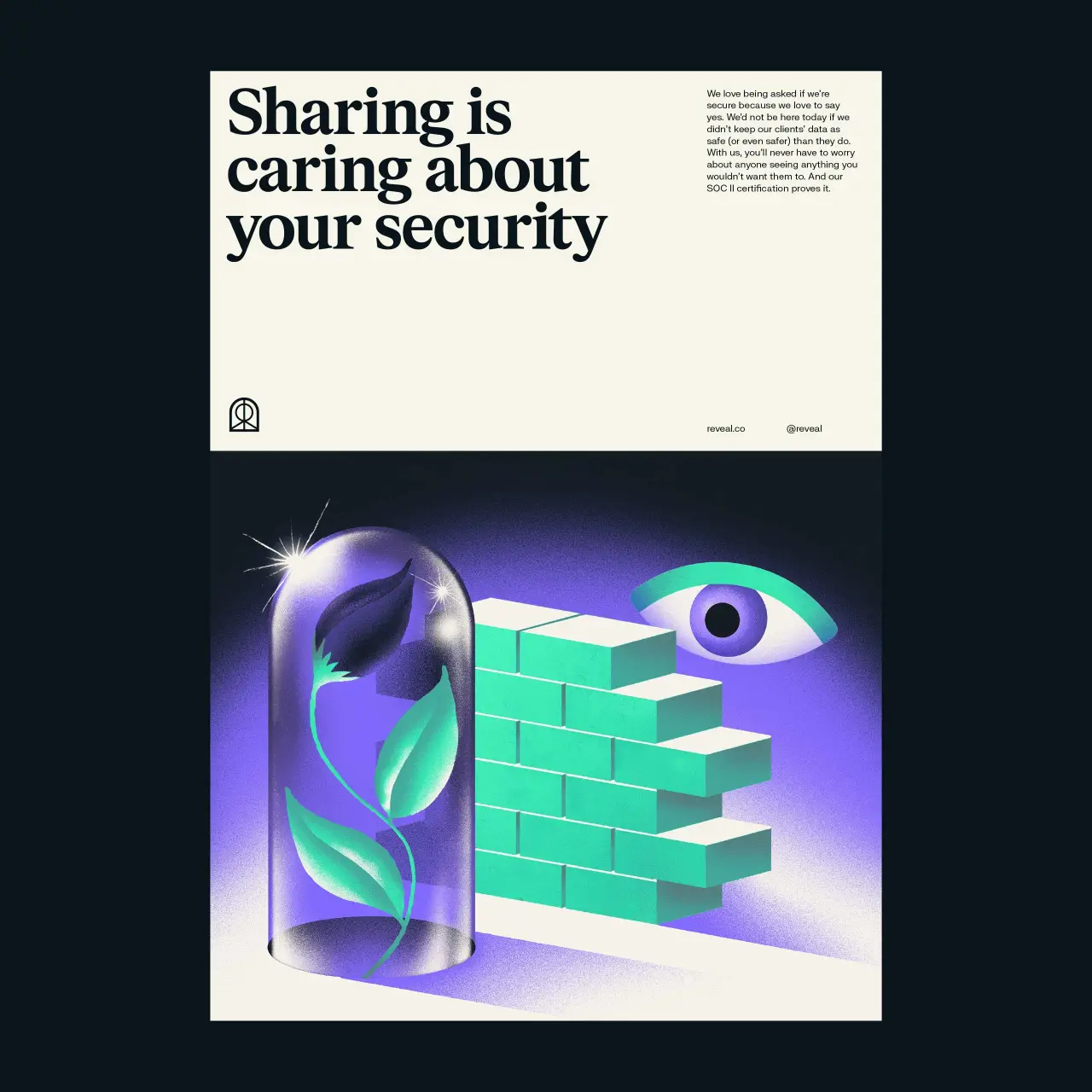
The London agency was approached by the software platform (formerly known as Sharework) to create an identity that stood as a "beacon for a new philosophy of business". The rebrand imagines a world where business happens behind open, not closed doors. So in this case, the not-so-secret society.
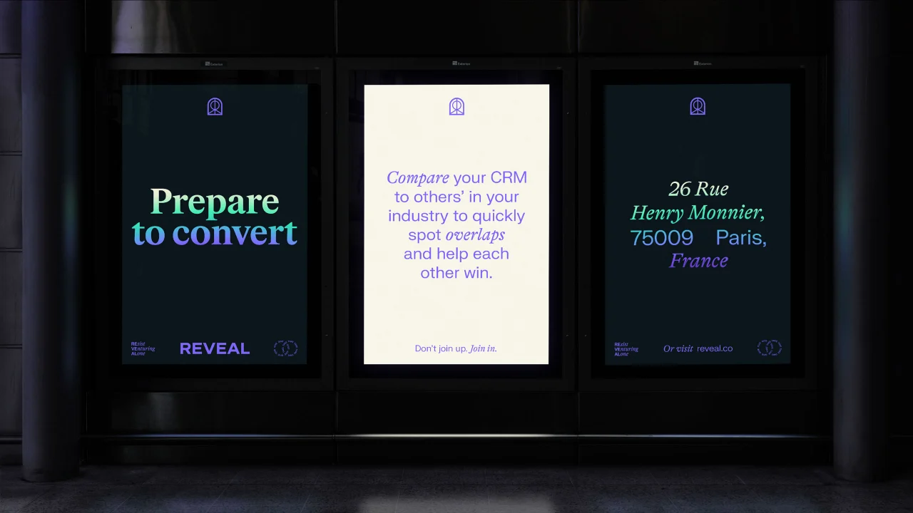
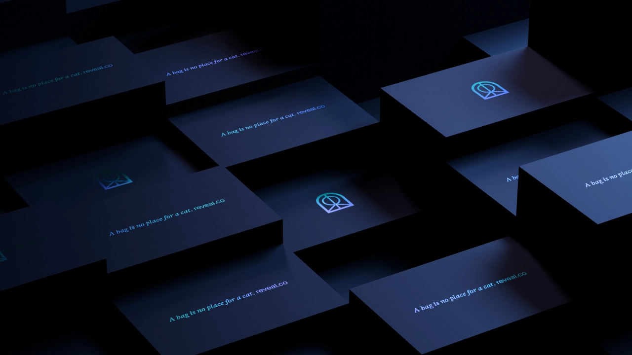
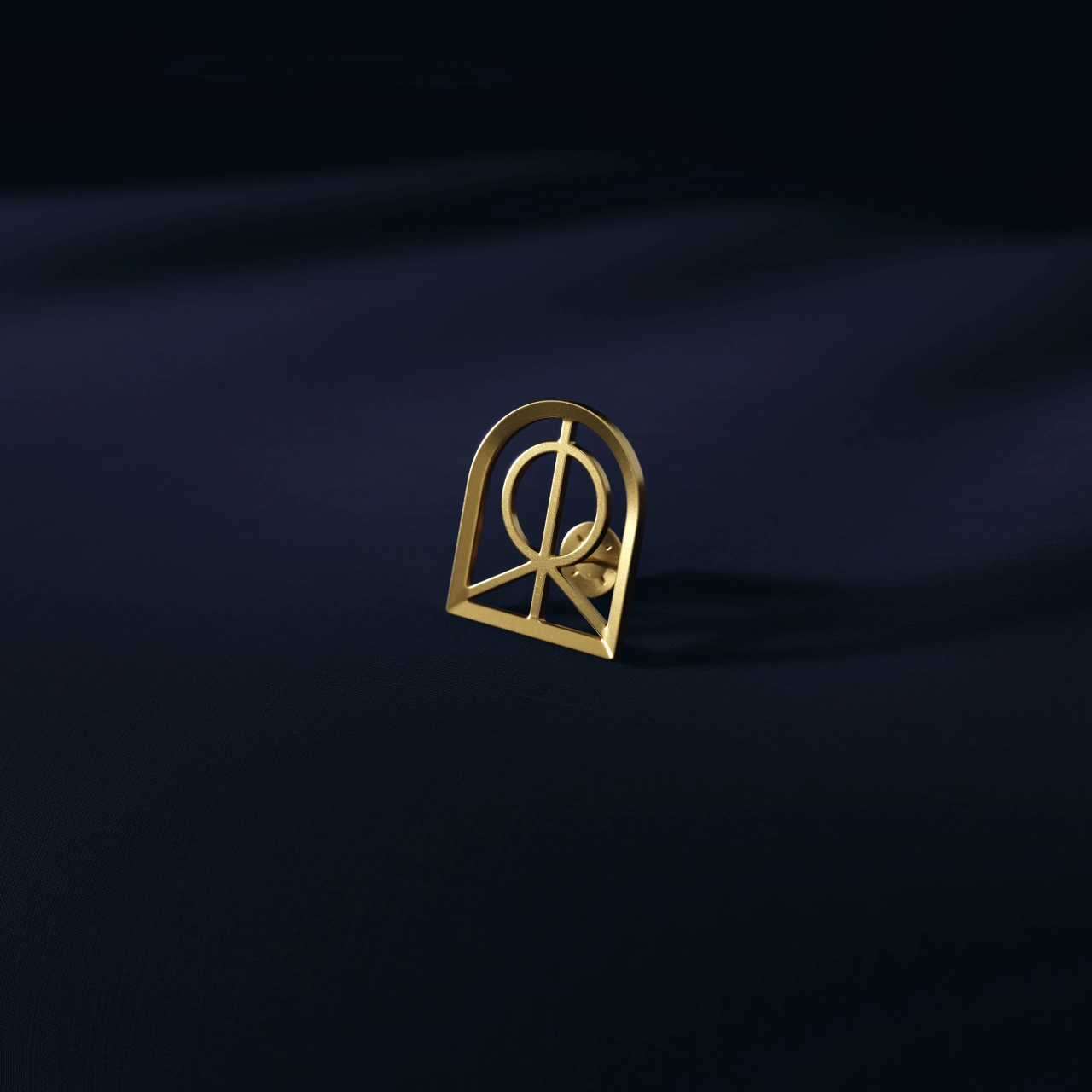
Ragged Edge went all Illuminati in the new look and feel with a logo that features an arched shape, almost like a doorway to a secret room, adding an extra layer of intrigue. There's a dash of codebreaking in the typography, too. And the dark colour palette of purples and greens adds mystery while brand photography features a backdrop of velvet curtains and dark moody spaces.
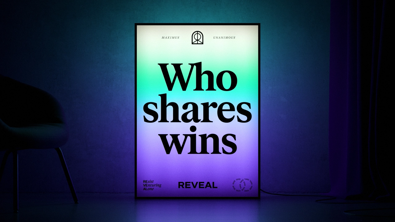
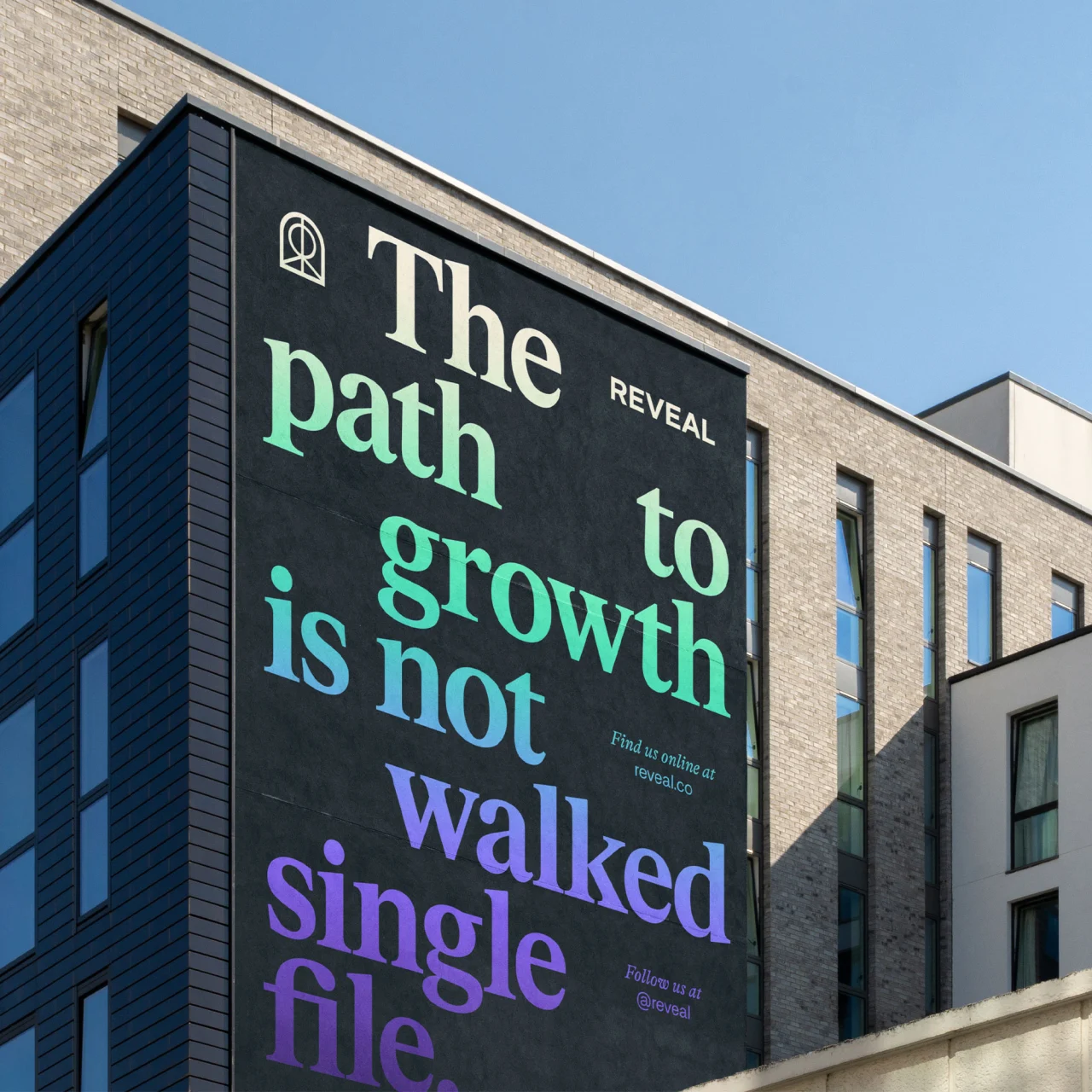
Accompanying illustrations by Itamar Makover point to further mysterious elements, such as the universe, alien landscapes and almost VR worlds. Featured typefaces include FK Grotesk Neue and FK Roman Standard by Florian Karsten Studio, giving the brand finesse. GT Alpina in italics keeps a nice balance.
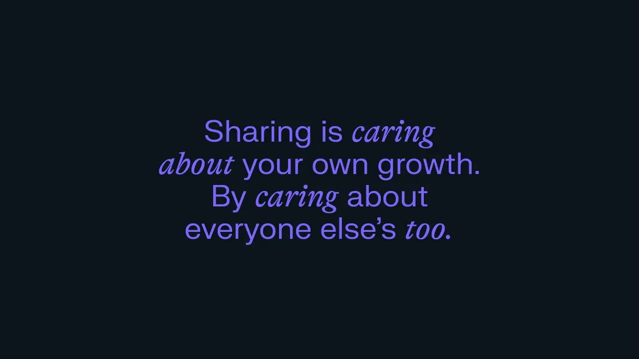
Brand language plays on the notion that business no longer happens "behind closed doors" – we love the simple yet impactful statements like 'Unite and Conquer' and 'Mum's a Word, Not The Word'. Heck, they've even transformed the arched logo into a pin badge (secret society style), along with appealing t-shirts and canvas bags that could almost glow in the dark.
How does it work? Reveal is a software platform that lets companies all over the world easily and securely compare their client intelligence, spot opportunities for collaborative growth, and work together to win bigger deals. Members share richer qualitative data, which leads to more meaningful connections, and greater business growth.
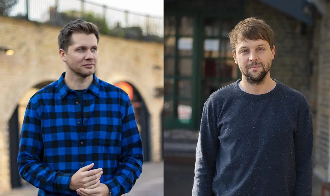
It's a game-changer, for sure. So how do you convince companies to let go? "To change the way people do business, Reveal needed to fundamentally change how people think about business. From secrecy as second nature, to who shares wins," says Max Ottignon, co-founder at Ragged Edge.
"That's a big shift, so it needed a brave idea. The not-so-secret society flips the conventions of secret society language and iconography on their heads, reimagining them as a beacon of collaboration and transparency. The result? A B2B brand that’s a long way from B2Business as usual. From a tone of voice with actual tone, to a visual identity that stays just this side of weird. Secrecy’s out, sharing’s in and everyone wins."


Editor's Picks





Trending






Latest Jobs
Art Director at SPOKE
Full-time·London·£55k-65k
Senior Brand Designer at Analogue
Full-time·Leeds·£38k-£45k
Account Manager at Moxie and Mettle
Full-time·Cheltenham·Up to £35k
Brand Designer at Adfin
Full-time·London·£30k–£50k
Brand Designer, Product Launches at Figma
Full-time·New York·$127k–$269k
Creative Project Manager at Analogue
Full-time·Leeds·£28k–£35k