Robot Food gives hot sauce brand a surprising sense of sophistication
Food packaging design is a tricky beast. Get it wrong, and you'll get laughed at. Get it right, and most people won't notice. Yes, the best design is invisible and all that... but sometimes it's nice to get praise for your fine creation.
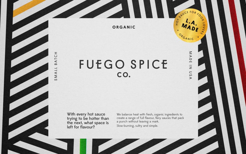
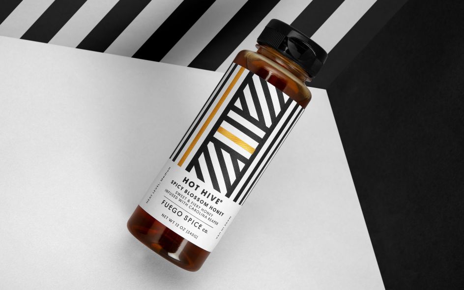
So let us do the honours, and pay tribute to the superlative work that Leeds brand design agency Robot Food has done in service of Fuego Spice Co.
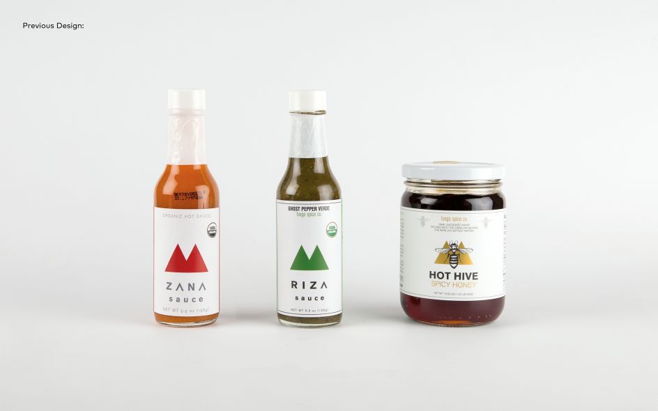
This California based client had long been enabling fans of fiery palettes to share their love of hot sauce through a subscription service, Fuego Box. Eventually, though, they decided to create their own range. But the packaging design lacked impact, and so they asked Robot Food to reimagine this new brand to help elevate it above rivals.
They did so, not by doubling down on market cliches but breaking away from them.
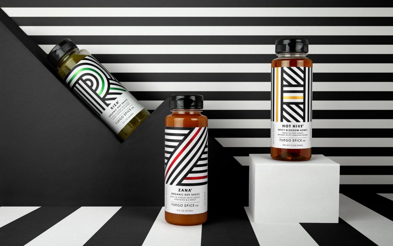
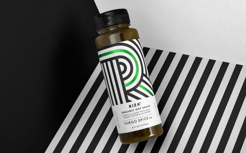
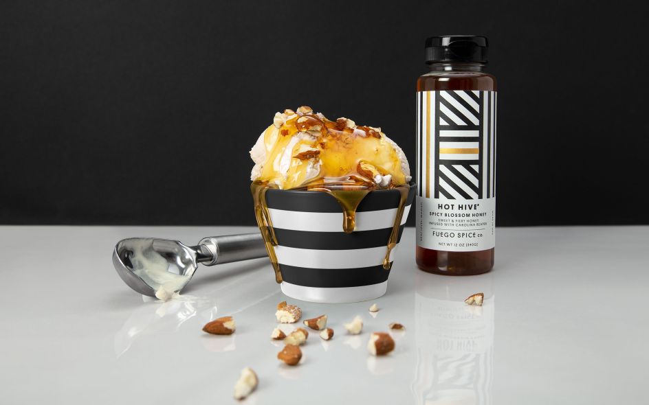
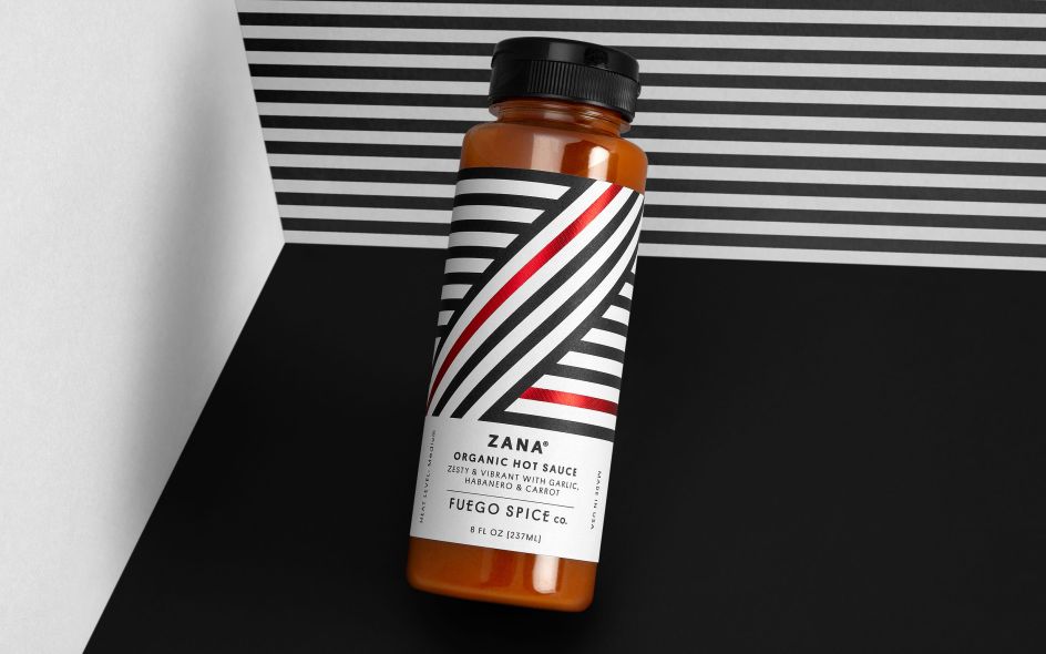
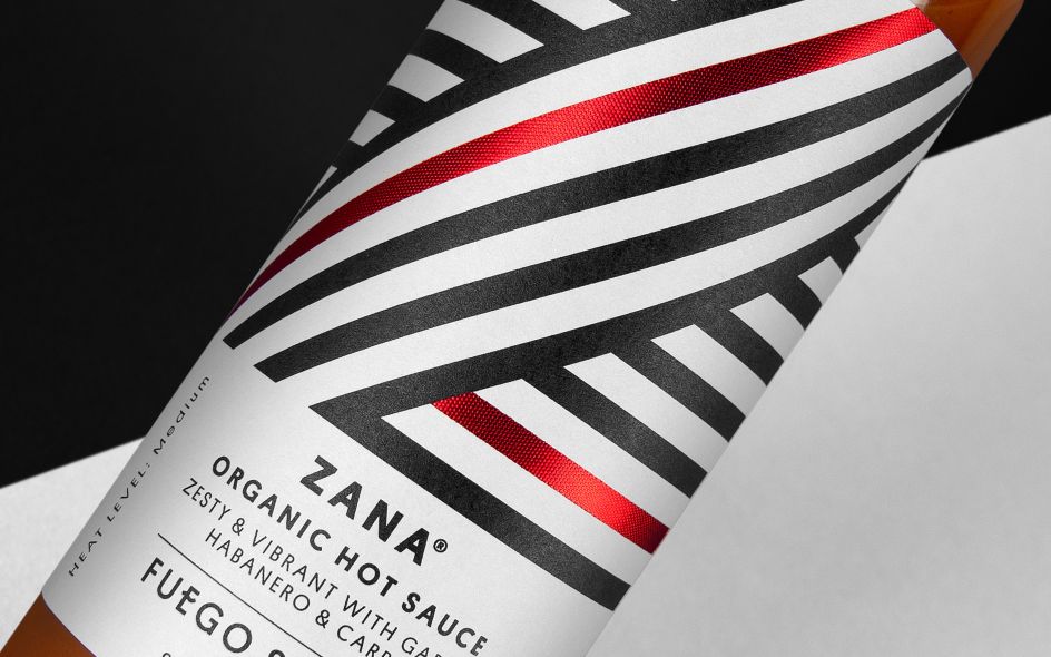
“Fuego stressed that these sauces aren’t scrambling for the top spot on the heat scale," explained Chris Shuttleworth, senior designer at the studio. "The range focuses on flavour over fire, so the design needed to move away from the gimmicky style of the category. We decided to look outside of hot sauce at more premium lifestyle products to pull some unexpected sophistication, in a category where novelty normally rules.”
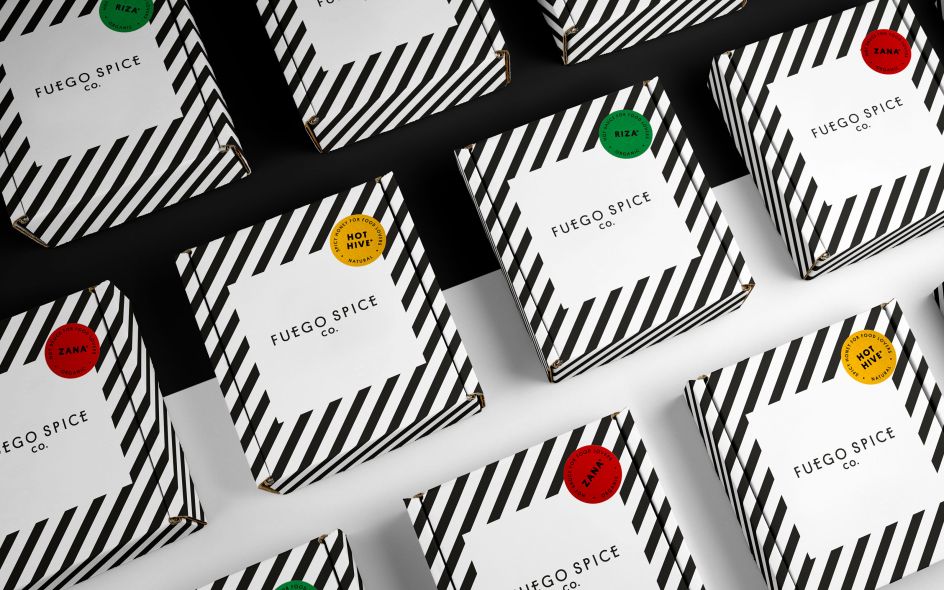
To establish Fuego’s hot sauces as a legitimate premium option, Robot Design harnessed bold, abstract lettering to identify each sauce, along with metallic foils, which are set off by a matte white background. The studio also initiated more of a visual hierarchy, giving prominence to the master brand and filtering the information down to flavour profiles. Expect to find the product appearing on Fuego Spice Co website's and in their subscription boxes soon.
Editor's Picks


Trending


](https://www.creativeboom.com/upload/articles/90/908fdb6378db1e95d12595416f54e6336d5e80b8_732.jpg)


Podcasts


Editor's Picks
Further Reading