Ragged Edge unveils superhero-themed brand identity for Wind
Wind, an e-scooter sharing company, has unveiled a new superhero-themed brand identity as it enters a significant period of growth.
Via Creative Boom submission. All images courtesy of Ragged Edge.
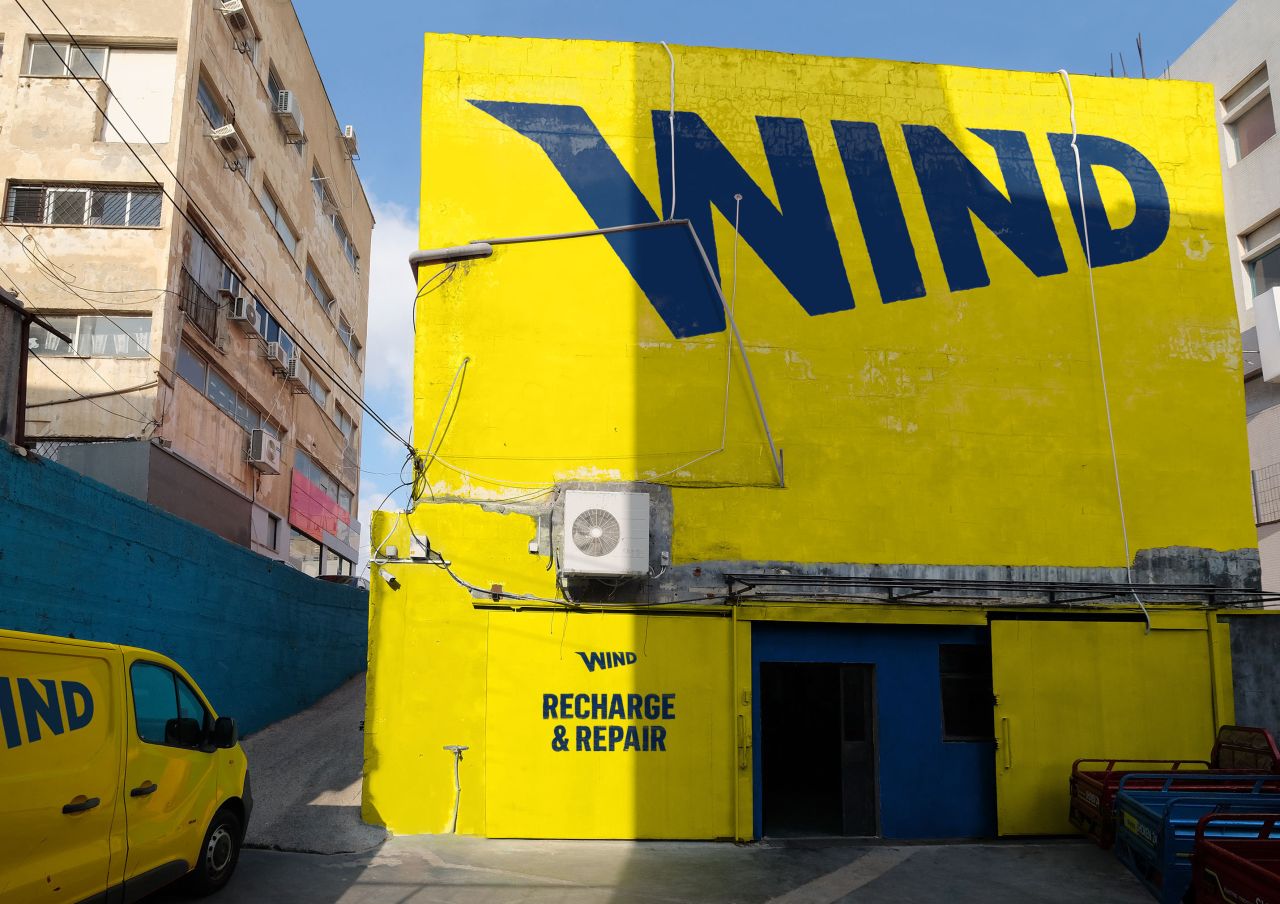
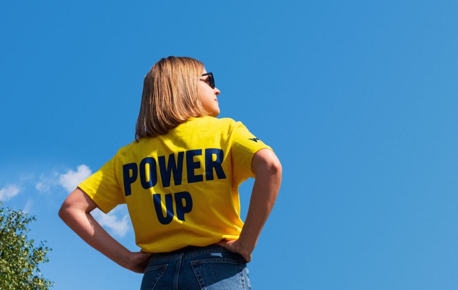
Following a $50million investment round, Wind worked with Ragged Edge to redefine its brand. Positioning Wind e-scooters as a secret superpower, the London agency created a vibrant new visual and verbal identity to cut through the rapidly growing category.
And just as every superhero has its arch-nemesis, Wind has identified travel misery as the 'villain' it seeks to defeat. Ed Schmidt, the EMEA CEO, explains: "In discussions with Ragged Edge, we hit on the idea of turning every mundane travel moment into one of happiness and joy. The commute is the worst of these – a journey that most people dread. Our mission is to turn that on its head and to allow our e-scooters to make that journey to work, or wherever you’re going, something to look forward to."
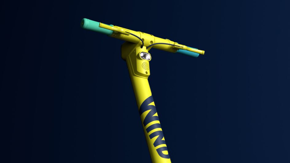
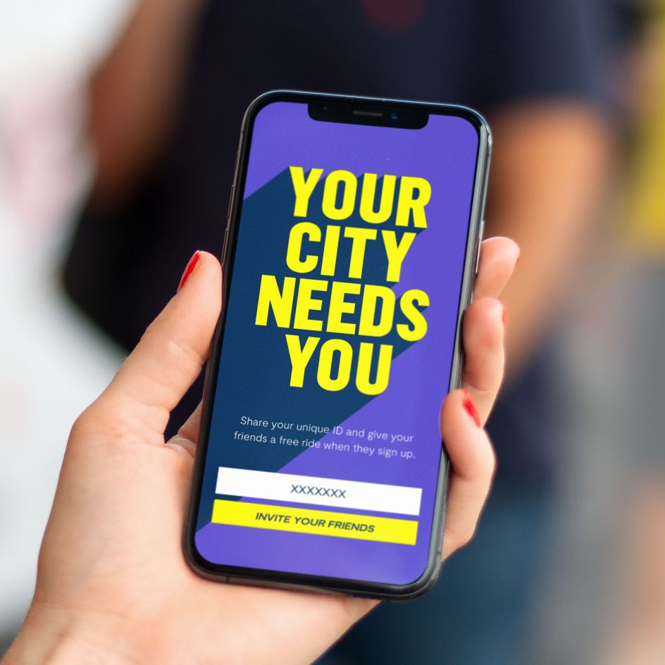
Wind’s new look and feel is evocative of the comics of the past and aims to empower its customers to be the ‘everyday hero’ of their city. The bold new look also matches Wind’s recently-launched hardware — an in-house designed scooter that was crafted specifically for the sharing market.
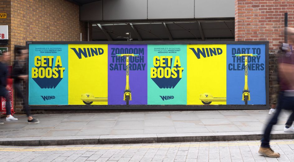
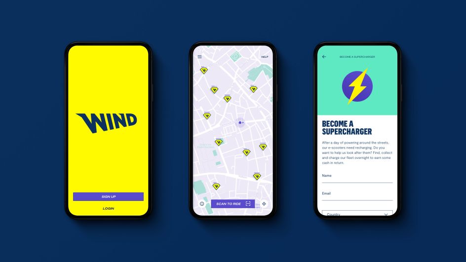
Max Ottignon, a co-founder of Ragged Edge, says: "In a race for market share, the e-scooter category has commoditised itself. Most of the competitor brands are pretty functional and generic. That felt like a big opportunity to stand out with something bold.
"Getting around cities is often a miserable experience. But scooting is exhilarating and fun. So we built a brand around joy. By reframing Wind e-scooters as a secret superpower, we turned users into superheroes, and everyday travel into sheer happiness."
Matt Turzo adds: "Our new branding truly reflects the vision we’ve always had for Wind to transform the ordinary and set ourselves apart from other companies. This rebrand comes at a crucial stage for our business, alongside a significant round of investment, and will play an exciting role in our future expansion."
Wind has operations throughout Europe and Asia and employs over 120 people worldwide, including at its R&D centre in China. The company offers its services in 20+ cities across the globe including operations in Germany, France, Spain, Israel, Austria, Portugal, Demark, Korea and Japan.

Editor's Picks


Trending



Podcasts
Editor's Picks
Further Reading