Principal studio designs a psychedelic identity for organic online shopping brand Fergus
Bryan-K. Lamonde, one of five founding members behind the studio, talks us through the inspirations behind the project – which pulls reference to Swiss graphic design from the '60s and '70s.
"There's so much to say about our creative process," says Bryan-K. Lamonde, one of five founding members of Montreal-based studio Principal, which also includes Bruno Cloutier, Mathieur Cournoyer, François Morin and Patrick Pellerin.
"Everyone is involved from different angles, depending on the project." While tackling a brief, for instance, there are three key phases the team uses to drive their practice. The first is the strategy, the second is what they refer to as "the jam", and the final phase is the preliminary design. "The magic happens when we are jamming," adds Bryan-K., "that is when we see the project starting to emerge."
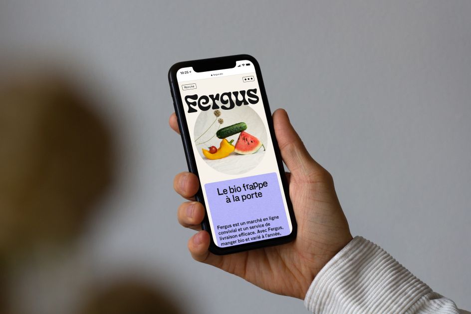
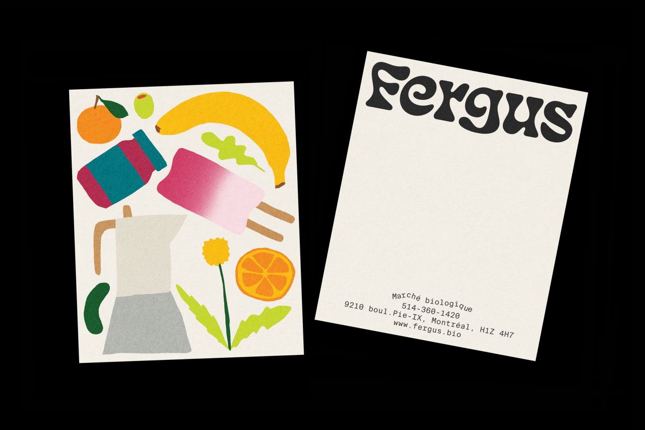
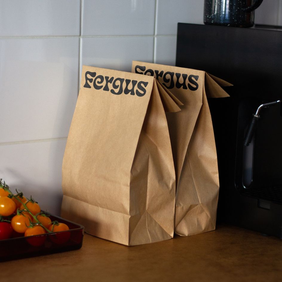
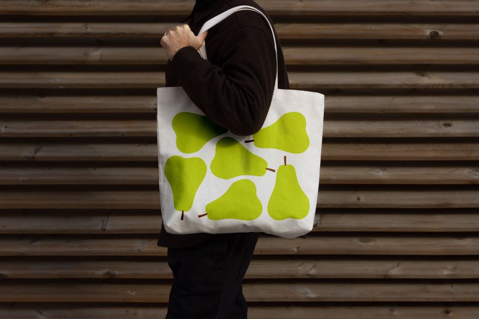
Most recently, the studio has designed the identity for Fergus, an organic online shopping brand. The latest project to come from the team, Bryan-K. explains how Le garden des Anges (Garden of Angels) were seeking a new direction for the brand, and as such, wanted to deliver a fresh name and visual identity. "The organic delivery company was in bad shape before the pandemic and wants to breathe new life into it," he says. "Our goal was for Fergus to stand out in the homogenous market that is organic online shopping and to translate the pleasure of eating into a sustainable and unifying language with a touch of magic."
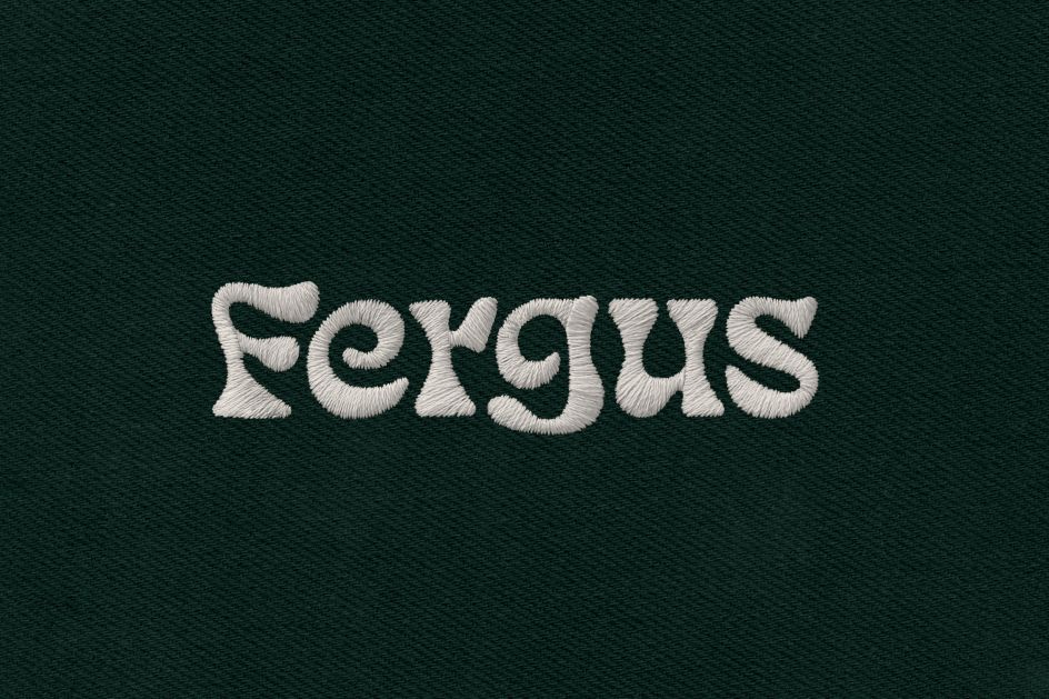
The result of which sees a bold and psychedelic bespoke logo serve as the central focus to the identity, which was drawn specifically for the brand. Based on James T. Edmondson's Eckmannpsych typeface, the font has been altered slightly – it's chunkier and thicker than the original – and characteristically infused with colour. The font reflects "magic of agriculture", adds Bryan-K., specifically the ways in which plants grow and evolve, which is mirrored in the bubbly curvature. The addition of colourful illustrations adds to these reference points, which are used to "support this flourishing and playful side of the brand." As for the headings and running text, the team opted for the Bau Medium font by Christian Schwartz, which is applied in a "free and uninhibited" manner.

Working across the cultural and institutional field, Principal's general output leans heavily towards the psychedelic; the team is mostly inspired by Swiss typography – and graphic design in general – of the '60s and '70s. Iconically retro, Bryan-K. and the team are drawn towards the geometric and brash aesthetic of this era. "On one hand, it is the typography, neutrality, the rigour, the rational aspect of it that attracts us," he says. "On the other hand, it is the emancipation, the openness, the craziness, the freedom and the diversity of the proposals that these years have left in the culture. In short, it's like black and white, and all the colours of the rainbow all at once."
In the near future, Principal will continue its colourful legacy and has plans to release a new website in the coming months – a place to present and show off its refined portfolio. Additionally, the studio has a host of projects in the pipeline; this includes a large web platform for the John H. Daniels Faculty of Architecture, landscape and design at the University of Toronto, plus a new website for C Magazine and a wayfinding project for Mount Royal Park in Montreal. "We also hope to be able to talk about a project that has occupied us for over two years now, which is a rebrand for one of the biggest sports brands in the world," concludes Bryan-K. Lamond. "To be continued!"
Principal studio designs a psychedelic identity for organic online shopping brand Fergus. More #brandidentity inspiration on today's #creativeboom
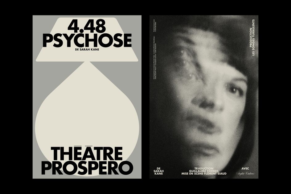
Outtake from a poster series for the 2021 campaign at Théâtre Prospero.
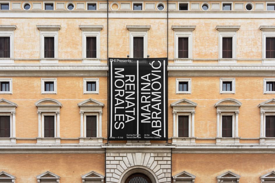
Campaign for a joint exhibition by Phi, showcasing Renata Morales and Marina Abramović’s work at the Ca’ Rezzonico Gallery during The Venice Biennale in 2019
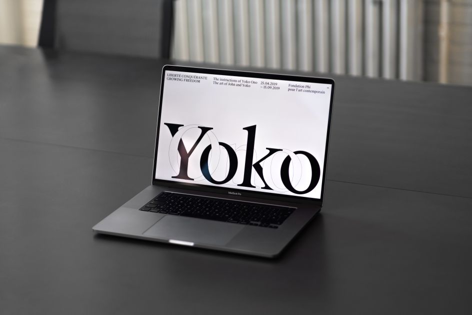
Microsite for the major exhibition of Yoko Ono’s work at the Fondation Phi in Montreal.
Editor's Picks


Trending


Podcasts


Editor's Picks
Further Reading