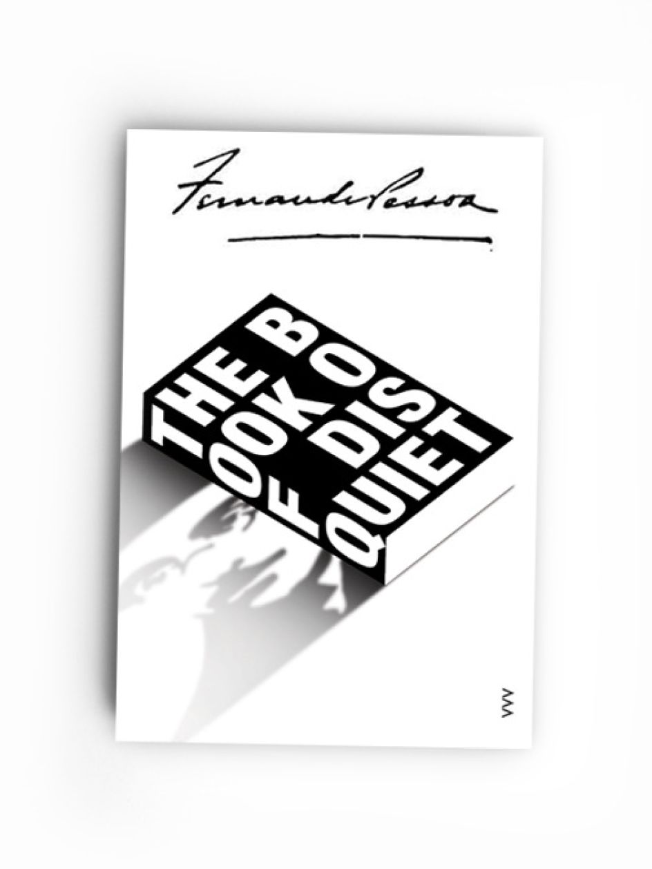
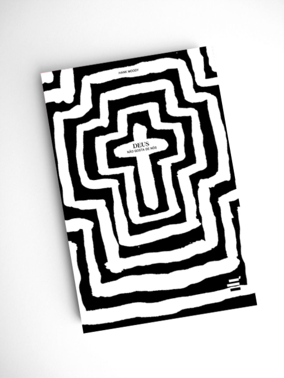
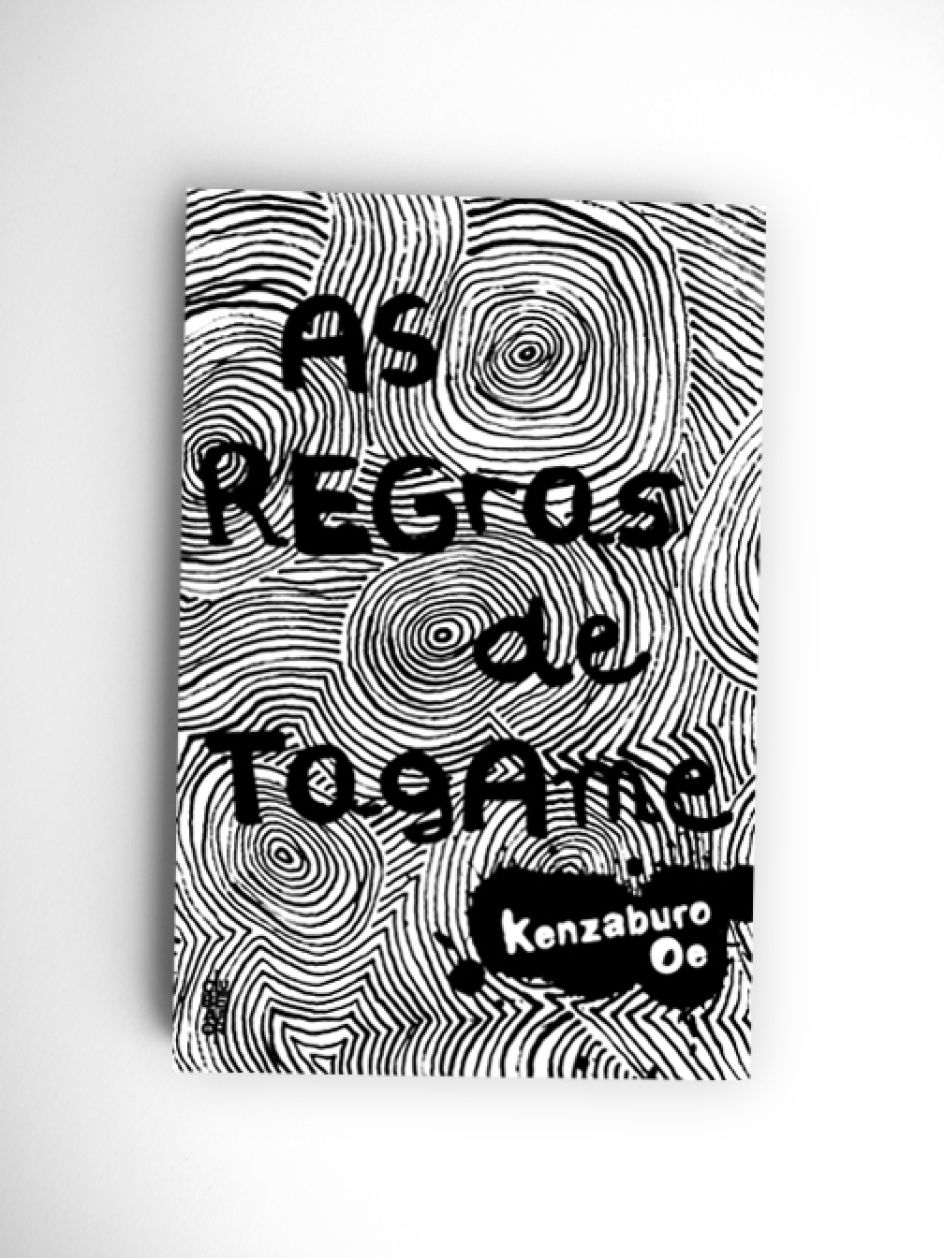
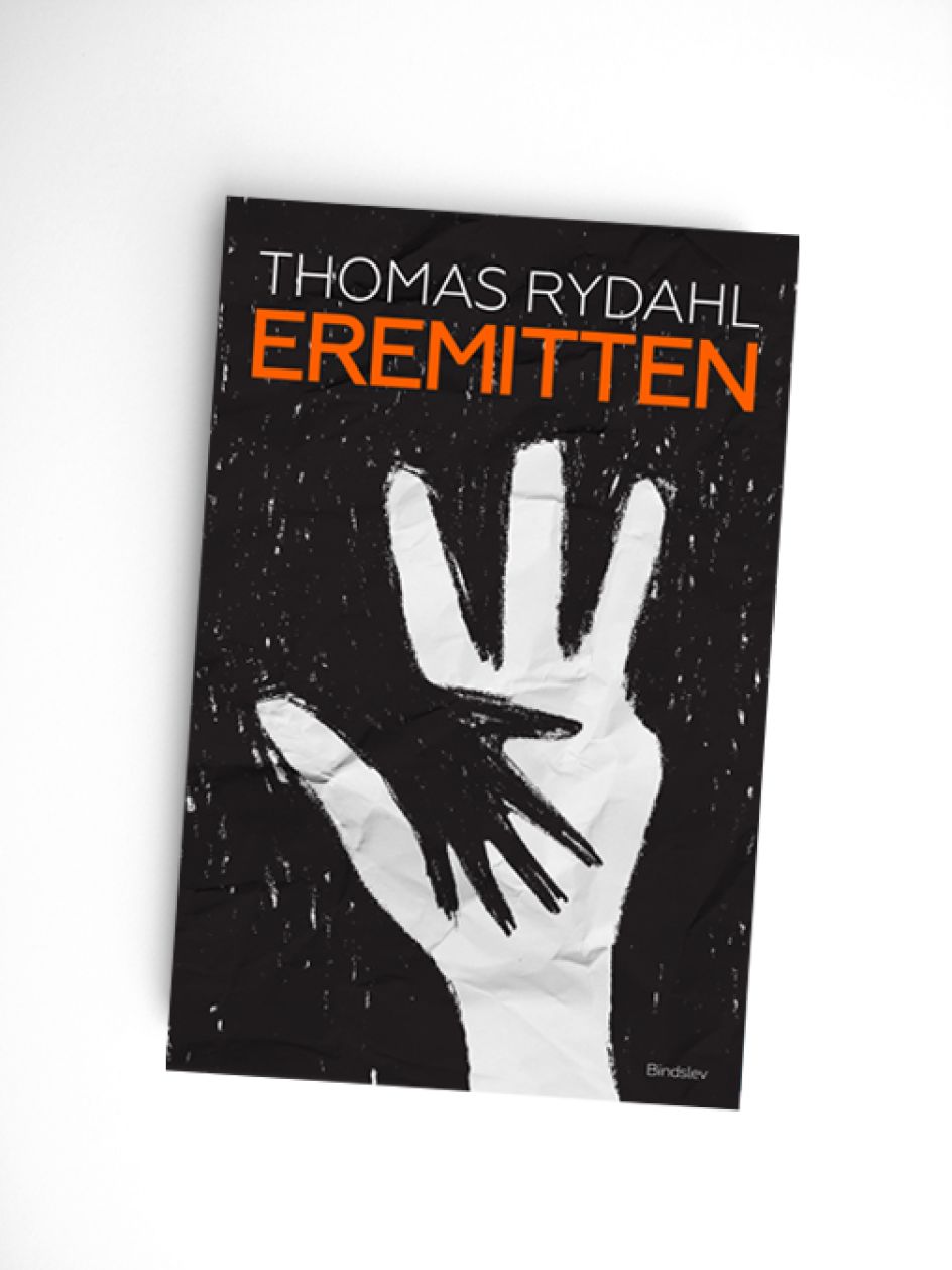
Portuguese designer Senhor Tocas' striking approach to book cover design and illustration
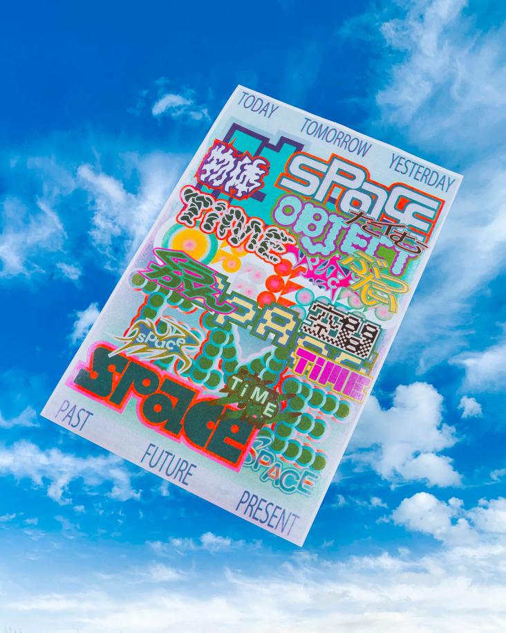
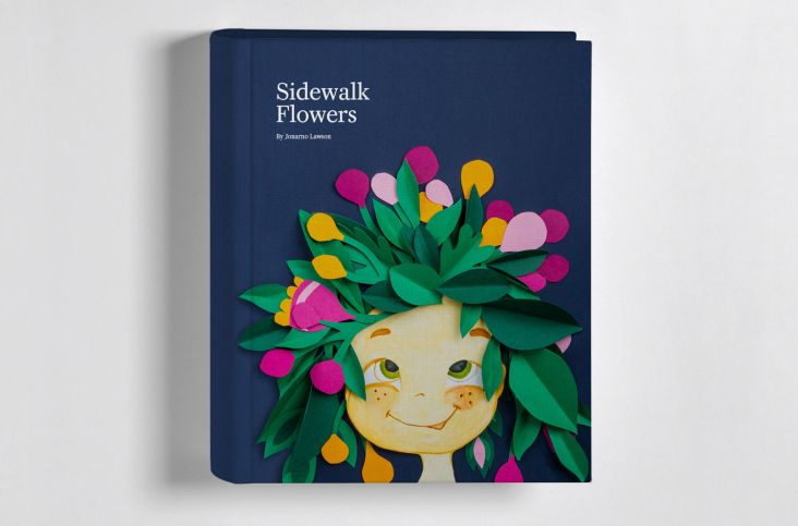
“The cover of a book is the first thing a potential reader will see: it needs to attract immediate attention, stimulate interest, heighten the desire to learn more about the book´s content, and create a clear call to action,” says Lisbon-based designer, illustrator and art director Senhor Tocas. “Many book publishers have not yet realised that.” Tocas has realised it though, and it’s proven across his varied and bold approach to book cover design.

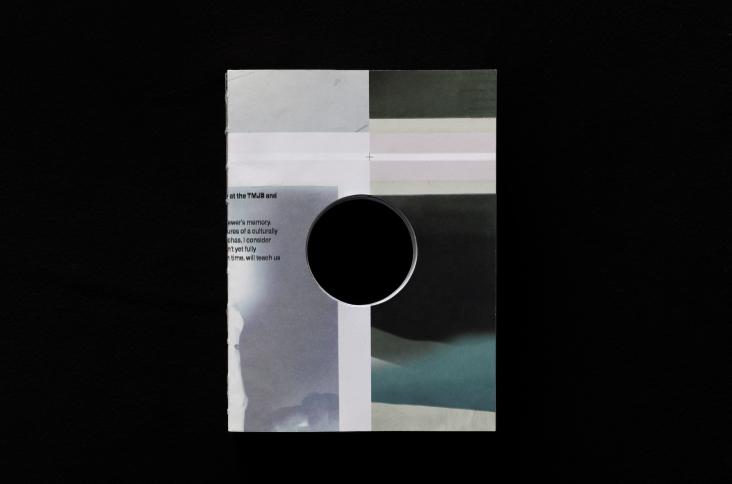
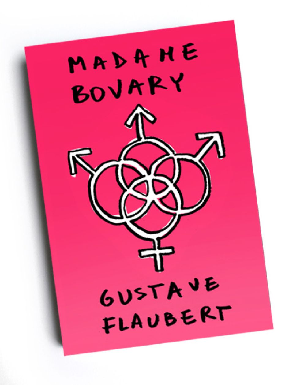
The approaches range from organic-looking painterly abstractions to using visceral and arresting photorealistic imagery, like that unflinching typographic stitches shot for the cover of Leo Tolstoy’s War and Peace.
Tocas has worked with companies including Portuguese publishers Nexo Editorial, Clube do Autor and Oficina do Livro and US-based Akashic Books; and when he’s not designing he says he’s really into “graffiti, lights and blurry pictures,” and wolfing down Haagen-Dazs ice-cream. It’s an unusual resumé, sure, but a rather endearing one.


Editor's Picks


Trending


Podcasts


Editor's Picks
Further Reading