BrandOpus creates new designs for American meat 'icon', Oscar Mayer
American meats brand Oscar Mayer has unveiled a new identity across all its products, created by BrandOpus.
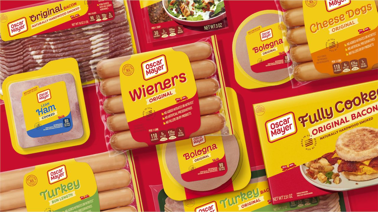
The agency was brought in to work on Oscar Mayer's designs since the brand realised that as time had gone on, its products varied widely in look and tone. A key part of the brief was also to create a more modern look that "better reflects the world today".
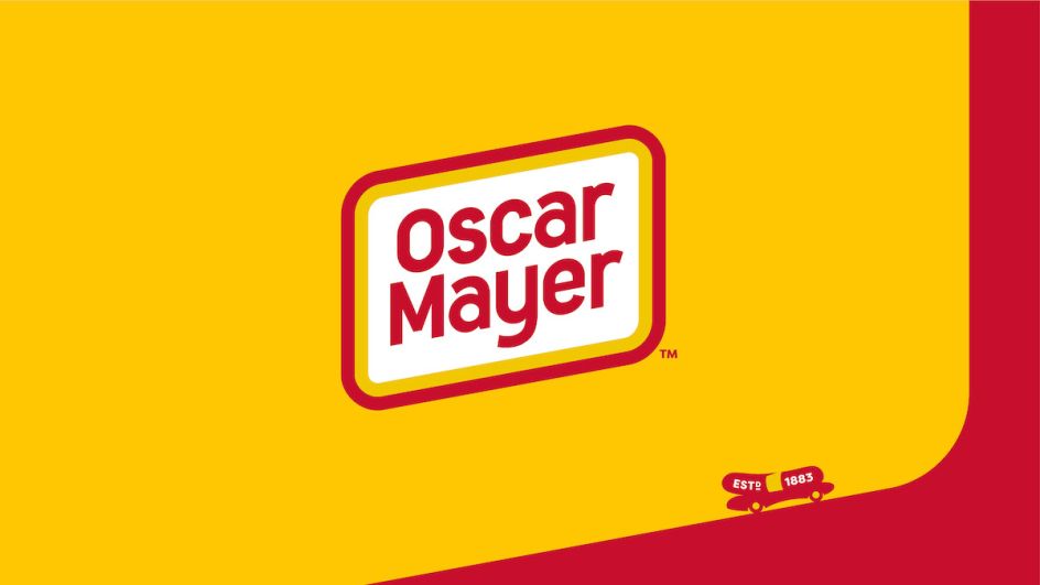
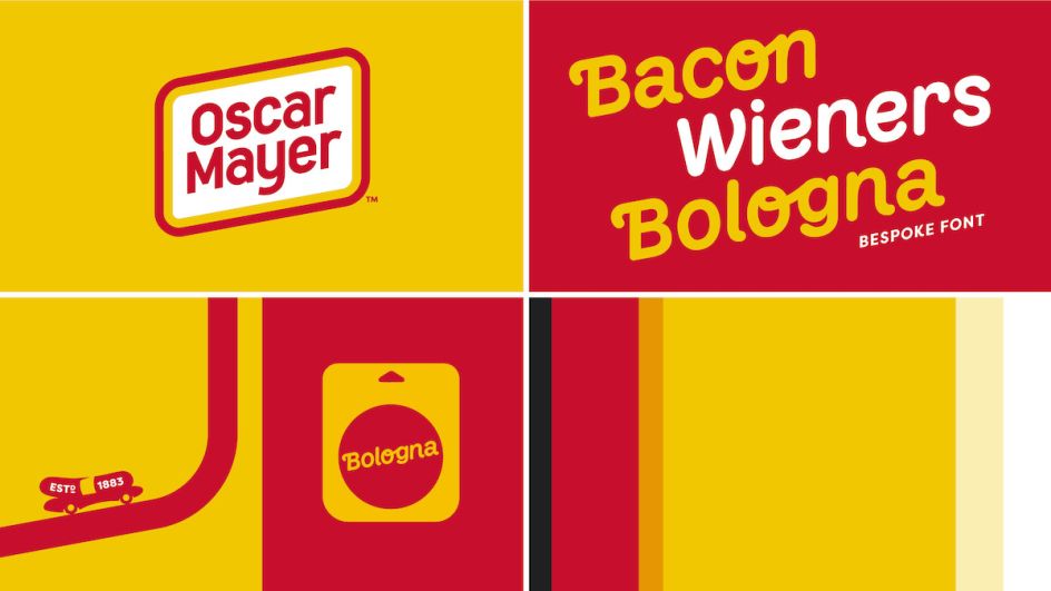
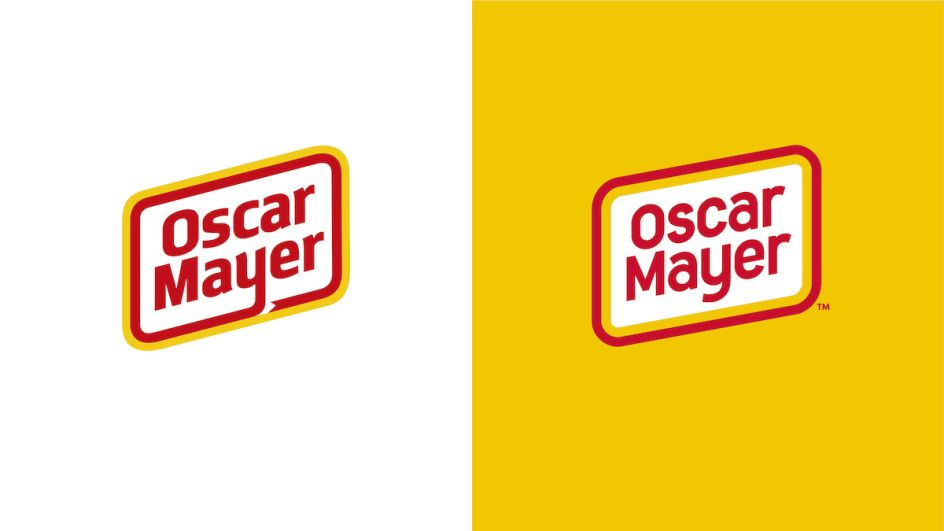
BrandOpus created the new "never square" logo, which uses a rhomboid shape to create a more dynamic and joyful feel, as well as becoming a tool that makes the look and feel of the brand cohesive across all products. The "Oscar Mayer yellow" tone is described as the brand's "superpower" to create recognition across all the brand's touchpoints.
The agency also created a custom typeface that looks to underscore the playful nature of the brand, which is integrated into the packaging designs. These elements are used across the new "Wienermobile" symbol, which looks to unite all the products in Oscar Mayer's portfolio while "figuratively driving the brand forwards into more modern times," says BrandOpus.
"Our task was to articulate everything that the public knows and loves about Oscar Mayer’s 138-year-old brand story into a unified and distinctive narrative, which, just like its logo, is never square," says BrandOpus CEO and founding partner Nir Wegrzyn. "The new brand identity celebrates the iconic rhomboid logo with a bold and straightforward design – exemplifying the brand’s uncomplicated approach to meats with a similarly uncomplicated aesthetic."
The new designs can also be seen in the brand's new creative platform, Keep it Oscar, created by ad agency Johannes Leonardo. According to BrandOpus, the platform "invites everyone to take life less seriously by reimagining meat in playful, unexpected ways."


](https://www.creativeboom.com/upload/articles/90/908fdb6378db1e95d12595416f54e6336d5e80b8_732.jpg)