Fortnight Collective creates simple, vibrant designs for new 'hard kombucha' drink, Allkind
Odell Brewing Co. has recently launched its new "hard kombucha" drink, Allkind, with branding and packaging designs by Fortnight Collective, an agency with offices in Boulder, Colorado, and London.
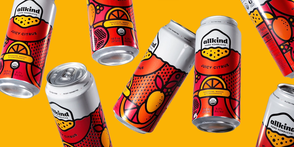
Kombucha is a fermented drink made with tea, sugar, bacteria and yeast celebrated for its probiotic properties which has been brewed for thousands of years. Allkind – Odell's first hard kombucha – is a little different to most in its booze content: the flavours in the range (Juicy Citrus, Super Berry and Tropical Turmeric) are each around 6.5% ABV.
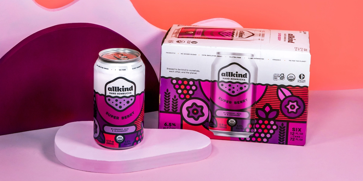
Colorado-based brewery Odell Brewing Co., which is 100% employee-owned, has worked with Fortnight Collective in an ongoing capacity, commissioning it for numerous projects including the designs of its line of canned wines, its Good Behavior beer and the Sippin’ Pretty fruited sour craft beer. Fortnight Collective works across all aspects of Odell's design, including brand strategy, naming, packaging and digital design.
The Allkind branding looks to reference the idea that it was "brewed to be kind to ourselves, each other and the planet," as Odell puts it, through bright colours and bold outlines. The simplicity of the designs looks to reference Allkind's organic, real fruit ingredients; while the colours on each variant's can designs correspond to their flavours and ingredients.
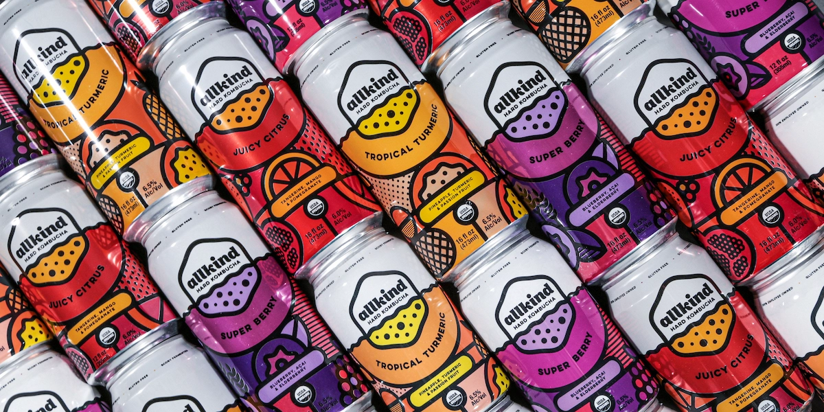
"Because Allkind Hard Kombucha is not a blend, it's a living harmony, we wanted the design to evoke this idea of balance," says Fortnight Collective. "The illustration in the packaging combines separate shapes, textures, and colours in a way that creates interlocked mosaics where all flavours and ingredients are represented while still being part of a larger composition."
These individual elements are separated through the use of flat design with distinctive black outlines, which also allow for the logo and typography to be easily integrated within the designs in multiple different ways.
"Kombucha is an exciting category to design for as the beverage and what it means to drink it, is evolving," said Andy Nathan, CEO, Fortnight Collective. "We've worked on a number of kombucha brands, appealing to those with a healthy lifestyle. Allkind takes that notion of health a step further, infusing fun and lightheartedness into the product, which we made sure came through with the design."

Editor's Picks





Trending



Latest Jobs
Digital Project Manager at Proctor + Stevenson
Full-time·Bristol·£32,000 – £36,000
Content Producer (Research) at University of York
Full-time·York·£32,722 – £37,369
Design Developer, Opinion at The New York Times
Full-time·New York·$113,946 – $136,000
Director, Head of Creative at Twitch
Full-time·San Francisco·$203,000 – $274,600
Creative Director at Ad Council
Full-time·New York·US$145,000 – US$155,000
Senior Visual Designer at Scout Motors
Full-time·Remote·US$130,000 – US$160,000