Japan's largest publisher Kodansha, of Akira fame, launches new branding by Gretel
New York-based design studio Gretel has worked with Japan's largest publisher Kodansha, which is responsible for AKIRA and Pretty Guardian Sailor Moon, a manga created by Naoko Takeuchi that was developed into a Japanese tokusatsu television series. Haruki Murakami started his career with the publisher.

Gretel, whose clients include Netflix, The New York Times, MoMA, and Vice, worked with the publisher on a new brand film and global rebrand, marking Kodansha's first unified brand identity and logo since its founding 112 years ago.
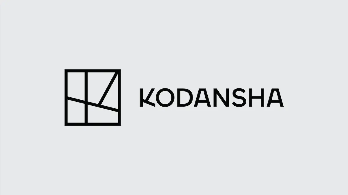
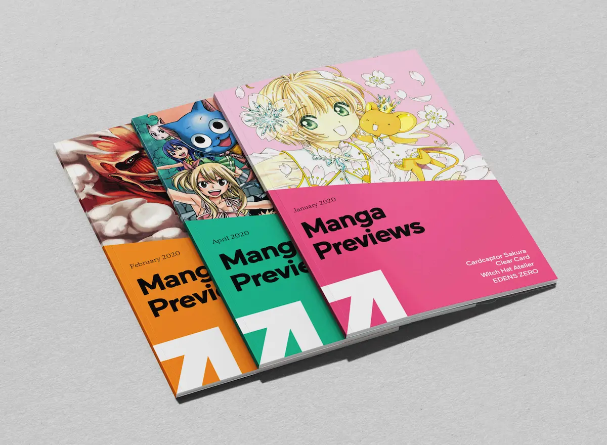
The idea behind the rebrand was to be the first step towards giving Kodansha a more visible global presence as an international media brand and a publisher. The rebrand was driven by the fact that Kodansha's core business was evolving across platforms and markets, including Kodansha USA, the subsidiary representing the brand in America. Gretel's partnership with Kodansha looked to both establish a global brand and better connect the company to the vast range of content offerings it publishes.
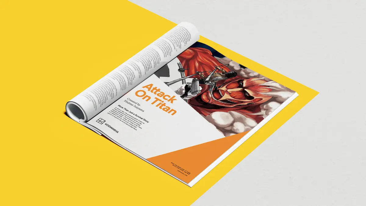
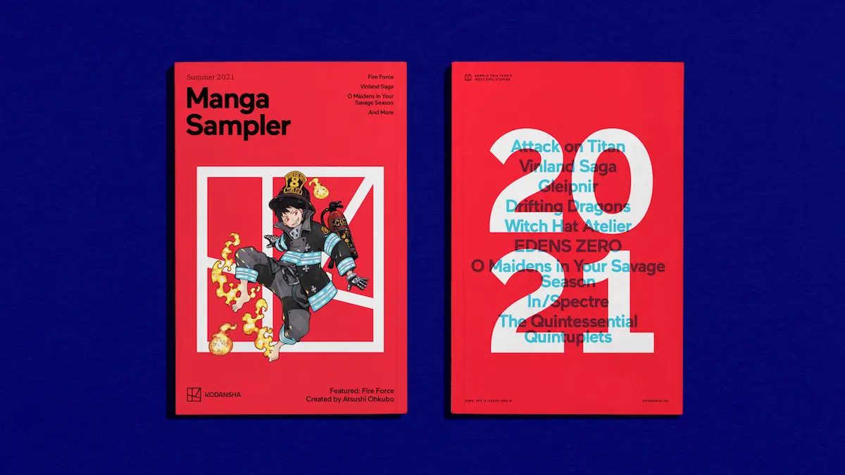
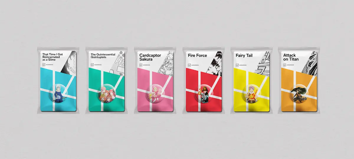
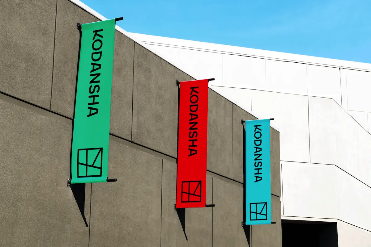
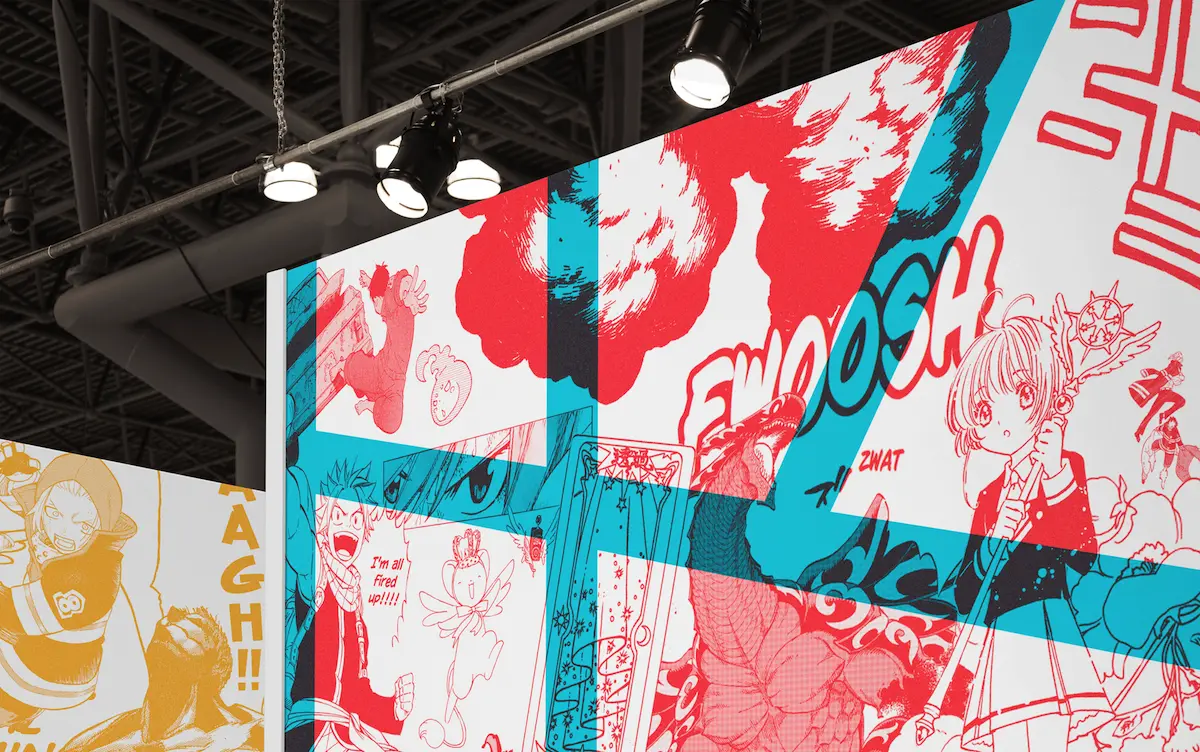
The new branding is used across various touchpoints including trade show designs, sonic and logo mnemonics, and a new brand video directed by Juan Cabral—the Argentine director who created the Cadburys' "Gorilla" ad—which follows stories from Kodansha as they take flight across the world.

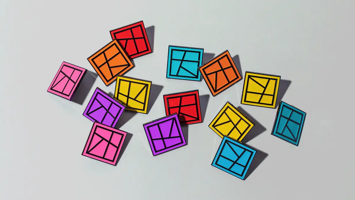
The identity "hinges on making more conscious, meaningful connections between Kodansha and the content it produces," says Gretel. "The fresh identity, strategy, and brand architecture culminate in a powerful new global purpose statement for Kodansha: Inspire Impossible Stories."
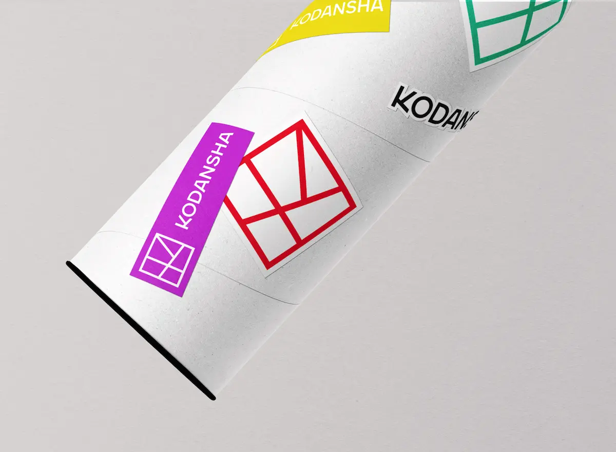
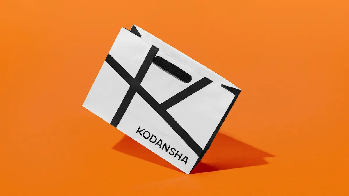
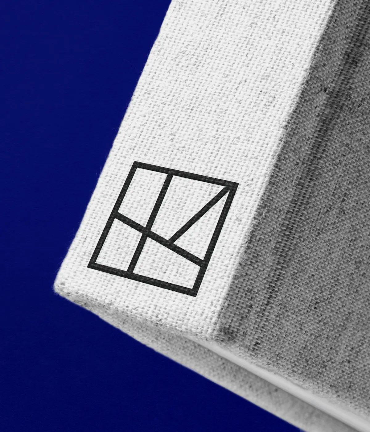
The new logo aims to represent "Kodansha's position at the crossroad of all cultures—where many ideas, voices and stories intersect," says Sue Murphy, Gretel creative director. "It's also inspired by Japanese hankos, acting as a stamp of quality on Kodansha content, as well as a monogram."
The brand film, titled Taking Flight, looks to underscore the "boundlessness of Kodansha's creativity" and ability to excite all kinds of fans from across the globe.
To bridge the cultural divide between Tokyo and New York, Gretel and Kodansha also worked closely with Japanese entry partner Anchorstar during the studio's initial in-depth discovery stage of the process.
Editor's Picks





Trending





Latest Jobs
Art Director at The New York Times
Full-time·New York·$120k–$130k
Graphic & Motion Designer at The SHARP Agency
Full-time·Leeds·£26k–£33k
Client Success & Growth Director at Revolution Growth
Full-time·Manchester·£60k-£70k
Midweight Editor at Earworm
Full-time·Bristol·£28k-£32k
Account Director at How&How
Full-time·London·£73k-£79k
Senior Digital Designer at Red Antler
Full-time·New York·$95k-$130k