Noise 13's ocean-inspired packaging for H2O+ hopes to 'sail above' other skincare products
San Francisco branding agency Noise 13 has created this stunning new ocean-inspired packaging for H2O+ to help the skincare brand "sail above the sea of white minimalism on the shelf".
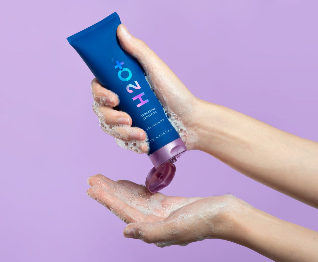
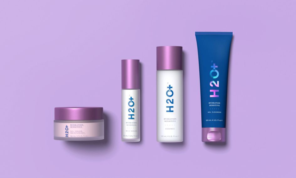
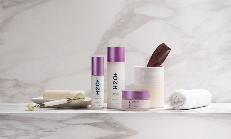
Ahead of the launch of its new line of sensitive skincare and body products, H2O+ challenged Noise 13 with designing packaging to "catch the eyes of a different demographic and signal a shift in the company's commitment to developing cleaner products".
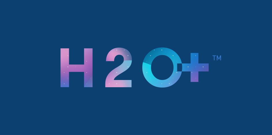
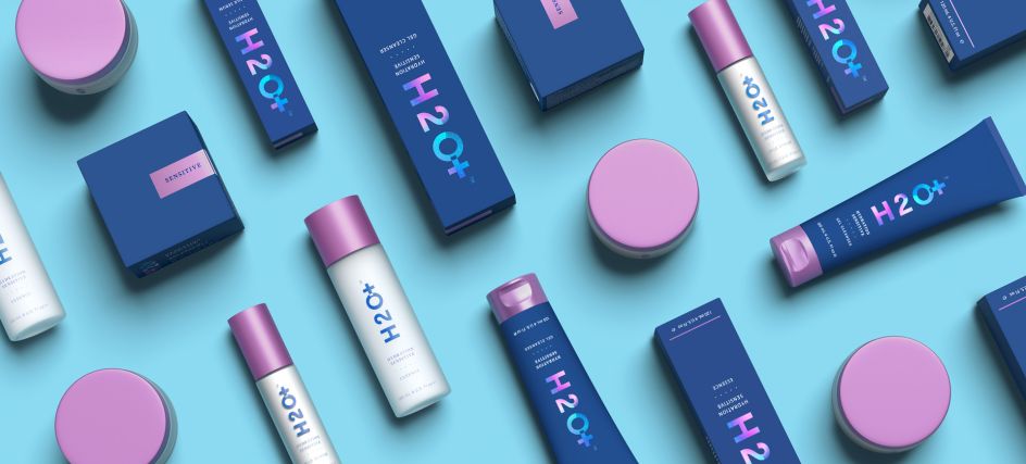
Research by the agency showed most brands in this niche use bright white packaging. "It's minimal and elegant; it looks crisp and expensive. But, it all blends together when placed side-by-side on shelves, and the lighter blues H2O+ had been using on the previous packaging got lost in that glare," says Noise 13.
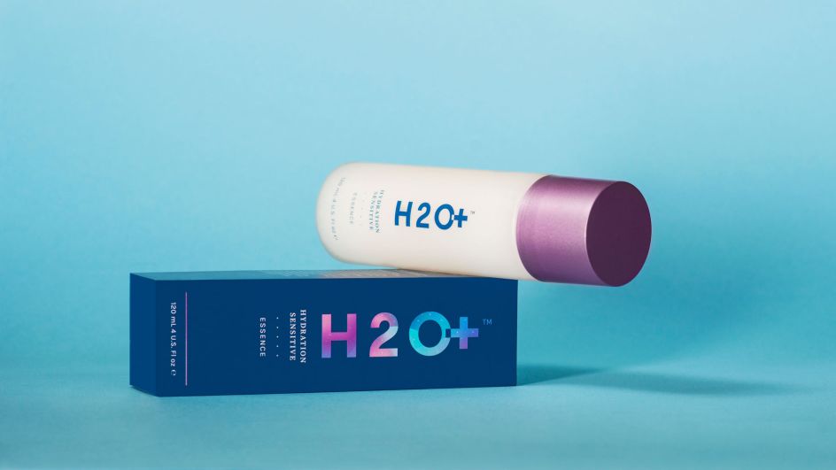
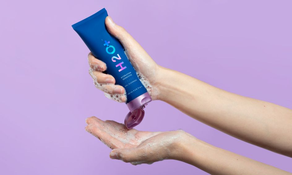
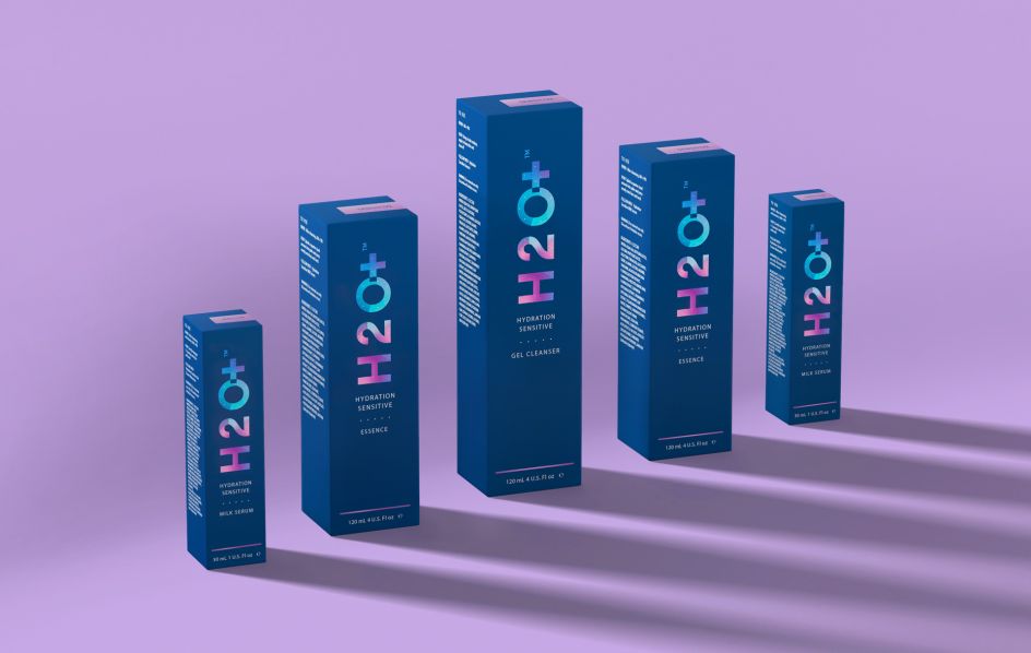
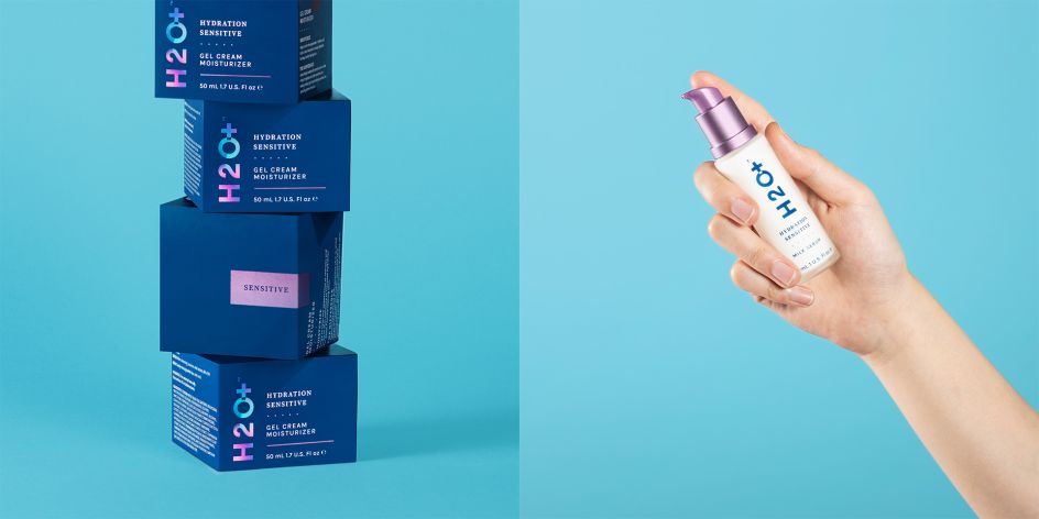
To help its client stand out, Noise 13 explored the "ocean's deepest depths, where light barely penetrates". A rich, almost black, midnight blue became the canvas on which the brighter colours of the extended palette can pop.
Tides, currents, bubbles, and other characteristics of water inspired the dots, waves, and gradient meshes, giving the graphics a vibrant sense of movement. The colourway, textural elements, and bold new iteration of H2O+'s update and differentiate the look and messaging of their bottles and boxes.
"Still elegant and clean, also now fun and energetic, this visual continuity allows room for expansion as additional products join the line," adds the agency.
The full project scope included revamped identity, packaging, brand standards and illustration.
Editor's Picks


Trending


Podcasts


Editor's Picks
Further Reading