Noah Mooney's bubbly branding for B Street Flea market is an inviting treat
We speak to the Washington, D.C.-based designer about how he created a cohesive visual identity for a new seasonal flea market.
Traditionally, city centre markets didn't really need much in the way of branding other than maybe a sign at the entrance. That's largely because they'd been in the same place for decades, so most people already knew about them.
Today, that's all changed. New markets are popping up all over the place at a time when many downtown areas are still emptier than they were pre-pandemic. At the same time, the more niche and specialist markets will attract certain people to travel long distances to visit... as long as they know about them, of course.
It's in this light that Washington D.C.'s B Street Flea recently collaborated with designer and creative lead Noah Mooney to create a cohesive visual identity for the enterprise.
"I believe kindness, empathy, and hard work lead to exceptional results," says Noah, who hails from Michigan but currently lives and works in D.C. "It turns out that if you put in the effort, listen, and give a damn, the creative has a way of revealing itself." And we certainly feel that's the case here.
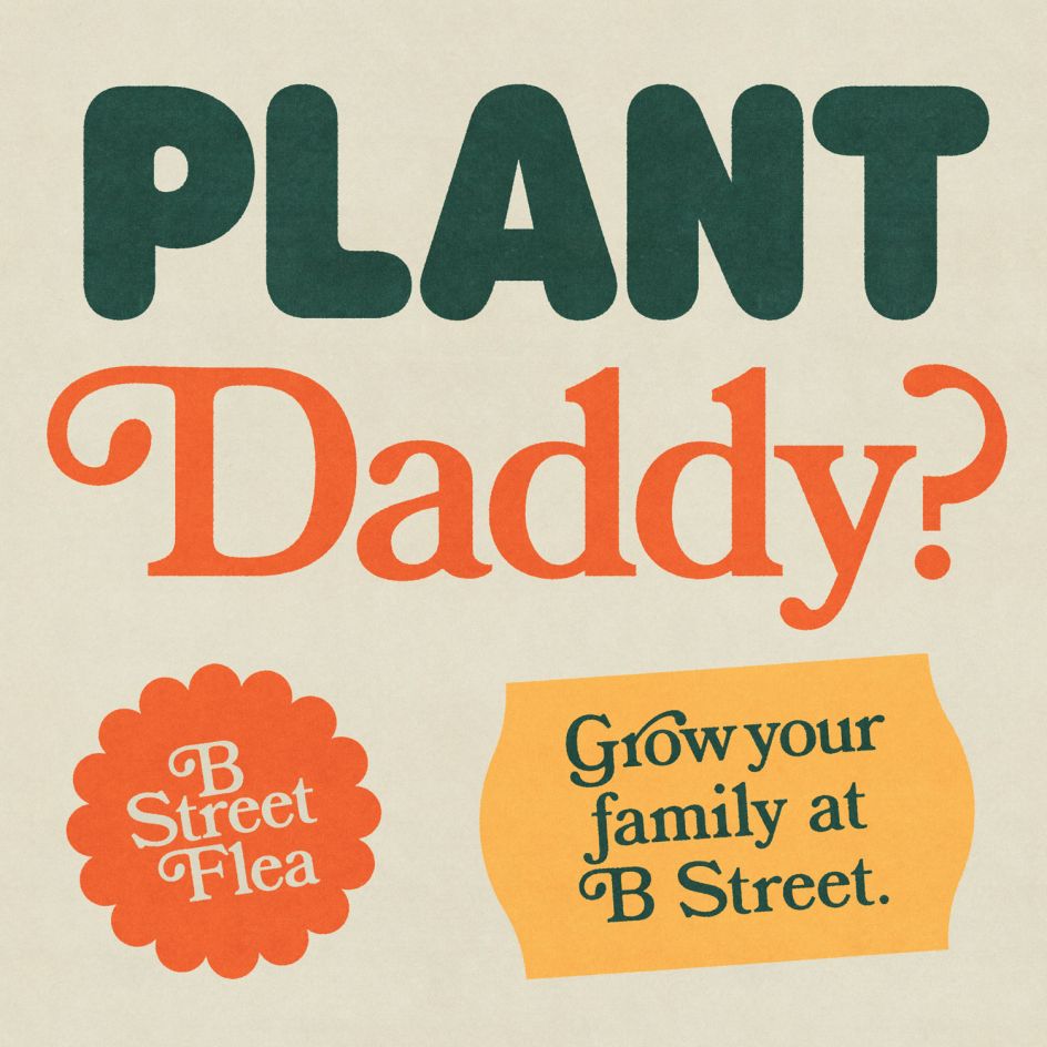
Back to the '70s
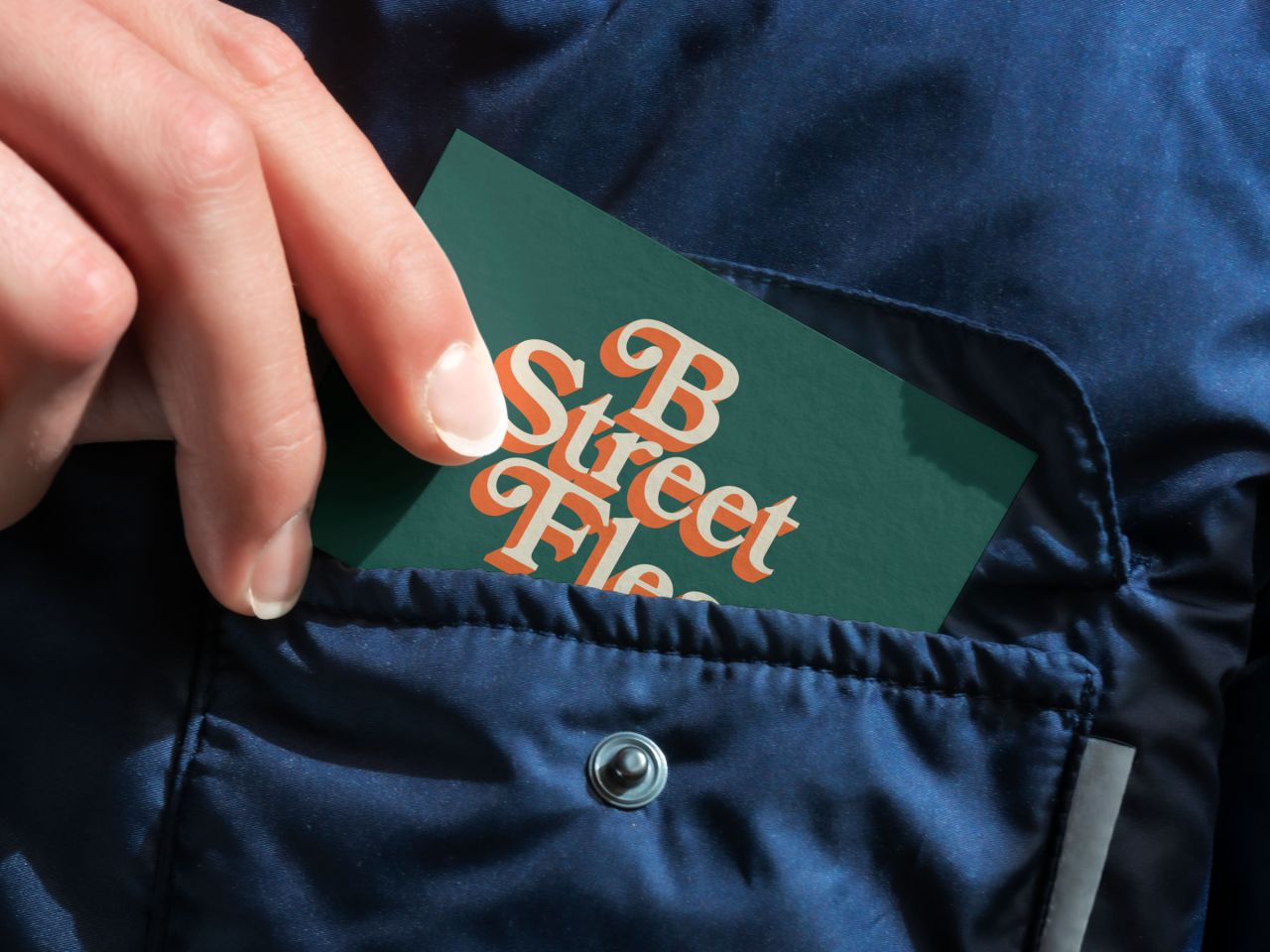
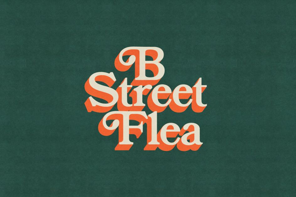
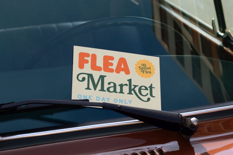
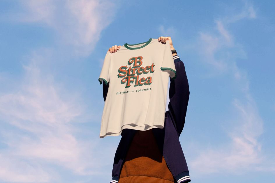
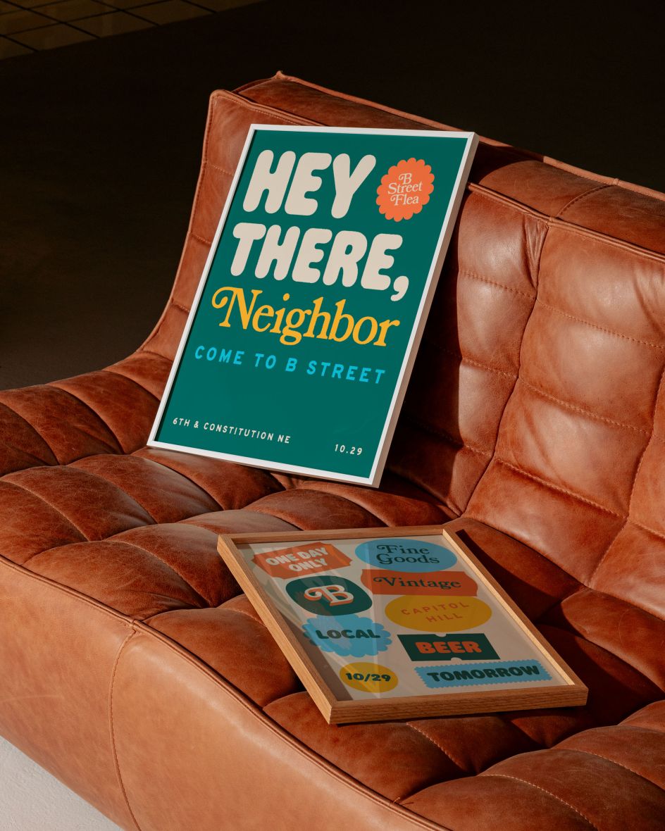
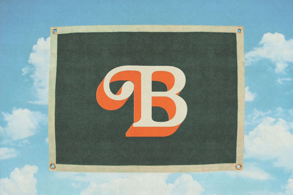
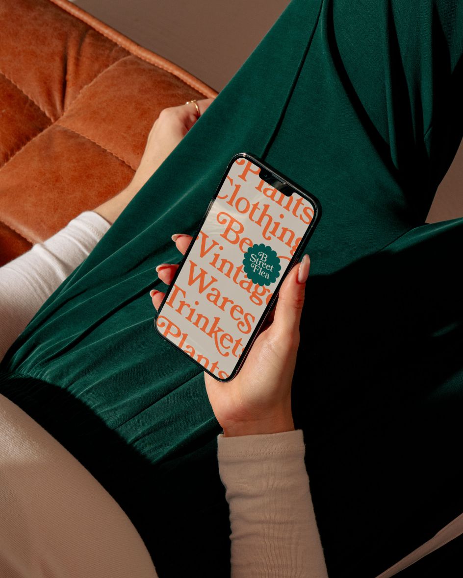
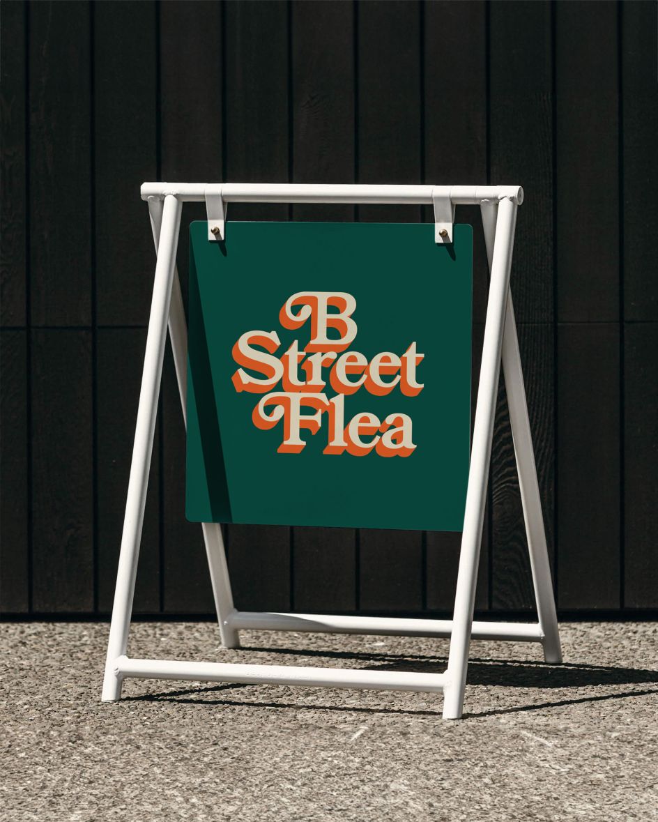
"B Street Flea is a seasonal flea market in Capitol Hill that supports local makers and artisans in Washington D.C," explains Noah. "We worked closely with Bailey Weaver, the owner, to create a cohesive visual identity that was colourful, friendly and had a nod to vintage typography and printing techniques.
"Much of the identity hinges on warm and inviting typography popularly used in the 70s on shows like Mr. Rogers Neighborhood," he adds. "To add a layer of uniqueness, we added a bubbly type treatment and vintage sticker elements to round out the look and feel."
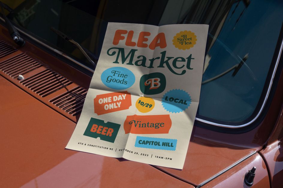
"The inaugural market was a resounding success with hundreds of shoppers and nearly all of the merchandise sold at the end of the one-day-only event."
Style and influences
It's typically impressive work from Noah, whose client list includes Hilton, Marriott International, Inova Hospital, Children's National Hospital, Long & Foster, Conservation International, University of Maryland and Foster Coffee.
"When it comes to personal style, the project usually dictates that," says Noah. "But I gravitate towards minimal, functional design without too much fluff. I've always been a huge fan of Lance Wyman: I love the simplicity of his marks and can still see the impact of his work around Washington, D.C.; his iconography is still prevalent at the National Zoo.

"For this particular project, I was inspired by some of the work of Do-Hee Kim as well as Amy and Jen Hood of Hoodzpah," he adds. "They do a great job of incorporating warmth and texture into their work; it has a vintage feel without feeling too gimmicky."
The multidisciplinary designer is also strongly influenced by his Michigan background. He originally got his degree from Calvin College, now Calvin University, a small liberal arts college in Grand Rapids. "It's honestly not the most prestigious program," he says, "but I'm thankful for growing up in a city that appreciates the arts.
"Grand Rapids is known for ArtPrize, a city-wide art competition each year," he explains. And although the design scene there is smaller compared to major cities, there's a tight-knit community and some great work coming out of there.
"Throughout the area, there are also strong influences from furniture designers like Charles and Ray Eames that I feel had an impact on me," he adds. "We could tour Herman Miller's HQ in school, and it really made an impression on me."
And all this has informed the design philosophy he practices today. "For me, the joy of my work comes from collaboration and problem-solving," he says. "I love elevating brands and creating new ones through sound design and thoughtful strategy."
Editor's Picks


Trending


](https://www.creativeboom.com/upload/articles/90/908fdb6378db1e95d12595416f54e6336d5e80b8_732.jpg)


Podcasts


Editor's Picks
Further Reading