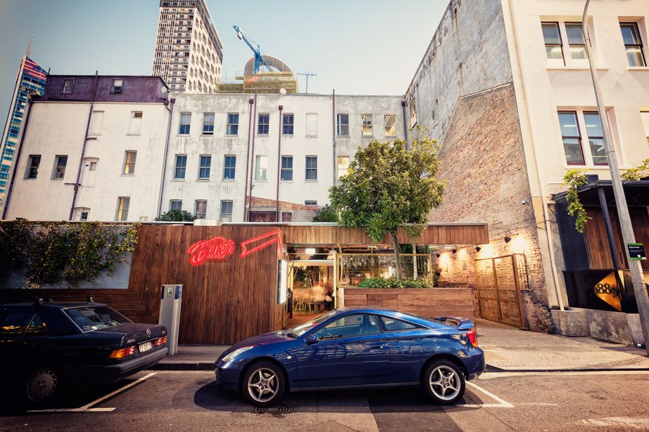
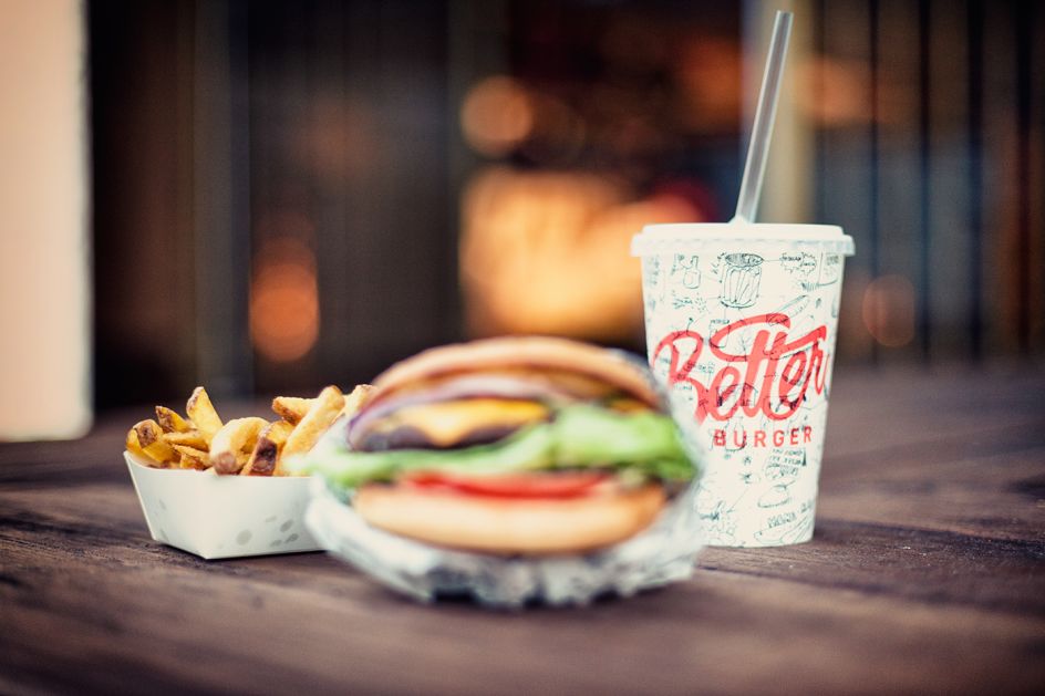
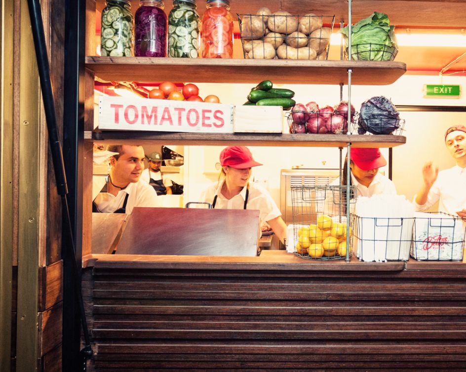
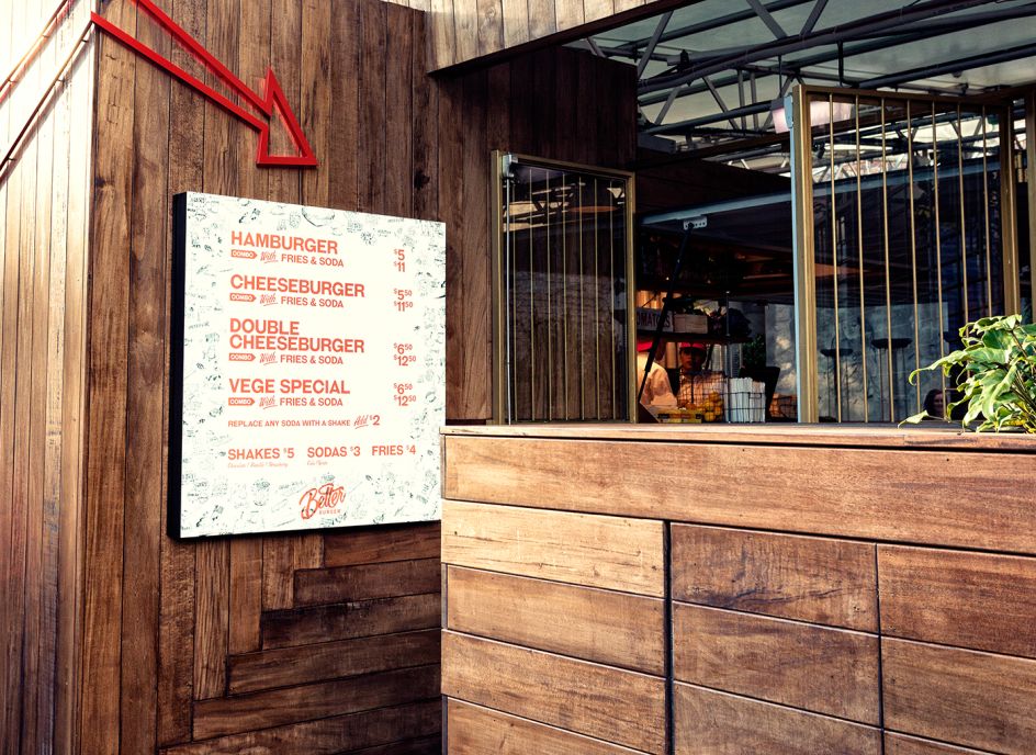
New branding for Better Burger ensures a balanced diet of illustration and striking design for tasty results
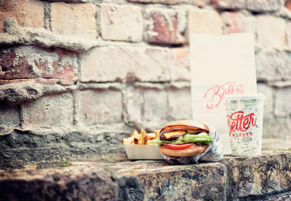
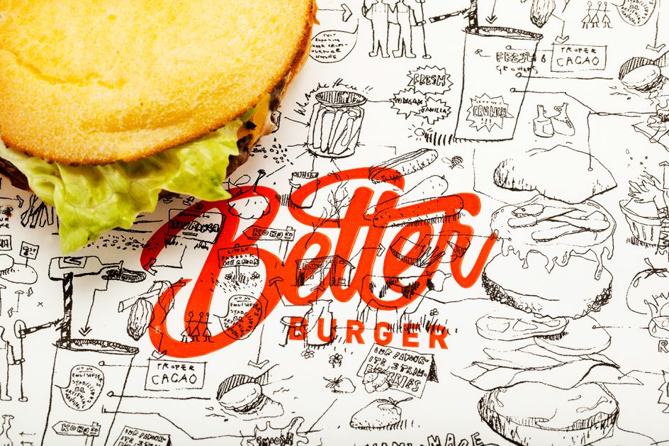
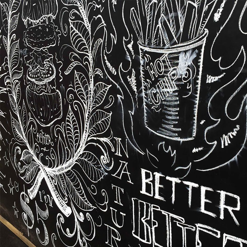
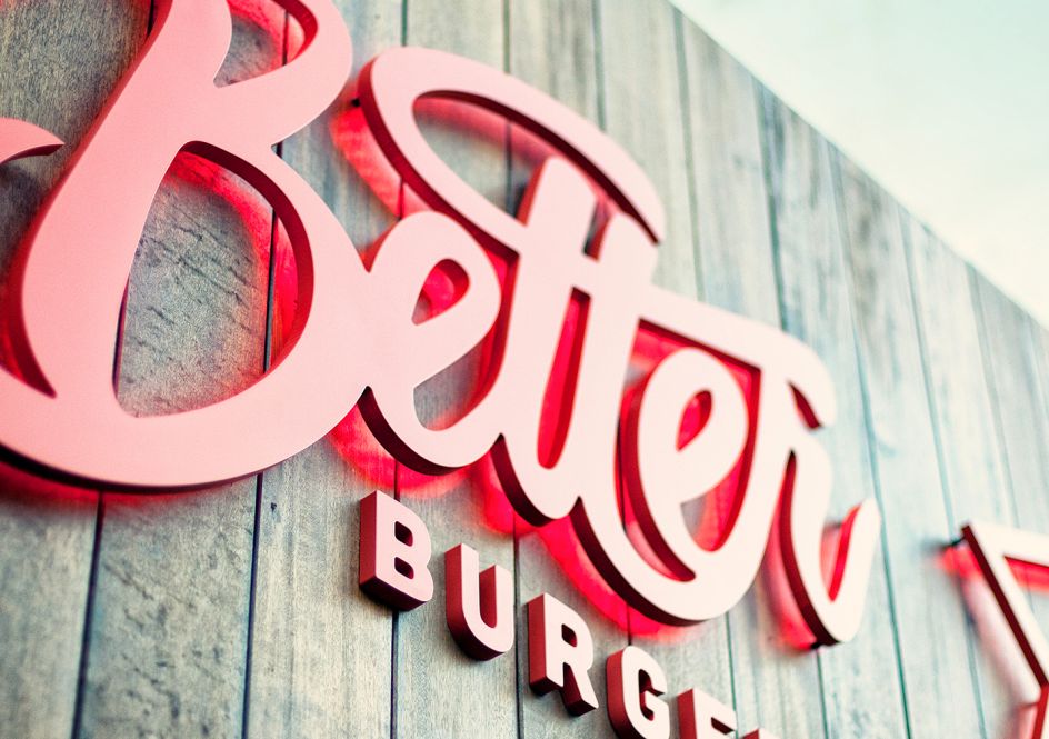
If you're not hungry now then I guarantee you will be after reading this post. And that's exactly the idea behind the branding for Better Burger. Created out of feeling apathetic towards other fast food burger joints, this burger establishment needed a branding concept that conveyed exactly what sets it apart from its competitors – ultimately being bold and upfront about creating a better burger.
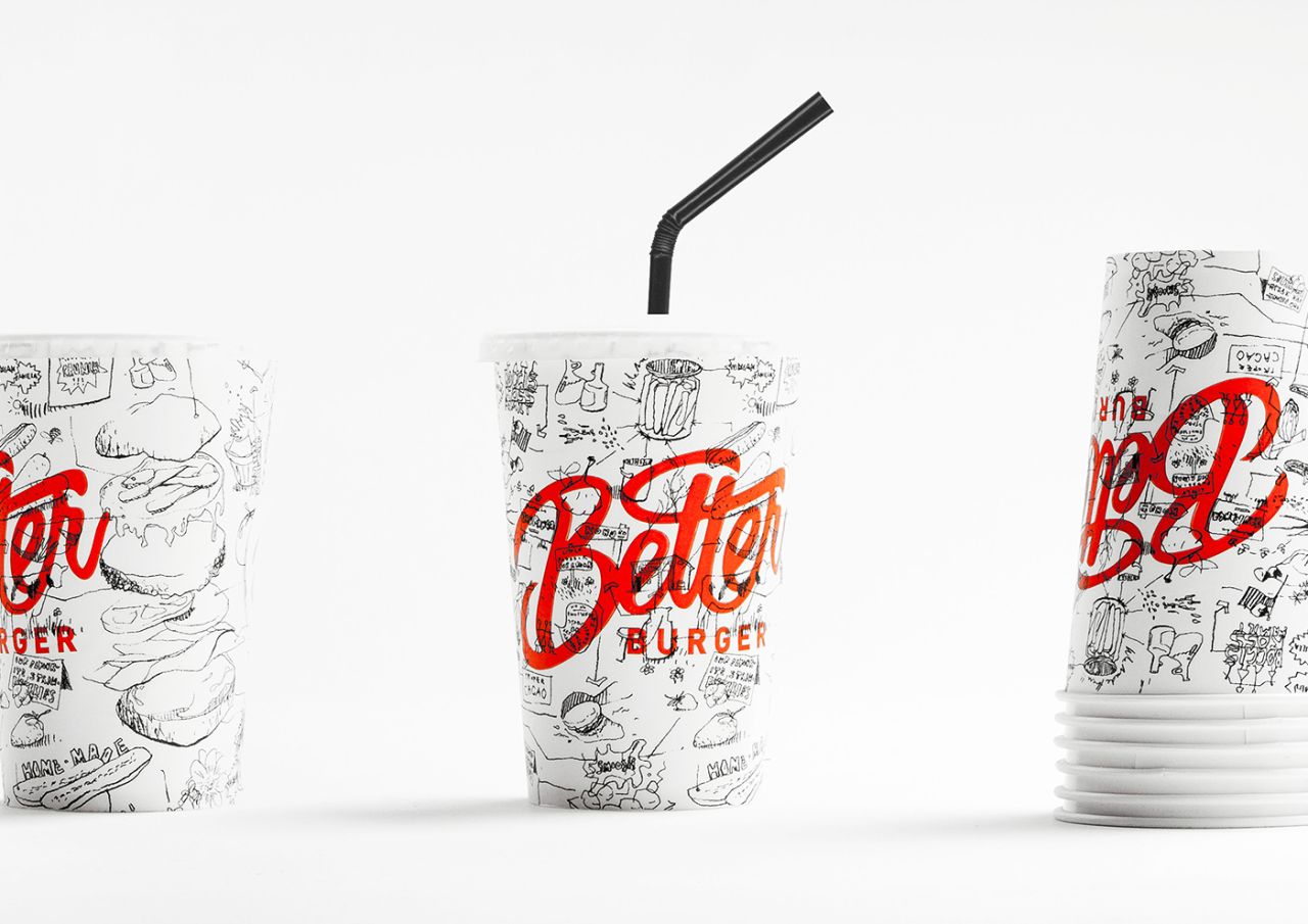
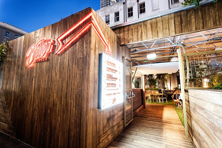
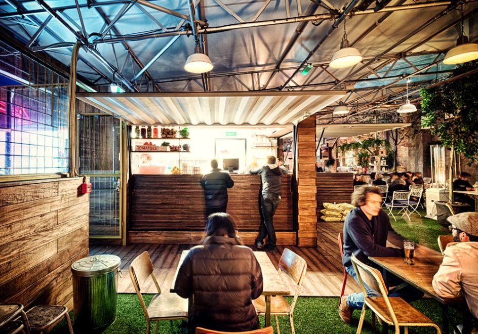
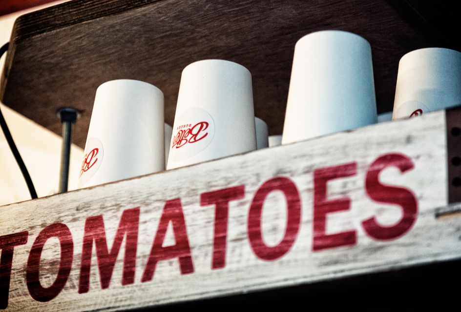
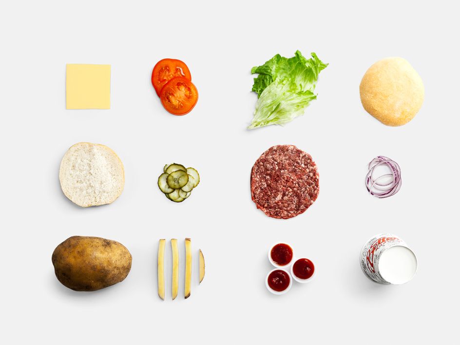
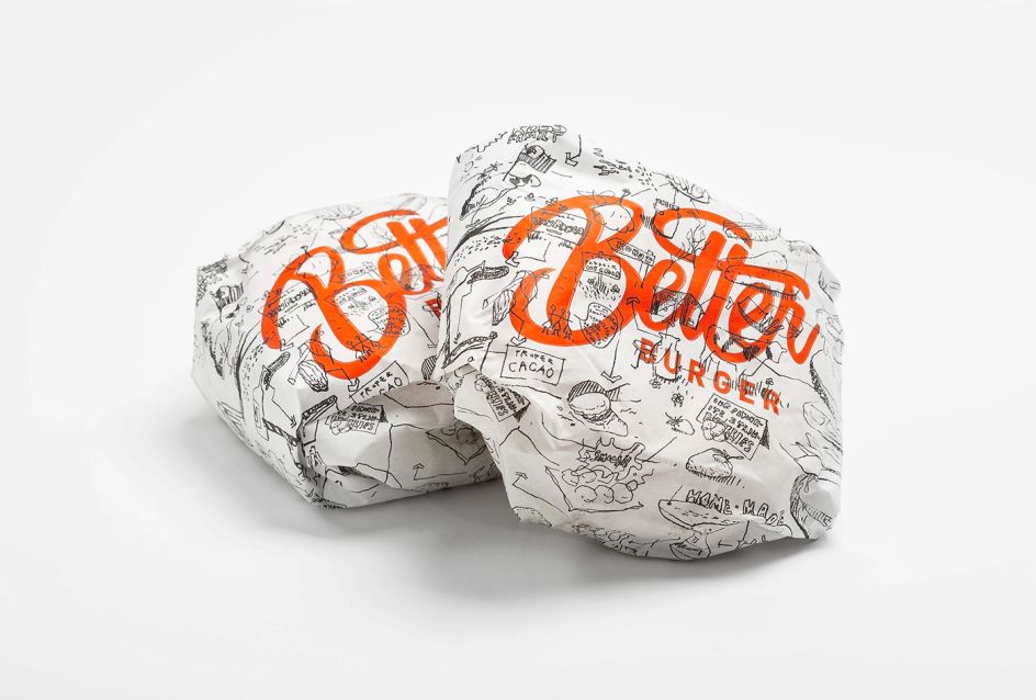
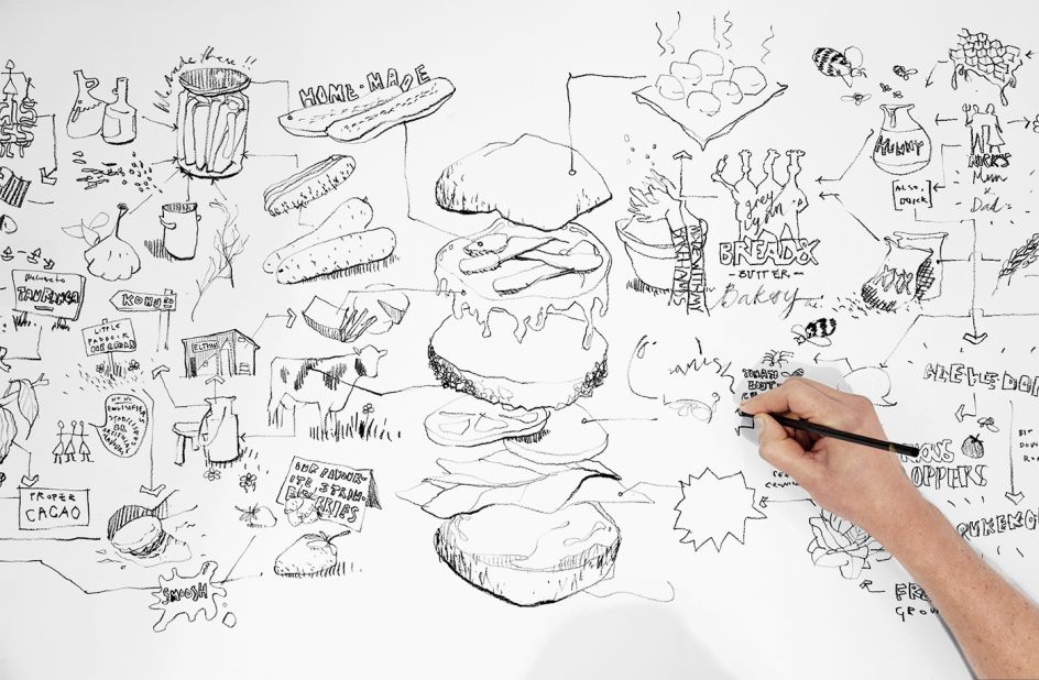
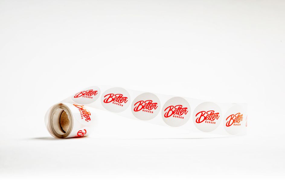
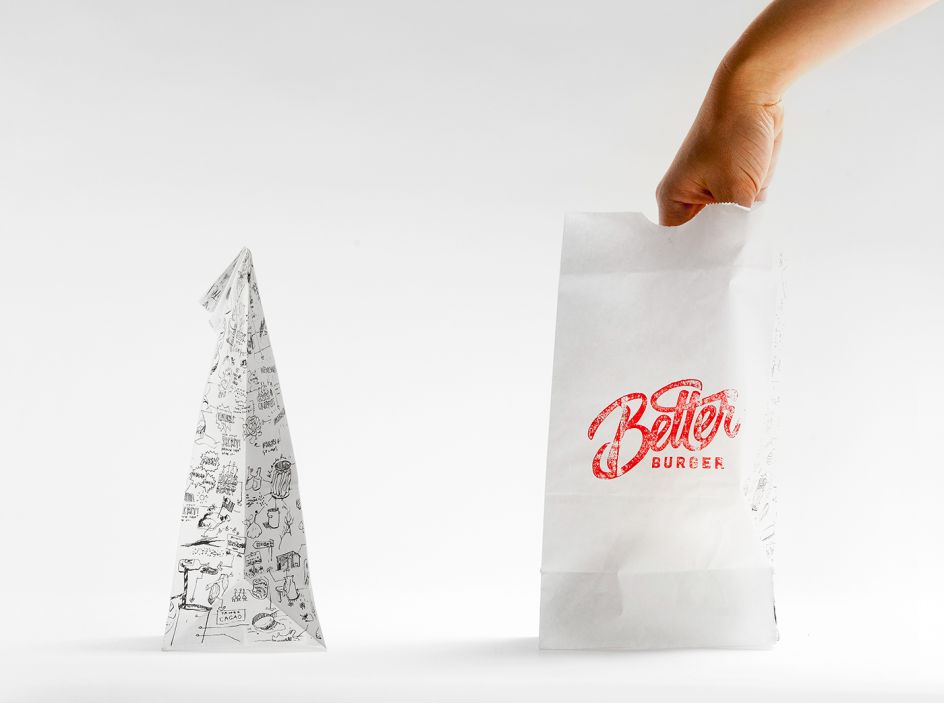
485 Design explain the concept: "The Better Burger ethos of making things fresh from scratch was applied to their look and feel — with nothing to hide. The hand drawn type and illustrations emphasise the journey of the ingredients and reinforce the philosophy of making things better by hand. Better Burger takes the large fast food chains on at their own game by offering better burgers for the same price. The look was carried into all of their environmental graphics to create signage that is simple, fresh, and still communicates the brand promise."
The result is an easily identifiable brand that promises, and delivers a simple, better burger. Find out more about 485 Design here.
Editor's Picks


Trending


](https://www.creativeboom.com/upload/articles/90/908fdb6378db1e95d12595416f54e6336d5e80b8_732.jpg)
Podcasts


Editor's Picks
Further Reading