Mother Design's modern rebrand for Ceria Brewing Company targets 'mindful imbibers'
Fiercely independent studio Mother Design has collaborated with Ceria Brewing Company to spearhead a revolution in the world of beverage branding. As part of its new brand positioning and refreshed visual identity for the brewer's packaging, Mother Design seeks to target a progressive, urban audience of 'mindful imbibers'.
Drinking habits are constantly changing. Where booze companies once used trendy characters and bright designs to catch the eyes of a younger audience, this demographic has moved on and been replaced by a more progressive generation. Enter Ceria Brewing Company, which has listened to its audience by producing alcohol-free beers that appeal to their more discerning palettes.
Helmed by Keith Villa, a Doctor of Beer and the creator of Blue Moon, Ceria Brewing Company has already made an impact with its beers that honour traditional brewing techniques while embracing innovation. But to set them up for the next stage of growth, it was decided that the time was right for a fresh new look courtesy of Mother Design.

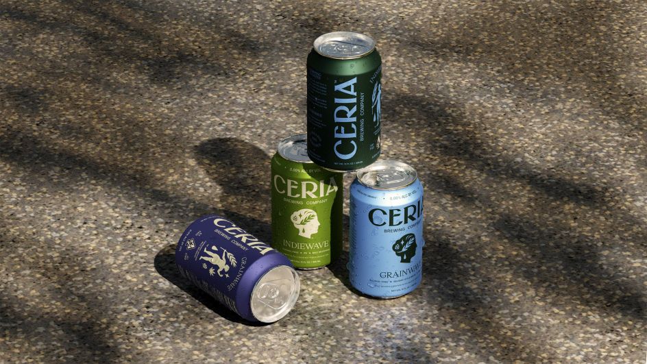
Working under the brand positioning 'beverages reinvented for modern living', the new look respects Ceria Brewing Company's ethos that drinks should enhance our lives and bring people together, not divide them or hold them back. Setting its sights on a young, progressive and urban audience dubbed 'mindful imbibers', the rebrand includes a new wordmark, monograms, typography, packaging design and much more.
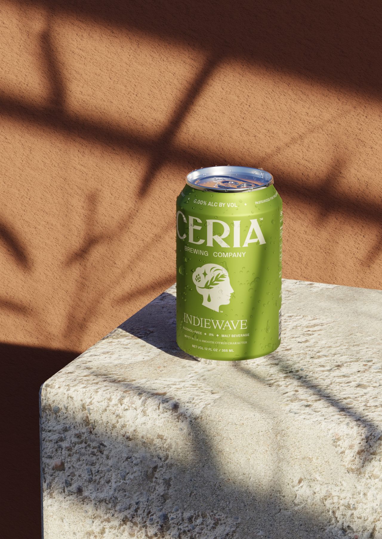
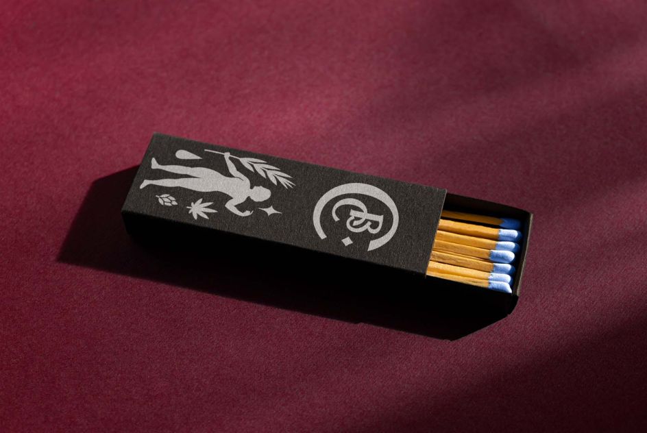
Elements such as the wordmark encapsulate Ceria's combination of traditional influences and future-facing details. Crafted to strike an enduring balance between heritage and innovation, it's the perfect distillation of everything the brewing company stands for.
Meanwhile, symbols that appear across the brand include Ceres, the goddess of agriculture and grain crops. Presented in portrait brew for alcohol-free beverages and full-body view for the THC-infused offerings, this symbol showcases simplified features which give it a modern, universal appeal.
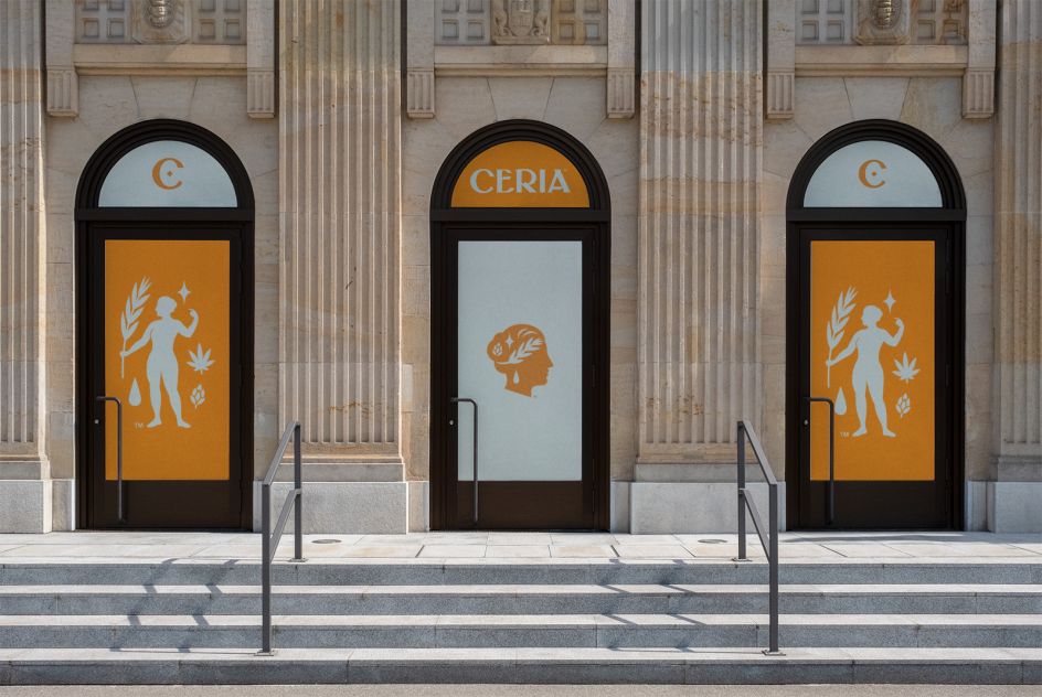
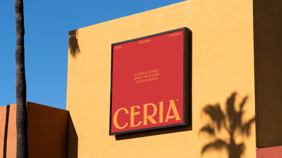
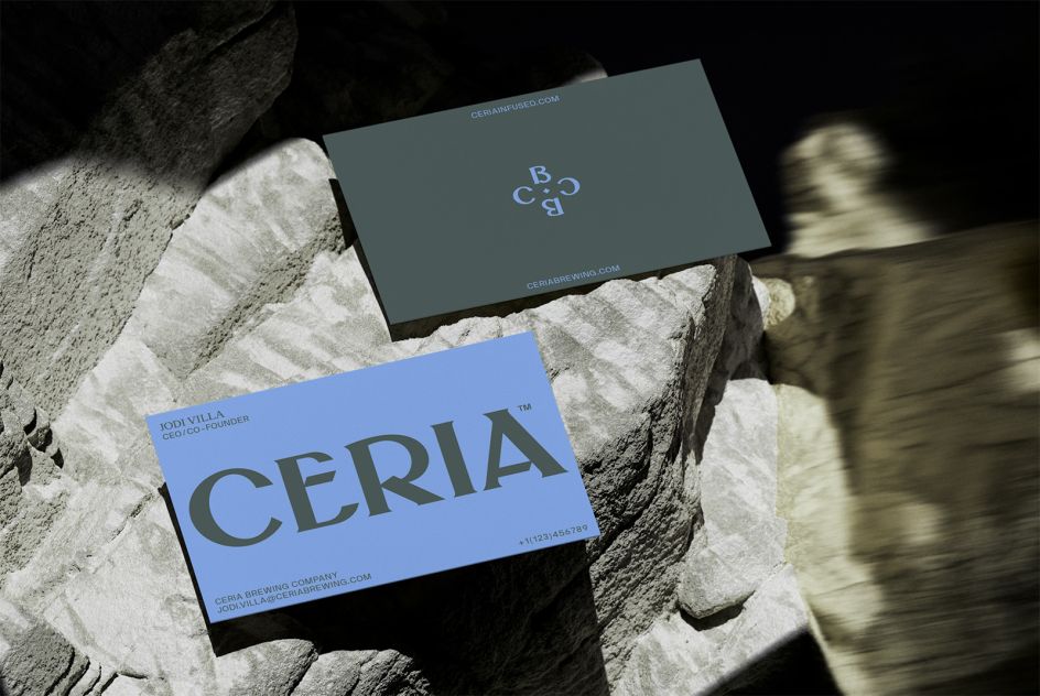
Iconography composed of leaf-like elements, which use wheat florets, help to furnish the design further, as do monograms with a modern approach to traditional lettering. As for the colour palette, this is designed to feel bright, refined, differentiated and delicious.
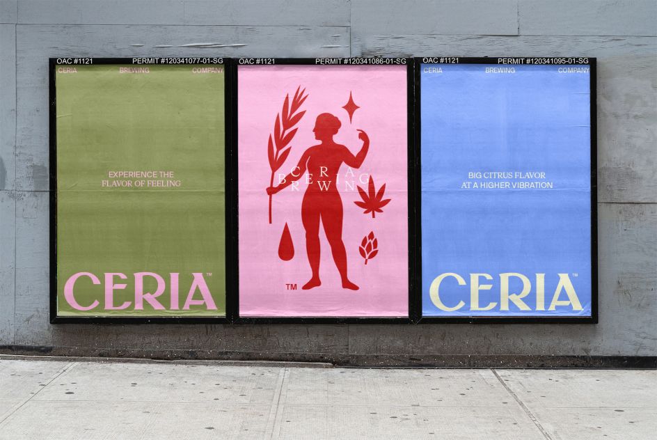
Optimistic and authentic photography finishes off the rebrand. It is hoped that this will inspire consumers to drink in the way they want, with the photography capturing the reality of the different ways people engage with the product.
"Working with the Villa family on Ceria is inspirational for us as a design practice, and we're very proud at Mother Design at playing a role in the company's evolution and growth," says Mark Sloan, Head of Mother Design.
He adds: "Our goal from a design standpoint is to channel Ceria's simultaneously classical and futuristic qualities—they have a deep knowledge of the ancient art of brewing, but also an irrepressible drive to innovate. The visual identity is an ever-evolving representation of this delicious dichotomy."
Expect the new visual identity system to appear on packaging, websites, social media and advertising soon, with the first of the newly designed cans hitting shelves towards the end of the month.
Editor's Picks


Trending


Podcasts


Editor's Picks
Further Reading