Butterfly Cannon's identity for Montezuma's Chocolates inspired by a passion for Latin America
When you explore the world (remember those days?), searching for adventure, you might be inspired to set up a chocolate brand, like the founders of Montezuma's Chocolates, which recently got a refresh courtesy of London design agency, Butterfly Cannon.
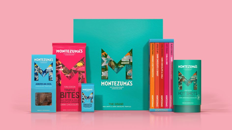
The company began over 20 years ago when its founders Helen and Simon fell in love with Latin America and the extraordinary chocolate they found on their travels there. Since setting up shop in Brighton to make handmade chocolates in a multitude of flavours, using only ethically sourced ingredients, their business had grown organically. Now they've got increased investment and an ambitious plan for growth beyond their own stores, so they approached Butterfly Cannon to re-focus the brand's purpose and re-think its creative platform and visual identity on its packaging to attract a more "urban ethical consumer".
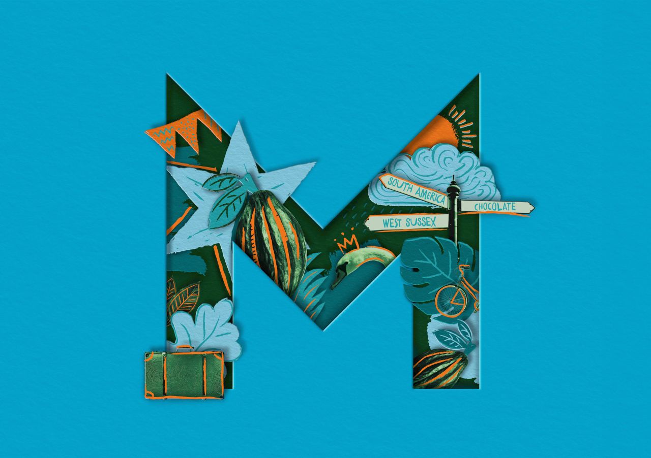
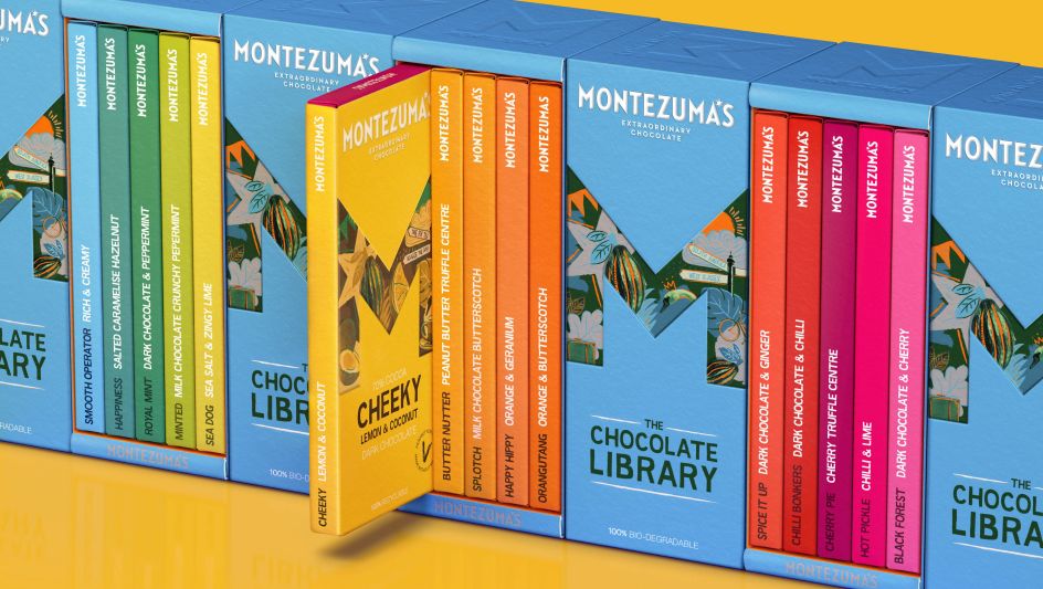
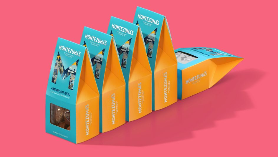
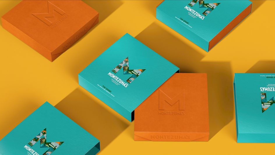
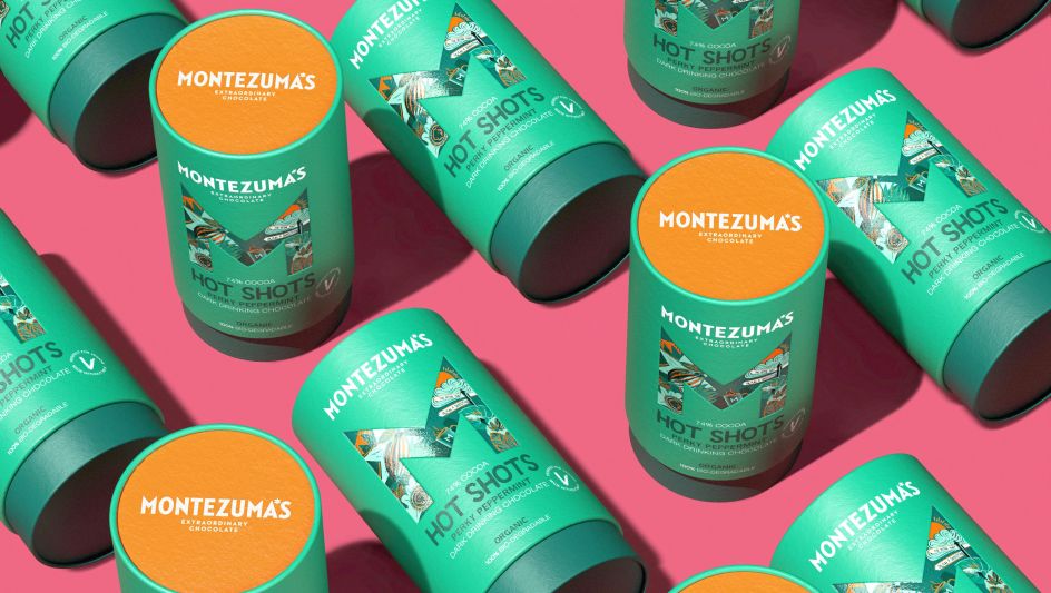
For the core brand icon, the agency broke the Montezuma's 'M' out of the ubiquitous star that it sat in, "boiling down and sharpening it to make it the instantly recognisable star of the show". It's now more than just an 'M' for Montezuma's, it is a "portal through which to explore a fantastical world of flavours and much, much more," explains the studio. It's accompanied with eclectic, hand-drawn illustrations and photographic elements that communicate integrity in sourcing ingredients, with each element telling a different part of the Montezuma's story, all with a "very British twinkle in the eye!"
There's a unique wordmark designed to reflect the sharp edges within the brand icon, while a six-pointed star in place of the apostrophe in Montezuma's is a "reassuring nod" to the old brand identity.
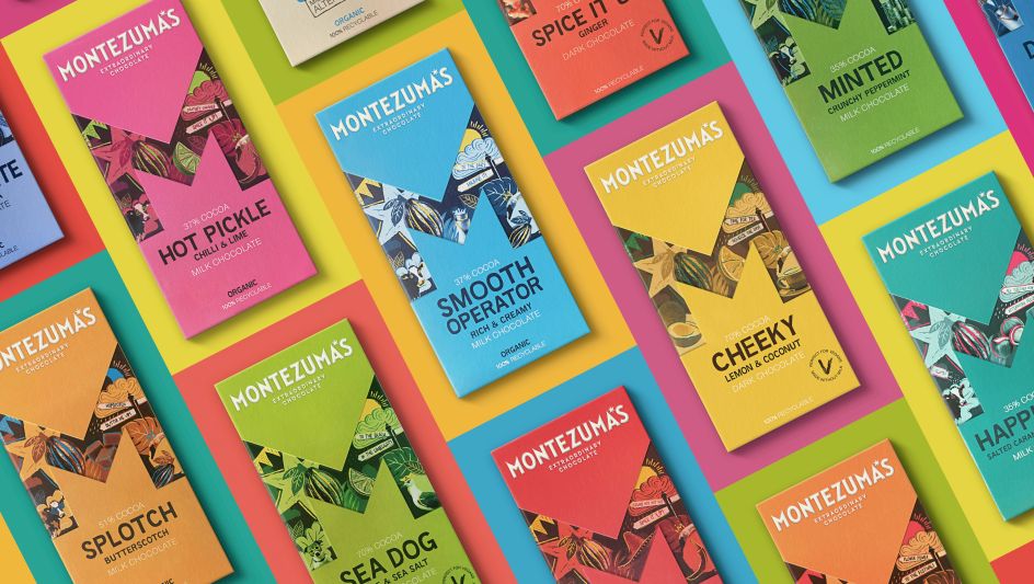
The central theme of "discovery and variety" is brought to life on its packaging through individual flavours having their own 'M' icon. Within each icon, the illustrations and colourways shift and change to tell the story of the flavour and bring to life quirky product names such as Nutterscotch, Like No Udder and Smooth Operator. These are executed in a bespoke Montezuma's Sans typeface created to "optimise legibility while reflecting the hand-drawn approach within the illustrations".
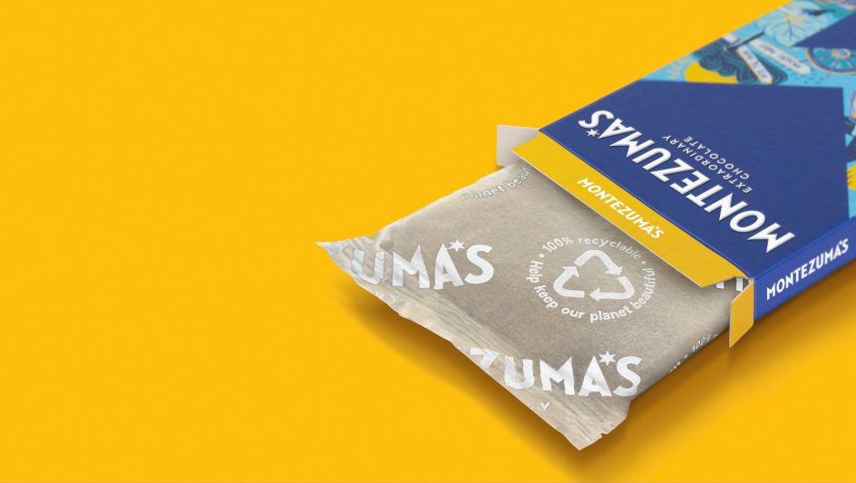
An important consideration was to ensure that its new packaging designs reflected the "ethical and sustainable ethos" behind the brand. Butterfly Cannon specified eco-friendly packaging across its client's entire range, making them the first British brand in the premium segment to do so.
Editor's Picks


Trending


](https://www.creativeboom.com/upload/articles/90/908fdb6378db1e95d12595416f54e6336d5e80b8_732.jpg)
Podcasts


Editor's Picks
Further Reading