Mental health charity Mind gets a brand refresh thanks to DesignStudio
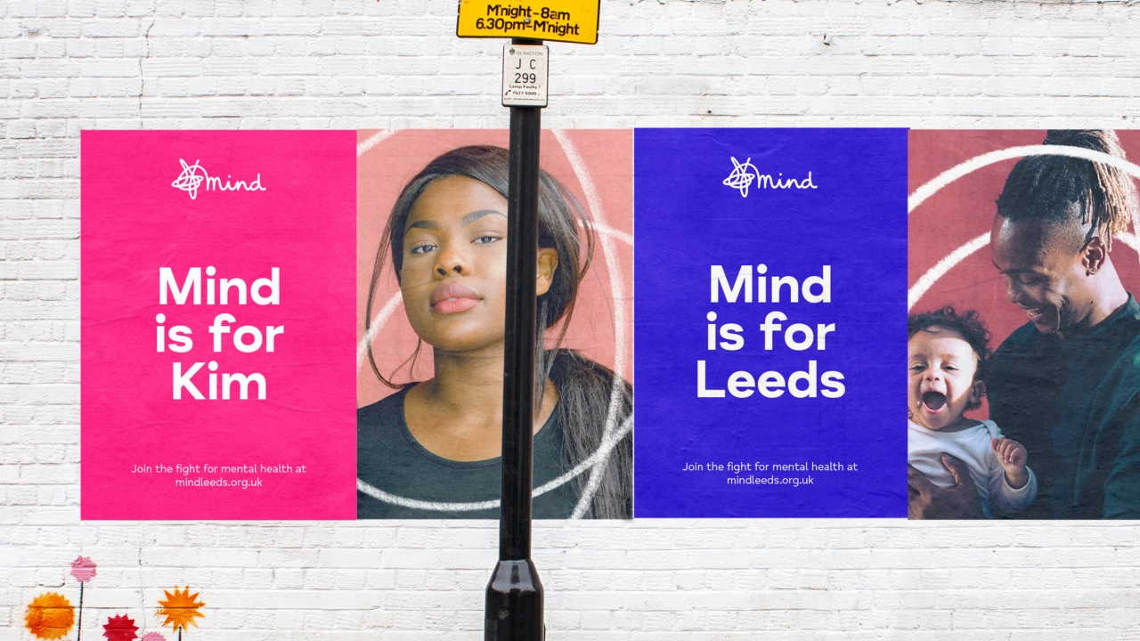
It's been over a decade since mental health charity, Mind, updated its brand. During that time the attitude around the subject has changed enormously. Although the stigma is slowly dissipating, there's still some way to go. DesignStudio was appointed to "recapture the charity's fighting spirit" with a contemporary new tone and identity.
The overhaul comes as we face an unprecedented mental health crisis in the wake of Covid-19. Waiting lists are apparently too long and the number of people struggling to cope is rising fast. What's more, if you live in poverty, you're more likely to experience a mental health problem while more young people than ever are dealing with anxiety, panic attacks and suicidal thoughts.
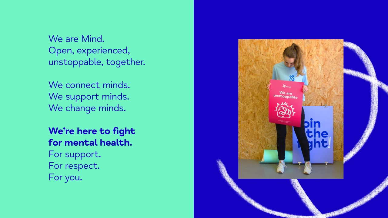
DesignStudio was brought in, working on a semi-pro-bono basis, to reimagine the "already ambitious" brand strategy and create a new brand purpose statement that is "simple, powerful and actionable", uniting the organisation internally and externally, and broadening Mind's reach.
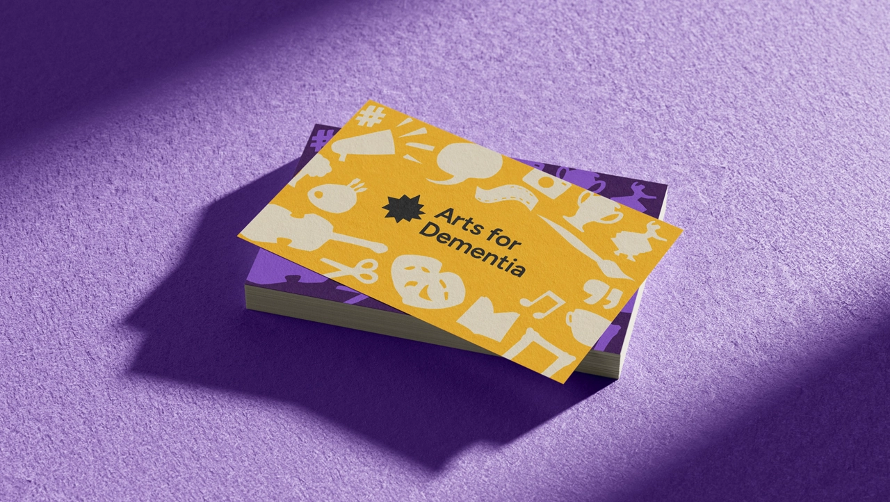
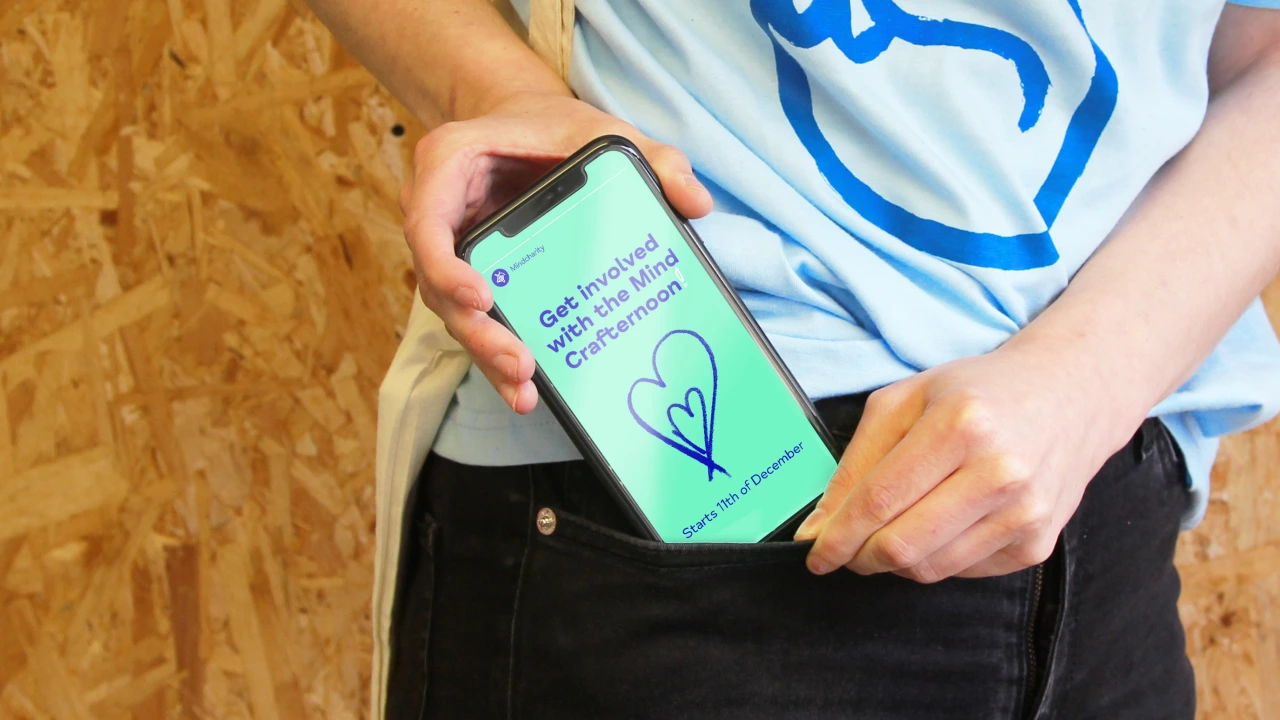
To make the brand more inclusive, the team developed an open and accessible typeface and evolved the 'brand VI' adding a broader, more vibrant colour palette reflective of Mind's new attitude. Gone are the previous three fonts which are now replaced with Monotype Mind Meridian, an accessible font designed in collaboration with Monotype, one that is legible for those with visual impairments.
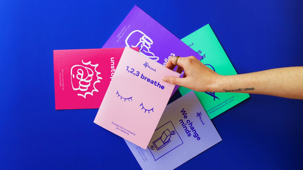
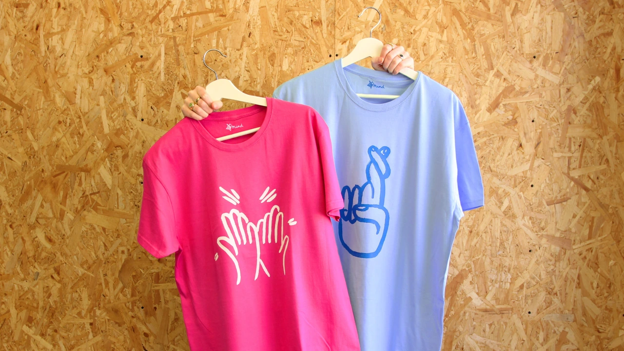
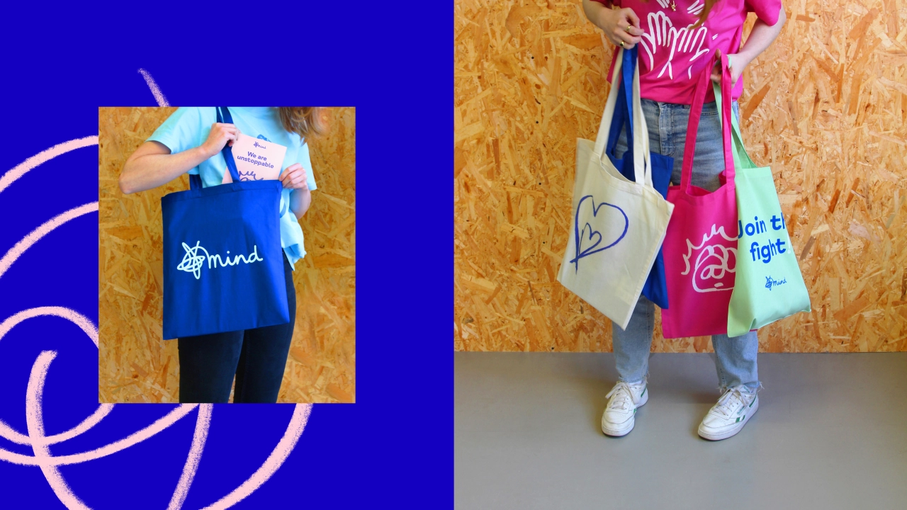
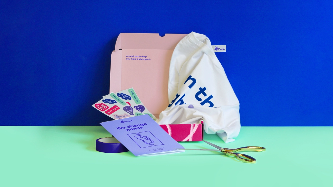
A set of hand-drawn illustrations, donated by those who work at DesignStudio, celebrates different styles unified through colour; capturing the huge variety in experiences around mental health. It also adds some relatability.
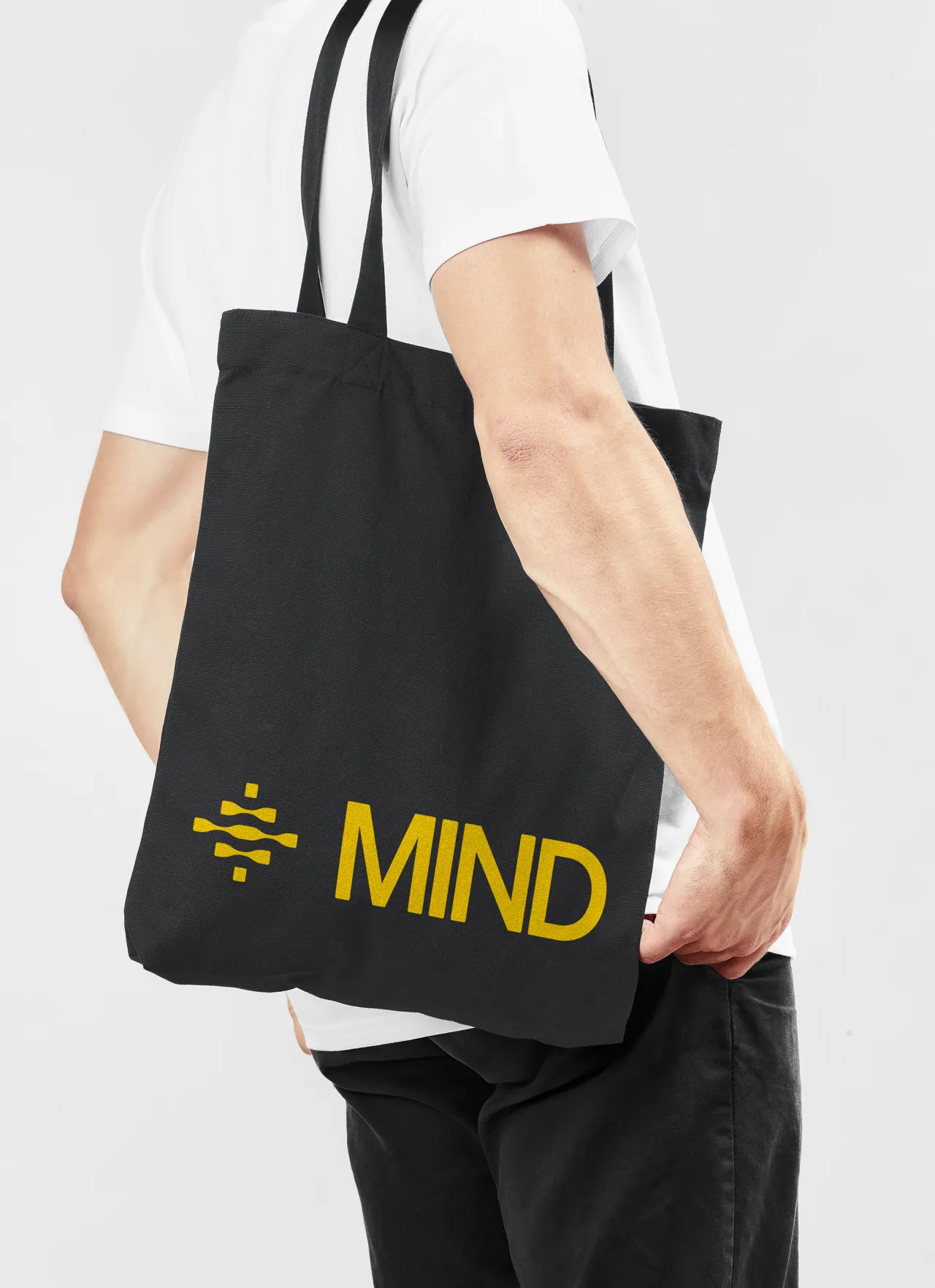
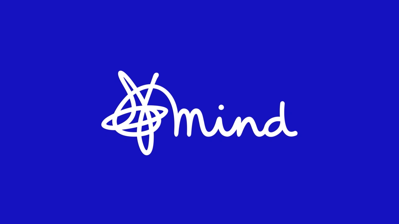
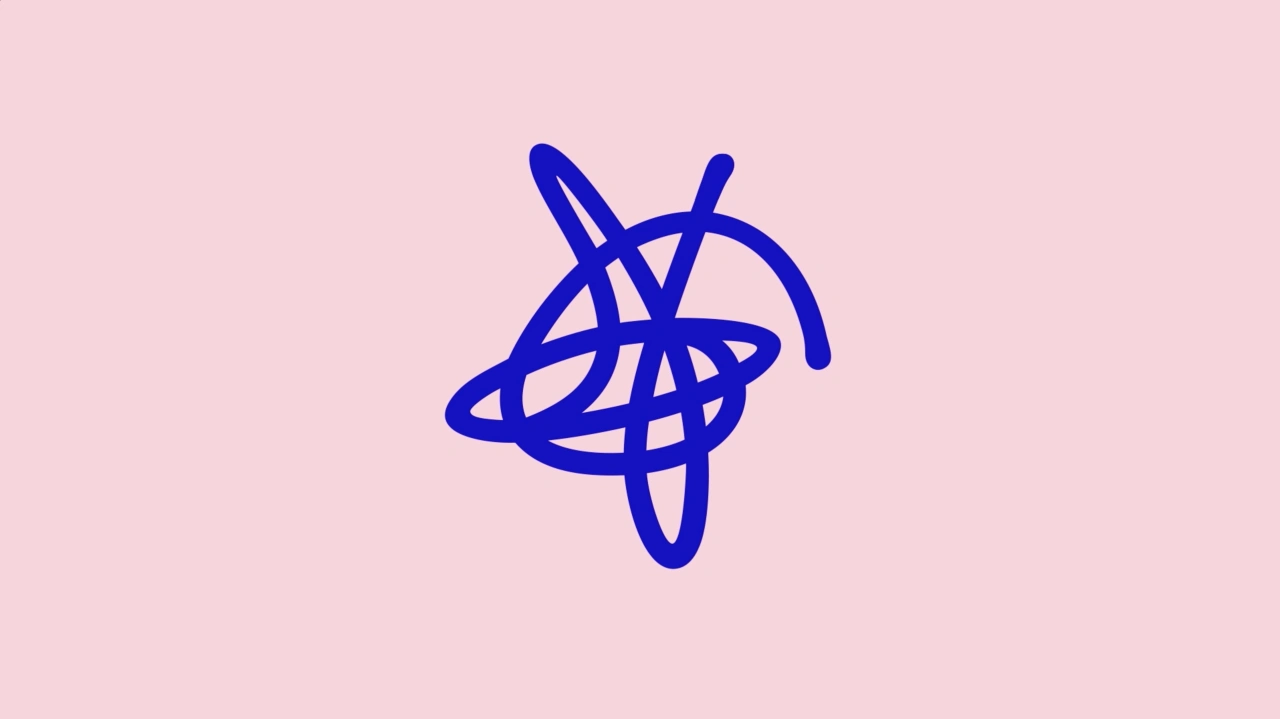
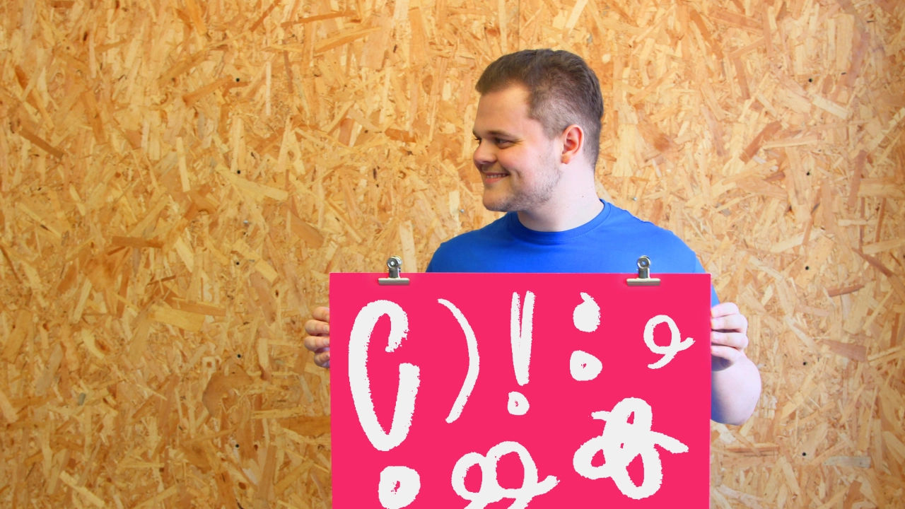
The beloved logo, meanwhile, has been redrawn and simplified: it's now thicker and the tagline has been dropped so it works at smaller sizes. This includes a bespoke word marque for Mind Cymru – drawn in the same style. And the iconic squiggle symbol has been redrawn so it is a continuous line ("as always intended") and can now be used independently in avatars. DesignStudio has also created 'Squiggly punctuation' inspired by the symbol to add character to words and to emphasise messaging and voice.
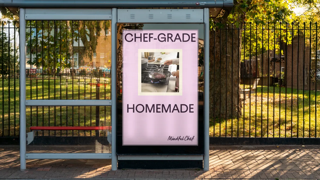
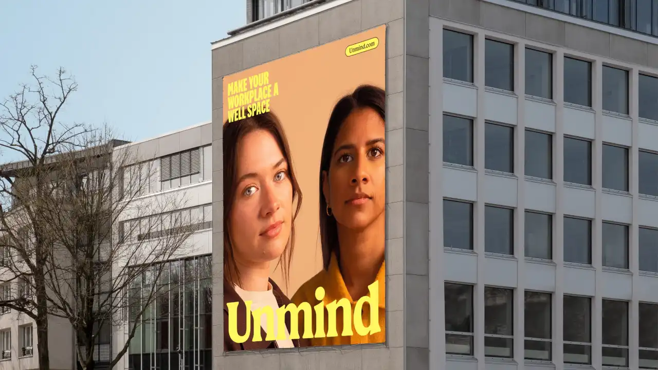
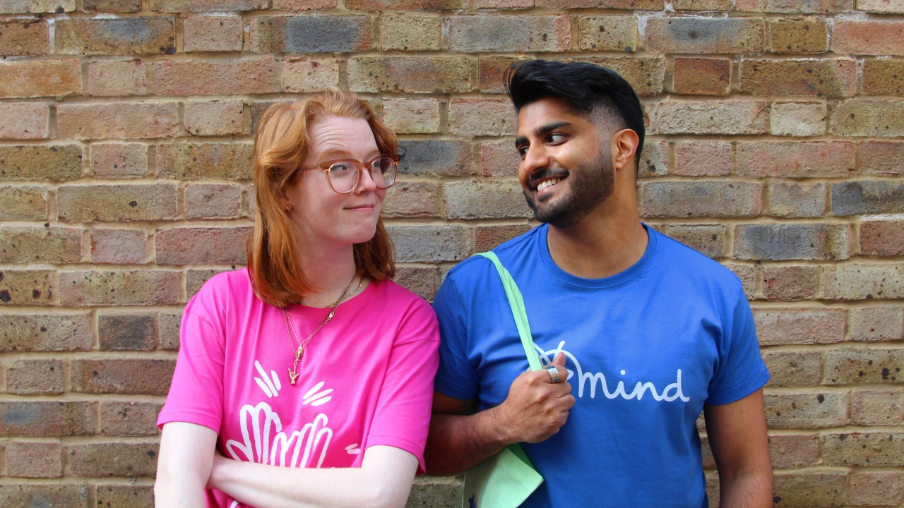
Finally, photography has been updated and diversified to represent people from all walks of life: "real people, real-life moments".
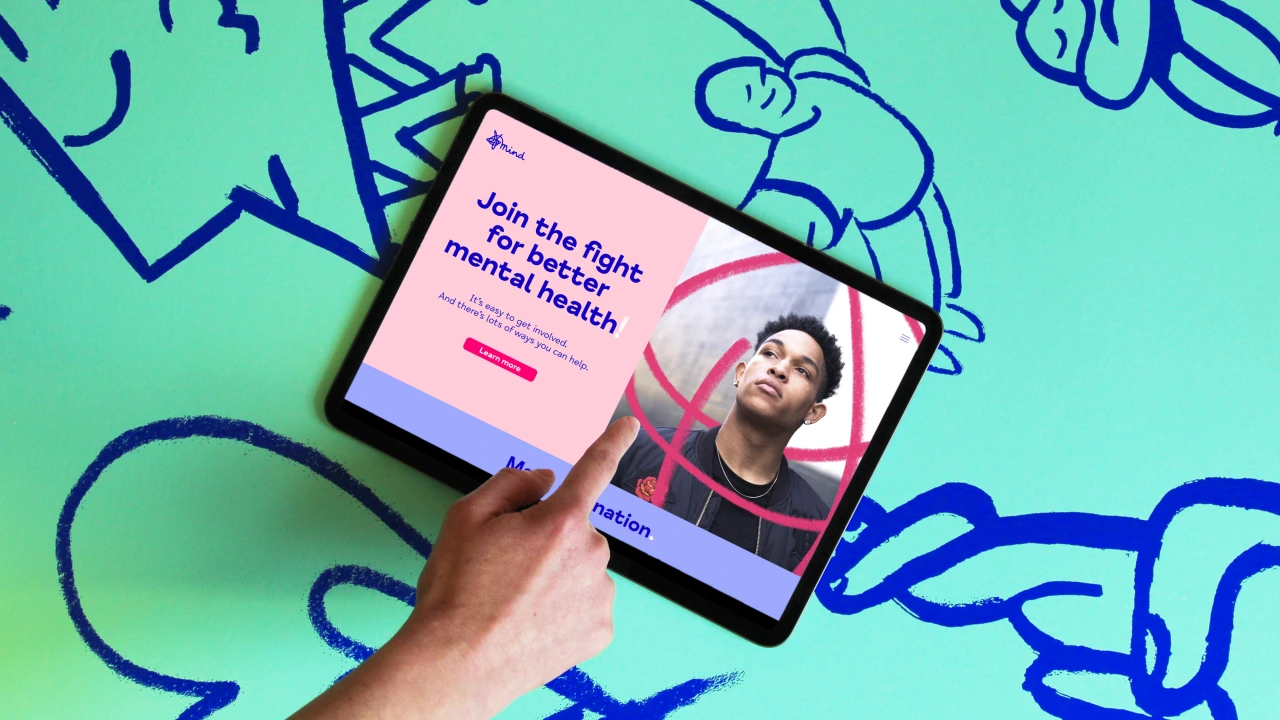
The brand refresh, alongside Mind’s new purpose and corporate strategy, launches on the back of Mental Health Awareness Week and will be rolled out gradually throughout the year.
Vinay Mistry, creative director at DesignStudio, says: "We wanted to build on existing elements but broaden Minds' appeal for today's diverse audience. After extensive research with employees, volunteers and people with lived experience, we brought fresh thinking to the visual toolkit. Each element has been designed to be more contemporary, personal and accessible, helping Mind express their authentic personality."
Editor's Picks





Trending






Latest Jobs
Design Director at Human After All
Full-time·London·£66k–£88k
Account Director at How&How
Full-time·London·£73k-£79k
Graphic Designer at Crux Product Design
Full-time·Bristol·Up to £36k
Graphic & Motion Designer at The SHARP Agency
Full-time·Leeds·£26k–£33k
Creative Project Manager at Analogue
Full-time·Leeds·£28k–£35k
Principal Software Engineer at BBC Media Tech
Full-time·Glasgow·Up to £83,790