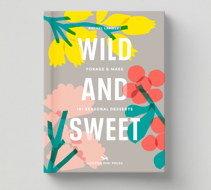
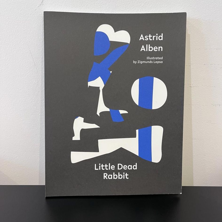
Little Dead Rabbit: playful poetry book finds new ways to balance text and design
Book-length poem Little Dead Rabbit is the latest collaboration between poet Astrid Alben and designer Zigmunds Lapsa. Created during the lockdowns of 2020 and 2021, it tells the story of a little dead rabbit found on the verge of a road via an innovative combination of concrete poetry and abstract handmade die cuts.
Described as partly an adult fairy tale, Little Dead Rabbit is as much a meditation on healing and joy as it is about death. And thanks to the unique opportunities that poetry presents as a "non-linear" medium, according to Astrid, it was the perfect project for the two creatives to come together and explore how syntax could translate into an image.
"A poem is a 'thought-scape,' that is, an assemblage of sound, images and implied actions pulling apart and converging in different possibilities," explains Astrid. "Zigmunds and I discussed how to 'just ignore the text', and over time we understood that what that meant was to disconnect the poem from this left to right top to bottom reading."
Zigmunds adds that the structure and the order of the different elements of the story were free to be shuffled around as they deemed fit. "Background elements in the image could switch with elements in the foreground, and the whole thing could then be read differently. We would also draw parallels between negative space in an image and music. Just really geeky talk."
Crucially though, Little Dead Rabbit was not a conventional poetry book with accompanying illustrations. According to Zigmunds, Astrid's "121st draft" was emailed to him as a starting point, and from there, he started coming up with sketches as the two of them thrashed out how text and design could work together as equal forces.
"I didn't envisage the poem to be a calligramme – think of Apollinaire and his Eiffel tower, or Paul van Ostayen's Occupied City, poets who used typeface and spatial arrangement of the words on the page to perform the role of meaning as much as the words themselves," says Astrid.
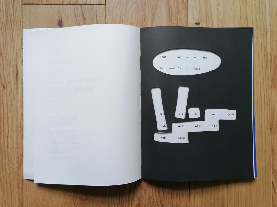
Just as poems don't arrive with a written brief from the muse, Little Dead Rabbit didn't start with a set idea of what it should be. Zigmunds would start by visually responding to Astrid's poem, and first attempts saw them experimenting with graphic text elements such as dashes, brackets and dots, which give the text more visual structure and rhythm.
"During the process, I had an idea of putting a diagram over the text, and I figured that there was a possibility of grouping words with the help of shapes and changing the direction of reading," says Zigmunds. "So it wouldn't read only from left to right, but also from top to bottom, diagonally. So in that sense, it has a similar principle to crossword puzzles."
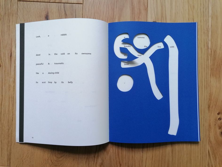
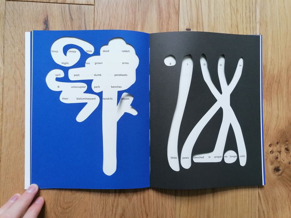
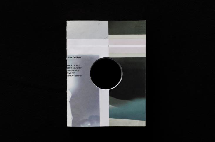
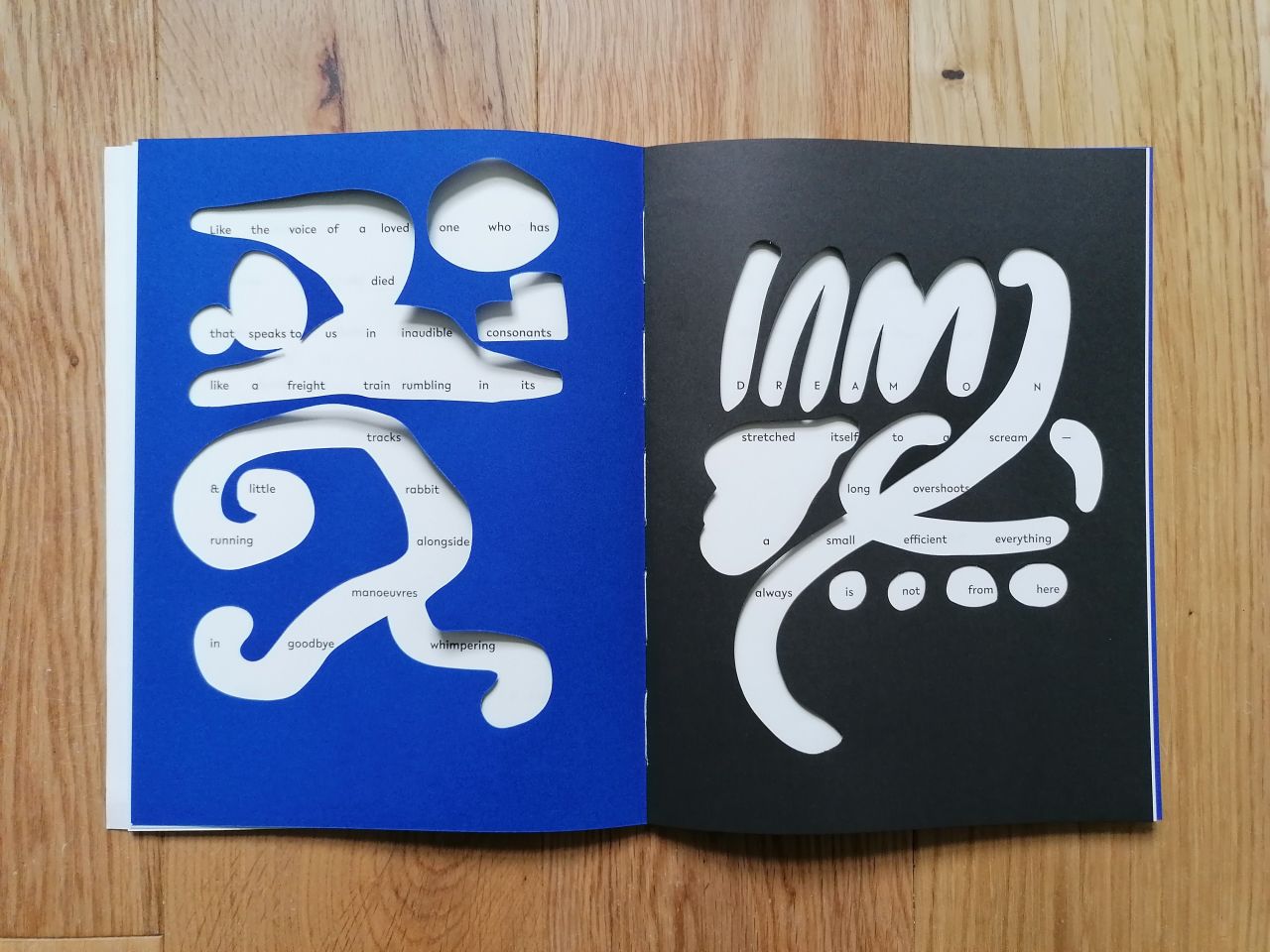
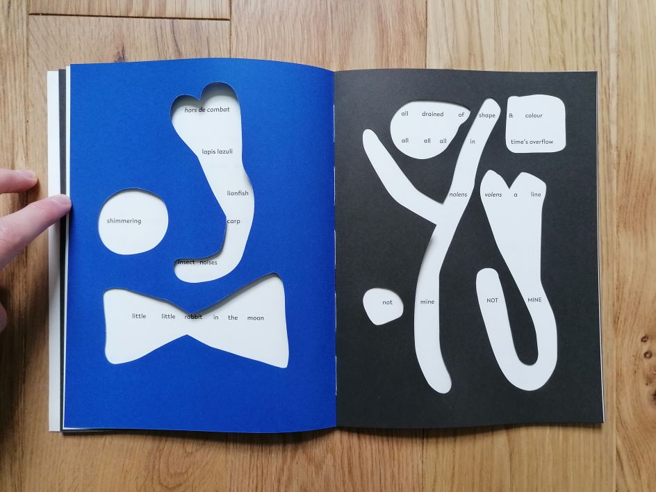
The process of making the stencil images in the book was mostly analogue and involved lots of drawing, cutting, scalpels and "finger-pain". Zigmunds would first print out the poem. Then he would create extra space between the words and use a lightbox as he placed another sheet of paper over them. From here, shapes were drawn with a brush, connecting the words on a page in a non-reading direction.
"The same shapes also became illustrations," he says. "So the cut-outs needed to work both as a matrix for reading the poem and as an image."
Once a couple of dummies were made, the pair had to figure out if they could produce the book using a commercial printing house. "We clearly didn't want to produce an unaffordable limited edition sort of a book," Zigmunds reveals. "We received a fair bit of apprehension from printers considering the complexity of the work.
"'Jelgavas tipogrāfija' printing house in Latvia agreed to work with us despite all its issues. They brought to it their experience and crafted it beautifully. Alexey Murashko, my colleague from Riga, also gave me several insightful tips about printing which he is a fan of."
And just as the words influenced the design, so too did the stencils impact the text. "Certain cut-outs asked for things to be rewritten, repeated, to be cut or have lines added to it," says Astrid. "The gaps and shapes showed me where the poem had to go. Importantly, the images influence the text now. The cut-out shapes open up different ways to read the poem and for the reader's eyes to flit back and forth, constructing different text versions."
Zigmunds adds that the shapes are in a free association with the text. "The colours black and blue were chosen to give it the feeling of it taking place at night and has a bit of dramatic, shadow-play quality. Hopefully, the process and the feeling of surprise translates into the book."
Astrid agrees that Little Dead Rabbit is as much about the bizarre absurdities of daily life as it is about death. And praise for the elastic extremities of language is tied up in that fun. "The words play at being images, and the images play at being words – it's a dance!"
Little Dead Rabbit is available now from Prototype.
Editor's Picks


Trending


Podcasts


Editor's Picks
Further Reading