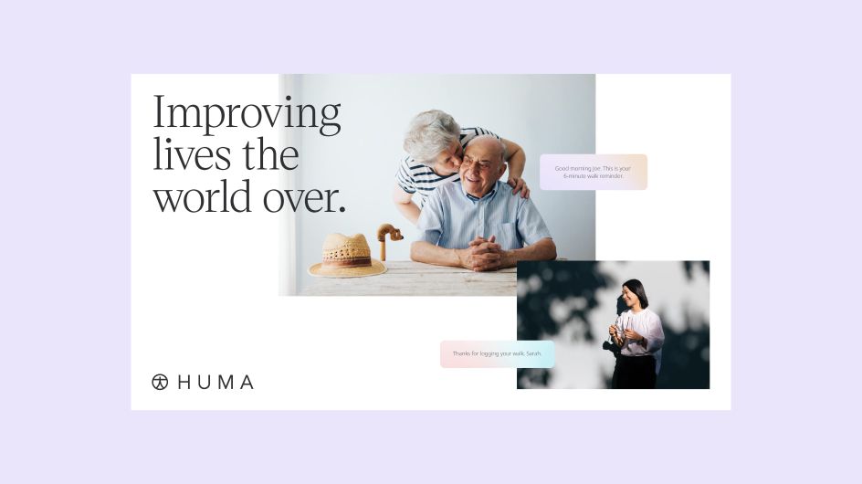
Koto's refresh for a global health-tech firm imagines a 'world where every person lives their life to the fullest'
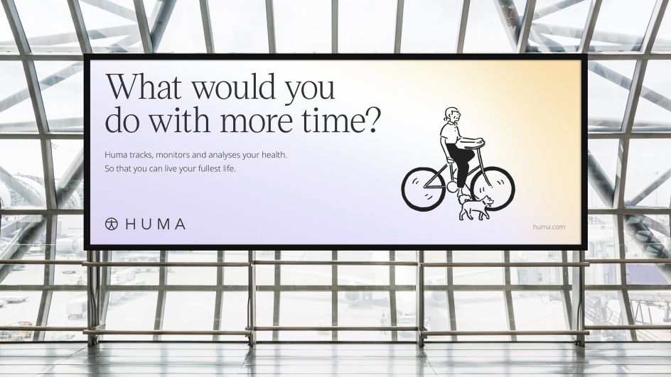
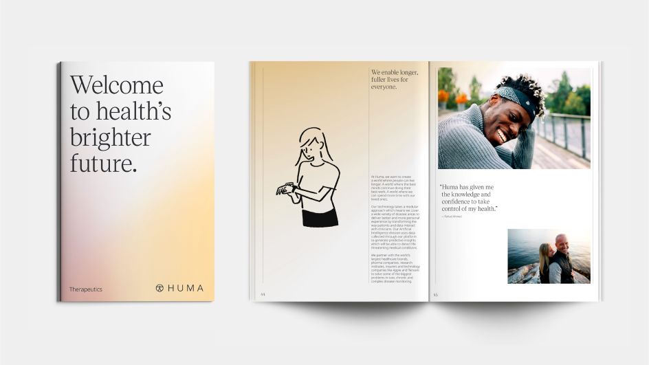
How do you turn a traditionally cold medical brand into something warmer and more relatable? For Koto's rebrand for Medopad, it was obvious: bring its passion for helping people live "their fullest lives" to centre stage.
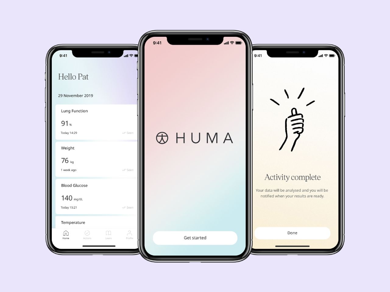
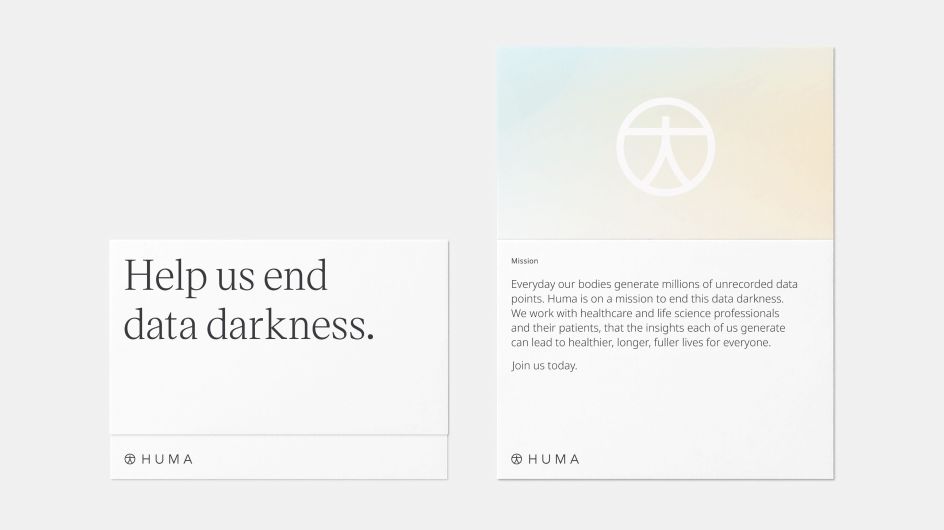
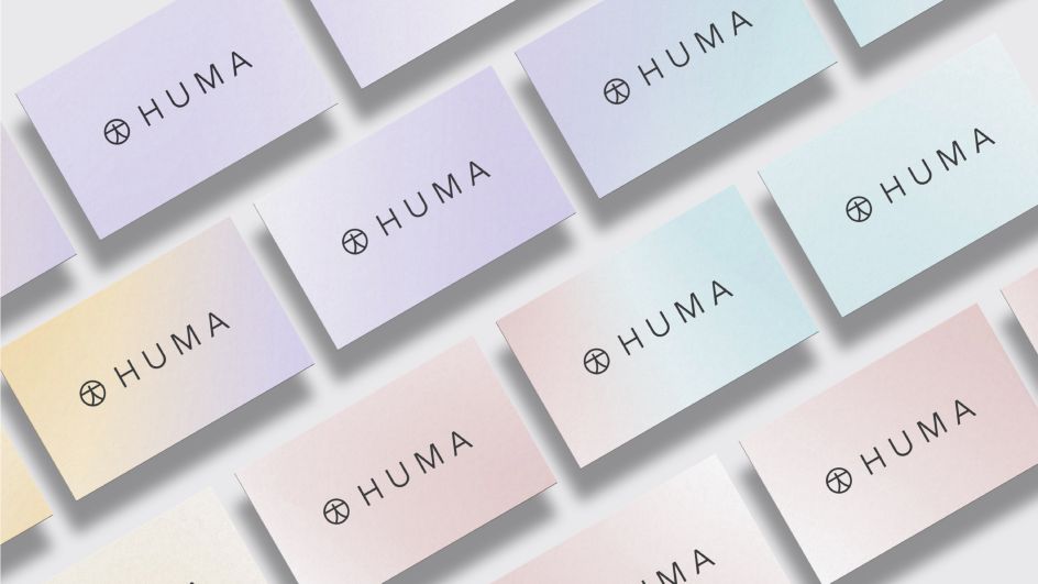
Answering to the brief to create "something which reflected the improved outcomes and quality of life they delivered by bringing healthcare providers closer to their patients", the London studio also renamed the global health-tech firm as Huma. Its meaning is a benevolent and lucky mythological bird and symbol of Persian history. "Immortal, it's said to renew itself in fire like a phoenix," explains Koto. "It never comes to rest, living its entire life flying invisibly high above the earth. It has both male and female natures in one body, and a glimpse of its shadow will make you happy for the rest of your life." Intentionally related to 'human', the brand's name reflects a "dedication to the lives of everyone".
It was something that came about collaboratively, as Koto worked with the client on the strategy and came up with a vision of "A world where every person lives their life to the fullest". The idea being, they'd create a brand focussed on "revolutionising the future of healthcare should be patient-centric and be grounded in their skills as a product focussed company".
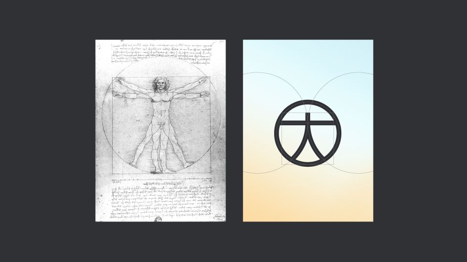
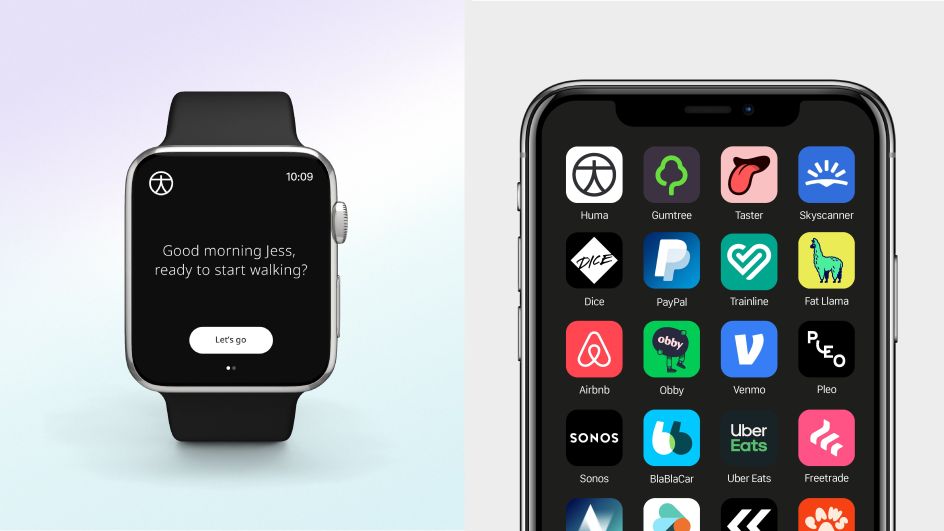
And what about the logo? It again focuses on the health of the whole person, with a form based on the proportions of the Vitruvian Man by Leonardo da Vinci, a universal symbol of humankind. It's designed to work at all scales, starting with little spaces like an Apple Watch.
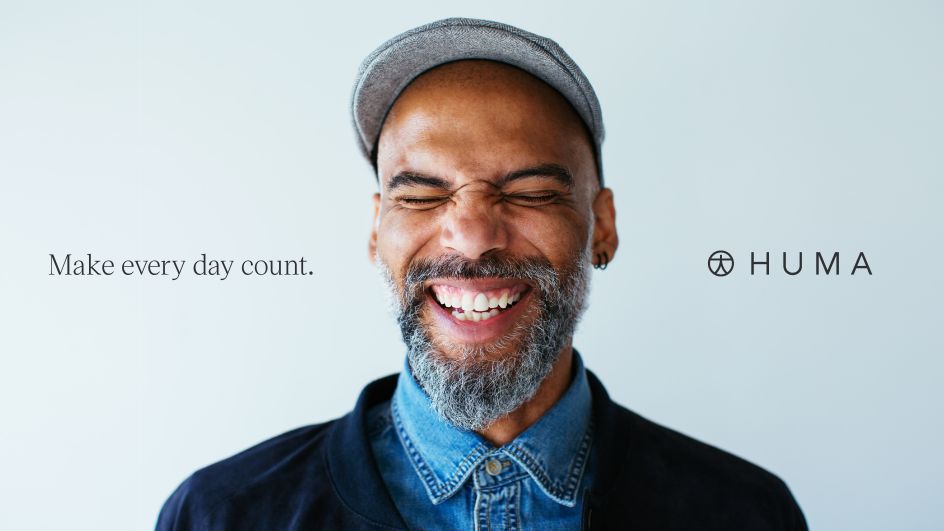
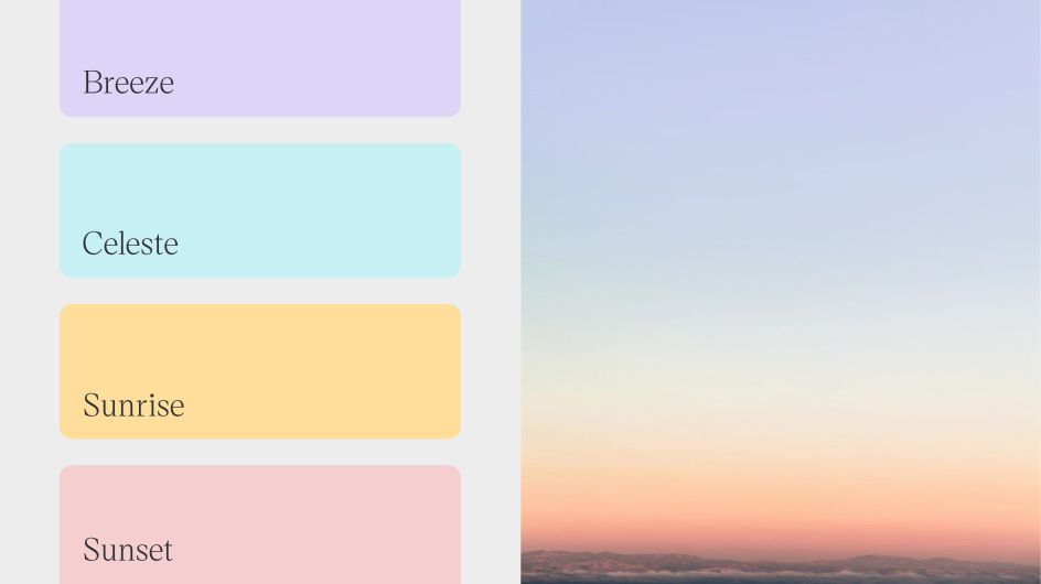
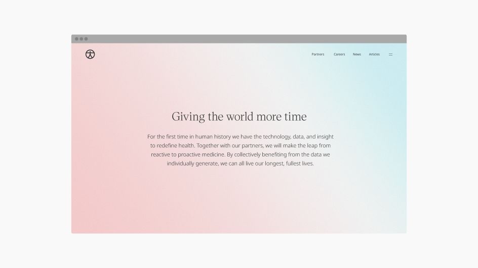
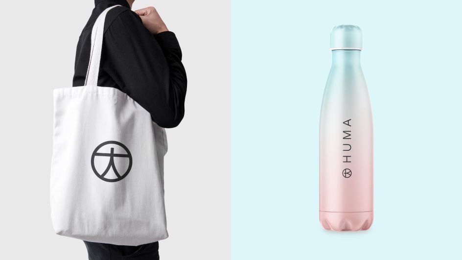
As for the colour palette? "It's inspired by nature and adds warmth and sense of calm to brand. A refreshing change from competitors within the healthcare space, which often feels quite cold and sterile," says Deanna German, design director at Koto.
Koto worked with Christian Janský at Kometa on the customisation of Victor Serif. The font was chosen to deliver a "trusted feeling utilising the semiotics of periodicals and other sources of knowledge", while Noto was used for body and general use.
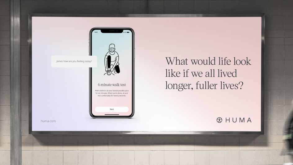
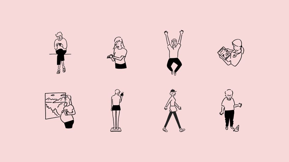
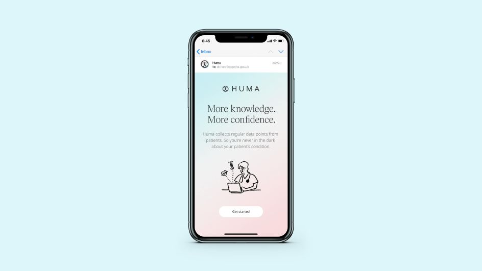
To humanise the digital experience, Koto worked with Tokyo-based illustrator Yu Nagaba to develop some charismatic illustrations capturing clinicians, patients and their families. These characters appear throughout the app and digital experience, giving an extra kick of optimism.
There's also a mixture of photography with some stock and some commissioned team shots working with London-based Patrick Harrison. And a launch animation was created with Michael William Lester at Beginners studio. The new website was designed by Koto and built by ON.
"From the minute we first engaged with Huma we knew this was a brand with massive potential," says James Greenfield, Koto's founder and creative director. "Healthtech has the chance to revolutionise the way people are treated globally. We've very much built a brand with our friends and relatives in mind."