Koto turns eco-friendly branding on its head with dinosaur-themed identity
Brand and design studio Koto has found a novel way to communicate eco-friendly credentials with its identity for sustainable packaging company De-extinction. Bursting with unusual colours and dinosaur imagery, it aims to warn users about the threat of single-use plastics.
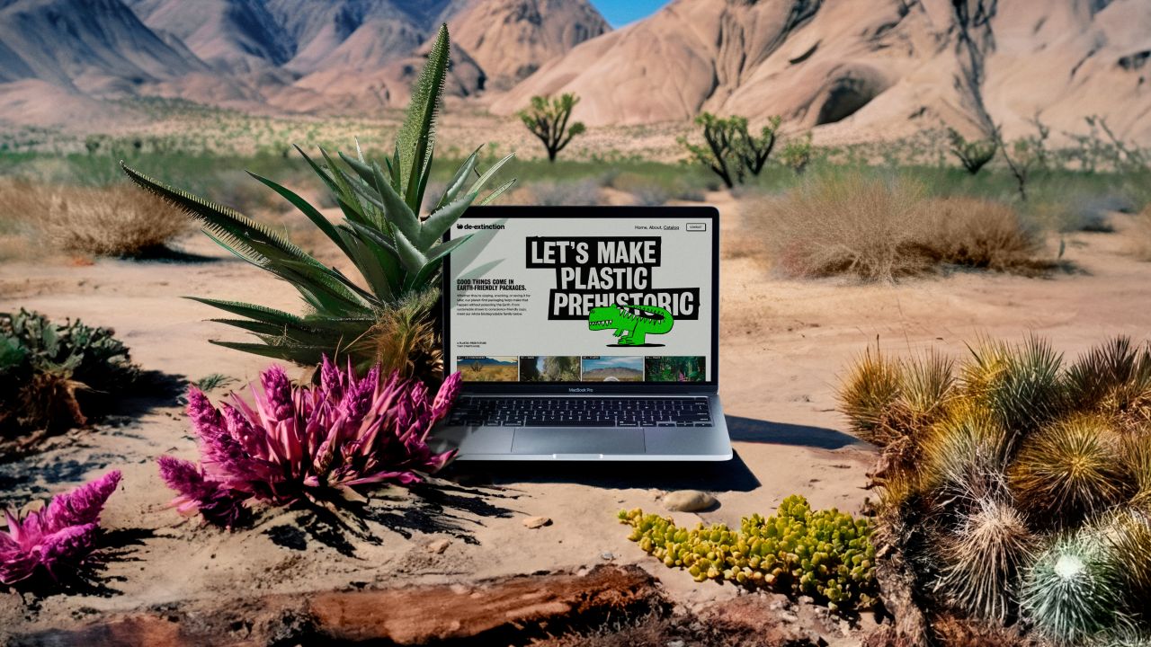
Everyone knows that single-use plastic is bad for the environment. In fact, it's such common knowledge that the message risks losing its impact. To help encourage people to remember to use eco-friendly alternatives, Koto has created a striking identity for sustainable packaging company De-extinction.
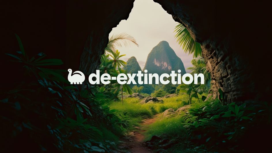
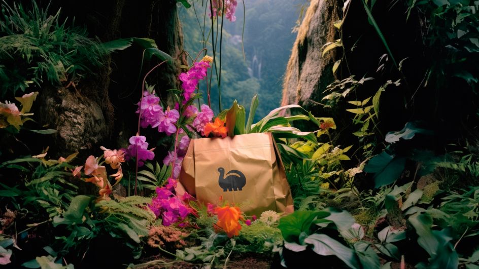
Rooted in a "rebellious but playful ethos", Koto's identity for De-extinction included the creation of both brand imagery and the company name itself. Centred around the idea of leaving no trace, it aims to be a rallying cry and proactive force in the war against wasteful attitudes.
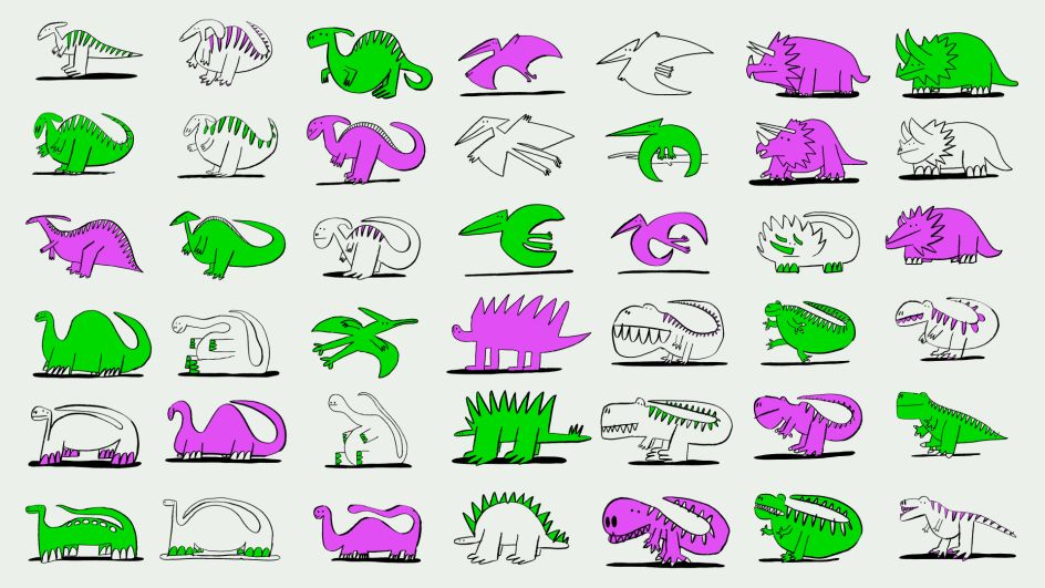
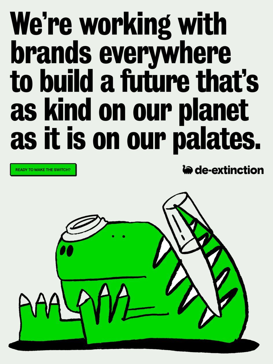
To get its message across, though, Koto steered clear of the cliches that have come to blunt eco-aware branding. Gone are images of the planet or sprouting leaves. In their place are beautifully-doodled dinosaurs who know a thing or two about what it feels like to be wiped out.
Even the colour palettes used by Koto defy expectations. Green is present throughout, but it's not a soothing shade. Instead, it has a distinct sharpness, almost making it difficult to look at. Accompanying this are lurid pinks, purples and off-whites that create a harmonious equilibrium.
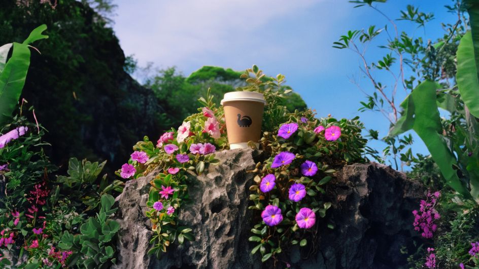
The perfect combination of this attitude and attention to detail can be found in the De-extinction logo, which takes the shape of a cute little dinosaur icon. Instantly recognisable across various platforms, the logo is paired with a customised wordmark which echoes its prehistoric inspiration through its letter shapes.
Elsewhere, even the font choices are a nod to sustainability and represent the old in a new light. Grotesque n9 is used throughout, fitting as it is the first sans-serif typeface. "This typeface masterfully balances expressiveness and functionality, serving as a typographic representation of the De-extinction ethos — reflecting reinvention for an unconventional, bold future," the studio explains.
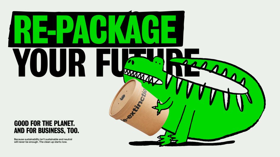
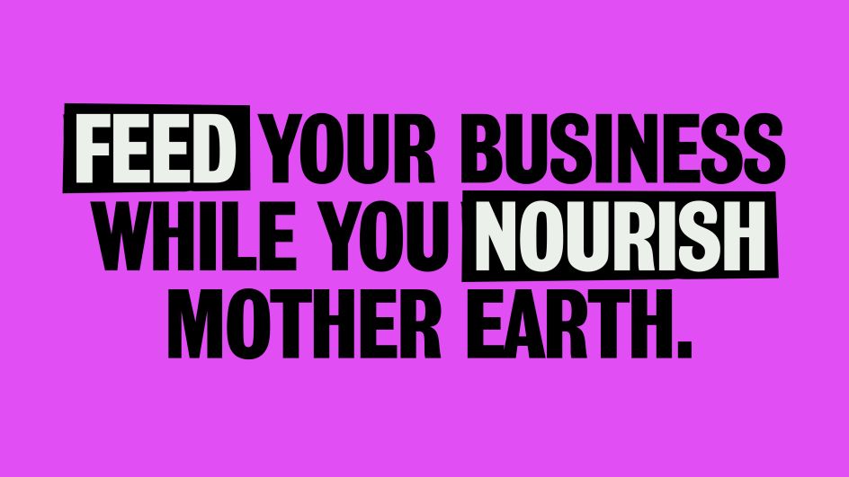
Built on the three commandments of 'Extending an inviting hand,' 'Speaking candidly,' and 'Embracing irreverence,' the brand uses its voice to nudge consumers into action via a series of powerful phrases. These include: "Let's make plastic prehistoric," "Go lean, go green," and "Re-package your future".
The result is a brand that's striking yet self-aware. And considering that softer approaches don't appear to have the desired results when it comes to reversing climate change, perhaps the time is right for a more in-your-face approach. After all, if we don't change, humanity risks going the way of the dinosaurs itself.
"With De-extinction, we sought to shake up the eco-friendly space by reviving dinosaurs as a playful, powerful symbol," says Arthur Foliard, Koto Creative Director. "Our vision was to stand out from a sea of sameness with a brand that would be immediately memorable while still addressing urgent environmental issues.
" Our dinos grab customers' attention as the stars of the show. But we didn't stop there in pushing boundaries. We crafted each branding element with the same rebellious spirit - from the unexpected colours to the bold typography through the motion principles.
"Every choice focused on breaking conformity to give De-extinction a provocative point of view. With this vibrant branding, we shook up the eco-friendly category by not playing it safe. We rebelled against dull branding by taking extinction head-on with an unconventional, vibrant voice."
Editor's Picks


Trending


Podcasts


Editor's Picks
Further Reading