'Just to keep drawing': The tale of how Innes Clark designed her way out of a bakery and into restaurant branding
From burnout after art school to designing menus and posters for London's restaurant scene, the illustrator talks us through her journey and key learnings.
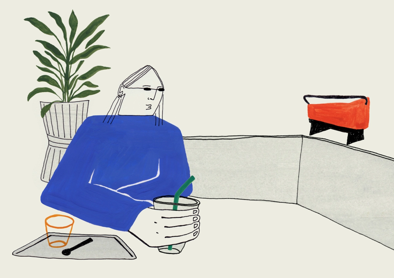
When you hear about a graphic design job starting from pulling shifts at a bakery, you might think it's quite the unlikely career pivot. Well, that's exactly how Innes Clark's practice took shape.
Burnt out after four pandemic-disrupted years studying illustration at Edinburgh College of Art, she took a bakery job to take a step away from it all, squeezing in a crash course in graphic design on the side because she knew, eventually, that's where she wanted to end up. "The bakery gave me so many opportunities and helped catapult me into my current role as a graphic designer," she says. "Never did I think taking a role in hospitality would get me where I am now."
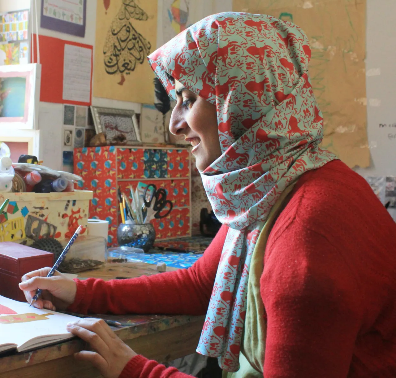
Innes grew up in north London to two creative parents, so art and design were part of the household. Inspiration, for her, still works the same as it did back then. "Whether it's being alone with my thoughts on the central line in the morning, having dinner with my friends or consuming media, my process and ideas, before I even get pen to paper, are about utilising what I take in throughout the day and running my own commentary over it." She names Saul Steinberg, David Hockney's early sketches and Tim Burton's illustrations as long-standing influences, alongside the zines stacked at GOSH! Soho, which she calls "an absolute library of inspiration for anyone".
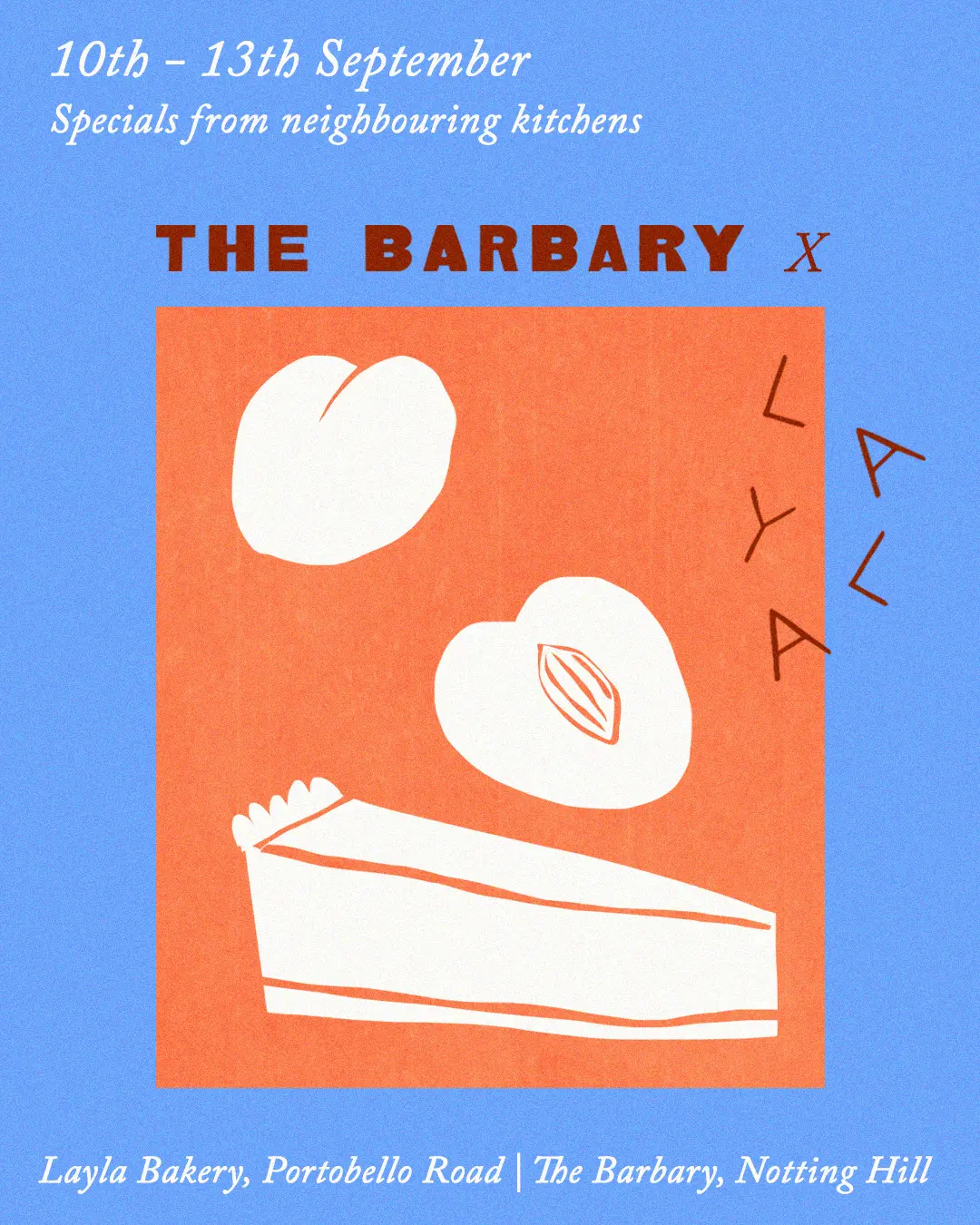
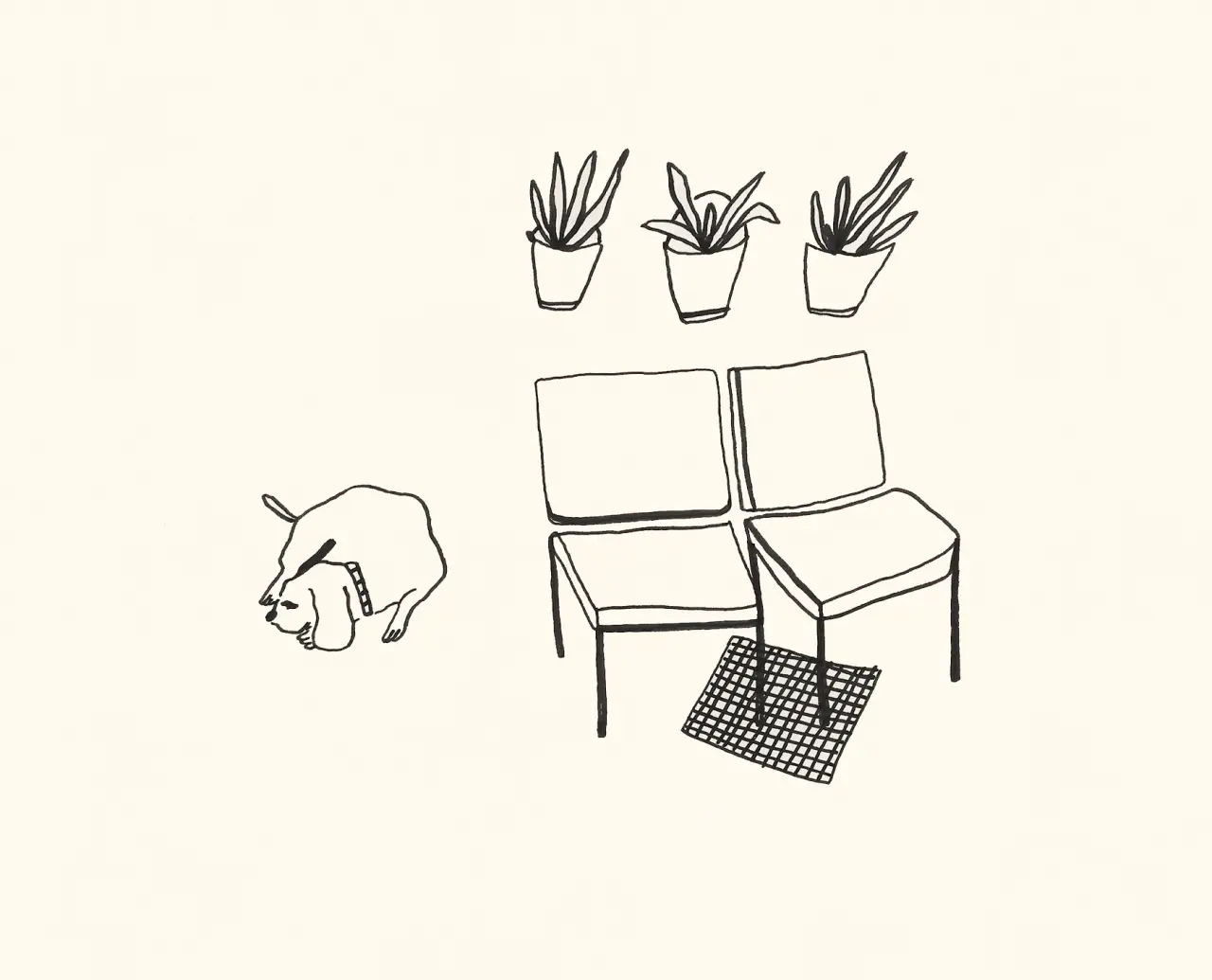
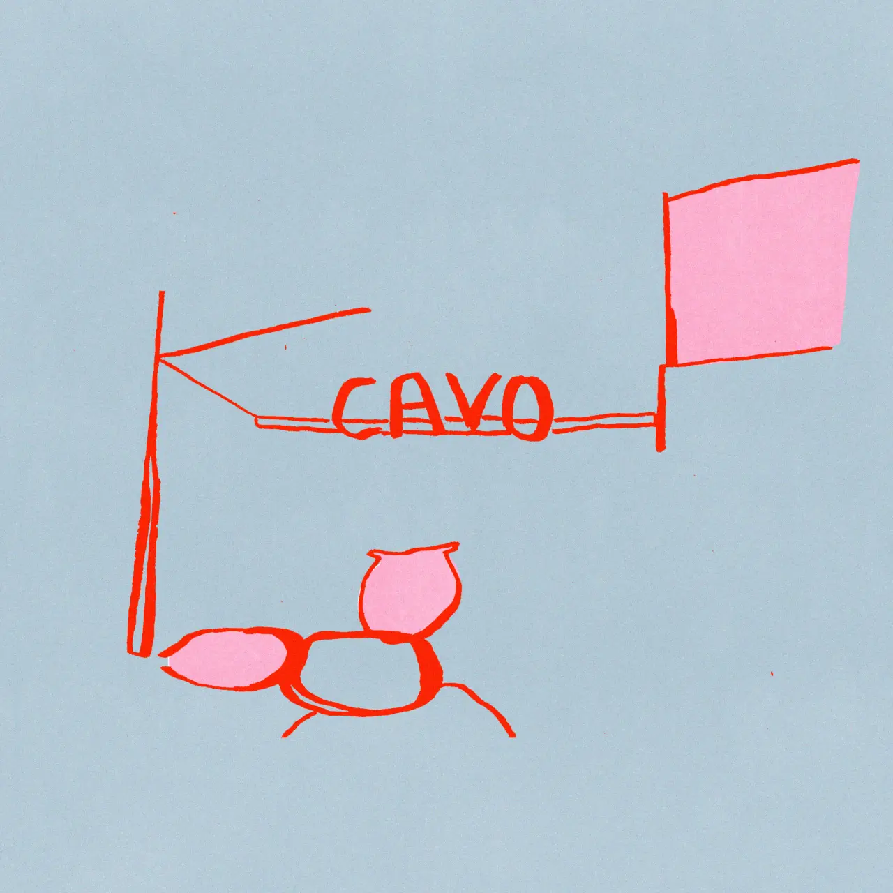
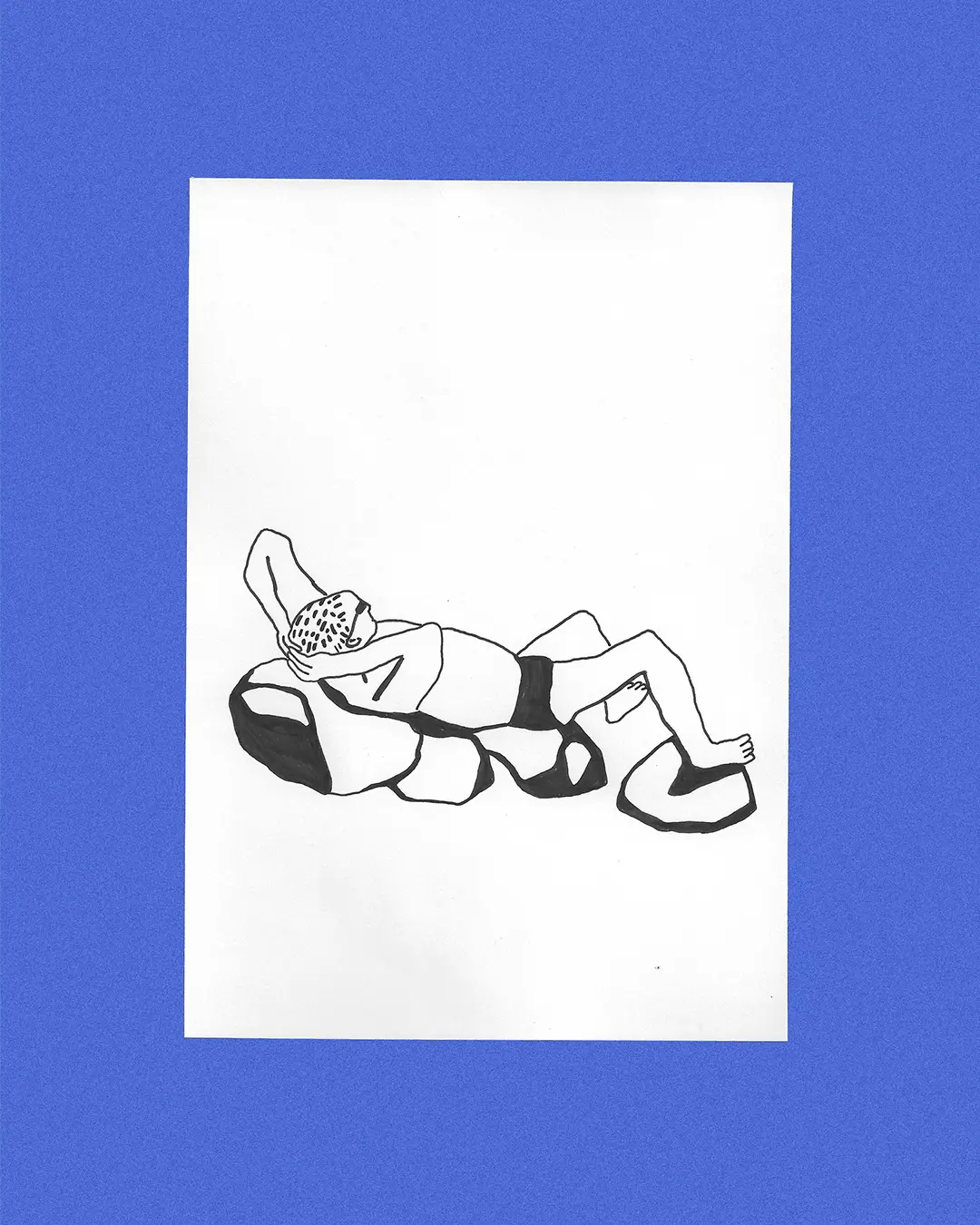
Once the inspiration strikes, it's time to start putting pen to paper in the most scrappy of ways possible – and let us just reiterate that this is the best kind of scrappy. "Controversially, I have never been very good at keeping a sketchbook," she admits. "I think it's my own perfectionist streak that creates such a high expectation of what a great sketchbook should be, and I've just found loose pieces of paper so much more freeing within my practice."
Once a drawing's done, she scans it in and moves into Photoshop, layering textures and blend modes until something clicks. "Nothing looks as good as the wobbly, imperfect and, most importantly in this climate, human lines," she says. "I also love recycling old illustrations and sketches, breathing new life into them as my process develops and changes."
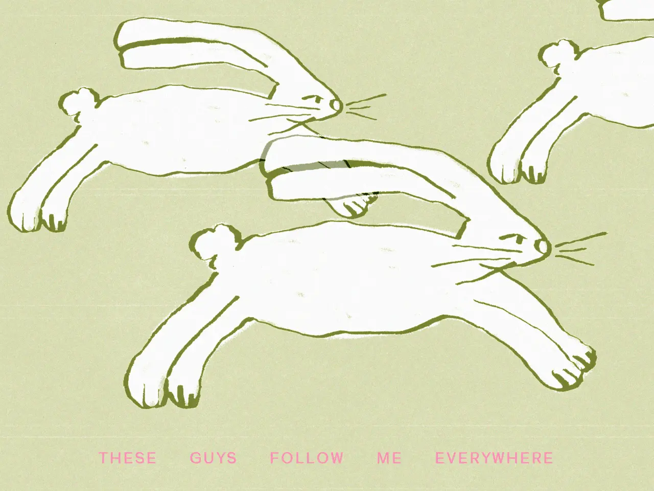
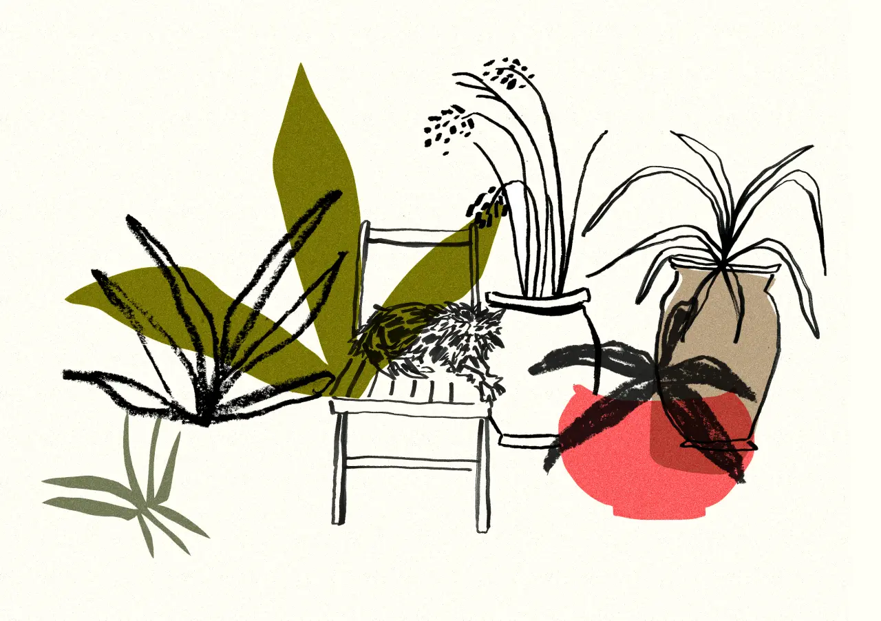
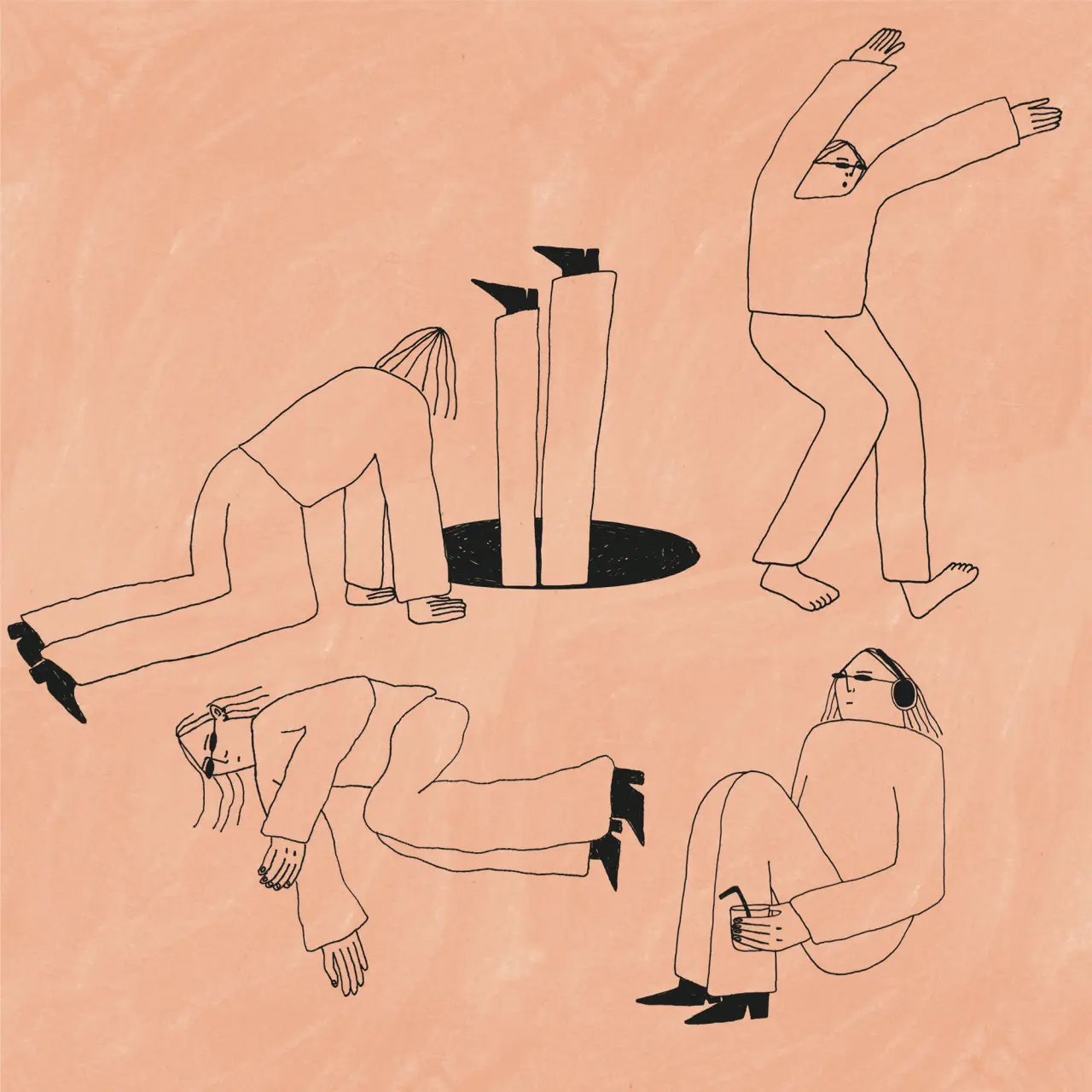
That ambition can be found across her entire portfolio, but they are often separated into two different corners. First, there's her cat – "she is such a character and has a really bold personality (a diva)" – who is seen crawling in the garden, her favourite spot, rendered with the same warm, loose linework as her other pieces.
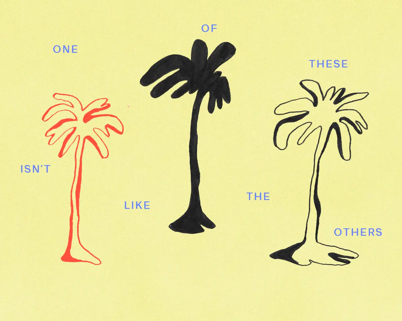
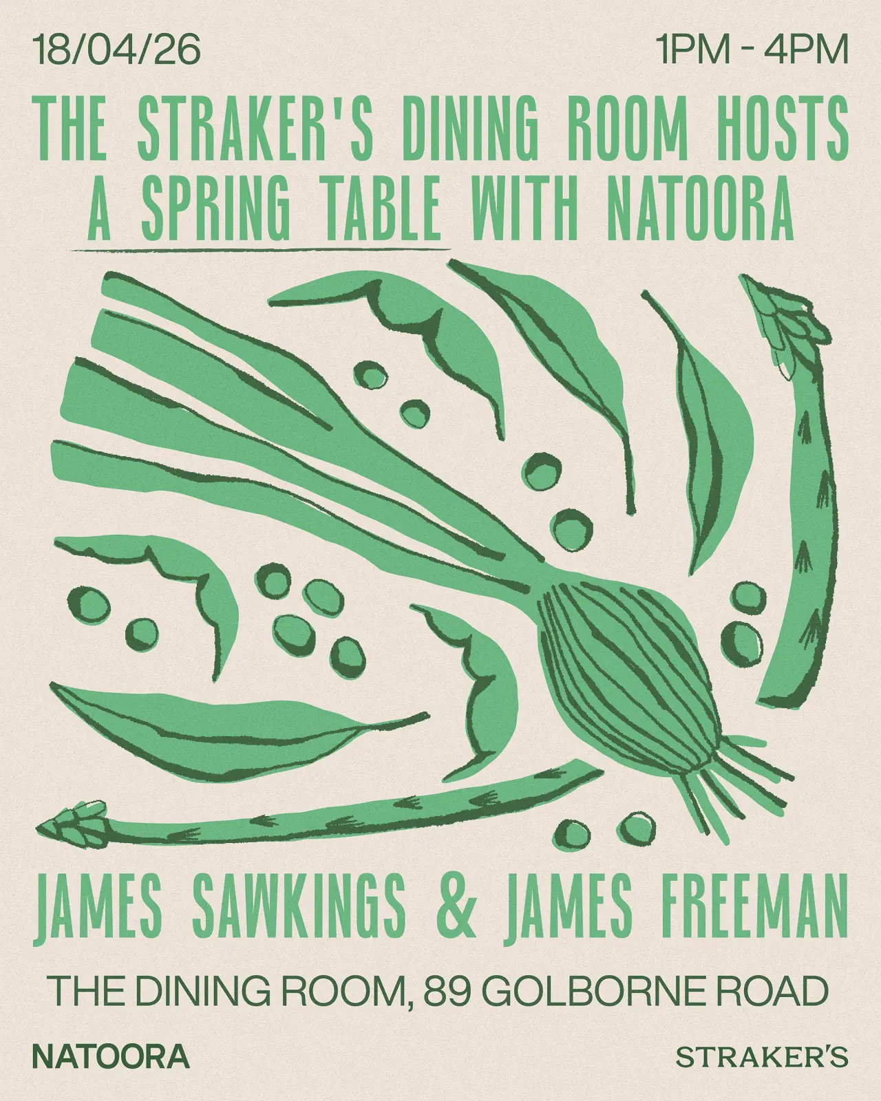
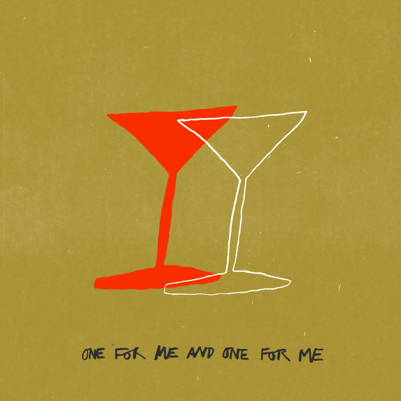
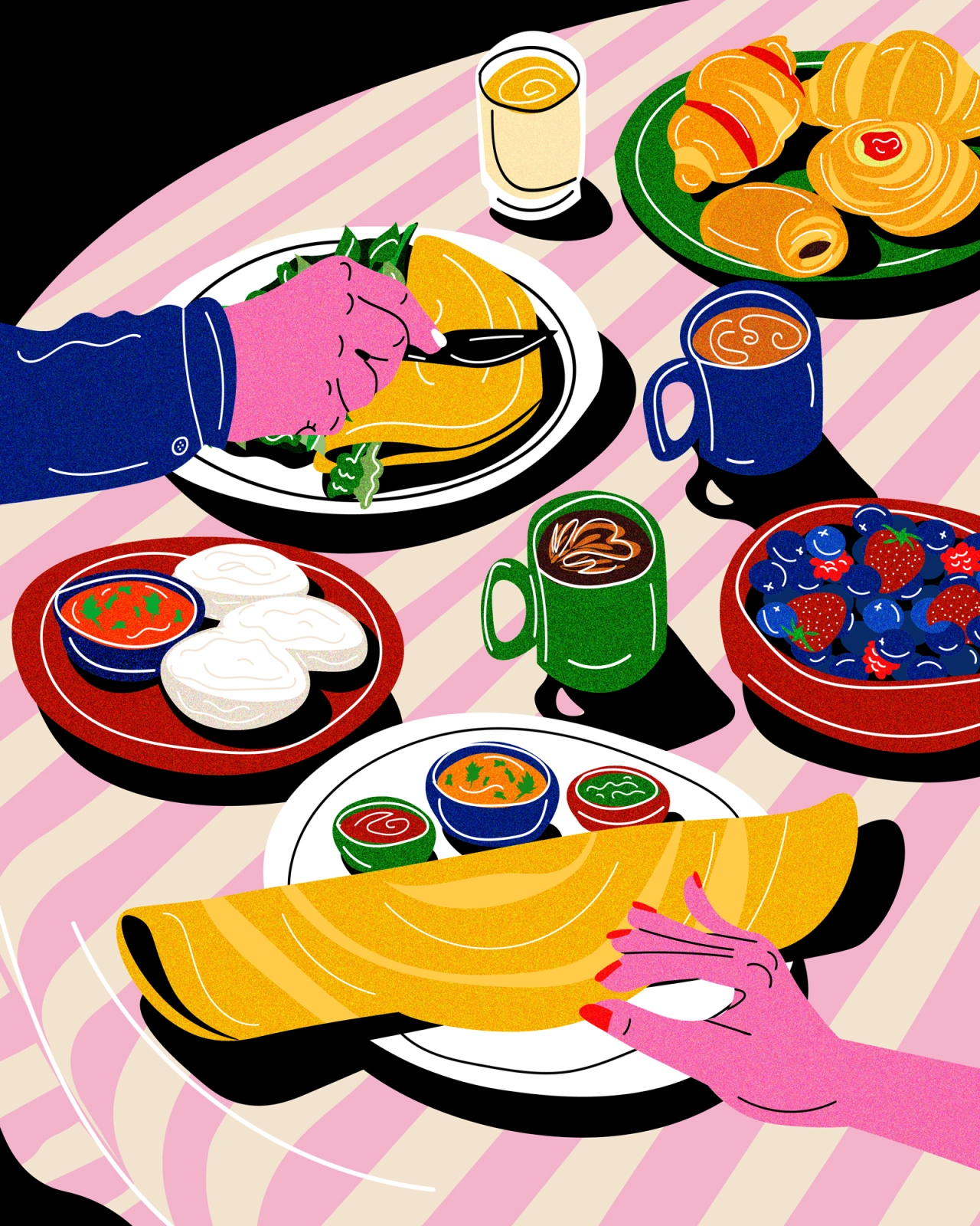
"She truly is a big ball of fluff." And then there are her restaurant posters, the other corner, which is made for the same clients she designs for in her day job, letting her merge both halves of her practice: a martini glass sketched loosely in red and white beside the line "one for me and one for me", or three palm trees insisting, in a different typeface for each, that none of them are quite like the others.
Innes hopes that people will find joy and humour in her work, and to be honest, there's no doubting it. But underneath it all, there's proof that hand-drawn images still beat anything AI can generate. "I want people to see that work like this is so much more interesting than AI, that it is unique and human," she says – leaving purposeful negative space in her compositions so viewers can bring their own reading to them.
Up next, she's candid about it all, and there isn't a grand plan. Instead, there's a smaller, harder promise: to stop letting burnout excuse the gaps in her personal work, and just keep drawing. "I've been using burnout as an excuse for myself, but I just need to get going again. So, just to keep drawing. Less screen time and more drawing," she says. "I'm holding myself to that."

Editor's Picks





Trending



Latest Jobs
Copywriter & Content Strategist at Chapel
Full-time·London·£30,000 – £40,000
Senior Account Manager at Consider
Full-time·London·£42,500
Senior Graphic Designer at goop
Full-time·Los Angeles·$70,000 – $80,000
Manager, Visual Design Art - TFT at Riot Games
Full-time·Los Angeles·$166,600 – $232,800
Multidisciplinary Designer / Photographer at Boomkat
Full-time·Manchester·£42,000 – £48,000
Design Director at Koto
Full-time·London·£72,000 – £90,000





](https://media.creativeboom.com/1bb3b075-5133-4f0f-ba3f-990846e03f64/conversions/80c02674c86382c771c49e94d6353ee1ca7165d2-medium.webp)