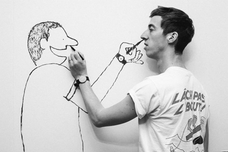
Janne Iivonen's clear line illustrations bring an upbeat charm to everything
If there's one style that never goes out of fashion, it's Ligne claire or 'clear line', the 1940s art form pioneered by Tintin creator Hergé, and kept alive today by smashing illustrators such as Janne Iivonen.
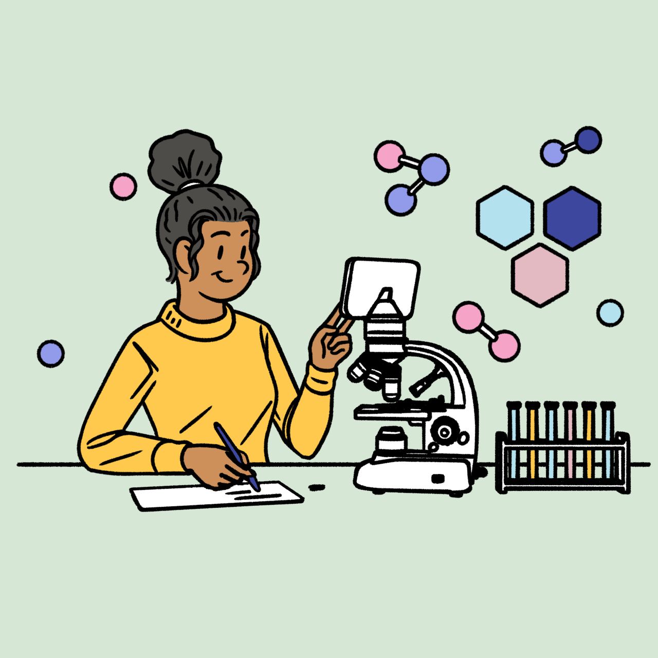
The Brighton-based, Finland-hailing creator has put the Belgian technique of strong colours, cartoonish figures and realistic worlds to good use in 2020, lending an upbeat charm to everything from university guides to mechanical keyboard packaging.
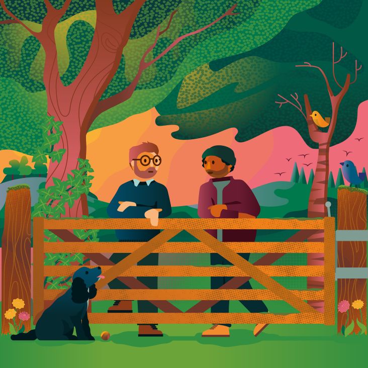
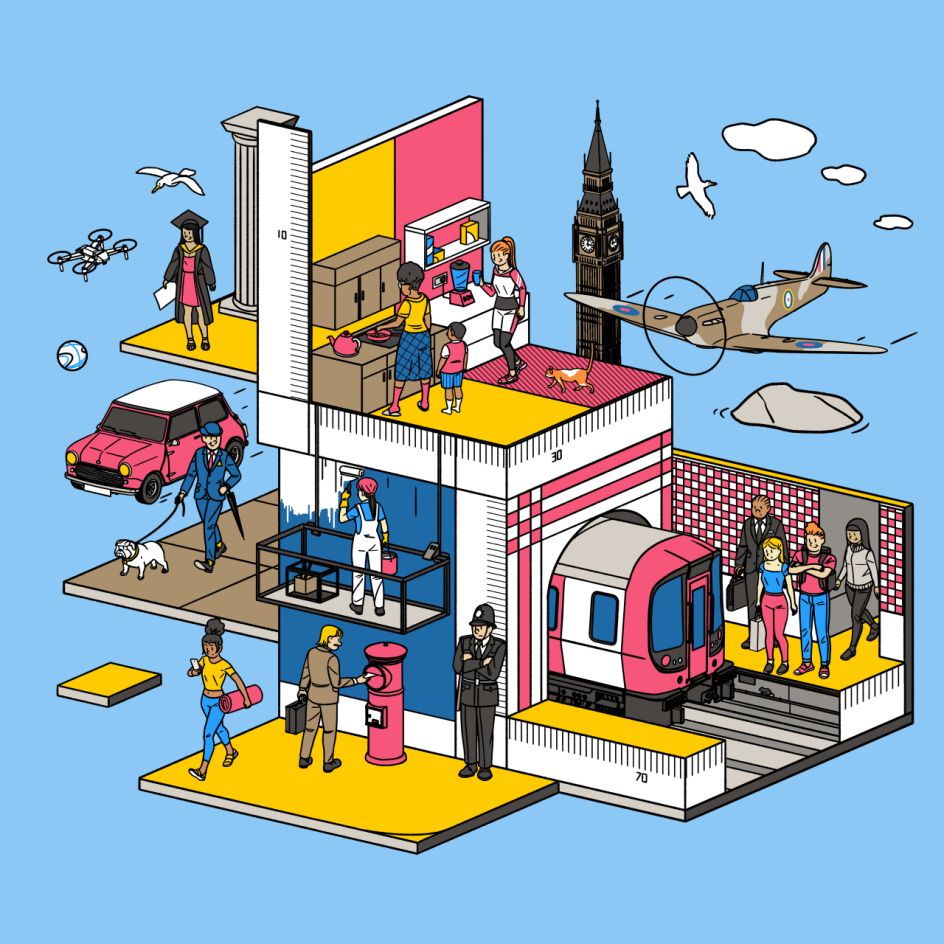
The university guide came from The Guardian, one of the many publications Janne has illustrated for over the years and came in a year when going to university was perhaps not the fun fest it had been in previous years.
"The Guardian University Guide is a print and online guide that provides university rankings as well as helpful articles aimed at prospective students and parents looking to learn more about various uni-related subjects and how to decipher the statistics included within the guide," Janne tells Creative Boom.
"I was midway through to making the roughs when the pandemic really hit the UK properly, and I was worried that as uni enrolments were being postponed for obvious reasons, that the project itself would be shelved too. Luckily, in the end, I was able to continue work on it over the summer with a new launch date set for autumn. This actually worked in my favour in the end as I had the rare luxury of having ample time to revisit the roughs I sent initially and to hone the details of the final illustrations."
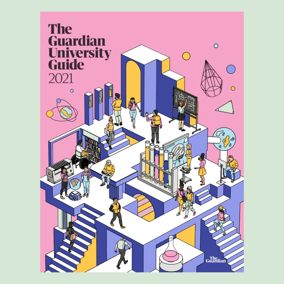


"Given the current circumstances, both the client and I felt that it was of utmost importance that the tone would be upbeat and inspiring. The brief itself was fairly open and quite large in scope, giving me enough creative freedom to do as I felt best. The only piece that had a little bit more direction from the get-go via Sara Ramsbottom (the art director at Guardian) was the print cover. Still, overall I was lucky to have a relatively free reign during this project. I feel truly honoured to have been allowed to create these illustrations, and I hope that people found them uplifting and inspiring."
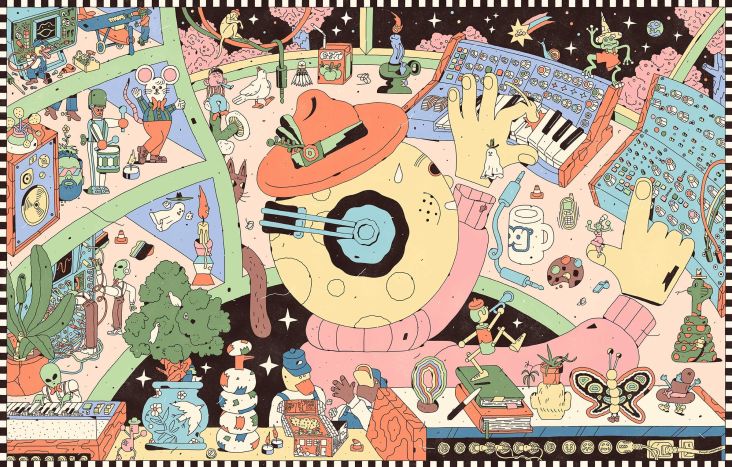
Janne tells us that he also enjoyed working for RAMA Works recently, a Melbourne, Australia-based company that designs and produces boutique mechanical keyboards.
"A couple of years back, they asked me to create an isometric illustration to be used on the cover of a manual of one of their keyboards. I really loved working on that piece on top of which they are one of the most friendly and amazing clients I've had the pleasure of ever doing business with."
"Fast forward to spring this year, and the people at RAMA approached me again with a creative brief: this time around it was an illustration that would adorn the packaging of their soon-to-be-launched new keyboard, KARA. Again the brief was pretty open: the only requisite being that the keyboard itself would be featured in the illustration. I ended up drawing two different scenes, one with a single character hacking away on the keyboard in a fun and colourful room and another one which showed a scene of several characters working on their computers while using the KARA."
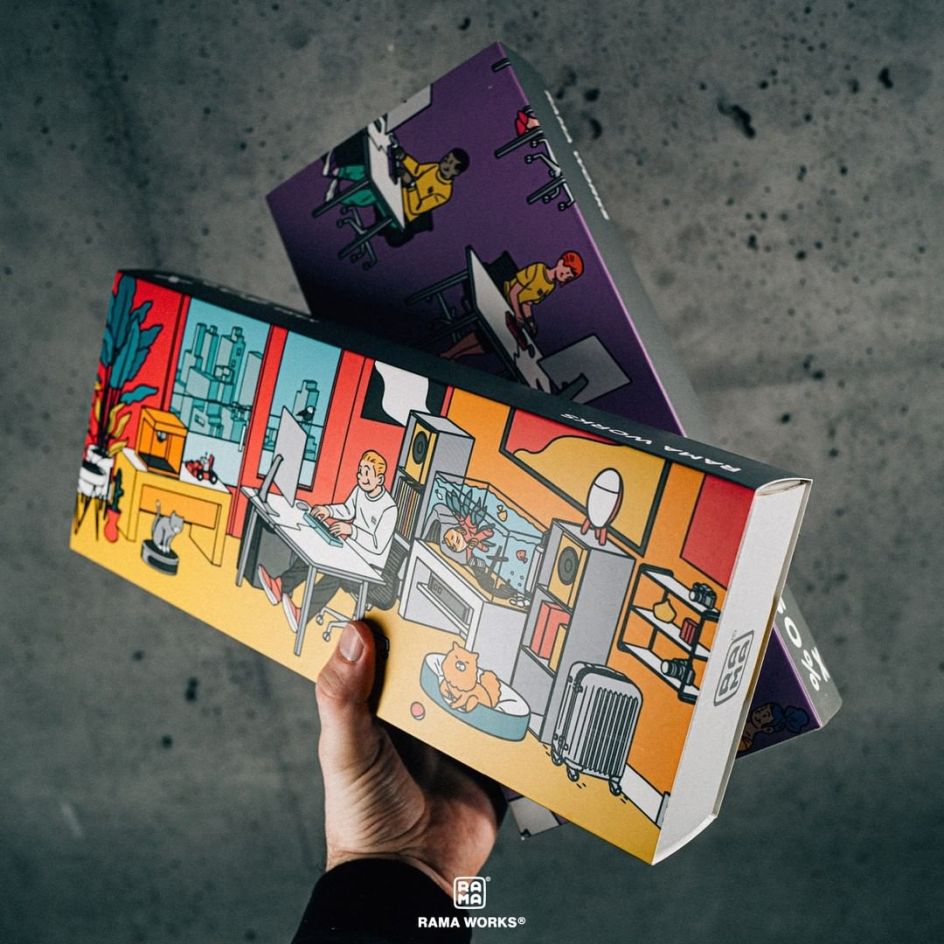
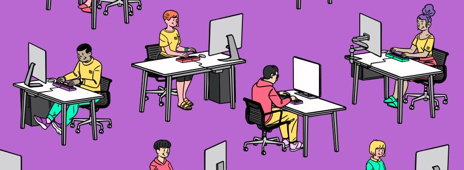
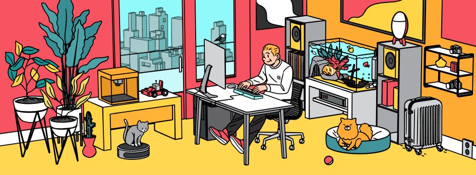
"The brand colours that RAMA use are yellow, black, white and grey. However, as this keyboard is going to be available in a multitude of bright colours I took some cues from these while devising a palette that would be both striking and eye-grabbing: perfect for those eventual unboxing videos on YouTube!"
We finish our online chat by talking about Ligne claire, which Janne describes as a "quintessentially timeless and classic style."
"As it seldom chases trends it's bound to be en vogue for some time to come," he believes. "The reductive line work and flat colours have a clean and almost minimalistic sensibility to them, which rarely tends to go totally out of style. Also, the clarity, 'realism' and communicativeness are qualities that are probably always going to be in demand by designers and art buyers."
Not that Janne is solely drawing from the 1940s when it comes to creating.
"Lately I've also spent more time studying the colours, patterns and line work of Japanese ukiyo-e prints, which in some form influenced the first graphic styles of illustration in Europe (think art nouveau posters)."
"I try to keep my eyes open when consuming various forms of culture and news so that I can add in some zeitgeisty references to current fashions, habits and phenomena. I do follow my peers on social media, but it's more for just keeping up to date on what projects my friends have worked on, than for seeking inspiration or for checking in on the latest illustrations trends. I still find life itself the most inspiring thing, followed closely by the work of vintage illustrators and comic book artists."
Follow Janne Iivonen on Instagram @mr_jti.
Editor's Picks


Trending


](https://www.creativeboom.com/upload/articles/90/908fdb6378db1e95d12595416f54e6336d5e80b8_732.jpg)
Podcasts


Editor's Picks
Further Reading