How to Ink: A crafted brand identity fit for a Singapore printmaking studio
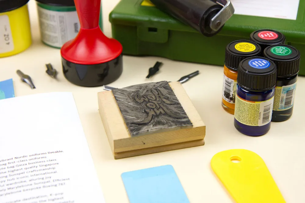
How To Ink is a printmaking studio based in Singapore with a name that is a literal translation of the Chinese characters 凹凸印 (Āo Tú Yìn). It is inspired directly by the art of printmaking that works on a yin-and-yang principle, by utilising negative and positive moulds to produce certain impressions on paper.
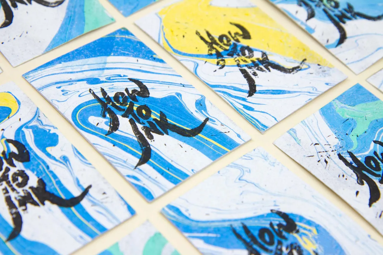
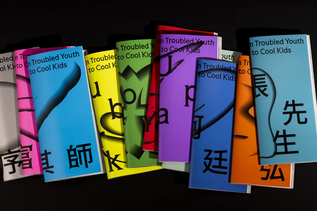
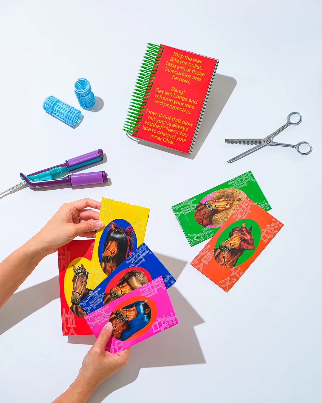
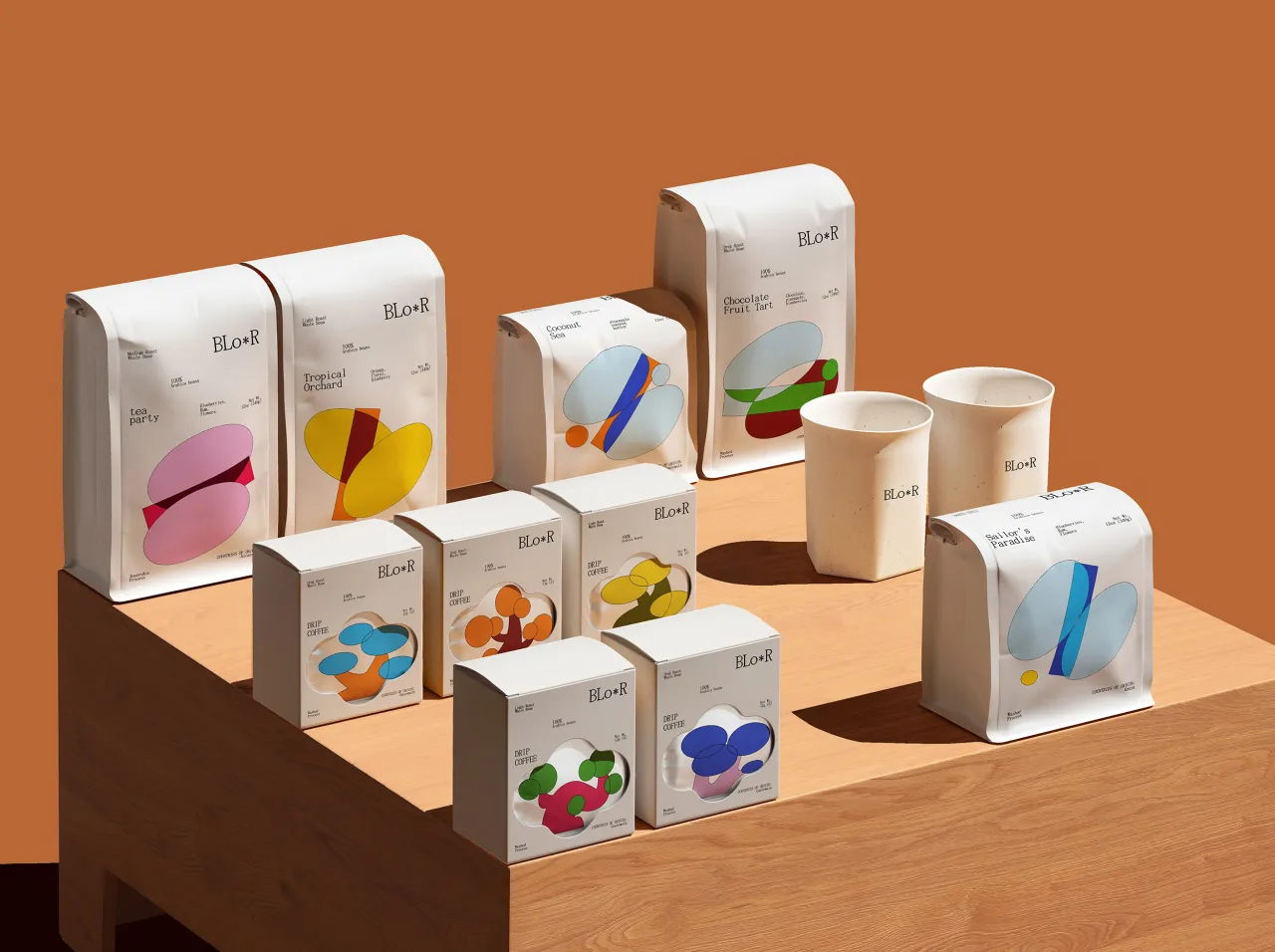
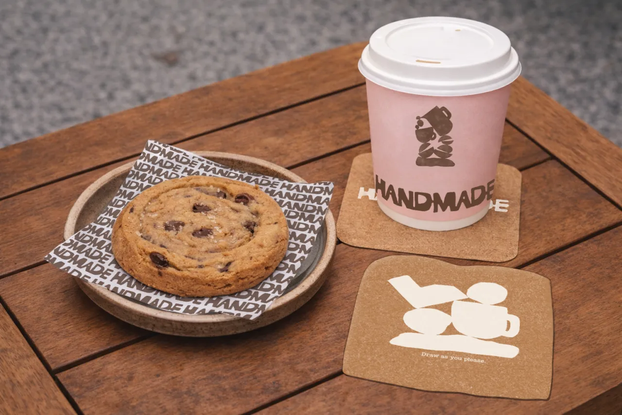
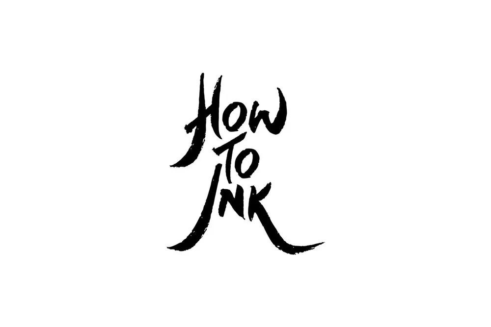
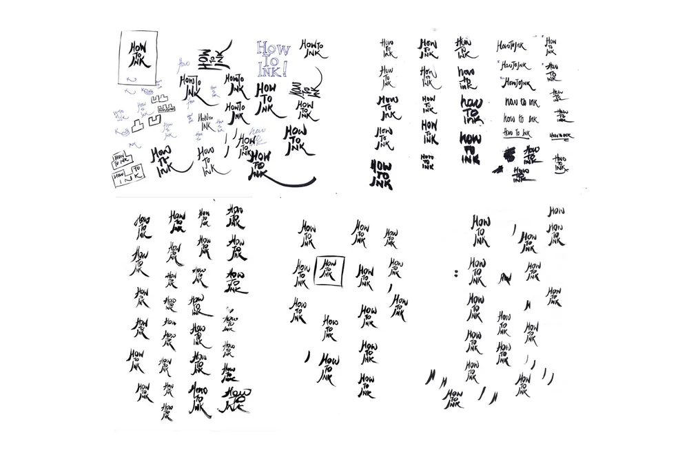
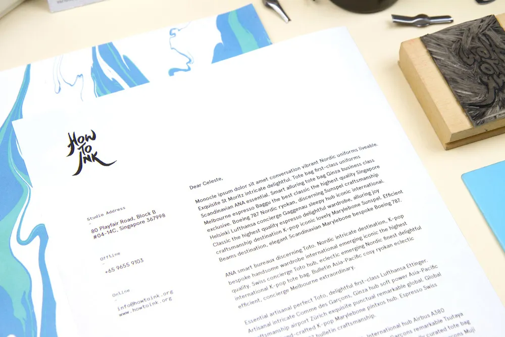
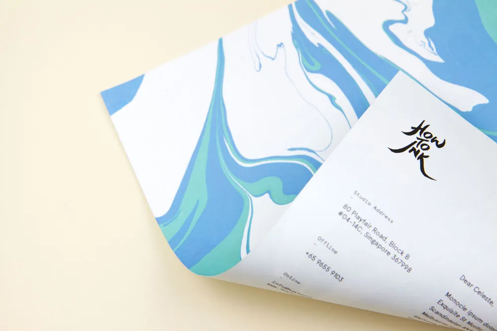
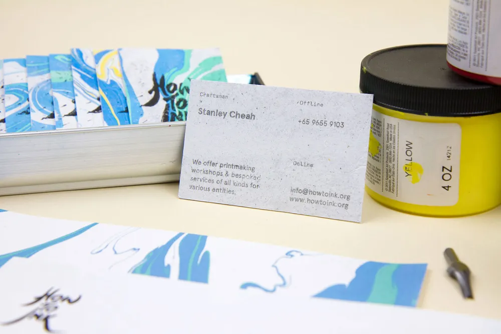
Appointing Singapore design studio The Workbench to craft its new identity, the overall design direction takes cue from How to Ink's artisanship and practices, creating everything handmade from their logo to their brand collaterals. The handmade materials were created in collaboration with How To Ink's master craftsman, Stanley Cheah.
Editor's Picks





Trending






Latest Jobs
Head of design at Cog Design
Full-time·London·£55K
Senior Operations Manager at BIG Partnership
Full-time·Glasgow·£45k–£50k
Senior Front End Developer at Crown Creative
Full-time·Belfast·£50k–£60k
Paid Media Executive at Munro Agency
Full-time·Glasgow·From £27,000
Head of Technical & Facilities at Midlands Arts Centre
Full-time·Birmingham·£40,210
Agent & Producer at The Jacky Winter Group
Full-time·London·£35k–£40k