High Tide helps Symbol create a soulful and handcrafted furniture brand
The New York agency explains how it has fused furniture brand Symbol with the spirit of vinyl in an identity overhaul that will get the industry talking.
We've all heard about fast fashion, and all the problems it produces. But 'fast furniture' is an issue too.
Disposable designs have enjoyed great success on the back of great brand-building and low prices, but it's fundamentally an environmental and societal disaster. This is why Symbol – a company focused on beautiful and functional furniture at the intersection of sound and design – has been working with creative studio High Tide to build a different kind of brand.
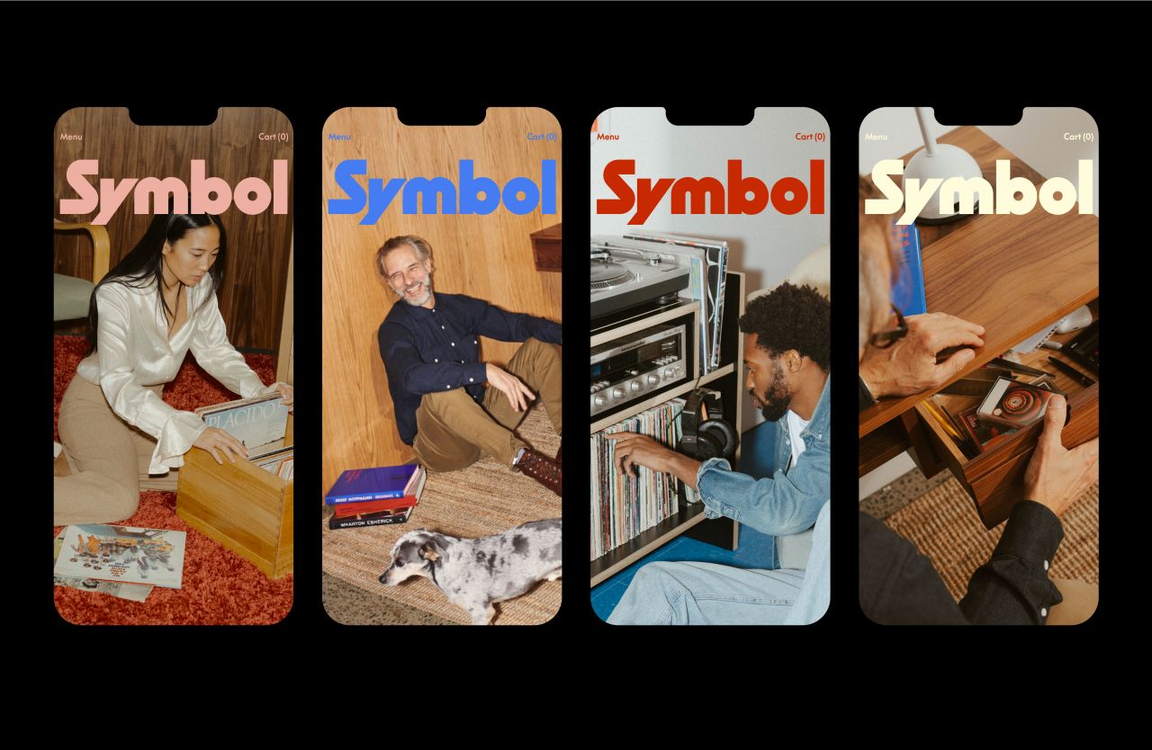
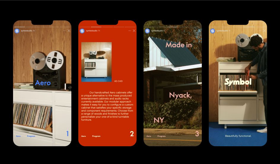
With its new nostalgic identity system, Symbol looks into the 1950s, 1960s and 1970s to offer a vision of the future that's handcrafted, soulful and built to last.
Symbol was founded by Blake Tovin, who's been designing furniture for companies such as Crate & Barrel, Restoration Hardware, West Elm and others for over 20 years. Now, with new branding, the goal was to stand out in a market experiencing a renaissance, as vinyl record sales boomed during the pandemic.
This sudden shift made an impact on ancillary businesses like Symbol, an audio hi-fi storage company looking to move more broadly into the furniture space. Needing to rethink its brand to appeal to a wider audience while positioning itself as an antidote for disposable furniture design, the company turned to creative studio High Tide for a new identity system and website.
Both would need to embody the brand's passion for quality craftsmanship and a time-tested approach in an era of disposable design.
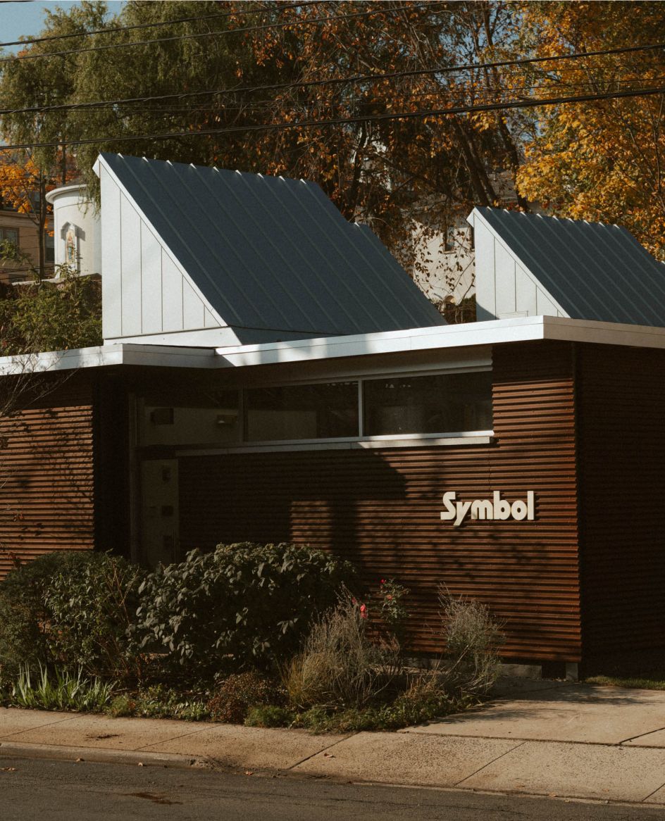
From the beginning, High Tide recognised Symbol's commitment to design and craftsmanship, from its products to its headquarters. Everything felt very personal and intimate, yet their existing branding communicated none of that passion.
"Sometimes with a rebrand, you need to find the brand's character, take everything that works and polish it," explains High Tide founder and creative director Danny Miller. "With Symbol, the company was in the right place, but its strengths weren't quite visible yet. We worked on figuring out how to bring the product's warmth, depth and personality into the brand to be the truest representation of itself."

Even as Symbol was expanding into other types of furniture, a key consideration was keeping the brand rooted in music, Danny adds. "We wanted to present Symbol as a brand that enhances and inspires people's lives with materials and objects that add emotional value."
"Also, because the furniture itself is very much a contemporary take on mid-century and classic Scandinavian furniture design, the branding had to take inspiration from the '50s, '60s and '70s while embracing modernist elements, too. Akin to heirloom pieces passed down from generation to generation, the identity needed to transcend different decades and not be too tied down to one era."
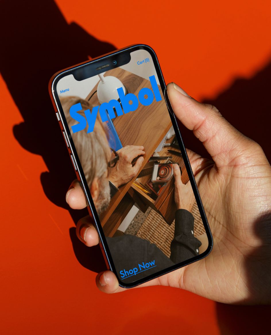
The finished designs pair bold lettering and iconography with stylish photography, giving the visuals a feel that's future-facing and energetic while simultaneously nostalgic. "The interplay between graphics, type and colours is bold, confident and highly rhythmic, especially when paired with the warm mid-century furniture," explains Danny. "Key subtle references are designed to excite older audiences, while the more contemporary and playful feel of the art direction and photography appeals to younger audiences."
This delicately balanced approach extends across all elements of the new brand, including logo, brand mark, typography, website design and development and photography. The result is a revitalised brand suited to the people, products and philosophy at the heart of a growing family business.
"This collaboration was a dream and not just because of our mutual love for vinyl, music and high-end furniture," says Danny. "Symbol trusted us and leaned into the more expressive and unexpected ideas, which truly made the design more confident and strong. The company creates furniture that is functional, intentional and soulful: three qualities that are very much in line with High Tide's ethos. We're excited to see where the next growth phase takes them."
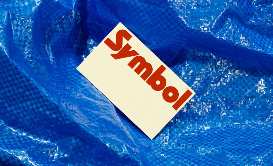
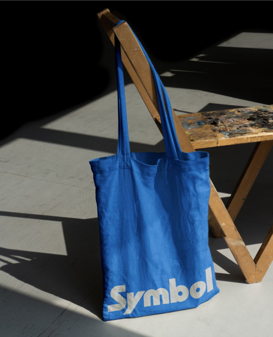
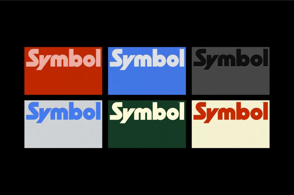
Looking at the finer details, the wordmark was mid-century inspired and meant to feel bold, iconic, and timeless. "It was meant to echo their furniture: sturdy and able to stand the test of time. We added some sharp, quirky moments like the custom 'Y' to give the mark ownability and an edge," explains Danny.
The colour palette was also mid-century inspired. "This was a time in design when designers were limited with what they could produce from a graphics standpoint, so utilising bold, punchy colours allowed them to create a maximum impact simply and effectively. This helped to bring emotion and excitement to the brand with the bold and liberal usage of colour throughout."
For the brand mark, its forms are deconstructed from the wordmark, says Danny. "The dot in the centre represents a vinyl record, a nod to the brand's musical roots, and the other forms enclose the circle to create an 'S'. This is also an evolution of their original brand mark, which was a simple circle within a square."
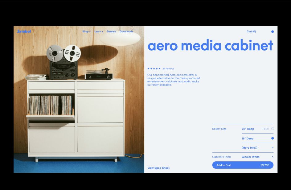
And with the typography, High Tide chose a font family called Supreme, which is rooted in the classic Futura typeface but a contemporary take modernised for today's digital era. "The sharp geometric forms complement and connect to the wordmark and brand mark, and the way we lay the type out in a rhythmic fashion is directly inspired by music and musical notes on a page," explains Danny.
Finally, the illustration style features a deliberately simple, clean and technical drawing style to showcase the furniture schematic drawings in a simple utilitarian way. "Some elements are filled and not completely linear to tie back to the boldness of the wordmark and brand mark," Danny concludes.
Editor's Picks


Trending


](https://www.creativeboom.com/upload/articles/90/908fdb6378db1e95d12595416f54e6336d5e80b8_732.jpg)
Podcasts


Editor's Picks
Further Reading