Fellow's new identity for coffee company embodies the vibrant spirit of Colombia
Coffee lovers want two things: a great brew and a sense of authenticity. Fellow has been helping Hermanos Colombian Coffee in London convey the latter.
On the go, a good cup of coffee is far more expensive than one you make at home. But then again, you're not really comparing like with like. When you give your money to a specialist, you expect rich flavour, a superior blend and, perhaps most importantly, a sense of authenticity that you'll never get from a jar of mass-produced granules.
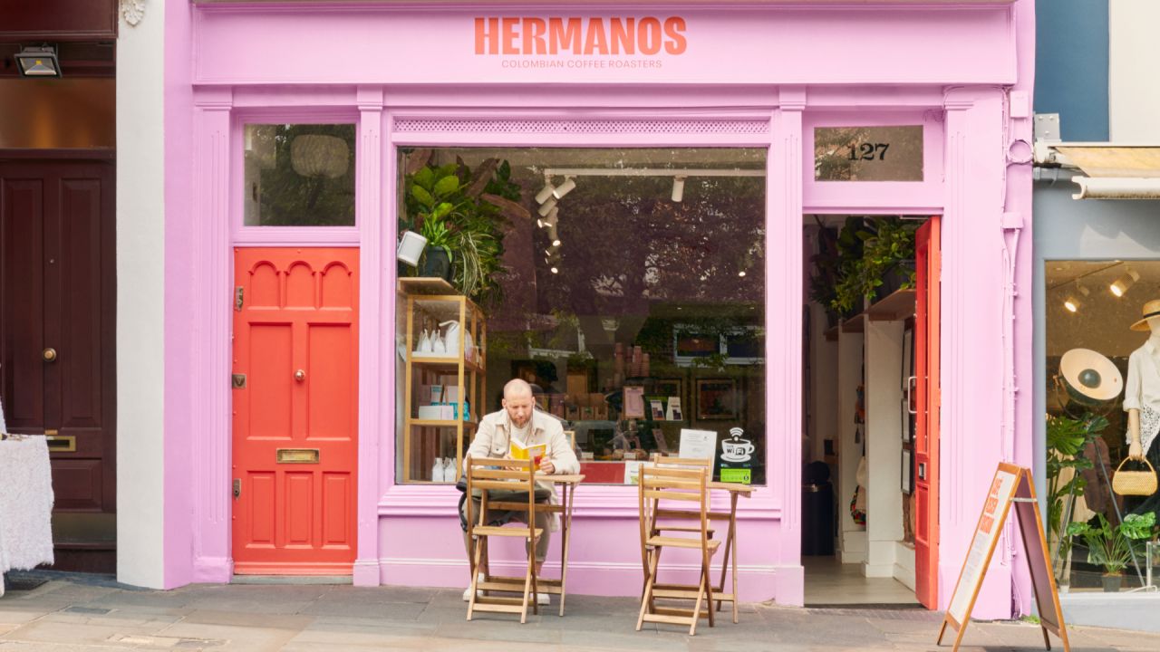
To help sell that vision, Hermanos Colombian Coffee Roasters have been partnering with specialist branding agency Fellow since making their debut at London's Victoria Station.
As they've expanded across the capital, Fellow has developed a rebrand of the company's identity, which helps to position them as an attractive choice for discerning coffee aficionados. Rooted in preserving the brand's essence, this design intervention seamlessly fused the exuberance of the cafes' atmosphere with their founders' origin story, sharing the essence of knowledge, passion and quality cherished by their patrons.
Research and revelations
Fellow began by peering into the competitive landscape and dissecting the existing brand. The outcome was a distinctive revelation that set Hermanos apart within a saturated market.
In a realm where 'premium' often translates to a sleek, modernist aesthetic, Fellow's ingenuity reframed this concept through the prism of value. This approach retained the brand's authenticity, infusing its origins and cultural fabric into every facet. Thus, the brand embodied the vibrant Colombian spirit, echoing the unique characteristics mirrored in every cup of their coffee.
At the heart of this transformation lies the central brand idea, based around the tagline 'True Colombian Spirit'. This line encapsulates the essence Hermanos embodies, nurtured by their rich Colombian heritage and passion for coffee.
Design elements
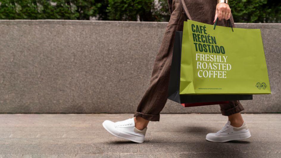
The journey continued with an exploration of aesthetics. Hermanos' brand needed to pulsate with vitality, drawing inspiration from Colombia's natural landscapes and the subcultures that define its regions. The outcome was a dynamic colour palette and typographic selection that echoed the pulse of these locales.
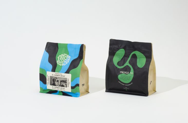
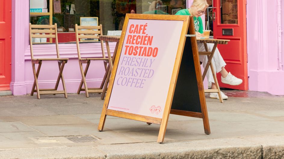
Fellow ingeniously embraced bold fonts reminiscent of street art and infused them with the vibrancy of pigments that grace Colombian shopfronts.
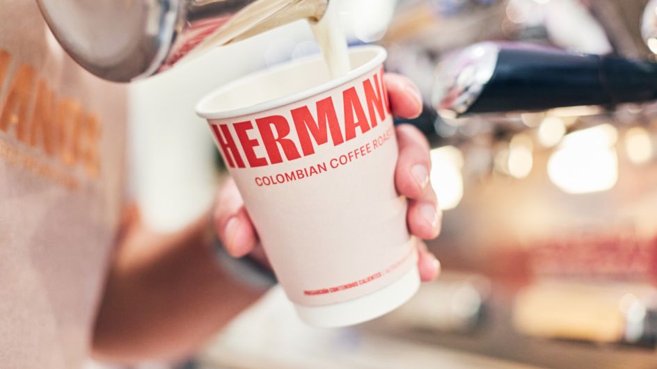
Typography itself turned into a bilingual art form, eloquently combining sans-serif and serif fonts. Spanish, Colombia's dominant language, took the lead, enabling Hermanos to communicate their heritage and personality while ensuring seamless understanding through English translations.
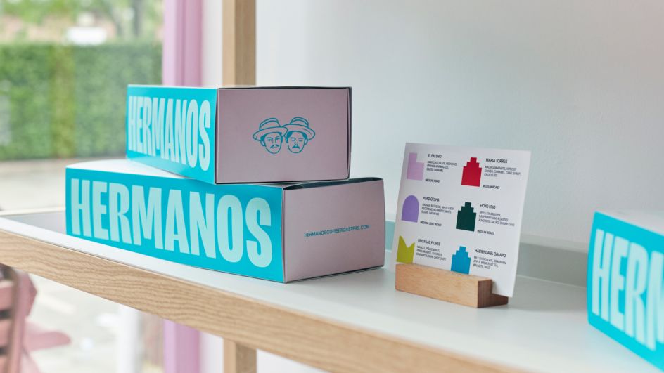
During the project's conceptual phase, Fellow integrated legacy assets from the existing brand, including a pictogram. This pictogram served as a visual representation of the brand, featuring the founders in vector form. The team reimagined and refined this pictogram as a hallmark of quality to be consistently employed across the brand alongside the primary logotype.
Design system
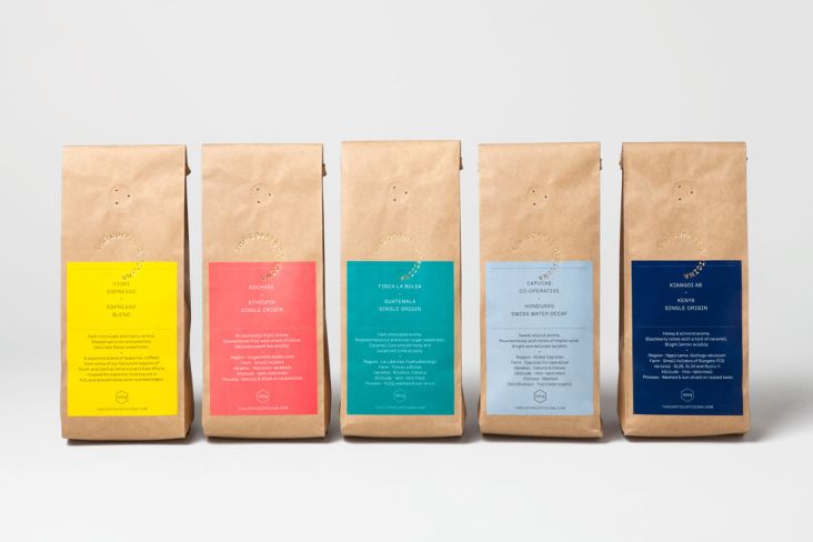
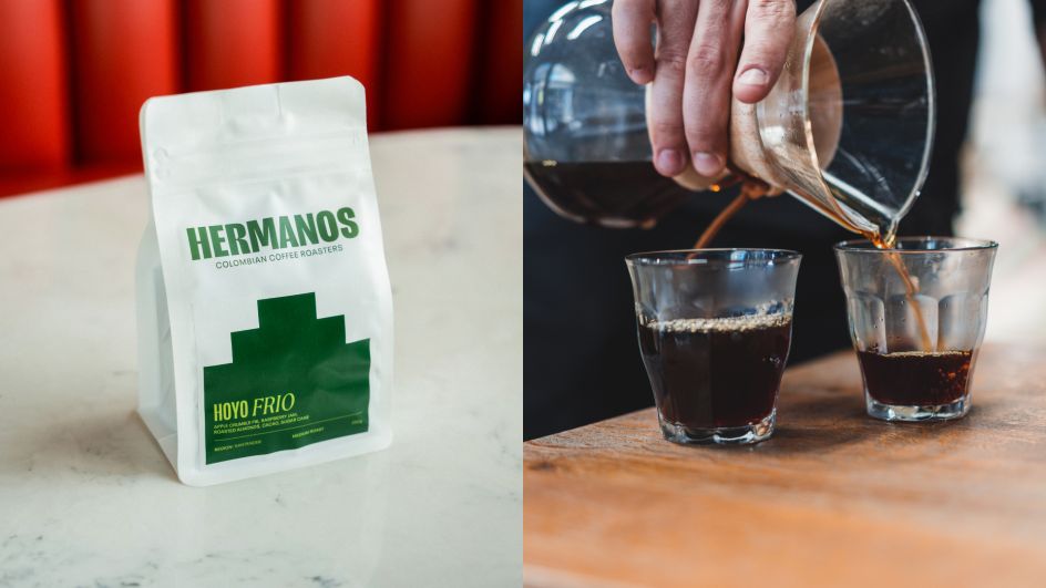
A pivotal juncture of this transformative journey was developing a design system to illuminate Hermanos' array of single-origin coffees. This system, a harmonious blend of graphic shapes and colours, etched the contours of Colombia's landmarks (temples, valleys, favelas) on a grid reminiscent of traditional weave patterns. Each shape portrays a unique region, infused with distinct colour pairings, transforming every coffee into a journey of taste and culture.
This new branding has been extended across various touchpoints, including coffee labels, bundles and taster kits. The result of these efforts was revealed at the London Coffee Festival, where Hermanos launched the revitalised brand and introduced its refreshed visual identity.
"Fellow have been excellent brand design and delivery partners," says Santiago Gamboa, cofounder of Hermanos. "They truly embedded themselves with us and worked with us for successful outcomes at every step. Strategic, creative and bold. We have received nothing but great feedback on all aspects of the design from our customers, and it has really allowed us to stand out in the market."
Editor's Picks


Trending


Podcasts


Editor's Picks
Further Reading