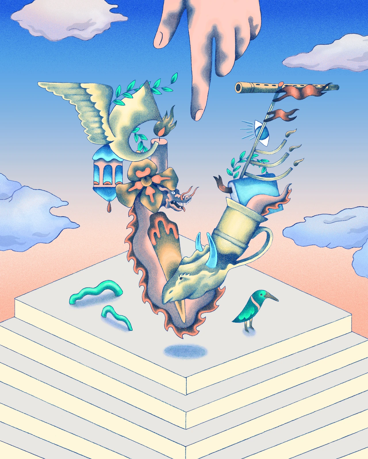
Hanneke Rozemuller has embraced that being an illustrator is a journey without a finish line
It's been three years since Creative Boom last spoke to Netherlands-based illustrator Hanneke Rozemuller. We caught up with her to hear how her work has developed.
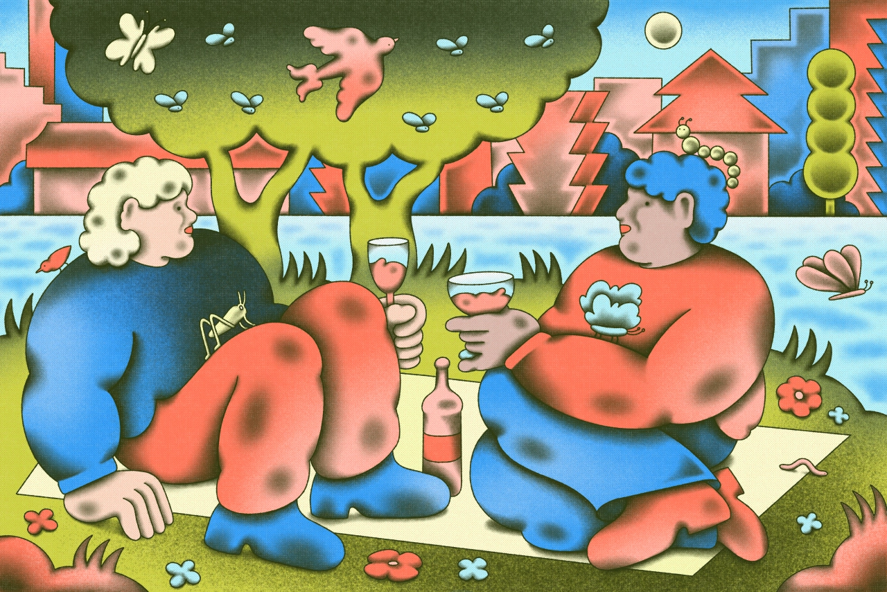
The last time Creative Boom spoke with Hanneke Rozemuller, she had just started pursuing illustration full-time. Not that you'd be able to tell, because her absurd, humorous work, inspired by the rural farmland she grew up in, shows the skill and nuance of an industry veteran.
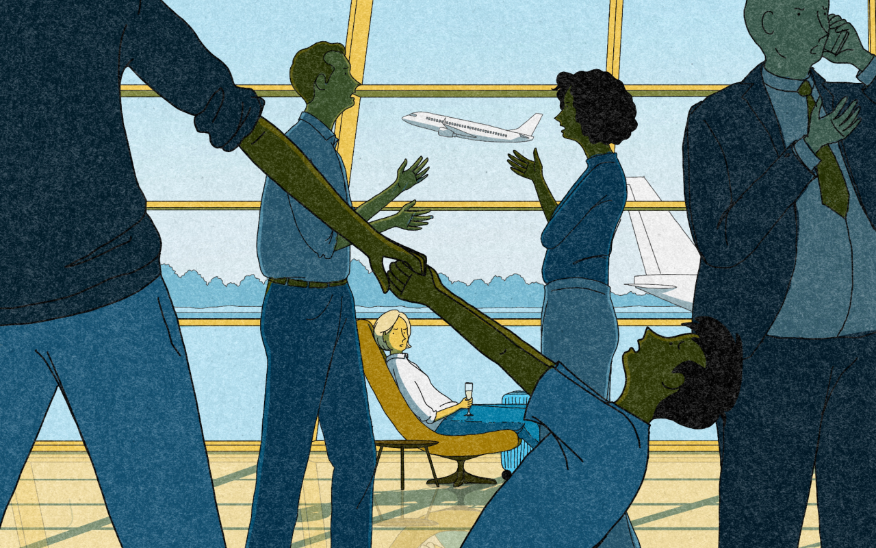
Since then, it sounds like her career has gone from strength to strength. The HKU University of the Arts graduate now works primarily in editorial, where she has created illustrations for Wired, The New York Times and The Wall Street Journal. Outside of this, she has also landed work on branding and commercial assignments.
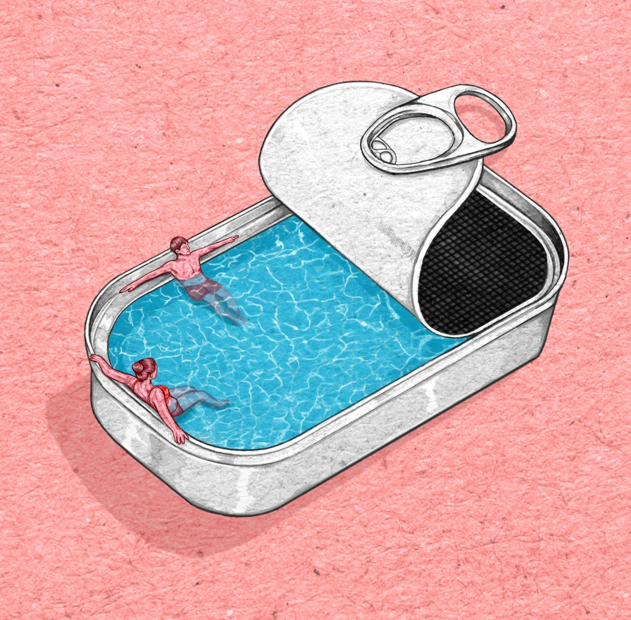
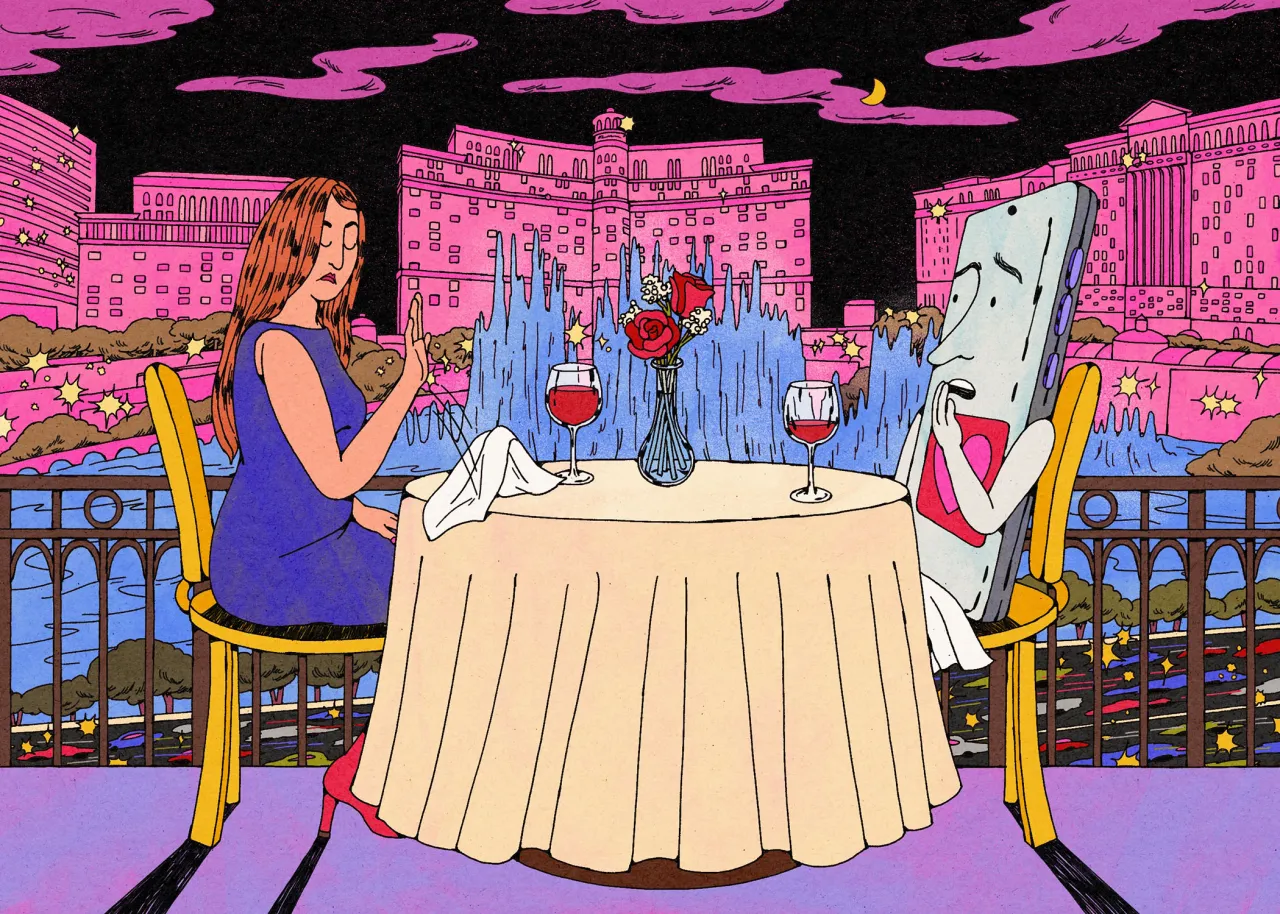
It's not just Hanneke's list of impressive clients that has expanded either. Her practice has broadened, and she feels her drawings have become cleaner and thematically clearer. Her illustrations also showcase stronger composition skills, and a two-colour palette mainly centred around blues and reds.
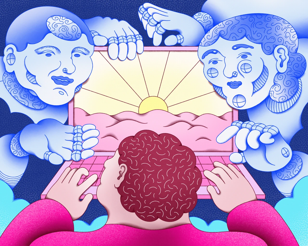
"After having done this, I felt some more room to explore colour, and I've been having a lot of fun with that lately," Hanneke tells Creative Boom. "Knowing how to navigate all these separate elements of style has become more natural for me as a result."
Hanneke's approach to being an illustrator has also changed on a personal level, and it's one of the biggest realisations she's had since 2023. "I used to think being an illustrator would eventually feel like arriving somewhere," she says. "Now I see it more as a practice without a finish line.
"There will always be people ahead of me, and I like that the horizon keeps moving."
It sounds like a healthy outlook, and it has helped Hanneke to produce some of her favourite work to date. "I'm most proud of the projects where the most idiosyncrasy and strangeness come through," she says. "It makes them feel more strongly like things that are truly mine."

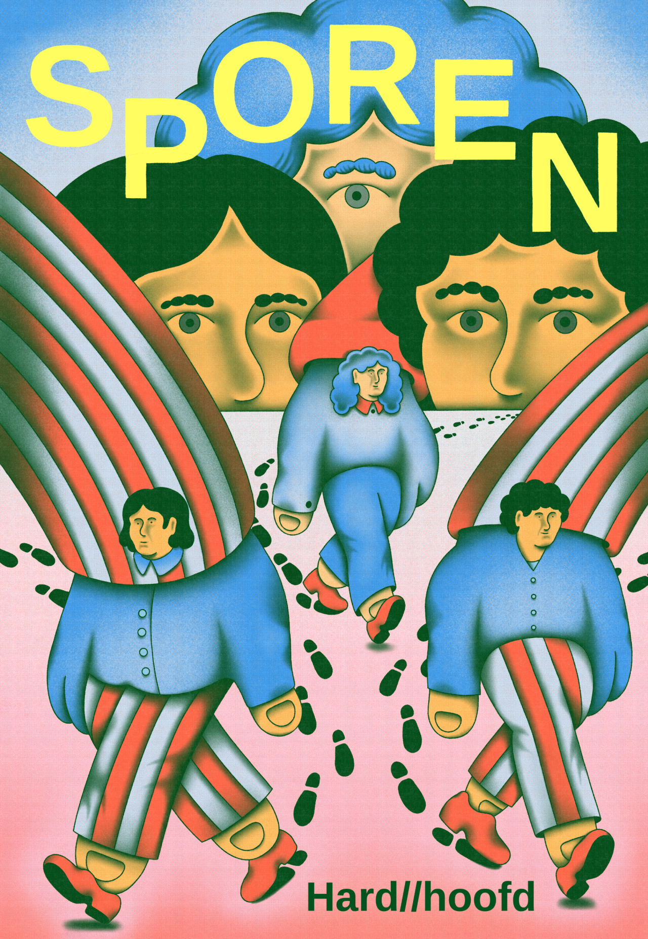
These projects include the cover for Hoofd magazine 'Sporen', which she feels contains an immense level of excitement: "It was like running a 'what if' experiment with a pencil."
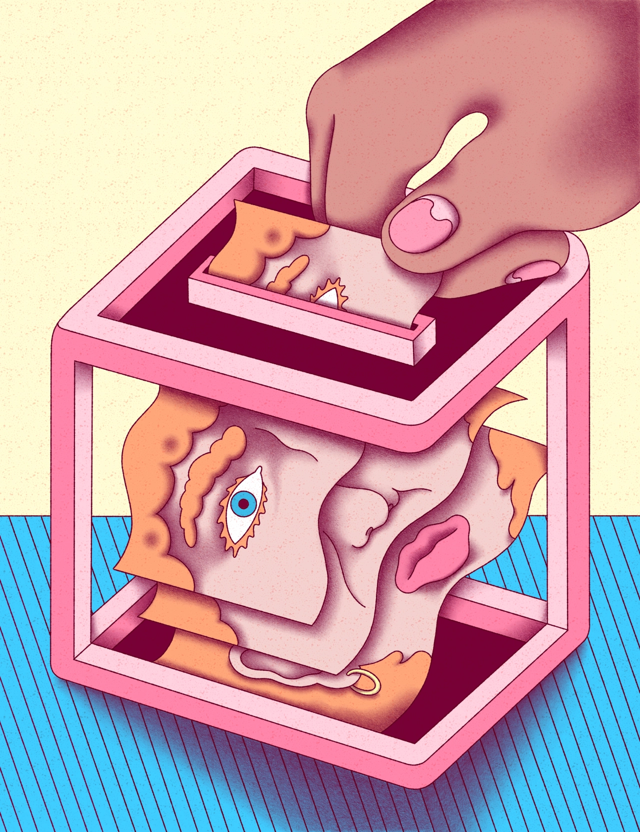
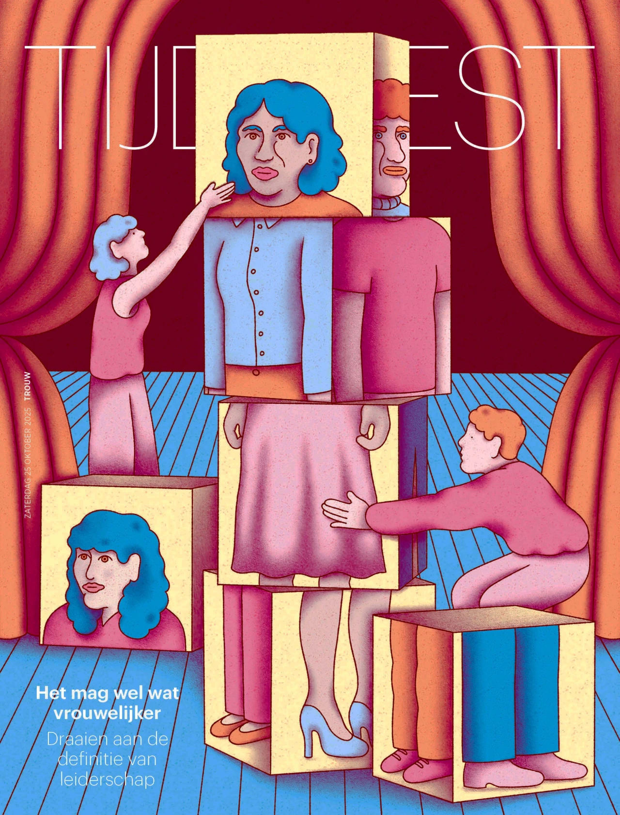
Another personal highlight is an illustration accompanying an article calling for more feminine leadership in the Netherlands. "I really like the composition, the architectural quality combined with the slightly weird separation of the feminine face by dividing it over the voting papers," she says.
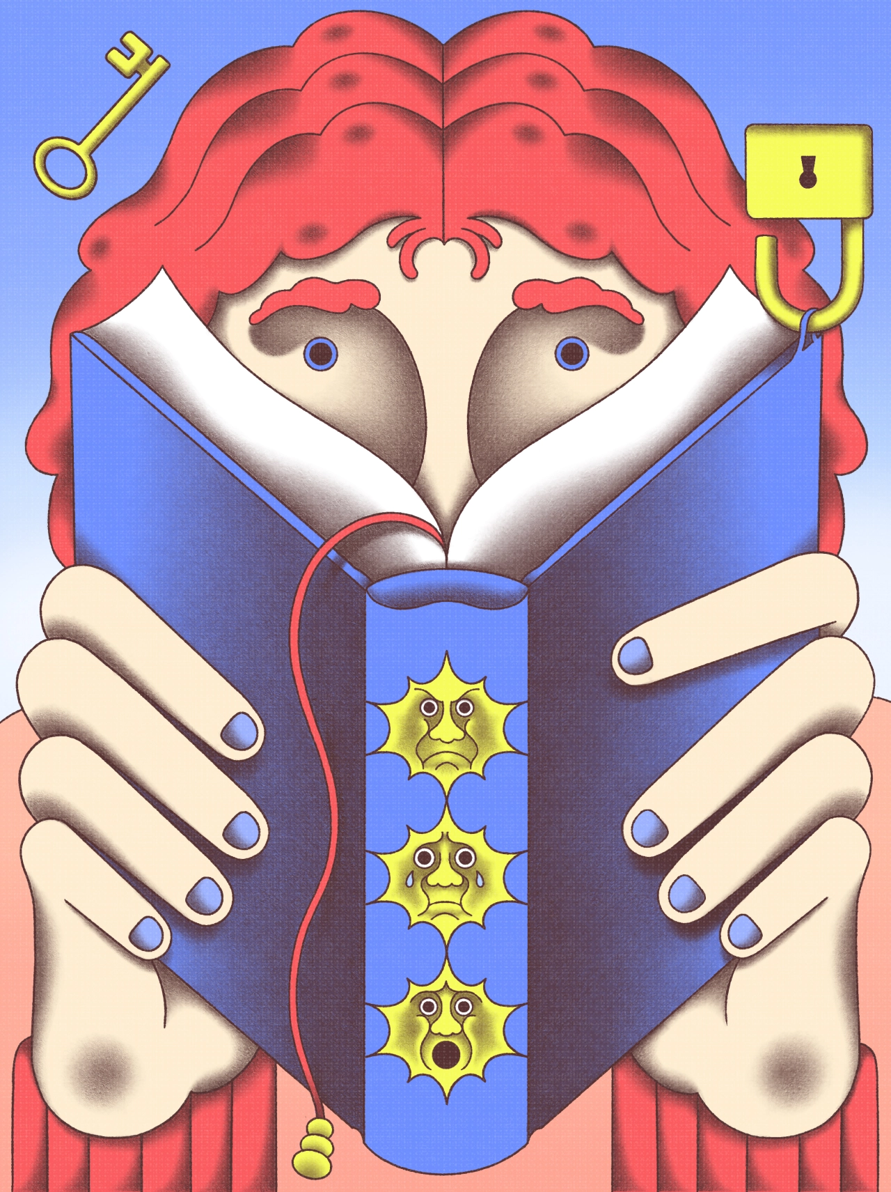
Elsewhere, an illustration where the theme was 'emotion in class' proved to be an engaging challenge. "I wanted to keep this illustration from looking too sentimental, which is a bit of a risk with this type of theme," she says.
"I think I solved that well here by making the whole look a bit whimsical, and keeping a 'cool distance' by using a nearly symmetrical composition and an index-like system of shapes."
Hanneke continues to develop her craft, and she is currently working on a series of drawings for a picture book that traces ten years of educational innovation in the Netherlands. "The challenge is giving visual form to something as abstract as a decade of change."

Trending

Latest Jobs
Creative Lead at Greggs
Full-time·Newcastle·£70,000
Copywriter, Developer at Anthropic
Full-time·San Francisco·$200,000 – $255,000
Lecturer in Interactive Applications at The Glasgow School of Art
Contract·Glasgow·£45,641 – £57,666
Creative Designer & Marketing Specialist at The Sweet People
Full-time·Leighton Buzzard·£32,000 – £38,000
Creative Traffic Manager at Tony's Chocolonely
Full-time·Amsterdam·€58,000 – €73,000
Senior Brand Designer at Kate McLeod
Full-time·New York·$120,000 – $150,000
](https://media.creativeboom.com/1bb3b075-5133-4f0f-ba3f-990846e03f64/conversions/80c02674c86382c771c49e94d6353ee1ca7165d2-medium.webp)