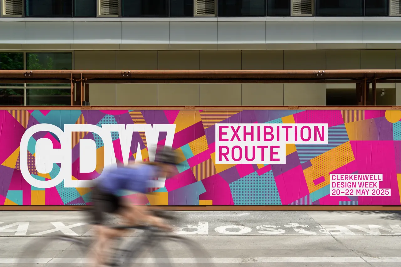
Cause & Effect rebrands Glasgow International with bold and abstract illustrations
Glasgow-based creative agency Cause & Effect has collaborated with illustrator and Risotto Studio founder Gabriella Marcella to deliver a new identity for Glasgow International 2020.
Via Creative Boom submission. All images courtesy of Cause & Effect.
Glasgow International is a world-renowned biennial festival of contemporary art, first held in 2005, which showcases work by local and international artists at venues across the city.
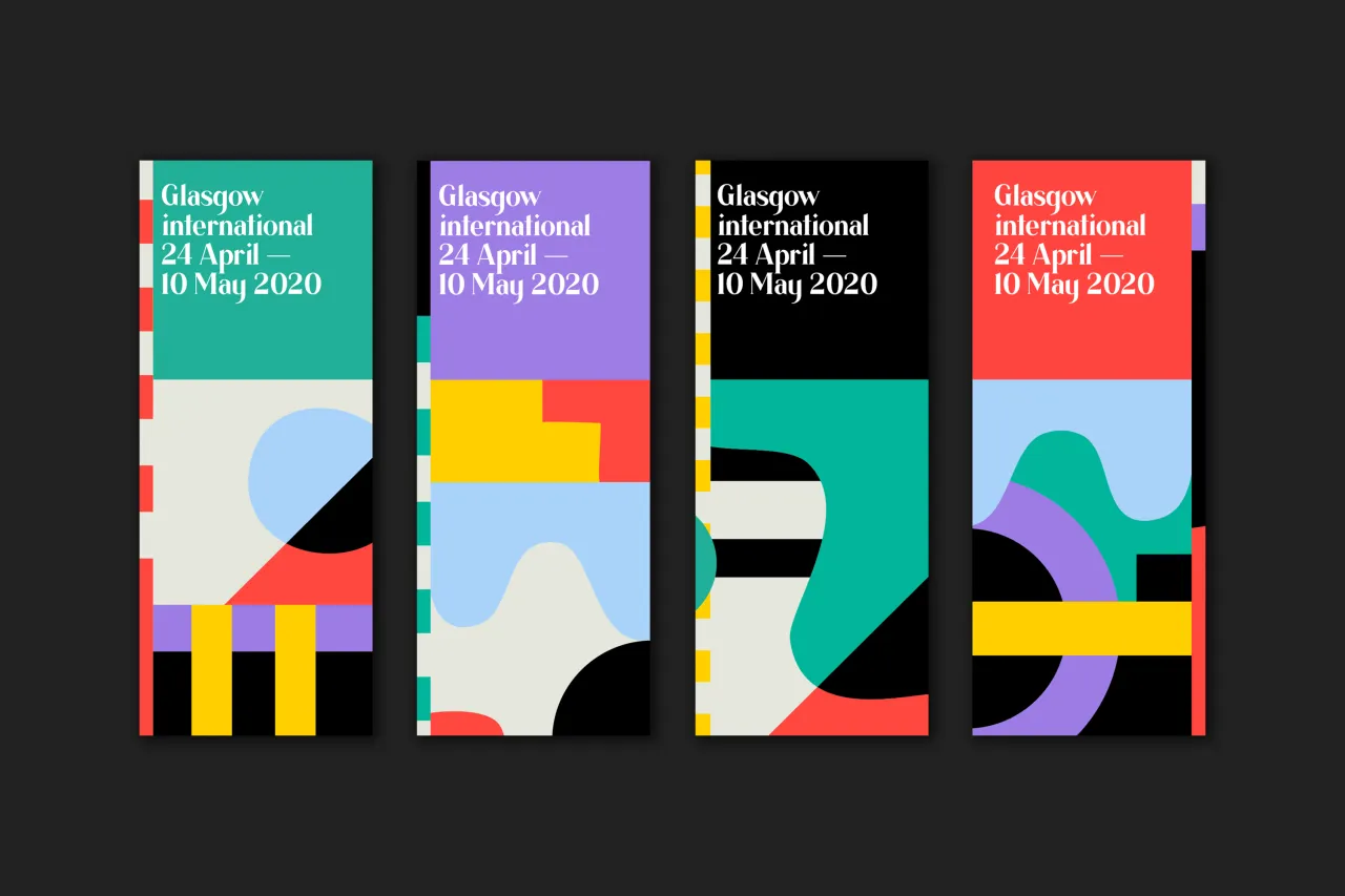
The new designs are an update of the branding first created by Cause & Effect in 2018. "This time around, the Glasgow International team asked us to develop the identity through illustration," says co-founder Kerr Vernon, "and Gabriella Marcella’s striking, bold and playful abstract work was the perfect fit."
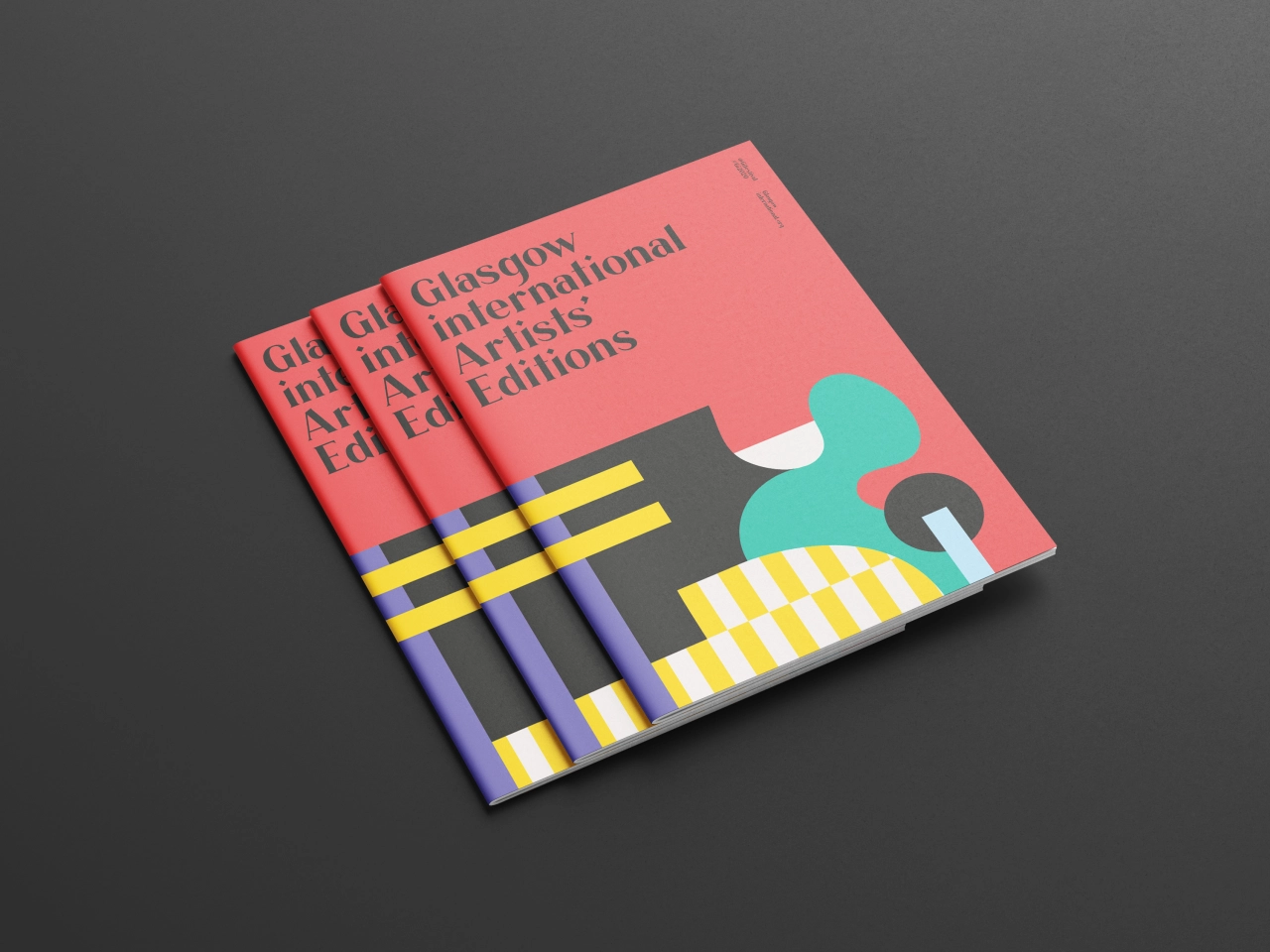
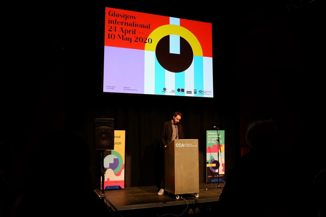
Once the colour palette was defined, the team tasked Gabriella with creating nine different graphic tiles. "Chopping, scaling, flipping and rotating the tiles gives us infinite random options, with no two brand touchpoints ever being the same," Vernon recalls.
"The visual approach underpins the 2020 festival theme of 'Attention'," he continues, "and rather than repurpose artist works and show them out of context, the new identity almost becomes a piece of visual art in itself. For locals and visitors to the city, it’s a welcome distraction from the endless visual landfill of social media and news feeds."
The rebrand retains the typeface Lacuna, which was first introduced in the 2018 identity and created by Glasgow School of Art alumni Imogen Ayres. "Keeping Lacuna was a no-brainer," says Vernon. "It was so effective in establishing things back in 2018, and it’s great that the typeface was created in Glasgow."



Editor's Picks





Trending






Latest Jobs
Account Manager at Moxie and Mettle
Full-time·Cheltenham·Up to £35k
Brand Designer, Product Launches at Figma
Full-time·New York·$127k–$269k
Midweight Designer at Catalyst Creative
Full-time·London·£32k-£36k
Senior Designer at Definition
Contract·London·£45k–£50k
Growth Strategist (Ecommerce) at Tribe
Full-time·Exeter / London·£50k + Bonuses
Senior Copywriter at Human After All
Full-time·London·£48k–£66k