Gemma Correll's quirky pug cartoons are at the heart of a new online brand
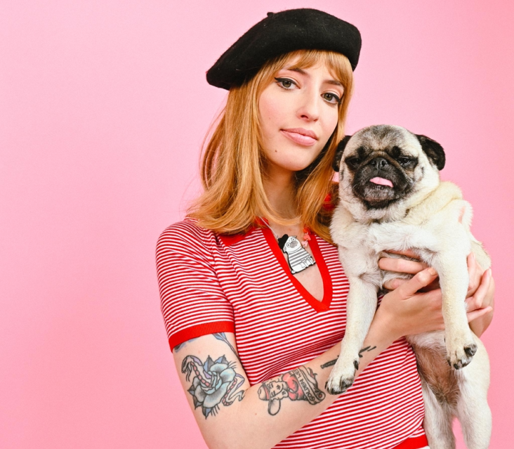
If you're one of Gemma Correll's legion of fans, you'll know that she's more than a bit fond of pugs. As well as featuring heavily in her cartoons, she even describes herself as an "infamous pug lady". What could be more fitting then than her latest project, which sees her create the brand of an online community dedicated to the beloved breed.
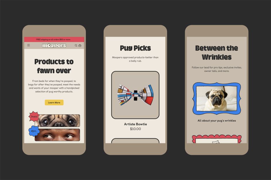
Working with New York-based design studio ThoughtMatter and The Fetchery, the popular New York Times and Forbes cartoonist has created specially commissioned illustrations of pugs for Moopers - an online community specifically created for pugs and pug lovers.
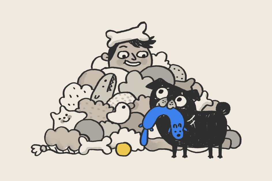
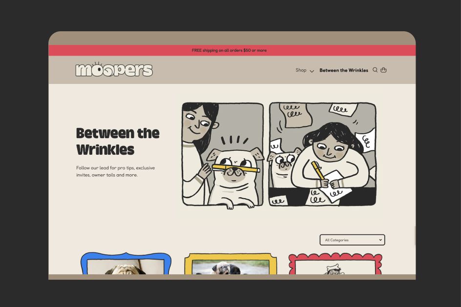
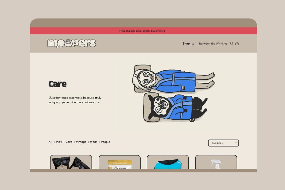
Packed with pug-specific expertise to help owners take care of their pets, Moopers is a carefully crafted site that also directs users to the best group-tested food and equipment on the doggy market. Its equally thorough brand architecture uses design elements and illustrations that capture the assertive and compassionate spirit of pugs.
"We wanted to be sure that Moopers possessed a comical personality that really reflected the pug and owner relationship, from Gemma's perfect illustrations, down to the brand's name," explains ThoughtMatter Creative Director Ben Greengrass. "You can't help but smile when you say it, just like you can't help but laugh when your pug does something wrong. They're your Mooper, and you are theirs."
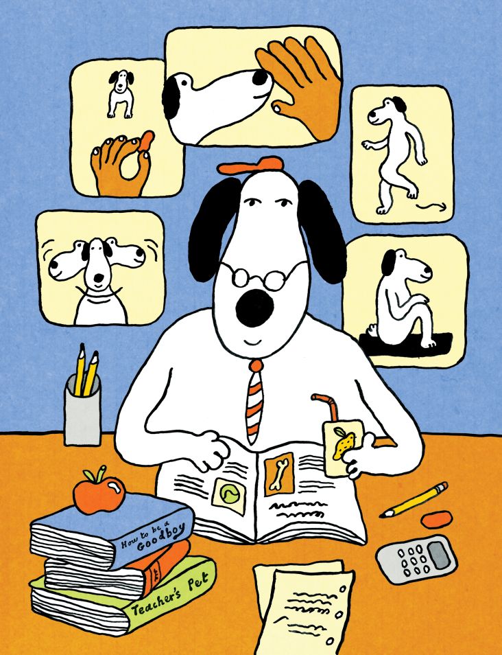
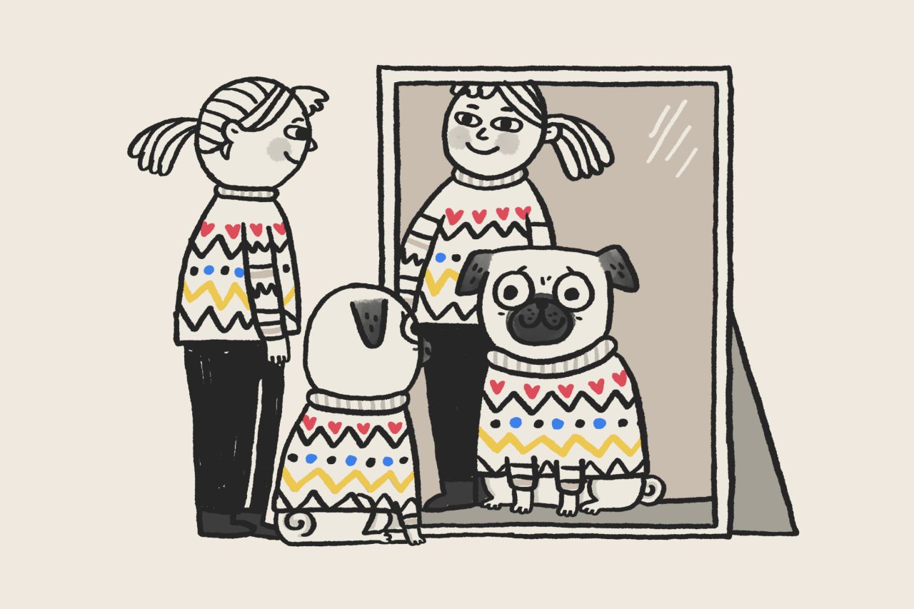
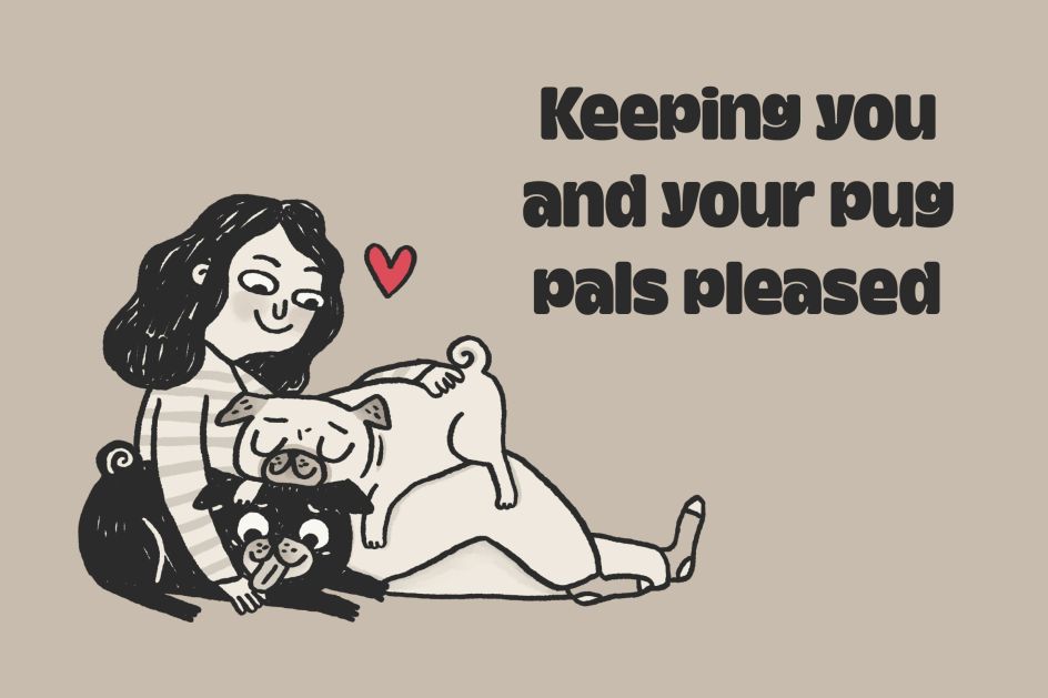
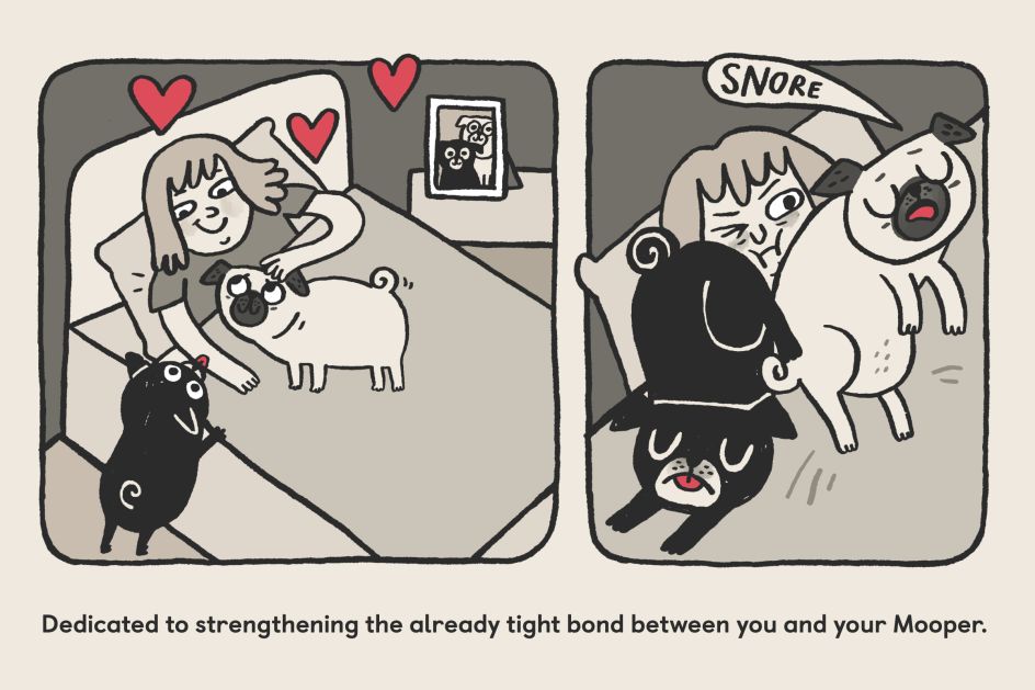
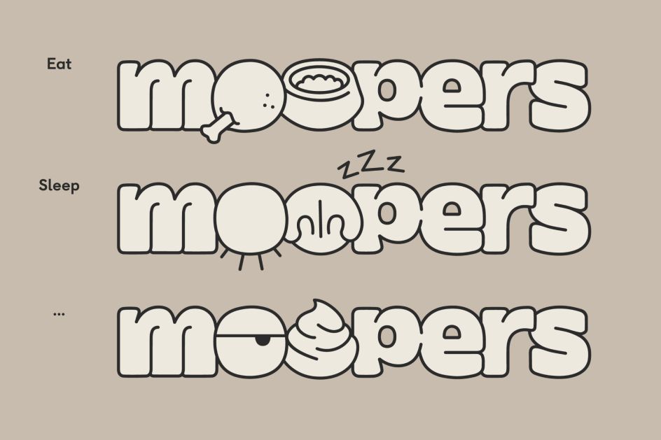
Anchored by Gemma's custom illustrations, the Moopers identity taps into the uniquely comedic aspects of pug ownership that have been glorified by her illustrations and memes. Think charmingly doodle-like illustrations of goofy pugs proudly hamming up puns like 'the puggle is real'. According to ThoughtMatter, Gemma's style was the perfect fit for this one of a kind brand because drawing the idiosyncrasies of pugs was nothing new to her as a pug owner and advocate.
Accompanying Gemma's charming cartoons is a colour palette based on the pug's iconic black and fawn coats, which also adds a dash of humour as it calls to mind the look of newspaper comic strips. A secondary palette symbolising their clownish behaviour completes the brand, along with a fittingly short and doughy typeface.
And if you're wondering where the brand name itself comes from, Ben reveals that it references and builds on the Scottish word 'moop': "It gave us a lot of flexibility, with two Os that can be used as holding devices for graphics that symbolise human and pug faces, emotions and expressions."
Editor's Picks


Trending


](https://www.creativeboom.com/upload/articles/90/908fdb6378db1e95d12595416f54e6336d5e80b8_732.jpg)
Podcasts


Editor's Picks
Further Reading
](https://www.creativeboom.com/upload/articles/7c/7c7bad8f3d40d889a00581f92898e563fe2224c2_732.jpg)