'Fresh' but 'mature' designs for an alcoholic kombucha brand that believes a drink creates a 'bridge' for communities
For all those thinking kombuchas – oft-touted as a sort of fermenting, living, breathing, gently bubbling super-drink was an angelic alternative to boozing, might think again when they see these sweet new designs.
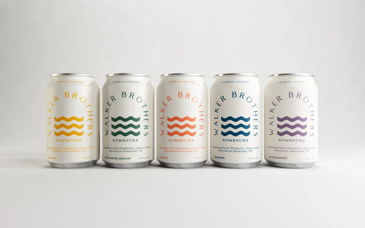
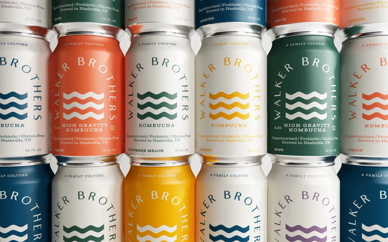
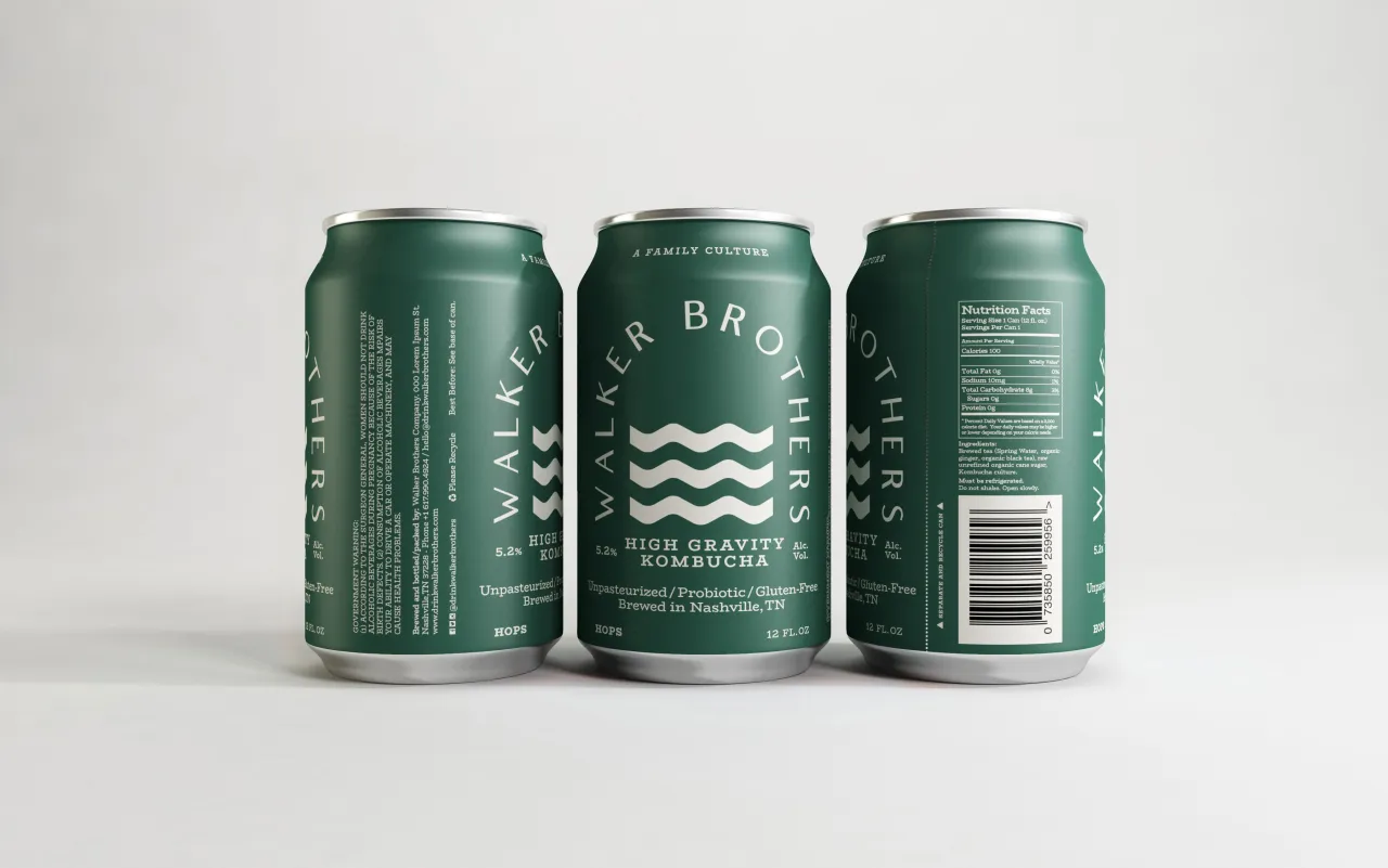
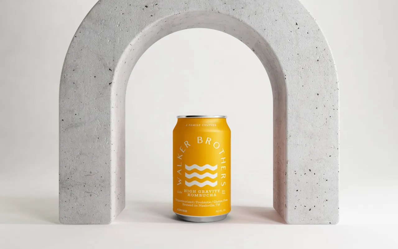
Created by makebardo, a creative design studio based in Queenstown, New Zealand, the new can designs for Walker Brothers are rather different to the browns and greens we’re used to seeing for kombucha in the UK; instead using bright flashes of colour and Matisse-like shapes to create energy and fun.
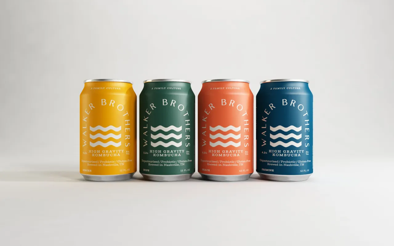
Walker Brothers was founded last year and brews traditional and high gravity (alcoholic) Kombucha in Nashville, Tennessee. “For them, brewing kombucha is a family affair,” says makebardo.
The brothers apparently inherited the company’s first scoby (the live culture used to make kombucha) from their aunt who would supply bottles of fizzy, homemade kombucha at all Walker family events. “It was out of this tradition that Walker Brothers' kombucha grew—literally!” the agency adds.
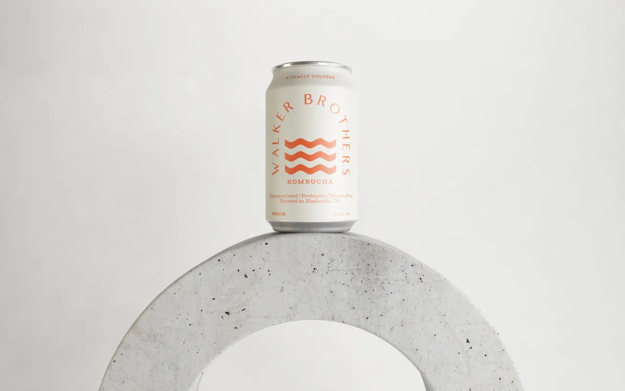
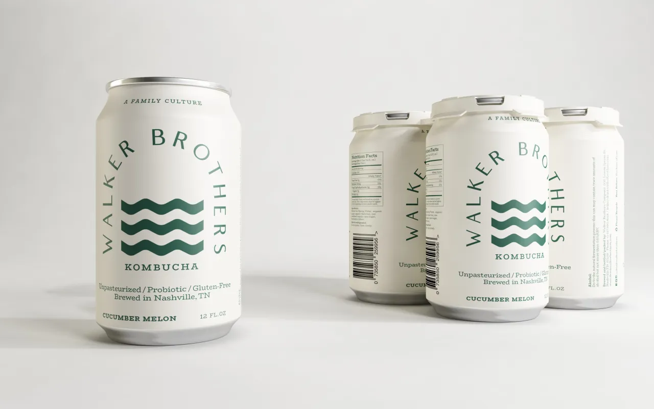
“The culture in Walker Brothers' kombucha is the same that their founders have shared over years of family gatherings and they invite you to join the celebration." makebardo’s designs are based on the concept “the bridge”, a symbol that aims to capture the Walker Brothers’ core values as a business.
“For example, they believe that community is an essential part of holistic health,” says makebardo. “In their experience, the act of having a drink – alcoholic or not – with a friend can create a space (a bridge) for the type of vulnerable engagement that facilitates community.”
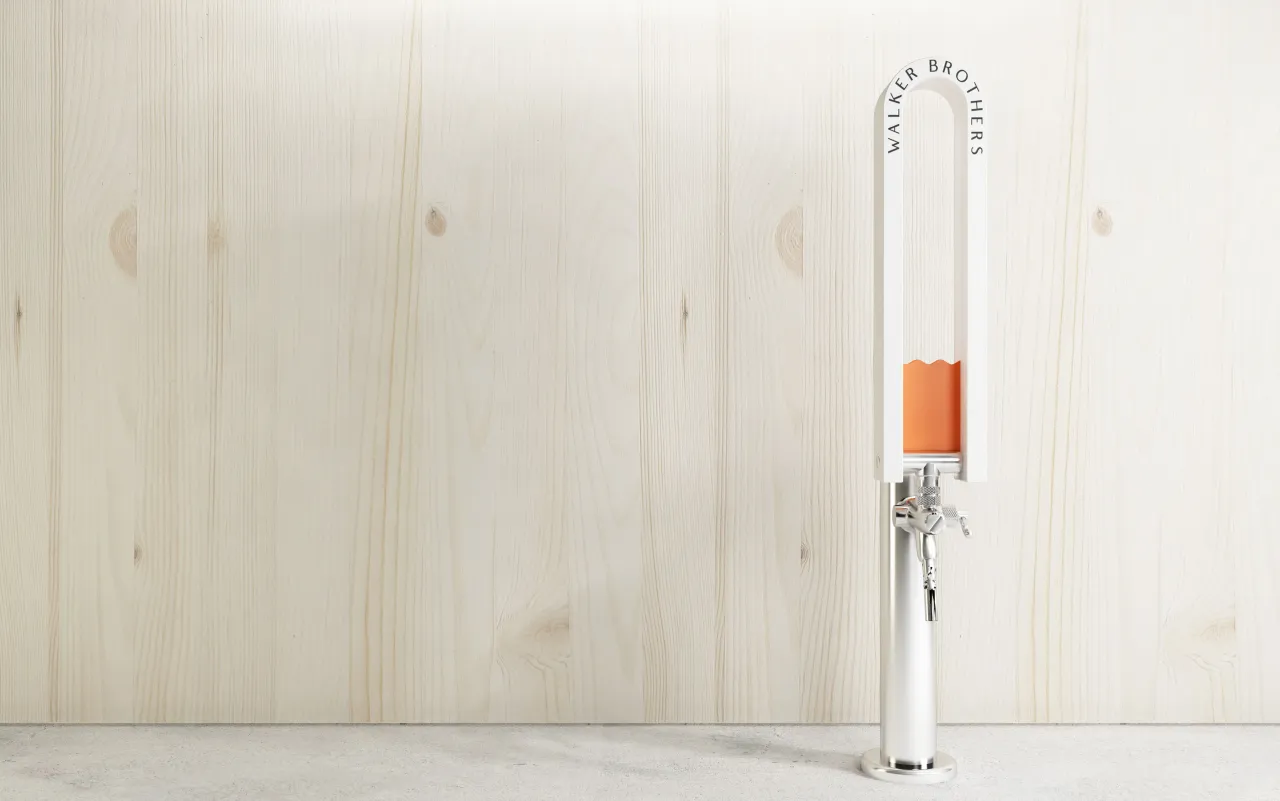
The beige device shown across packaging is derived from the Walker Brothers wordmark; using a wavy effect that aims to create “movement” and a “strong and pure” look “representing a bold stream.”
The colour palette aims to strike a balance between “freshness and maturity, appealing to multiple audiences.”
Editor's Picks





Trending




Latest Jobs
Frontend Developer at Northern Artillery
Full-time·Leeds·£35k–£45k
Growth Strategist (Ecommerce) at Tribe
Full-time·Exeter / London·£50k + Bonuses
Graphic & Motion Designer at The SHARP Agency
Full-time·Leeds·£26k–£33k
Senior Designer at Definition
Contract·London·£45k–£50k
Paid Media Executive at Munro Agency
Full-time·Glasgow·From £27,000
Senior Digital Designer at Red Antler
Full-time·New York·$95k-$130k