Emoji-packed designs for content agency Feed borrow from the language of social media
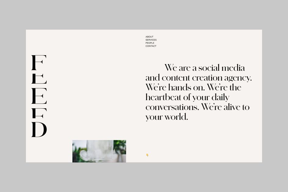
London-based creative agency DutchScot has created the visual identity for recently launched social media and content creation agency, Feed.
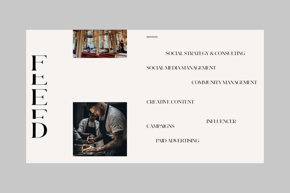
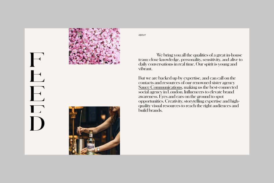
The company is the sister agency of Sauce Communications, and works across creative campaigns, content creation, social media and community management, paid advertising and working with influencers to enhance brand awareness.
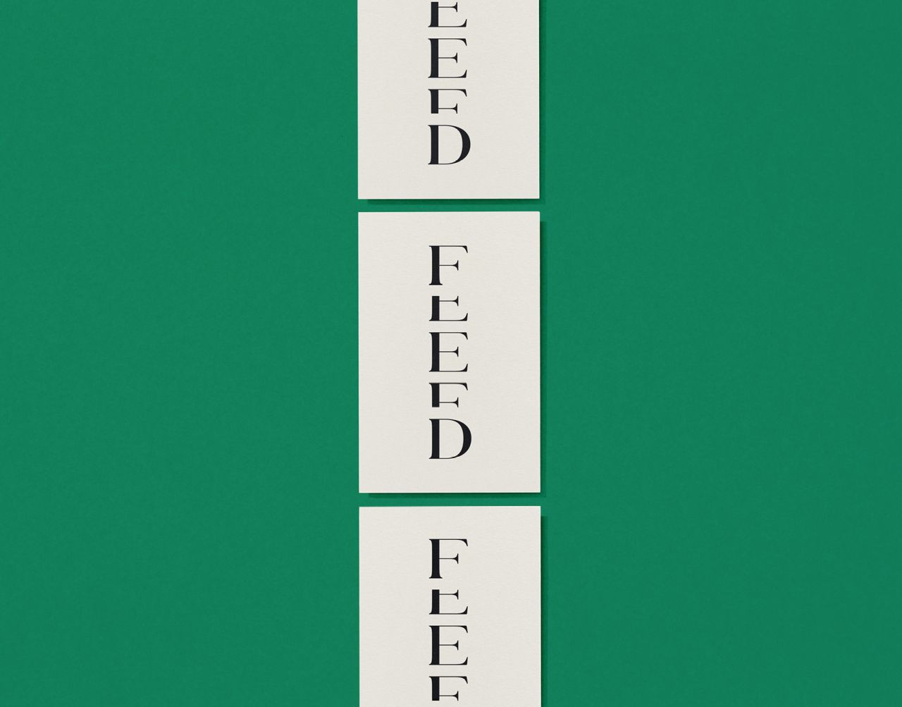
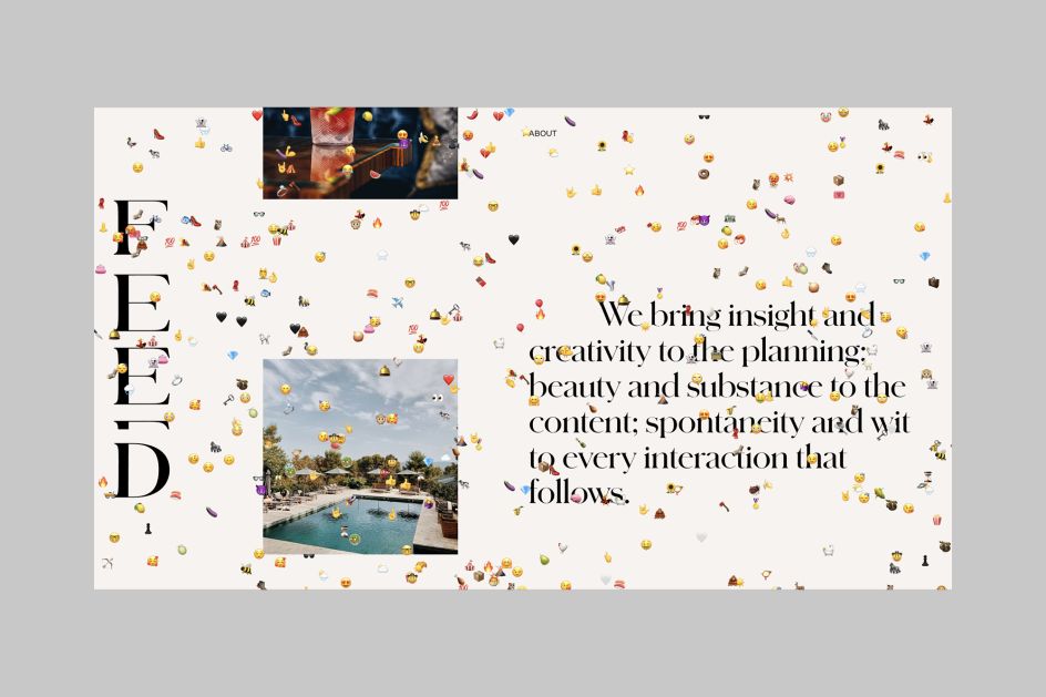
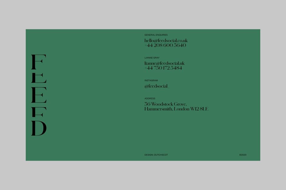
DutchScot chose to use the classy but subtly playful serif font family Schnyder by Commercial type, along with a vertically scrolling website design using images cropped into Insta-friendly squares.
The website design consists of three 'feeds': one that's message led, one which presents case study images and finally, a feed that shows the animated version of the Feed logo.
"The logo is a living breathing representation of the word 'Feed', constantly in a state of transition, scrolling as a user would on their phone, tablet or computer," says DutchScot. "The behaviour of the logo is linked to how the user interacts with the site and scrolls up and down as they do."
Much of the design work is informed by the aesthetics and behaviour of social media. For instance, when users roll over an image on the Feed website, an emoji appears relevant to that particular project. "And if left to its own devices, the website is gradually taken over by emojis," says DutchScot.
Editor's Picks


Trending


Podcasts


Editor's Picks
Further Reading