Bed brand Earthfoam launches 'space-age' retro identity to celebrate its sustainability
Since its launch last November, the fair trade sleep brand Earthfoam has been developing products made from 100% natural materials like natural rubber, wool and cotton. Its in-house creative director crafted something special for its identity that champions the brand's sustainable credentials.
We spend half our lives in bed, so it only makes sense to invest in the space that recharges us best. This was the aim behind the newly-launched bed brand, Earthfoam, which arrived on the market late last year. Its offering is simple: to provide an end-to-end sustainable supply chain using natural products for its rubber mattresses, mattress toppers and pillows, prioritising sustainability. And its brand identity reflects this focus.
It was created by Creative Director Michael Mitzman with an aesthetic that highlights the brand's commitment to quality, comfort and durability. Inspired by retro Airfoam ads promoting original foam rubber mattresses in the 1950s, the new Earthfoam identity features bright colours, space-age curves, bold lettering and an old-school script logo. It's purposefully modern and clean, embodying surrealist illustration tones with minimalistic photography. This presentation aims to evoke the calm sensation of sleeping and dreaming.
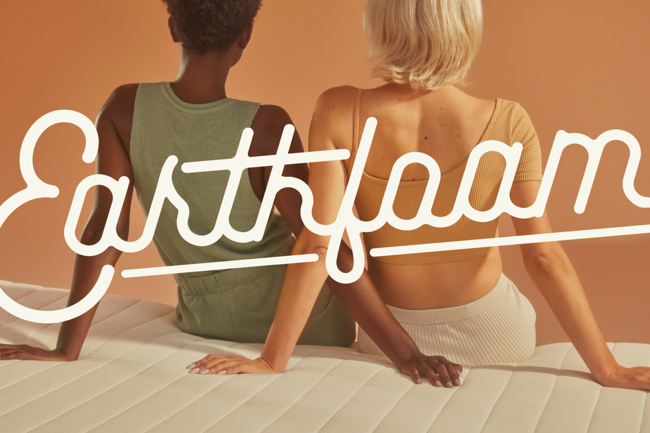
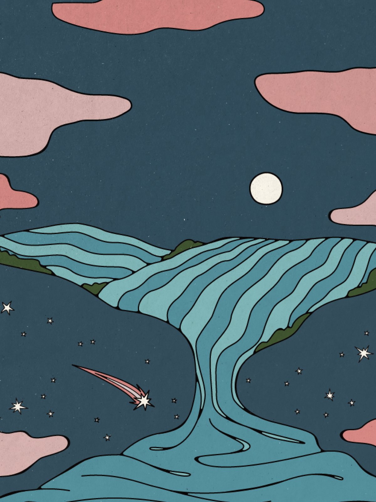
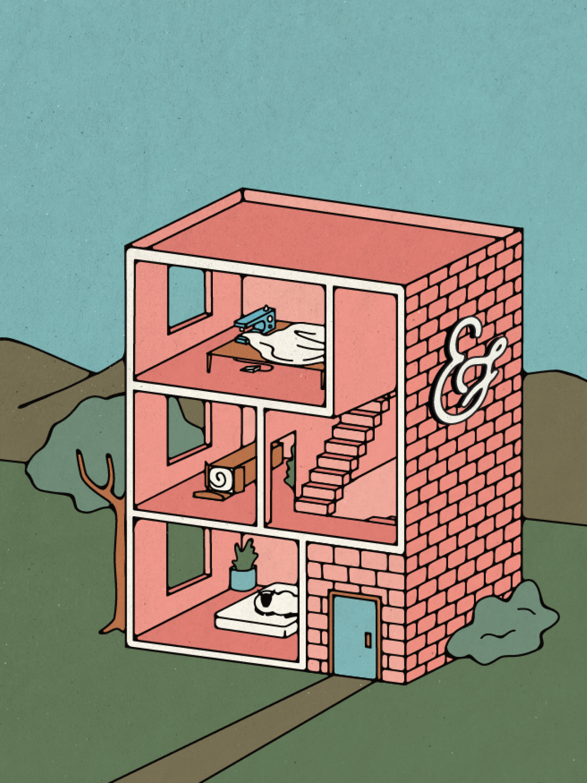
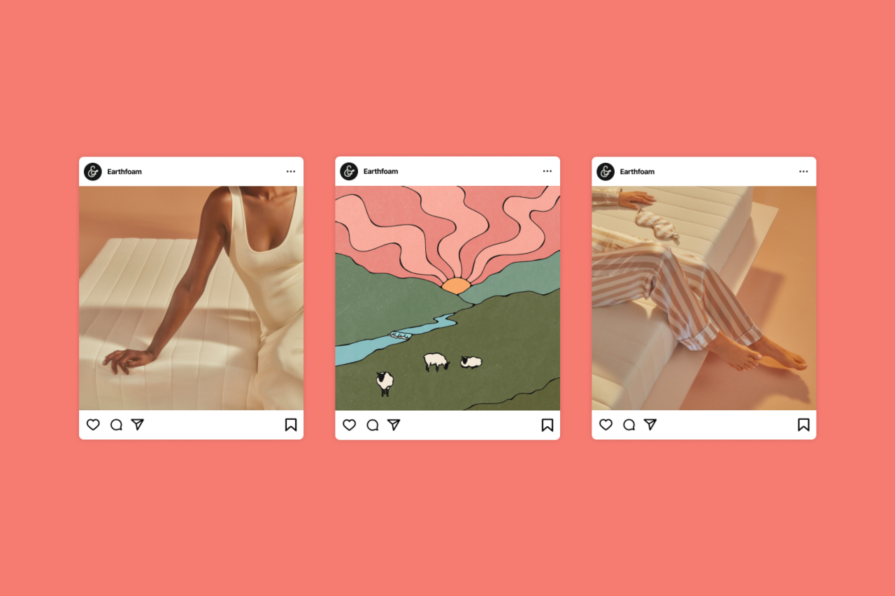
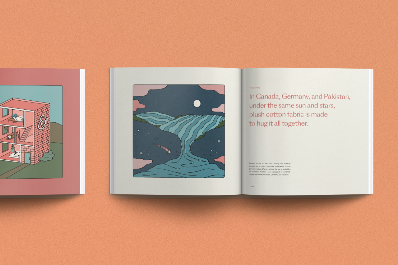
"It marries retro and modern elements to create a look and feel that is both nostalgic and fresh," explains Michael. "Reflective of our value proposition, roomy, inviting, and high-quality visuals shine throughout." That includes its UX, packaging, branded collateral, and a bespoke magazine that tells the story of how Earthfoam products are made in the style of a children's bedtime story – with accompanying illustrations that spark happy memories of our own upbringing.
"The new photography and graphic treatments layer in abstract and unexpected elements like cheeky bedroom-dwelling sheep that hint at the surrealist absurdities that sleep and dreams can invoke," adds Michael. It certainly hammers home the company's impressive mission of "offering honest products that bring sustainability to the forefront without sacrificing function or form".
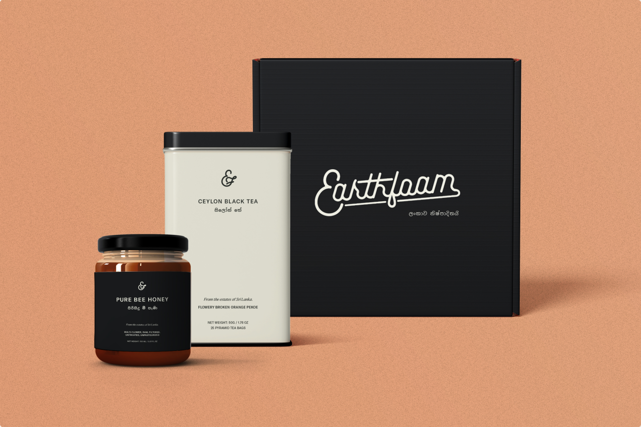
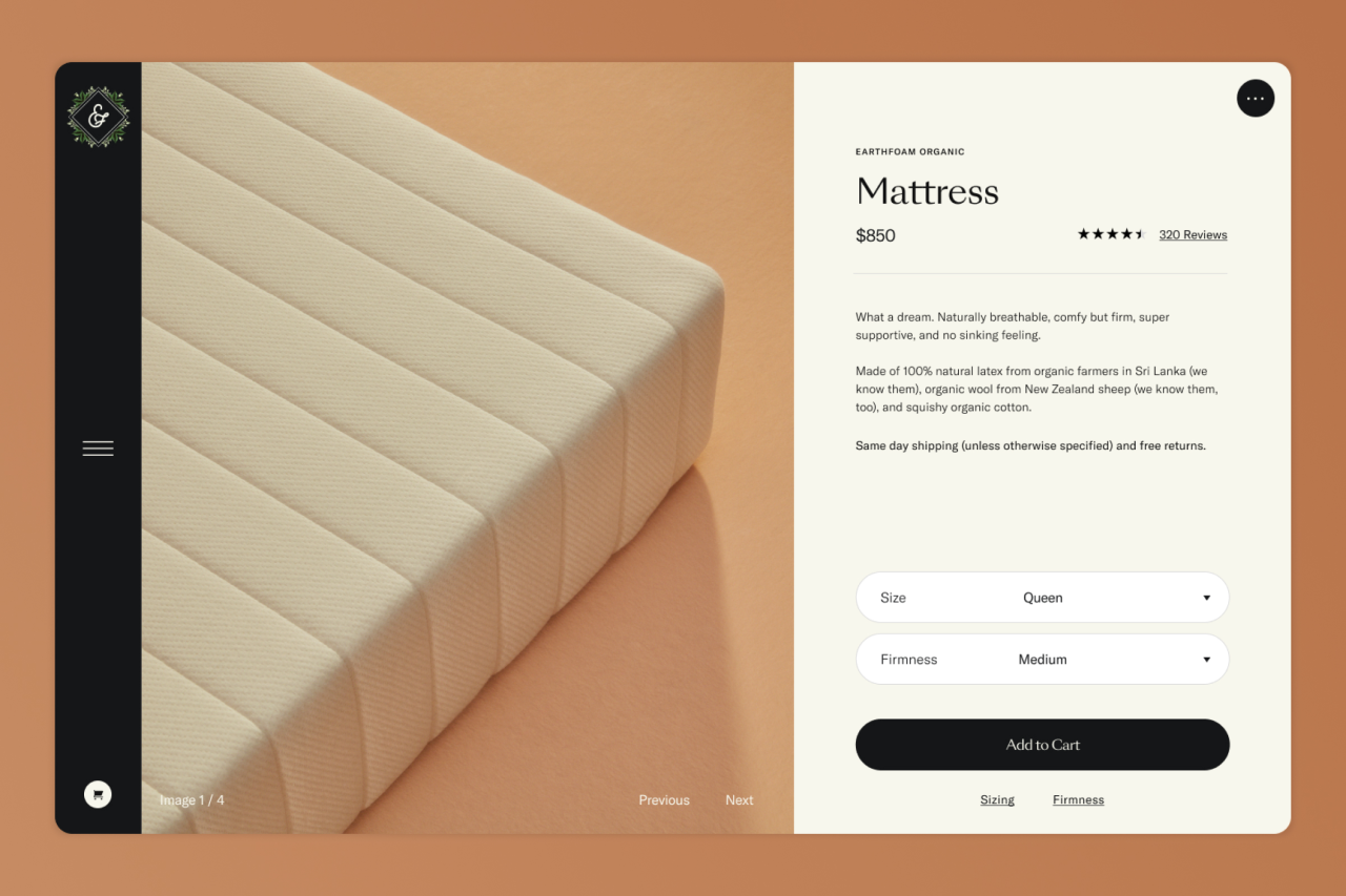

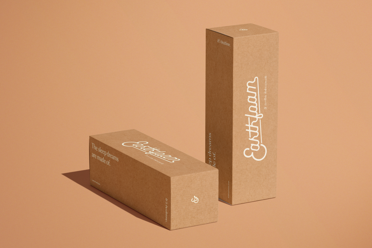
Rolled out across packaging, web design, social media and more, Earthfoam's identity launched with the company in November. You can discover more about the brand at earthfoam.com.
Editor's Picks





Trending






Latest Jobs
Senior 2D Motion Designer at Art&Graft
Full-time·London·£50k-£65k
Account Manager at Moxie and Mettle
Full-time·Cheltenham·Up to £35k
Head of design at Cog Design
Full-time·London·£55K
Client Partner at Halo
Full-time·Bristol·£30k–£36k
Growth Strategist (Ecommerce) at Tribe
Full-time·Exeter / London·£50k + Bonuses
Paid Media Executive at Munro Agency
Full-time·Glasgow·From £27,000