Design Bridge Singapore creates 'hyper-local' craft beer brand for the Hong Kong market
Design Bridge's Singapore studio has revealed its striking transformation of YAU, a craft beer brand from Hong Kong, featuring witty local colloquialisms, and vibrant illustrations by Brainrental.
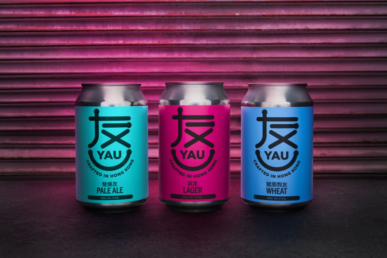
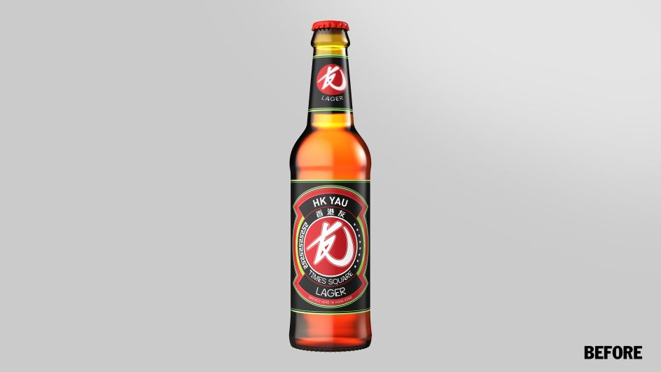
"YAU was originally launched in 2017," says Tim Siro from Design Bridge. "To go with a new format launch in 2019, the brand was looking forward to creating a stronger connection and genuinely resonate with consumers in Hong Kong. We've done that by using playful twists on the local Cantonese dialect and introducing a bold new visual language that firmly situates YAU in Hong Kong.
"The result is a brand that excites locals while appealing to both local Hongkongers, as well as curious ex-pats and tourists eager to explore the local beer culture in the bars of Mongkok, the laneways of Lan Kwai Fong and beyond."
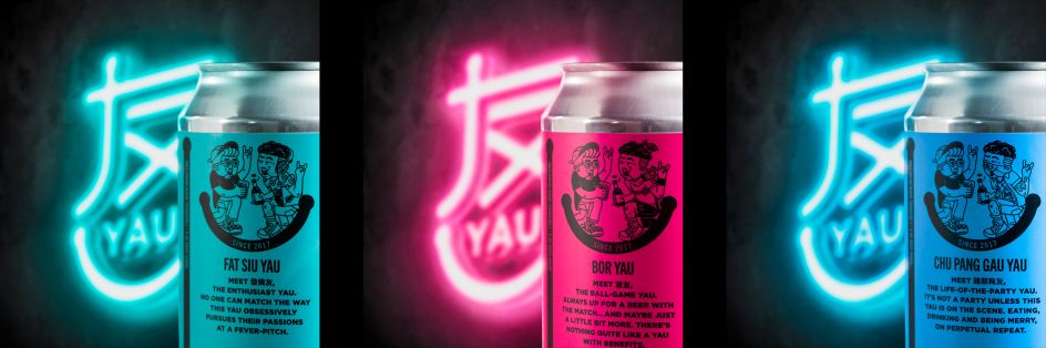
'Yau' translates as 'friendship' in Cantonese and is often embellished in the local Hong Kong vernacular to create new phrases that playfully describe the character traits of our friends of all characters. Inspired by this, Design Bridge selected three of the most distinctive 'YAU-isms' to name the three current YAU brews after:
'Bor-Yau' is the kind of friend you watch football with, then might just end up in bed with after! 'Fat-Siu-Yau' is that intensely obsessive friend who is constantly working themselves up into a fever. And 'Chu-Pang-Gau-Yau' is your gluttonous friend who takes eating and drinking to a whole new level.
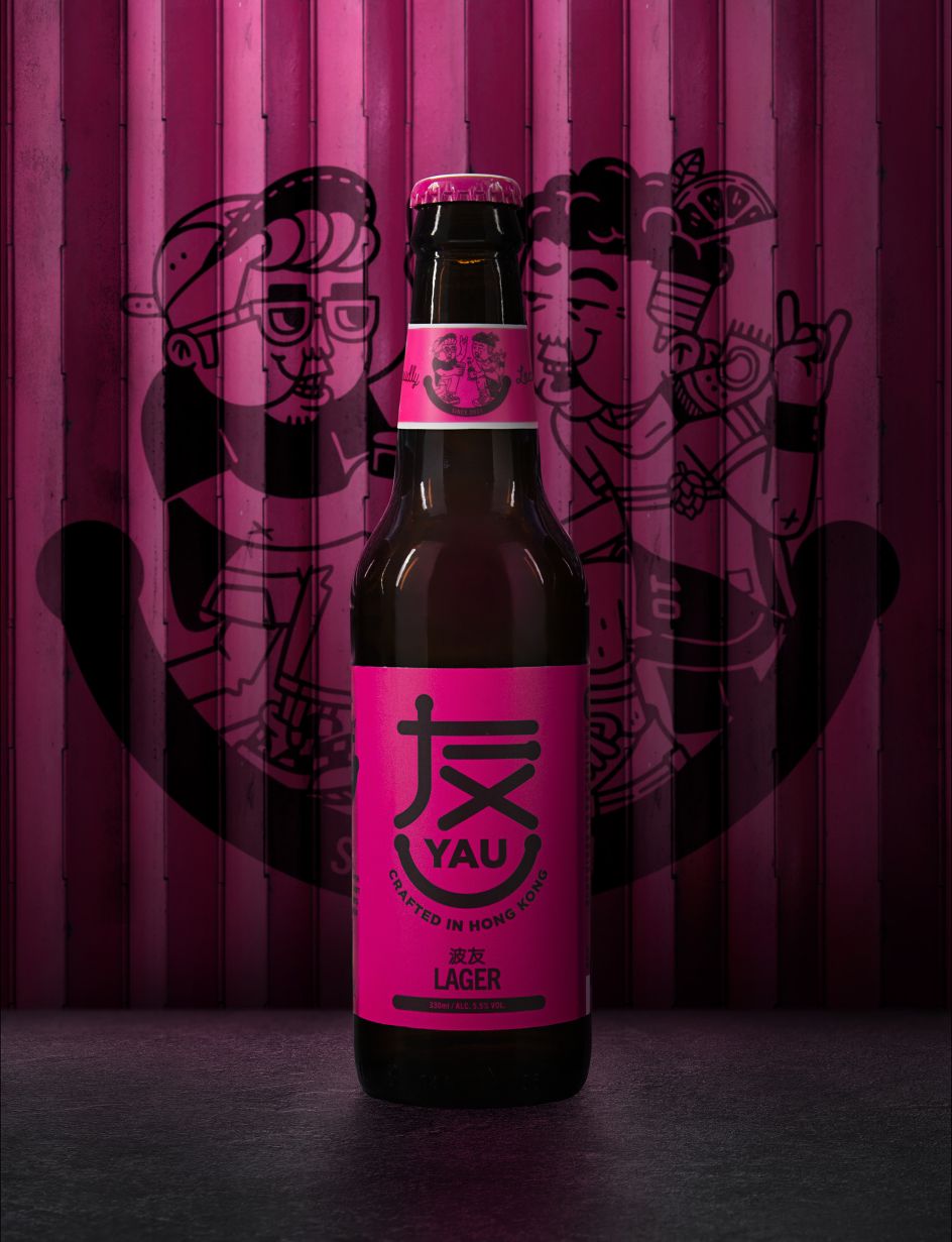
These have been brought to life in a collaboration with local illustration trio Brainrental, renowned for their tongue-in-cheek depictions of modern metropolitan life in Hong Kong, adding another layer of local relevance to the designs.
Tim adds: "Making these uniquely colloquial terms the focal point of the designs allows us to express the brand in a hyper-local way – something that was missing in the previous branding. Each of the three variants is a 'friend', a different Yauism to explore, and this narrative is continued in the new brand mark where the Cantonese symbol for 'YAU' has been crafted to depict a friendly smile."
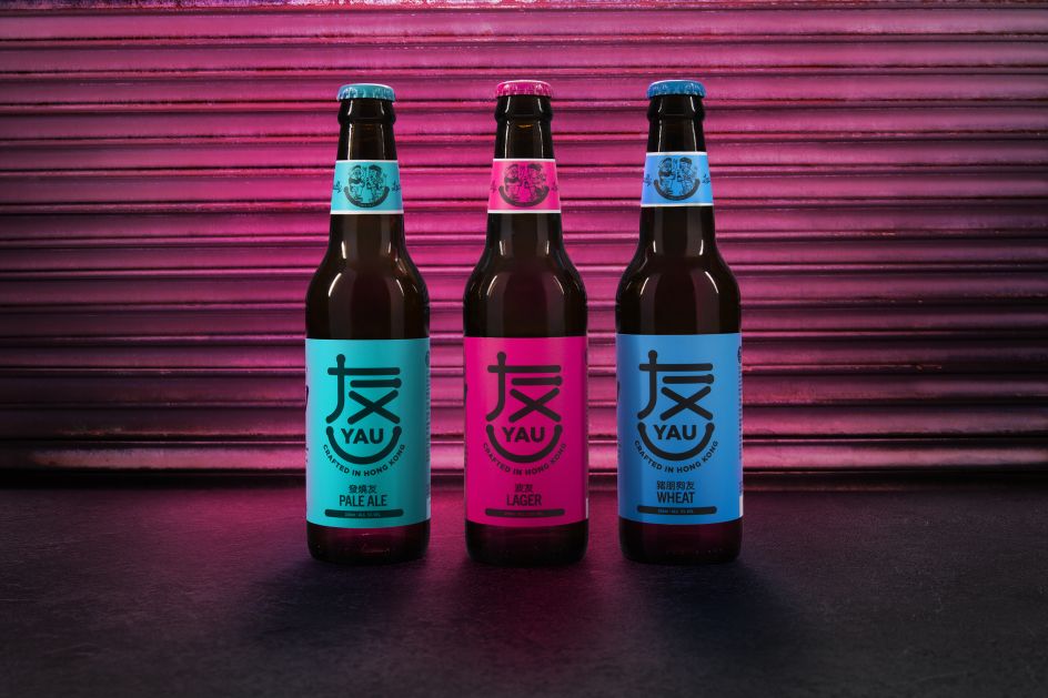
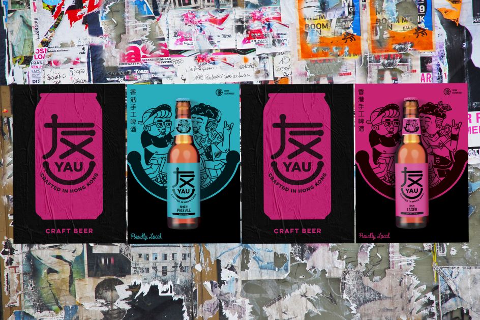
Set against a new colour palette of piercing magenta, ultramarine and cerulean blue to further re-energise the brand and ensure it stands out in what is a competitive market. The brand has also been rolled out off-pack to include glassware, posters, signages, flight trays and pop-ups.
Editor's Picks


Trending


Podcasts


Editor's Picks
Further Reading