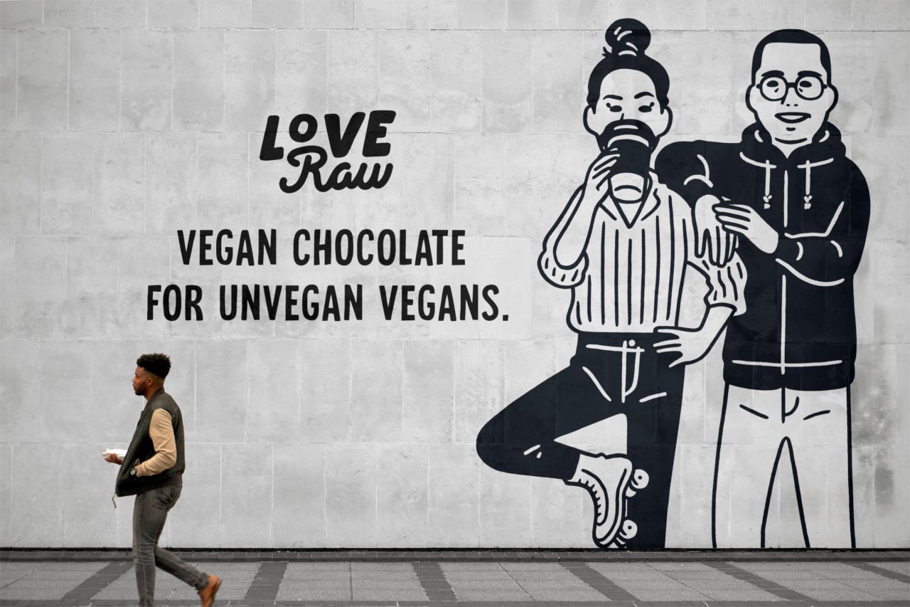
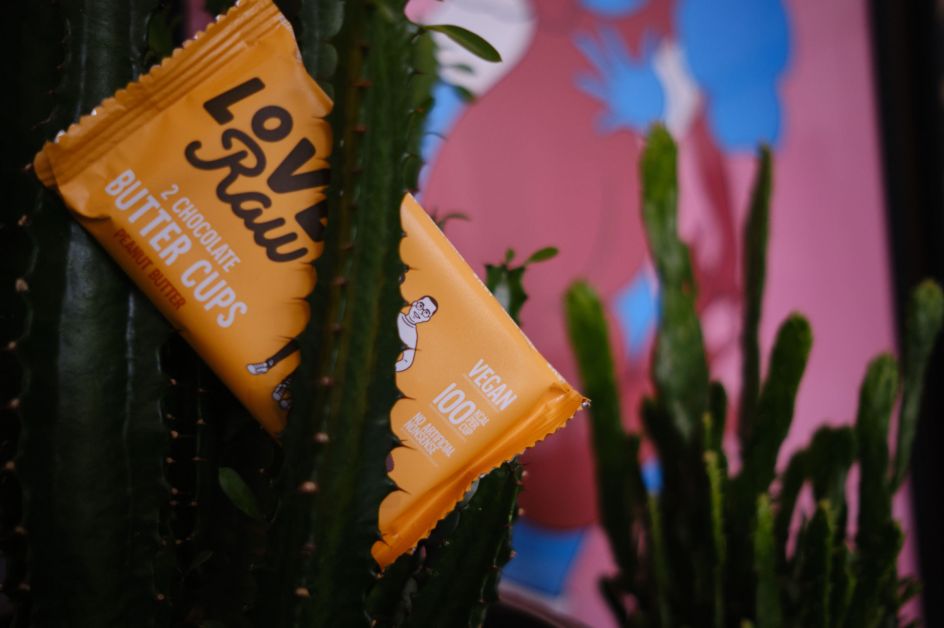
Daughter's LoveRaw designs look to 'dissociate from vegan stereotypes'
Leamington Spa-based studio Daughter is behind the new branding for vegan chocolate range LoveRaw.
The agency came to work on the project having been recommended by another client, sports nutrition brand Grenade, for which it created the brand positioning, a new strapline and a brand book.
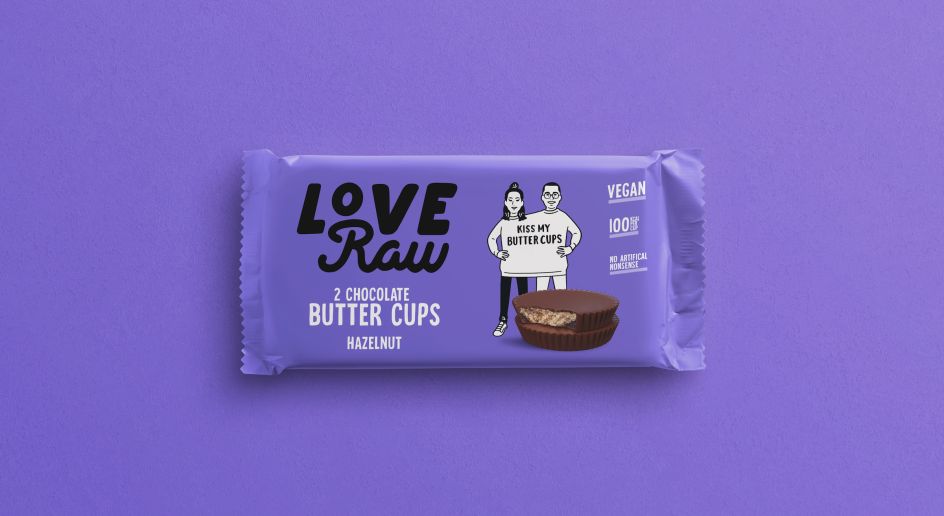
LoveRaw was looking to commission new packaging that supported its strategic positioning: a vegan brand that also appealed to non-vegans.
"Many vegan brands have previously seemed to sell a lifestyle of perfection beyond the product itself," says Daughter, before falling back on an old cliche: "as the saying goes: how do you know someone is vegan? Don't worry, they'll tell you."
The studio's work for LoveRaw looks to reflect the fact that, apparently, "veganism grew up a little" now that it counts 3.5 million in the UK. "Veganism has come some way in shaking off its status as a moral signifier," says Daughter. "There's been an important shift in how people think of vegans and vegan food. It no longer signifies restraint, control or sacrifice, or marks you out a 'type' of person."
The brand positioning now looks to align the brand with the 'imperfectly normal' as "counterweight to the inauthenticity and preachiness of 'old vegan'." (Their words, not ours - coming from a card-holding animal rights-leaning vegan of, erm, 14 years) In a bid to "dissociate the brand from the stereotypes," LoveRaw choc is now positioned as "great-tasting chocolate that just so happens to be vegan too."
Japanese illustrator Nimura Daisuke was commissioned to create imagery for the new packaging designs, adding to what aims to be a "fresh" take on the growing vegan market across the new packaging, logo and tone of voice.
Editor's Picks


Trending


Podcasts


Editor's Picks
Further Reading